Overview
As one would expect, using the Performance Monitor tool to view the data we have collected is the most obvious and easiest tool we have available. Let’s find out how to analyze this data.
Explanation
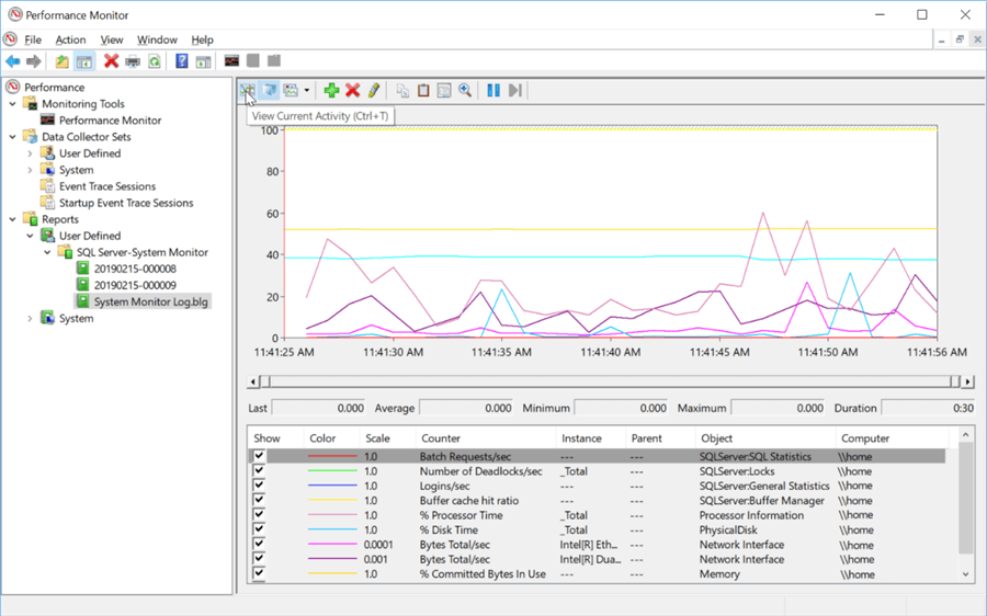
As we had briefly shown in the real-time data collection section, after you have added counters, you are immediately presented with a screen with graphs of the performance counters in real time, as shown below.

After a data collector has completed, you can also get a similar graph by selecting the file that the data collector created under the “Reports” menu on the left-hand side. Under this item, there is a “User Defined” label that contains a folder for each of the data collector sets you’ve created. And once a data collector set is expanded, you will see a list of all the files created by that data collector. Click on a file, and the performance counter data in this file will be displayed, as shown below.

Now that we have a couple of different ways to display our counters within Performance Monitor, let’s look at how we can change the formatting of the output. If we right-click on any of the counters in the list at the bottom and select “Properties,” we can change the appearance of any of our counters, as shown below. Color, Scale, Line Width, and Style are all configurable.

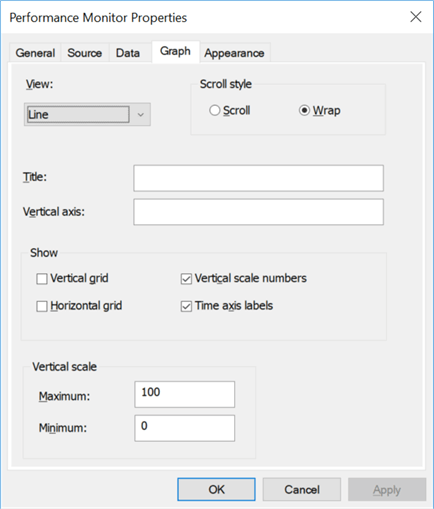
Also, notice that if we click on the “Graph” tab, we have even more options for the graph as a whole. We can change the line style, add titles, change the vertical scale, etc.
There are also options within the main output window that allow us to configure the look of the graph. Even with all the different colors for each counter, it can still sometimes be difficult to identify an individual counter. In order to isolate an individual counter, we can use the “Highlight” button. Shown below, pointed to with the mouse pointer, once we click on this menu button, the counter that we currently have highlighted in the list at the bottom will also be highlighted in the graph.

There are also different ways we can display data, as sometimes a line graph is not the best way to look at the counters being collected. Performance Monitor provides two other methods for displaying the performance counters, as shown below.

Here is an example of the “Histogram bar” graph.

And here is an example of the “Report,” which isn’t really a graph, but is actually a text output of the counter values.

From this window, you can also switch back and look at the current activity on the system. This is done by selecting the “View Current Activity” button, as shown below.

Ben Snaidero has been a Database Administrator for just over 10 years. Starting out working mainly with Oracle he got into SQL Server in 2005 and has worked primarily with SQL Server for the last 3 years. His main focus with both Oracle and SQL Server is in the area of performance tuning.
- MSSQLTips Awards: Achiever (75+ tips) – 2018 | Author of the Year Contender – 2016-2017