Problem
Companies often use a Bell Curve approach to measure performance of various aspects of the business, such as employee performance. A histogram is a statistical concept and according to Wikipedia it is defined as “a graphical distribution of the numerical data”. A histogram is made of several bins and a bin can be considered a range of values or a benchmark.
As part of this process, we have to divide the entire range into multiple bins and the range should be unique and continuous. Our grades in high school (i.e. A, B, C, D, E, F) can be considered an individual bin. If a teacher plots the student marks across the grades (bins) in a bar chart it sometimes follows a bell shaped pattern with a mix of high grade, medium grade and low grade students which could be used for assessing students. The same could be applied at company level by plotting an employee performance metric across bins to understand and assess employees.
Solution
For today’s tip we will use the self service BI tool, Power BI desktop to create and understand how to use histograms. Consider yourself as running a Telemarketing company (XYZ Telemarketing) and you have hired Telemarketers to promote and sell your company’s product. You are in need to assess the Telemarketers performance and we will use a histogram approach.
Before proceeding, make sure you have Power BI desktop installed in your machine, if not please follow this tip (Getting Started with Power BI Designer) by Scott Murray and install the product.
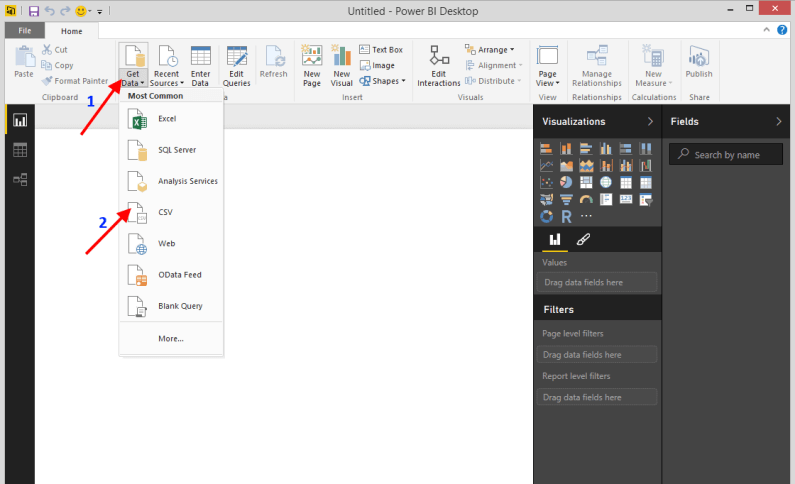
Open the Power BI Desktop application. Our first step is to load the necessary data for this project. The data for today’s task is available to us in the form of two CSV files. The first one is the SalesData.CSV which has the Sales made by Telemarketers and the second one is Benchmark.CSV which has the benchmark (bins) defined for the Sales metrics. Let’s load the first file. Click the drop down available for the Get Data option and select the CSV option as shown below.
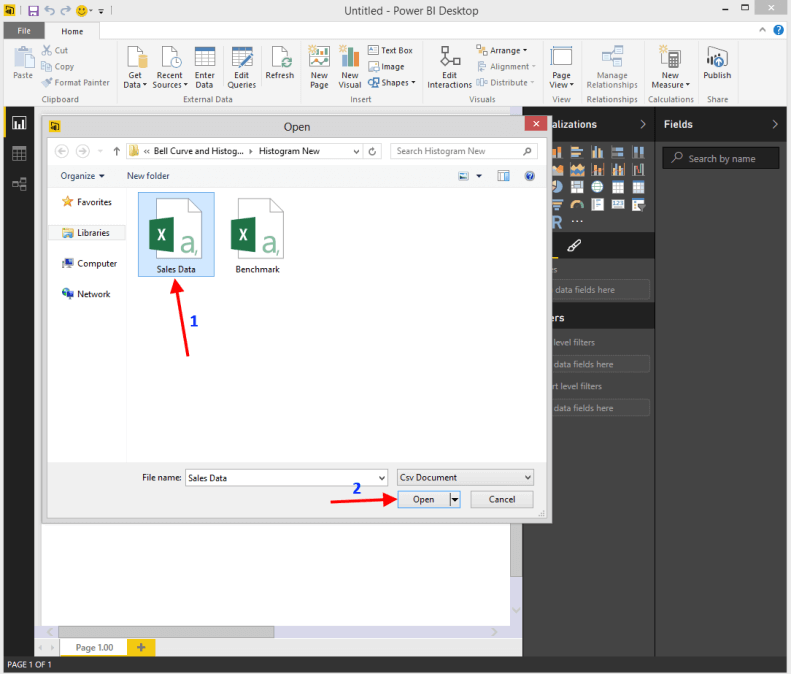
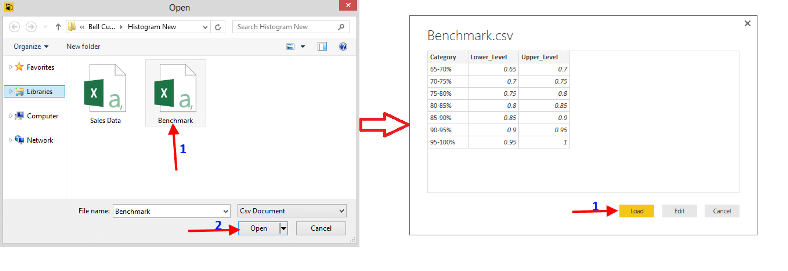
It will open a pop up window as shown below. At that point, navigate to the location of Sales Data CSV file and select it and click the Open option as shown below.
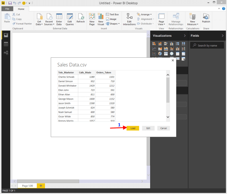
It will open a preview window like below which will give you a preview of the data available in the Sales Data CSV file. Next click the Load button to load the data into the project.
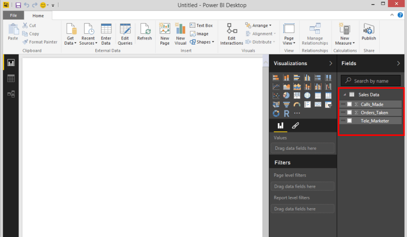
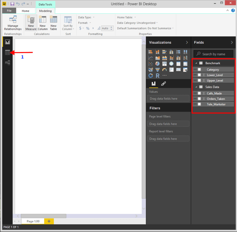
Once the data is loaded you will see all the fields of the loaded data available in the Fields Section of the Power BI Desktop as highlighted below.
Our next step is to load the Benchmark data. Repeat the above steps to load the Benchmark CSV file.
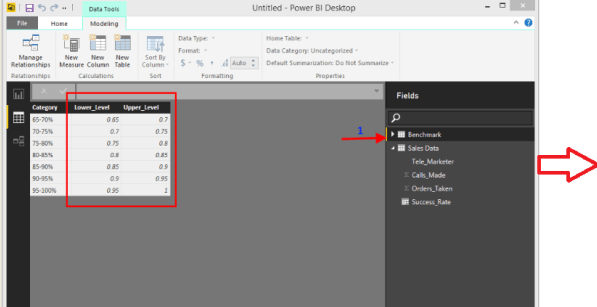
When the Benchmark data is loaded you will see the fields of the Benchmark data available in the fields section as highlighted below. Lets navigate to the data tab by clicking in the area of where the arrow is pointed in the below image.
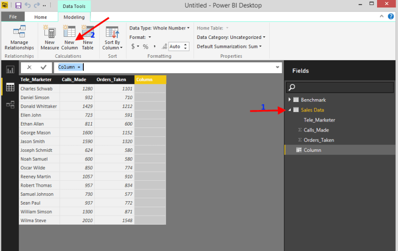
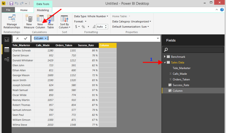
You can see the loaded data is available in the data tab. We now have two tables with raw data. Our next step is to create a performance metric from the Sales Data table and link it with the range of values in the Benchmark table, so that we can create a histogram. In this case the performance metric is the ratio of Orders_Taken to the Calls_Made by the Telemarketer and we will call it Success_Rate. Double click the Sales Data as shown below to open the contents and create a new column in Sales Data by clicking the New Column option.
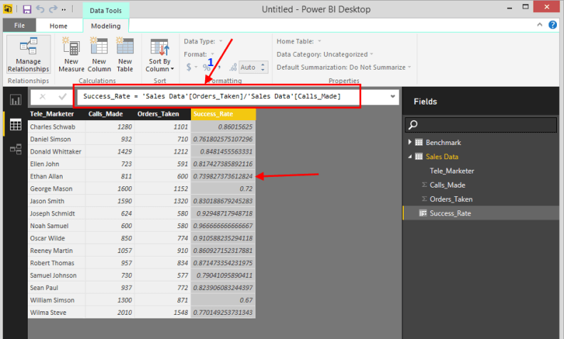
Type in the DAX formula as shown below in the calculation bar of the New Column. Once you type fields like Orders_Taken or Calls_Made it will auto populate the fields for you in the formula bar and then hit enter. Please note the expression in Power BI Desktop supports only the DAX language. You will see the Success_Rate column getting populated as shown below.
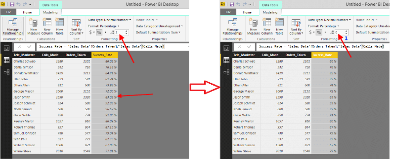
Let’s format the Success_Rate column as a Percentage. Click the drop down available in the Format button and select percentage as shown below.

Now the Succes_Rate column is available as Percentage with a 2 scale, let’s make it to 0 scale by highlighting the Success_Rate column and changing the scale value to 0 as shown below.
Double click the benchmark table in the fields section and you will see the ranges Lower_Level and Upper_Level available in decimals, repeat the above formatting steps and convert it into a percentage as shown below.
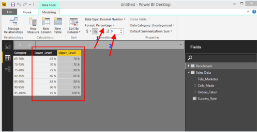
As you see from the formatted image above (on the bottom) we have the lower and upper range defined for every bin in the benchmark table and we are at the step to map these bins to every record in the Sales Data table by joining them. Double click the Sales Data from fields section and create a new column which we will use as bin and call it RankCategory column.
We will write a DAX formula like below in the formula bar of the new column added. This formula uses the CALCULATE function and checks if the Success_Rate column from Sales Data is greater than the Lower_Level and Lesser than or equal to the Upper_Level of the Benchmark, if it is true it returns the Bin value minus the Category field from Benchmark to the RankCategory column of Sales Data.
RankCategory = VAR CatVar=[Success_Rate] RETURN CALCULATE (VALUES ( BenchMark[Category]), CatVar>BenchMark[Lower_Level],CatVar<=BenchMark[Upper_Level])
Once you have typed the formula you will see the RankCategory column gets populated like below. We now have the performance metric (Success_Rate) mapped to the bin (RankCategory) as per the bin range provided and our next step is to plot and see which Telemarketer falls under which bin. For that let's navigate to the Report Canvas tab as shown in the second arrow below.

Double click the Clustered Column Chart available in the Visualizations, it will open up an empty visual like below in the report canvas.

Drag the RankCategory colum from the fields section to the axis and the Telemarketer to the value. You will see the empty visual turn into a chart like below.

We have distributed the Telemarketers across the bin and formed a histogram, note the Histogram looks in a Bell curve shape. Let's format the visual to make it more engaging by following the steps below.
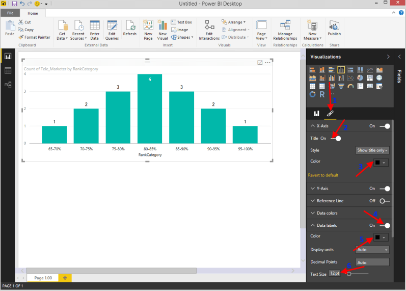
1. Click the Format option in the Visualization section.
2. Turn the Title On for X-axis it will add a title as RankCategory.
3. Format the X - axis fonts to black.
4. Turn on the data labels, this will show how many Telemarketers are there in each bin.
5. Format the data label color to black.
6. Increase the font size of data label to 12 pt.
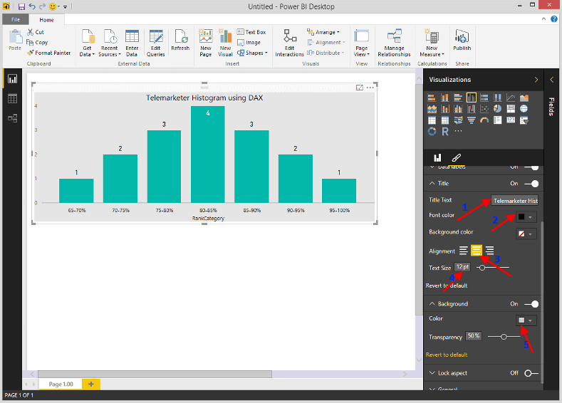
Scroll down the format option and follow the below steps to format the visual more appealing as shown below.
1. In the Title Section, add a title as Telemarketer Histogram using DAX.
2. Change the title color to black.
3. Align the title to center.
4. Increase the title text to 12pt.
5. In the background section change the background color to light gray.
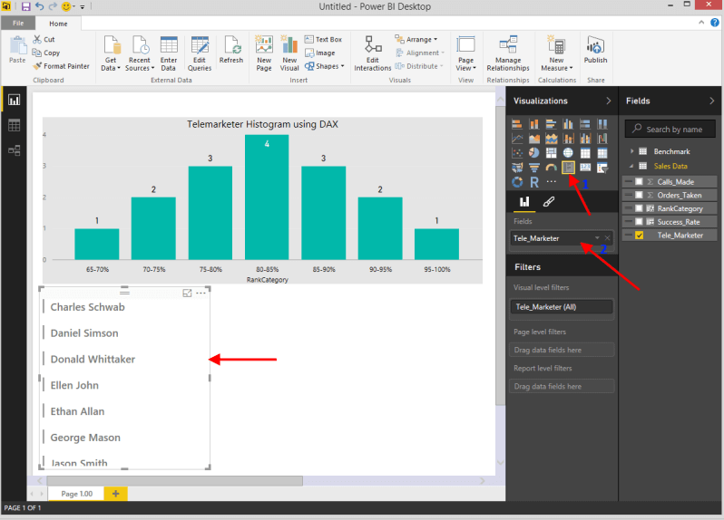
We now have a well formatted histogram which shows how many Telemarketers are in each bin, to know who they are we will add a multi row card visual by double clicking the multi row card visual from the visualization section and drag the Telemarketer to the Fields as shown below.
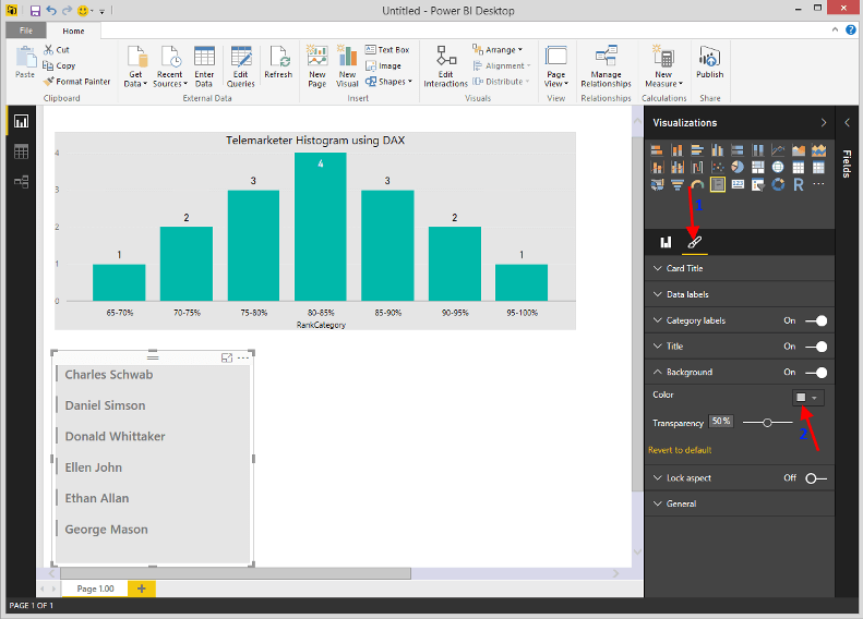
Format the Telemarketer visual like below.
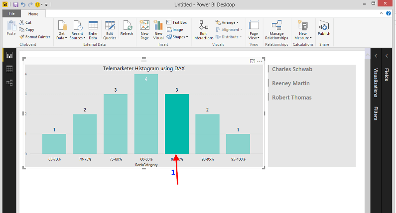
Move the Telemarketer visual to the right of the Histogram visual and adjust their positions. Minimize the Visualization and Fields section, you will have a well formatted histogram which follows a bell shaped curve like below. As I mentioned in the beginning of this tip by looking at the Histogram we can see the Top Performers (90-95%, 95-100%), Mid Performers (75-80%, 80-85%, 85-90%) and the Low performers (65-70%, 70-75%).

If you want to know who belongs to a bin, click the bin like below and you will see the Telemarketers name on the right.
Next Steps
- Download the sample file and contents then try creating a Histogram to measure performance from a data you are familiar with.
- If you want to learn more about Power BI Desktop follow these articles.

Junaith Haja is a senior data engineering leader with over a decade of experience transforming raw data into scalable platforms and actionable insights that drive business performance, operational excellence, and sustainability. At Amazon, he applies a “data as a product” philosophy to architect resilient data infrastructures supporting global domains such as identity verification and financial risk mitigation.
Beyond engineering execution, Junaith is an active voice in the global data and AI ecosystem. He has authored over 100+ articles in major database and AI platforms including MSSQLTips.com, AITimeJournal, AI Frontier Network, DZone. He writes a weekly LinkedIn newsletter, Signal Over Noise and his personal blog juniathhaja.com where he shares insights on data engineering, AI and leadership. He serves as a Senior Member of IEEE, a Fellow at the Institute of Analytics, and a Distinguished Fellow at the Soft Computing Research Society, reinforcing his commitment to responsible, sustainable, and impactful data practices.


Hi, May I have an idea how you get the bell curve histogram? I followed your steps but my chart becomes bar with high from left low to right, seems no matter how I tried..