Problem
We are currently using Power BI as our self-service reporting and ad-hoc analysis tool. There are so many different ways to present data to the users that it becomes overwhelming. There are dashboards, reports created in Power BI Desktop and Excel workbooks to choose from. Which type of reporting should we use?
Solution
Each reporting type in Power BI has its strengths and weaknesses, but also their own use cases. Although there certainly is much overlap between all of them, there’s enough difference to consider which one you’ll use, before you dive into the creation of your data visualizations.
Power BI Dashboards
Let’s begin with dashboards. If you’re new to the world of Power BI, you can take a look at the tip How to Build your First Power BI Dashboard to get you started with dashboards. In the tip it’s explained the term dashboards actually means something different in Power BI than in most other business intelligence and data visualization tools. In Power BI, a dashboard is a collection of tiles. These tiles are visualizations (tables, matrices, charts, etc.) from reports or workbooks, or they can be more static tiles containing images, text or URLs.

Unlike other tools, the visualizations in dashboards in Power BI are not meant to be interacted with. If you click on a visualization, you are directed to the report behind it. There’s one notable exception: live tiles. Instead of pinning a single visualization to a dashboard, you pin an entire report page to the dashboard.
On the dashboard, you can interact with the tile, hence its name.
But in general, we can assume Power BI dashboards are quite static. Their main purpose is to present data at a glance. If something seems interesting, users can click on the visualization to go the report to interact with the data and see more detail. Hence, dashboards can be considered as some sort of a glorified contents table.
There are some features though which are only present in dashboards.
- Q&A. This feature allows the user to ask questions about the data, which will be answered by the Power BI service using the data models stored in the workspace. More information can be found in the tip Power BI Q & A Example and Demo. If the presented answer is useful, you can also pin it to a dashboard.

- Dashboards can be lived updated using streaming data. For more information, check out the documentation.
- Dashboards can combine visualizations from multiple datasets into one single page, where a report is bound to a single dataset (but a dataset can import data from multiple sources as well).
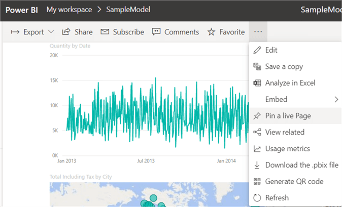
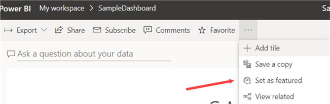
- You can set a dashboard as a featured dashboard. Every time the Power BI service is opened, the dashboard is shown first.
- You can define data alerts on tiles of the dashboard. You can find more information in the tip Power BI Online Alerts.
- You can pin a visualization from an on-premises Reporting Services (SSRS) report to a dashboard. If you click on the tile, you are directed to your local SSRS server. The tip Pinning a SQL Server Reporting Services Report to Power BI gives a good example.
Power BI Workbooks
Excel Workbooks
The integration of Excel in Power BI is described in the tip Power BI Workbooks. You can lift & shift existing Excel workbooks directly to the Power BI service, but usually it’s more interesting to either convert it to a Power BI Dataset or to just import the source data directly into Power BI Desktop. The reason for this is Power BI Desktop (and the dataset itself once it has been published to the service) offers way more flexibility and features than Excel Online can offer.

Analyze in Excel
A more interesting feature is the Analyze in Excel feature. From a dataset or a report in the Power BI service, you can create .odc file which you download on your machine. When you double click this file, Excel opens with a direct connection to the dataset in the service. This means users can analyze your data hosted in the Power BI service using the tool they’re probably most familiar with: Excel PivotTables.

Power BI Reports
Reports in Power BI are what people usually describe as “dashboards”. They are one or more pages containing visualizations of data from one dataset.

Reports are typically created in Power BI Desktop. Some reasons why reports are the go-to place for your users:
- Although it’s also possible to create datasets and reports in the service itself, it’s recommended to use the Desktop, since it will have the latest features and updates, but also the full Power Query experience (aka Get Data) to prep the data before it is loaded into your model. The Desktop is updated monthly with new features and bug fixes.
- Matrices now support collapsing and expanding groups, which means they behave almost like an Excel PivotTable (the + and – icons are only available for rows though).

- There are interesting drillthrough and bookmarks capabilities, allowing for complex navigation and storytelling opportunities in your reports. There are also custom tooltip visualizations possible. Check out an example in the tip Power BI Tooltips for Context Specific Intelligent Reporting.
- You can create extra visualizations using R or Python.
Power BI Reports are the most comprehensive tool to present data to your users.
Reporting Services Reports
SSRS reports, or paginated reports as they’re now called, can also be hosted in the Power BI Service. These reports are pixel-perfect reports and they are typically more static than their Power BI counterparts. The caveat is that this feature is only available in Power BI Premium. For more information, check out the documentation.
Conclusion
There are different ways to present data in the Power BI service. Even though they support different use cases, there’s a general narrative that can be followed:
- Reports are created in Power BI Desktop. You can import data from various sources using Power Query and create a powerful in-memory model. Using this model, you can visualize data in dozens of different ways. When the report is finished, it is published to a workspace in the Power BI service, where it can be shared with other users.
- In the service, you can create dashboards by pinning visualizations from one or more reports. The dashboard acts like a contents table; when a user clicks on a tile, the browser redirects to the underlying report. There are other types of tiles available as well and dashboards can also show streaming data.
- If you have existing visualizations in Excel available, you can upload them to the service as well. If you have Power BI Premium, you can also integrate SSRS reports. This makes the Power BI Service a true portal for all your reporting needs.
- Users in the service can browse reports, workbooks and dashboards to view the data. They can interact with reports to dive deeper into the data and do more analysis. If some questions are left unanswered by existing visualizations, the Q&A feature can be used to ask questions about the data.
- For true ad-hoc analysis, the “Analyze in Excel” feature can be used to create PivotTables in Excel using the model created in step 1. Giving users tools they are familiar with is a huge benefit.
We can conclude it’s useful to have all different types of reporting available in the service. Depending on the need, users can choose which type suits them best.
Next Steps
- The official documentation has a nice side-by-side comparison of dashboards and reports.
- There are plenty of Power BI tips to be found in this overview.

Koen Verbeeck is a seasoned business intelligence consultant with over a decade of experience with the Microsoft Data Platform. He holds several certifications, including Azure Data Engineer. He’s a prolific writer, with over 375 articles on technologies such as Microsoft Fabric, SSIS, ADF, SSAS, SSRS, MDS, Power BI, Snowflake and Azure services. He has spoken at various events such as PASS, SQLBits, dataMinds Connect and many others. He frequently delivers educational webinars on MSSQLTips.com. For his efforts, Koen has been awarded the Microsoft MVP data platform award for many years.
- MSSQLTips Awards:
- Leadership Award (200+ Tips) – 2021
- Author of the Year – 2014/2020/2022
- Author Contender – 2024/2025