Problem
Reports and charts are a visual medium used for insight at a broader and in-depth level. We can also create drill-down reports to get a deeper understanding of the data, but this is not always what is needed. One feature of Power BI is the ability to create dynamic tooltips that provide additional insight from the primary report and charts without the need for drill-down reports.
Solution
Power BI has a feature called “Reporting Tooltip”. Basically, this feature dynamically shows textual as well as graphical information based on the context. To further explain, let me give you an example.
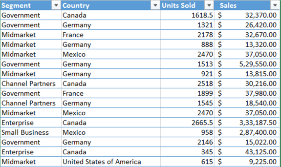
I have a financial sheet where the product information is stored by segment and country. It also has units sold and sales as shown below.
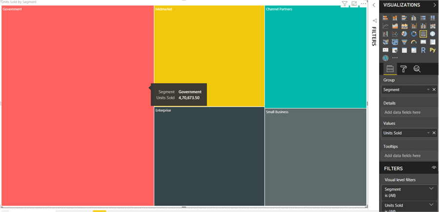
I created a “Treemap” report in Power BI which shows the gross number of units sold in each segment. I grouped it with the “Segment” field and used “Units Sold” as the value field as shown below.
Now the report user wants to see sales done in each continent for each segment. The challenge is to have just have an overview and not the drill down information for each continent. In this situation, a feature like a “Reporting Tooltip” comes in very handy. To put it simply, this is a lightweight feature which has the capability to dynamically map an entire report with various information and tag it to a data field. In our case, we will be tagging it with the “Segment” field.
Creating a Power BI Reporting Tooltip
To configure the above report, “Financial Segment”, we will perform the below steps to show the graphical tooltip:
- Create and configure the tooltip page “Sales Tooltip”
- Add a tooltip “Filled Map” report and configure fields
- Configure the “Financial Segment” report to show “Sales Tooltip”
So, let’s get started.
Create and configure tooltip page “Sales Tooltip”
To create and configure the page, we will first create a page and we will define the page as a tooltip page.
Let’s first add a page. To do so, use the “+” (plus sign) at the bottom of the page where all pages will be shown as tabs. Click on the “+” and add a new page. Name it “Sales Tooltip” as shown in the below image.
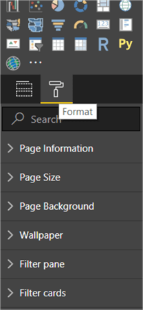
Once the page is created, on the right side of the report there will be a “Visualizations” Pane. Under that, there will be a format icon. Click on that icon as shown below.
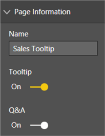
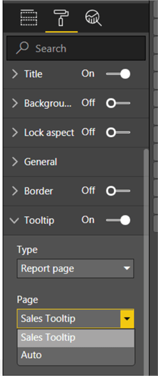
We must configure two sections. First the “Page information”. Under this section, we must change the “ToolTip” status from “Off” to “On” as shown in the below image. By doing so, we are declaring this page to be available in tooltip selections under any relative report.
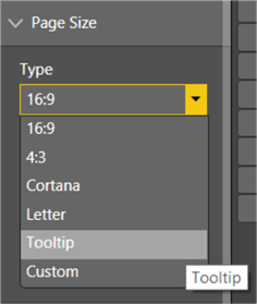
The second configuration on the page is to select a size in the “Page Size” section. We will select “Tooltip” for this demonstration from the “Type” dropdown, to show the report in a compact size.
Add tooltip “Filled Map” report and configure fields
We completed the first step and the next target will be to create a tooltip report and configure it to show the relative data.
From the “Visualizations” Pane, select a “Filled Map” as shown in the below image.
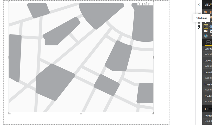
Keeping the report selected, we will map the “Location” field to the “Country” as we want to show continent information. Also, we will map the “Tooltips” field to “Segment” as we want the map report to show when we hover over the “Segment” field in the “Financial Segment” report.

Next, configure the color saturation to automatically bifurcate from highest sales to lowest sales. To do so, go to the “Format” section just beside the “Fields section” and under “Format” the first section will be “Data colors”. Open the section and click on “Advanced controls”.
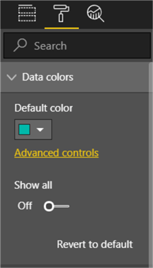
Also, in case you want to map different colors for different locations, that could also be achieved. To do so, enable Show all and select different colors for each country choice available.
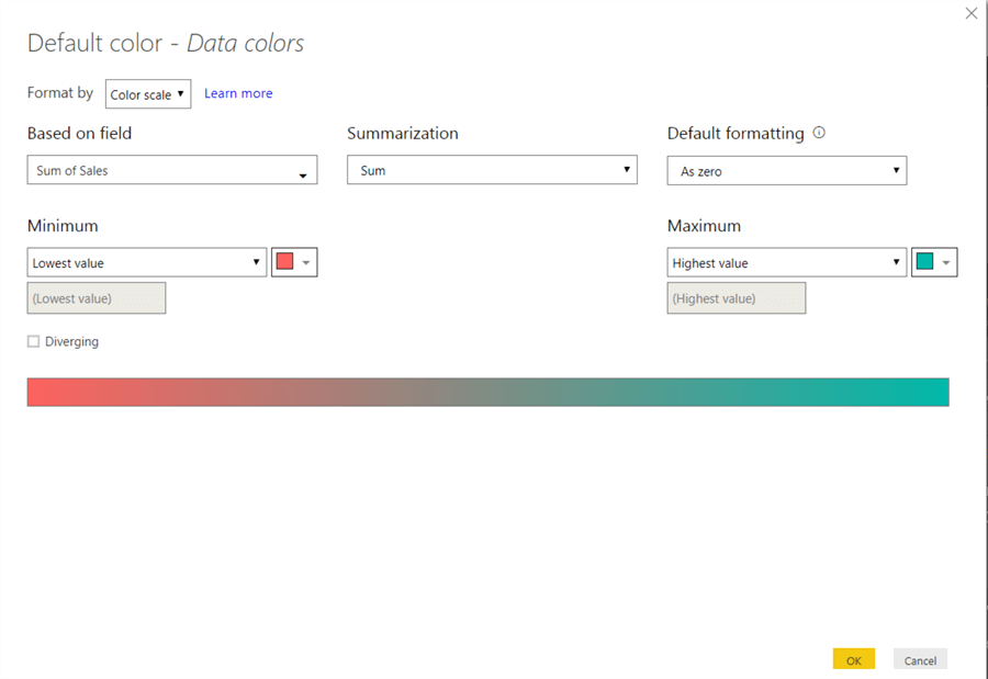
A pop window will appear, which will allow you to configure data fields, summarization and other formatting options. For our current purpose, we will select “Sales” in the “Based on field” dropdown. Once selected, click “Ok” to apply the changes. This is to show the total number of sales according to each county. Also, one thing to observe at the bottom is the “Minimum” and “Maximum” color scale. This will identify sales in each region.
Configure “Financial Segment” report to show “Sales Tooltip”
Now we are at the last configuration step to show the “Sales Tooltip”.
Go to “Financial Segment” page > Visualizations Pane > Format. Scroll down until you see the “Tooltip” section. Change the status from “Off” to “On” (if not already done). Also, select “Report Page” in the “Type” dropdown, and “Sales Tooltip” in the “Page” dropdown. This will define that we want to show the tooltip page whenever we hover over the “Financial Segment” page.
Once all of the above steps are configured properly, when we hover on “Segment”, we will be shown the relative “Filled Map” sales report as the tooltip.
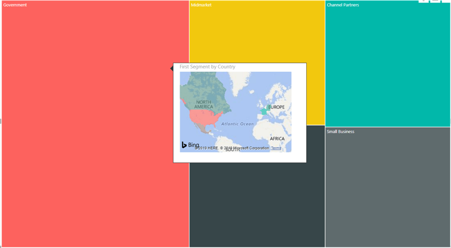
A few points to observe in the above image:
- The data is show in continents rather than country. You can configure the zoom level to zoom in or out.
- There is dark blue in “North America” compared to “Europe”. This shows it neither has the highest nor the lowest sales. It is more on the side of average sales.
- In South America, below North America, the color is close to red which states it has the lowest sales for the “Government” segment.
- Power BI uses Bing maps to show the location informed for the “Filled Maps”.
So as shown above, we can create powerful, compact and informative reports using a “Reporting Tooltip”.
Next Steps
- Think about using this to create rich reporting tooltips for pie charts and other charts.
- Also try to embed different reports using the tooltips report page.
- Check out all of the Power BI tips.

Rahul Mehta is a Project Architect/Lead at Tata Consultancy Services in Mumbai focusing on ECM. My prime role is as a system architect. I work with Microsoft SharePoint to build ECM solutions and Microsoft SQL Server Reporting Services and Integration Services for Business Intelligence solutions. I have worked with clients like Viacom, Paramount, BP, AmeriSourceBergen, etc. I am Microsoft Certified Professional for Microsoft SharePoint ECM solutions.
