Problem
What are Power BI Pulse Charts and how are they used? Can you provide a step by step example on how to get started with Power BI Pulse Charts?
Solution
One of the neat features of Power BI is the proliferation of various visualizations. Between the default visuals available upon install plus all the custom visualizations that have been created and available in the Microsoft store, the variety of visual solutions is ever growing. The pulse chart is one of those charts that excels at telling a story, a story with visual cues and animation. Pulse charts act like a “moving” pulse monitor you may see in a hospital, so thus the name Pulse. As an added benefit, the pulse chart provides an auto-run option which automatically starts the animation for the chart. Furthermore, “highlighted” events can enhance the animation by creating a temporary pause to highlight a particular event or events.
Implementing a Pulse Chart in Power BI
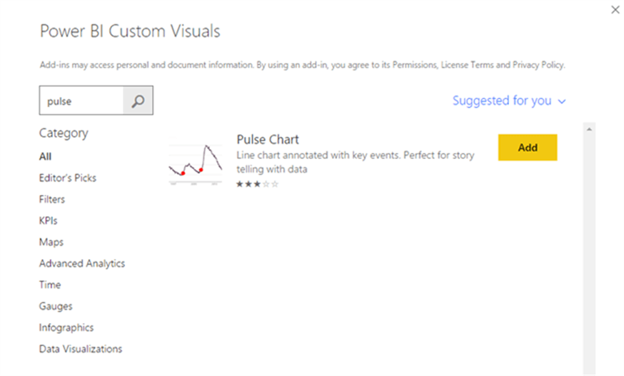
Since the pulse chart is a custom visualization we first must import it into Power BI. It can be downloaded from the Microsoft app store at: https://appsource.microsoft.com/en-us/product/power-bi-visuals/WA104381006?src=office&tab=Overview. Of course, you will want to download Power BI Desktop if you have not already done so: https://powerbi.microsoft.com/en-us/desktop/.

You will want to download the visual to your local machine.

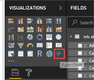
After starting Power BI Desktop, you will need to import the newly downloaded custom visual into the visualization gallery.

As an alternative, the Pulse Chart visual can be imported directly using the Import from store option.
Now we are ready to use the Pulse chart. Our first step is to import some time series data into Power BI. I am using a data set which shows attendance figures from Major League Soccer (MLS) matches. This type of data is perfect as it shows a data measure over a time series. For this exercise, we will show the maximum attendance per day (to emphasize when record attendance was achieved).

Next, we will load the attendance data into the data model.

The Att (attendance) field will be used as the main measure while the Date field will be used for the x-axis. We will also add an event field to the data set which we will employ later to highlight special records in MLS history. More to come on that item. To get back to the design window from the data model, you would want to select to Close & Apply.
Now that we have a prepared dataset, the Pulse Chart is now ready to be setup. We have several items that will need to be added to the chart. The first step in setting up the Pulse chart is to select the chart from the chart gallery and drag it onto the design grid.
Next, we begin to add the data items.

For the Timestamp field, we will add the MLS match Date field. The TimeStamp field is really the x axis for the chart. Next, the Att / Attendance field is added to the Values area; this figure is the total attendance per match. Since we want to show the highest attendance event per day, the maximum attendance value for matches on that day is used. This value becomes the y value for the chart.

We next add the Special field to the Event field. The Event field shows the value to the Event field and the Att / attendance value to the Event Size field. This item is one of the neat features of a Pulse Chart. The event field is used to highlight a particular special item at a particular time; the event size will emphasize the attendance value at the event occurrence on the chart.
One last item that was added to the Pulse Chart is a filter; we will limit the chart to just 3/5/2013 to 03/04/2018.
So on an initial pass, we have the following result for our chart. As you can tell, it does need some work to get the formatting and aesthetics in a better format.

Our first formatting steps are to adjust the color of series, changing it to red and then turning the gap property off. Turning off the gap property allows the graph to flow and be connected between one year of matches and the next.

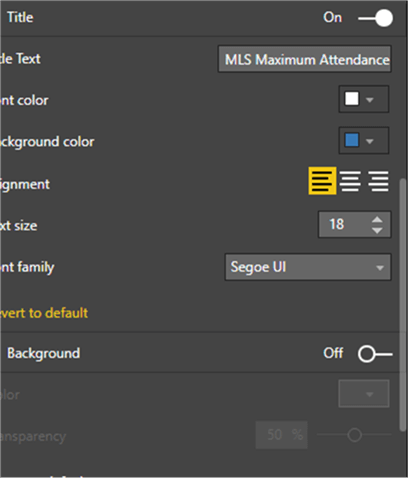
Now the Popup formatting is set; this particular set of properties sets the formatting of the Popup areas. This Popup will display the details from the event setting; in our example that would be the “Special” field. These properties control the look of the popup box (sort of like a tool tip) and include items like the font size and color, the background color and the size of the overall popup box.
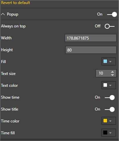
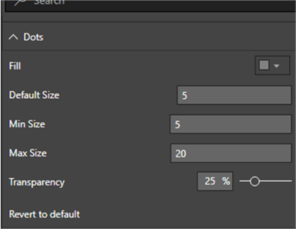
The next set of options controls the size of the circle that show when an Event takes place.
The X and Y axis properties control the coloring and location of the x and y axis on the chart. You may have noticed on the original chart, the x axis was centered horizontally. Based on the number values to chart, moving it to the bottom of the chart was a better option.

The subsequent option to be set is the playback properties; this list of properties controls how fast the “pulse” line will play across the screen and whether the playback occurs automatically or not. Furthermore, the pause option tells Power BI how long to stop and display the popup when an event occurs. Finally, the button color controls the color of the play, pause, forward and backward buttons which appear in the upper left corner of pulse chart grid.

The Title and Background formatting options are self-explanatory, and control how the tiles appear on the chart and whether a background color should be used to enhance the visual.
The last 3 options control: 1) the lock aspect of the chart for sizing purposes, 2) the border color and 3) the general location and size of the chart.

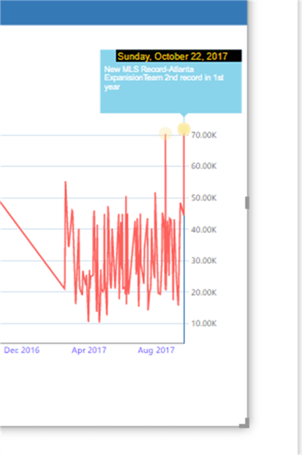
So now that we have completed our formatting for the chart, we are ready to “play it” by clicking the play button. The chart starts at the left side and begins drawing the red line. When the chart gets to an “event”, the playback pauses, and the popup box is displayed as illustrated in the first screen print below. The chart pauses for the time frame we specified above, and then begins drawing again. When the drawing gets to the next event, as shown in the second screen print, the next event is displayed in the popup.


This process continues until the chart drawing reaches the end data for the data set. If set in the playback options, the chart will automatically replay the drawing again from the left side.

Furthermore, each dot can be clicked on to display the event appearing at that point in time.
Once you are satisfied with your new chart, you would need to publish this report to the PowerBi.com online service to display for others.
In this tip, we covered using the new Pulse Chart visualization available in the Microsoft Power BI gallery.
Next Steps
- See all the neat Power BI Tips on MSSQLTips.com.
- Create Custom Maps in Power BI.

I have a passion for crafting Business Intelligence Solutions for my user groups. My experience includes almost 15 years of SQL Server involvement with the last 12 years focused specifically on Business Intelligence, SharePoint, OLAP, SSRS, and Decision Support solutions. Currently, I am a Business Intelligence Architect in the healthcare industry, and I also teach database and analytics classes for Kennesaw State University, Southern New Hampshire University, and Reinhardt University. My education includes an MBA and an undergraduate in Accounting (yes I am a reformed accountant!), both from Kennesaw State University. I enjoy every day by trying to grow my faith and spend precious time with my family. I have been happily married to my wife of over 20 years, and we have two teenagers one who we home school with the help of a University Model School, Cornerstone Prep in Acworth, GA (cornerstoneprep.org). Our other child is a Construction Management major at KSU’s Southern Poly / Marietta campus. We are a soccer and Cross Country (XC) family who play, coach, and referee soccer or run for fun most every day. For several years, our family has volunteered (and played with the dogs and cats) at Etowah Valley Humane Society in Cartersville, GA.
- MSSQLTips Awards: Champion (100+tips) – 2016 | Author of the Year – 2015 | Author Contender – 2014, 2016-2021
