Problem
Reporting aggregated data with the ability to slice-dice or drill down is a very common and standard reporting requirement catered by different reporting tools, including Power BI Desktop. However, often analyzing the data for predictive purposes needs more than drill-down and slice-dice features. Reporting data distribution, trends, classification and predictions are some of the fundamental requirements for predictive analytics. In this multi-part tip series, we will learn a few techniques to develop visualizations in Power BI for predictive analytics.
In this tip we will look at placing reference guides on visualizations in a first step towards comparing the data against the expected target or goals. This provides a means to measure progress against a pre-determined set of parameters / goals. In this tip, we will learn how to place a dynamic reference line on a visualization in Power BI Desktop.
Solution
Power BI Dynamic Constant Line
A Power BI dynamic constant line in the analytics pane can be used to create a reference line for a set of visualizations which we will cover in this tip.
First, we need data to populate a visualization on which we will create the reference lines. I recommend installing the AdventureWorks sample database, which has a number of tables to populate visualizations with sample data. Assuming the sample data is available, open the Power BI Desktop and click on the Get Data menu. We need to connect to the data source where you have the sample data and import the data. In this tip, we will be using the ProspectiveBuyer table from the AdventureWorks database by following the steps mentioned below.
Click on the Get Data menu in the Power BI user interface as shown below. This should bring up options to select from a list of different data sources. In this case, the data is hosted in SQL Server in the AdventureWorks database. So we will select SQL Server as the data source.

After selecting the data source, the next step is to provide connection details as shown below. Provide the server name and optionally the database name on which the data is hosted. It is recommended to provide the database name as the connecting string to SQL Server that needs it as a part of the connection. The next option is Data Connectivity mode for which there are two options. Either we can import data into Power BI or the data can be read directly from the data source while the report is being processed. There are certain Power BI options that require data in a specific format to enable analytics related features, so consider selecting the Import option for now.

After connecting, you will be presented with a list of tables and views hosted in the database.

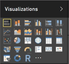
After the data is available, we need to create a stacked bar chart of “Yearly Income by Occupation”. Click on the stacked bar chart from the visualizations pane and click on the report layout to create a bar chart.
Select the “YearlyIncome” and “Occupation” fields to add these to the chart. After you select the fields, the visualization should look as shown below.

Let’s say we intend to represent the mean value of the target yearly income on this visualization. The high end for this graph is close to 40M, so let’s say we want the value 20M to display as an additional element on this visualization, but without occupying a significant amount of real estate on the visualization. To do this, a reference line can be used.
Click on the Stacked Bar chart, which will enable / display the analytics icon under the visualizations pane as shown below.

Clicking on the analytics pane, you should be able to find an option to create a constant line as shown above. Click on the Add button to create a new constant line. This will create a new line object with different properties that can be formatted. The properties we will set are described below:
- Value - This property sets the value on the axis where the line will be rendered. In our case, we want a line to be displayed at around 20 Million, so provide this as the value.
- Color - You can select any color for the line. It is recommended to select a contrasting color compared to the color of the bars on the chart, so the line is clearly visible on the chart.
- Transparency - This property determines how bright the line will appear on the chart. A transparency value of zero means the line is a pure solid color line on the chart. On the other hand, a transparency of 100% would make the line invisible on the chart. You can set the value of the property to 50%, so the line blends partially into the UI without visually obstructing any details, though retaining its significance.
- Style - This property can have one of the three values: Dashed, Dotted and Solid. I personally prefer to use the dashed line, which provides a perforated line type visual to show separation between different sections.
- Position - This property can have one of two values: In-Front or Behind. This means whether you want to line to be on the top of the bars of the chart or behind the bars. If you select “Behind”, the line will be visible only from the bar separation sections. It is advisable to select the In-Front value for this property.
- Data Label - This property determines whether you want to display text in the form of a data label for the line. By default, this property is set to off. Once you select to set the value of this property as “On”, other options to format the label like Color, Text, etc. appear. You can then select the appropriate values for these properties for the data label to format the text as required.

Here is what our constant line looks like. I added a red arrow to show the line that was added. This can be added to the following chart types: Stacked Area, Stacked Bar, Stacked Column, 100% Stacked Bar and 100% Stacked Column.

In this way, you can create different reference lines to represent values for different business Key Performance Indicators (KPIs) on your visualization using the constant line feature. This adds a statistical flavor to your visualizations without making the visual too statistical, which is a graceful way of representing statistical significance of data to a business user.
Next Steps
- Consider creating different reference lines to represent different parameters / statistics on the visualization.
- Try checking out whether you can create a reference line on a pie chart.
- Stayed tune for other Power BI visualization tips.

Siddharth has more than 14 years of experience in the IT Industry, with more than a decade of experience in Business Intelligence and Analytics, for clients banking, logistics, government, Media Entertainment, products, life sciences and other domains. He has been a lead architect for a portfolio of 40+ apps, containing apps in web, mobile, BI, Analytics, data warehousing, reporting, collaboration, CMS, NoSQL and other technologies. He has several certifications and is a published author for online and print-media publications, as well as the MSDN Library.
In his present role, he remains responsible for architecture design, technology stack selection, infrastructure design, 3rd party products evaluation and procurement, and performance engineering. These applications use technologies like Elasticsearch / Lucene, MongoDB, SharePoint 2013 and 2010, jQuery-based framework like Highcharts and GoJS, SQL Server and the Microsoft Business Intelligence stack (SSIS, SSAS, SSRS, MDX, PowerPivot, PowerView), jQueryMobile, Bootstrap, iOS xCode framework, and many others.
- MSSQLTips Awards: Champion (100+ tips) – 2018 | Author of the Year – 2017 | Author Contender – 2016, 2018-2019
