Problem
In decision analysis, a decision tree can be used to visually and explicitly represent decisions and decision making. Decision tree learning uses a decision tree to analyze observations from a dataset to derive conclusions about the target variable. Classification and regression trees (CART) are a decision tree learning technique that produces either classification or regression trees, depending on whether the dependent variable is categorical or numerical, respectively. Decision trees are formed by a collection of rules based on variables in the modeling data set. Rules based on a variable’s values are selected to get the best split to differentiate observations based on the dependent variable. Once a rule is selected and splits a node into two, the same process is applied to each child node recursively. Splitting stops when CART detects no further gain can be made, or some pre-set stopping rules are met. Each branch of the tree ends in a terminal node. In this tip, we will learn how to perform classification and regression analysis using decision trees in Power BI Desktop.
Solution
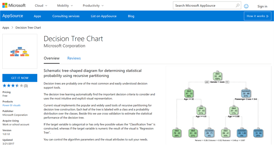
Power BI provides Decision Tree Chart visualization in the Power BI Visuals Gallery to create decision trees for decision analysis.
In this tip we will create decision trees in Power BI Desktop using a view from Adventure Works DW database. It is assumed that Power BI Desktop is already installed on the development machine, as well as the sample Adventure Works DW database is hosted on SQL Server on the same machine. Follow the steps as mentioned below.
Step 1
The first step is to download the decision tree chart, as it is not available by default in Power BI Desktop. This visualization makes use of the R rpart packages. The same plot can be generated using the R Script visualization and some code. Instead this visualization does eliminate the need for coding and provides parameters to configure the visualization. If interested, you can read in detail about decision trees from here.
Step 2
After downloading the file, open Power BI Desktop. You can click on the ellipsis in the visualization tab and select the “Import from file” menu option. This will open a dialog box to select the visualization package file and to add the visualization in Power BI. Select the downloaded file and it should add the decision tree chart to Power BI Desktop visualizations gallery. Click on the chart icon in the gallery and you should be prompted with a warning as shown below to enable scripts visuals. Click on Enable which will make the chart operational.

Step 3
After the decision tree chart is added to the report layout, enlarge it to occupy the entire available area on the report. After you have done that, it would look as shown below.
Step 4
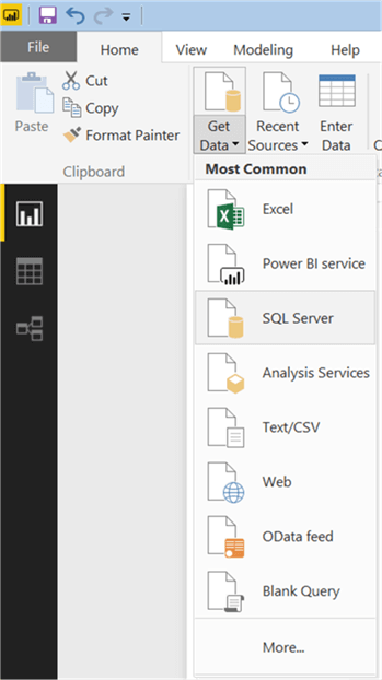
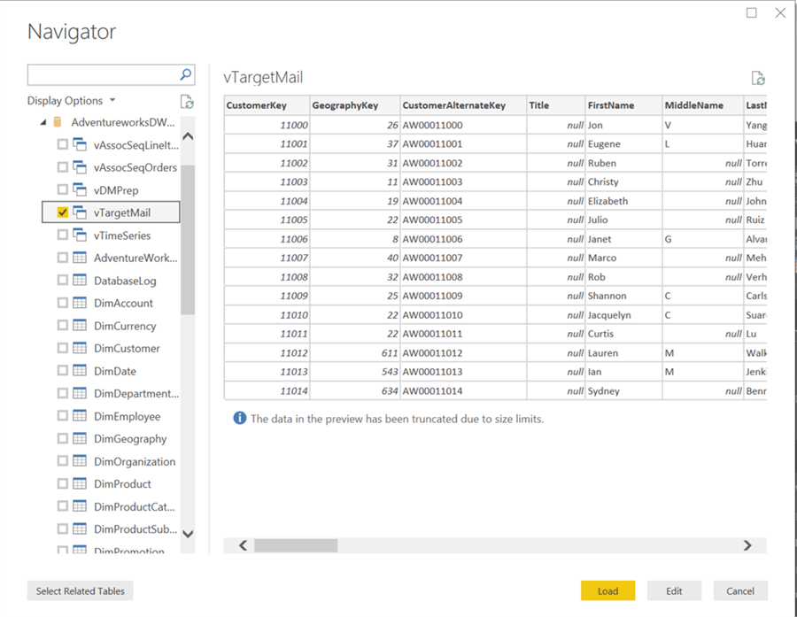
Now that we have the visualization, it is time to populate some data on which decision analysis can be performed. We need a dataset that can be used for classification and/or regression. There’s a view in Adventure Works DW database named “vTargetMail” that contains data of Bike Sales to customers. This view is originally designed to be used as a source data for developing data mining models. So, it is a suitable candidate to be used with decision trees as well. Click on the Get Data menu and select SQL Server as shown below.
Step 5
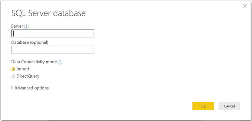
This will open a dialog box to provide server credentials. Provide them as shown below and click OK.
Step 6
Select the vTargetMail view from the database and click Load.
Step 7
After the loading is complete, the model should get created in Power BI Desktop as shown below.

Step 8
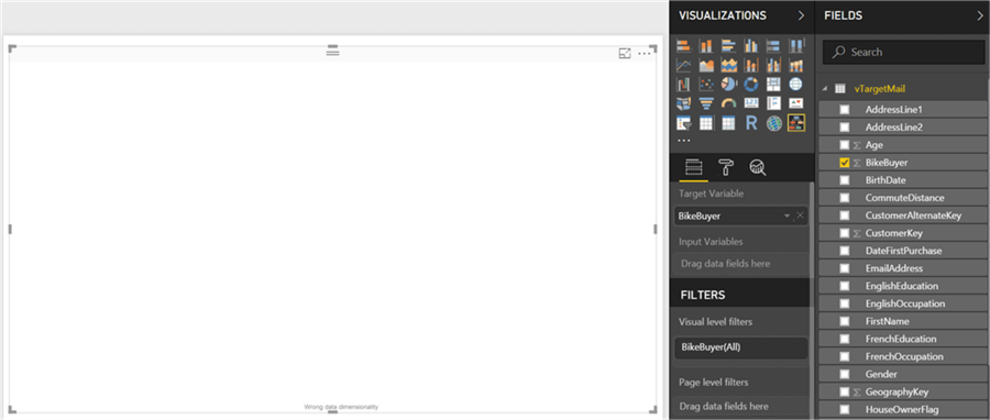
Now it is time to select the fields and add them to the visualization. Click on the visualization in the report layout, and add the Bike Buyer field first. This would add it to the input variable section by default. The intention is to develop a classification tree to determine whether a customer will buy bikes based on a set of input variables. As the BikeBuyer field has just 2 values – 1 or 0, this makes it a categorical variable, hence the chart will develop a classification tree.
Step 9
Now add the Yearly Income field which will add it to the Input Variable section, but you won’t see any visual on the chart yet and there will be a message at the bottom that says the depth of the tree is zero. This just means that the input variables are not forming the tree to an enough depth level to develop a decision tree.
Step 10
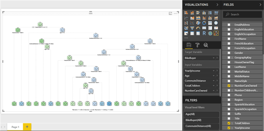
Other fields of interest can be Age and Commute Distance which may influence a customer’s decision to buy bikes. So, select them as shown below, and a decision tree visual will get rendered.
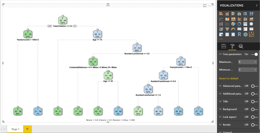
Let’s try to decode the visualization. The labels in green represent classes where a customer is not probable to buy bikes, and the labels in blue color are the ones that shows a positive probability of buying bikes. The two figures in the label show the predicted probability of customers who did not buy bikes (53) and who did buy bikes (47). The bottom most figure shows the percent of data in the node (100% in the root node). Below the label are the rules (Age >= 74), which will have a Boolean outcome and based on the outcome other nodes / branches will follow. The CART algorithm will recursively iterate the values of different input variables, determine which criteria qualifies for a next level split to reduce the complexity of the data.

Step 11
Let’s add more input variables “TotalChildren” and “NumberCarsOwned” as shown below. As you can see, the depth of the model can increase to a considerable extent. But at times, it is not necessary to have such a deep hierarchy. We may need just a 5 to 6 level deep tree to derive key rules to make a decision at a higher level.
Step 12
Switch to the format options and switch on tree parameters. Change the maximum depth option from its default value of 15 to 6. This will reduce the depth and update the tree as shown below. This makes the decision making easier to decipher without having too detailed information in the decision tree. Other formatting options are either cosmetic or for advanced tuning of the algorithm for technical users who are well versed with the algorithm.
Step 13
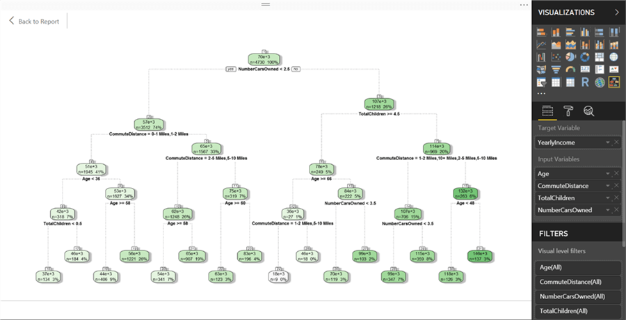
If we change the target variable as Yearly Income which is a continuous variable, a regression tree would get rendered as shown below. The intensity of the color shows the weight of the target variable in each node.
Step 14
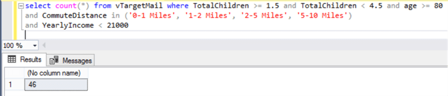
If you want to test the criteria, you can also query the data in the view using SSMS, and you will be able to see that the number of records in the nodes would match as shown below. The below query shows the bottom-leftmost node where count of records in the node is 46.
In this way, without dwelling into any coding or complex statistical calculations, one can easily develop a decision tree in Power BI Desktop that uses recursive partitioning algorithms in the background.
Next Steps
- Try modifying the chart to add a title to blend it with the theme of the report.
- Check out all of the tips on Power BI.

Siddharth has more than 14 years of experience in the IT Industry, with more than a decade of experience in Business Intelligence and Analytics, for clients banking, logistics, government, Media Entertainment, products, life sciences and other domains. He has been a lead architect for a portfolio of 40+ apps, containing apps in web, mobile, BI, Analytics, data warehousing, reporting, collaboration, CMS, NoSQL and other technologies. He has several certifications and is a published author for online and print-media publications, as well as the MSDN Library.
In his present role, he remains responsible for architecture design, technology stack selection, infrastructure design, 3rd party products evaluation and procurement, and performance engineering. These applications use technologies like Elasticsearch / Lucene, MongoDB, SharePoint 2013 and 2010, jQuery-based framework like Highcharts and GoJS, SQL Server and the Microsoft Business Intelligence stack (SSIS, SSAS, SSRS, MDX, PowerPivot, PowerView), jQueryMobile, Bootstrap, iOS xCode framework, and many others.
- MSSQLTips Awards: Champion (100+ tips) – 2018 | Author of the Year – 2017 | Author Contender – 2016, 2018-2019
