Problem
Data can contain complex relationships and it cannot always be represented in a parent-child relationship typically found in relational databases. Specialized databases like graph databases are available in the industry from commercial vendors to deal with the semantic relationships in data.
SQL Server 2017 has introduced the ability to create data structures to host data in the form of graphs. A graph is typically formed of nodes which are connected by relationships called edges. A typical example is an employee to supervisor relationship, where employee and supervisor are nodes and reports-to is the relationship which can be called an edge. Such relationships can be found in abundance in day-to-day data, but analyzing it requires visualizations that are designed for this analysis. One of the industry standard visualization for analyzing data having complex relationships is by using a force directed graph. In this tip we will learn how to use a force directed graph in Power BI Desktop.
Solution
Power BI provides a Force Directed Graph visualization in the Power BI Visuals Gallery to create a visualization for graph data analysis.
In this tip we will use a force directed graph in Power BI Desktop using a dimension from the Adventure Works DW database. It is assumed that Power BI Desktop is already installed on the development machine, as well as the sample Adventure Works DW database is hosted on SQL Server on the same machine. Follow the below steps.
1) The first step is to download the force directed graph package from here, as it is not available by default in Power BI Desktop. This visualization makes use of the D3 force layout diagram. Coding a force directed graph in D3 would require extensive coding and practice. This control eliminates the need for any coding and provides a user interface which the user can customize the graph. If interested, you can read in detail about force directed graphs from here.

2) After downloading the file, open Power BI Desktop. You can click on the ellipsis in the visualization tab and select the “Import from file” menu option. This will open a dialog box to select the visualization package file, to add the visualization in Power BI. Select the downloaded file and it should add the graph control to the Power BI Desktop visualizations gallery.
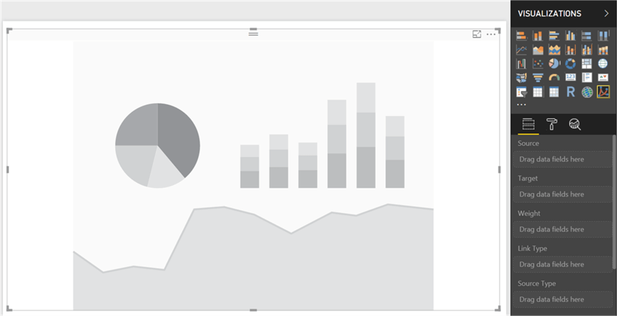
3) After the graph control is added to the report layout, enlarge it to occupy the entire available area on the report. After you have done that, it would look as shown below.
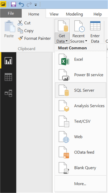
4) Now that we have the visualization, it is time to populate some data on which graph analysis can be performed. We need a dataset that has relationships explicitly / implicitly embedded. There’s a dimension table in Adventure Works DW database named “DimEmployee” that contains data of employees and their supervisors. This table contains employee key, employee parent key with their demographic details like name, title, charge rate, etc. So, it is a suitable candidate to be used for graph analysis. Click on the Get Data menu and select SQL Server as shown below.
5) This will open a dialog box to provide server credentials. Provide them as shown below and click OK.

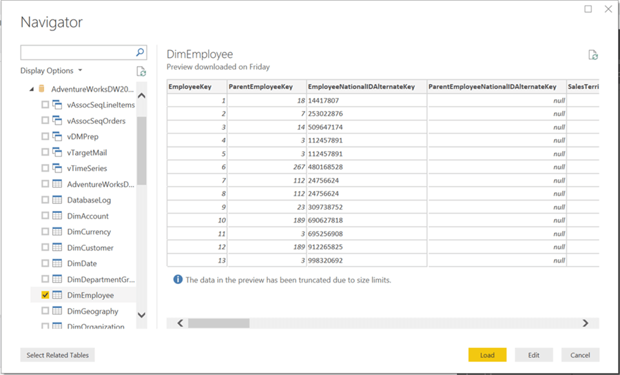
6) Select the DimEmployee table from the database and click Load.
7) After the loading is complete, the model will get created in Power BI Desktop as shown below.
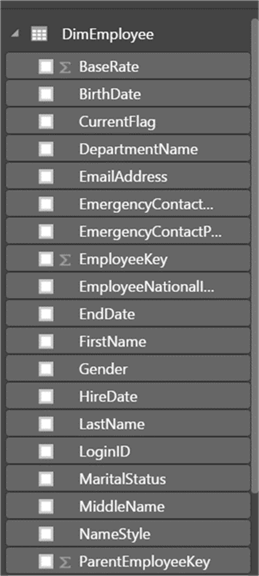
8) Now it is time to select the fields and add them to the visualization. Click on the visualization in the report layout, and add the EmployeeParentKey to the Source section and EmployeeKey to target section. The intention is to develop a node to node relationship to emphasize the reach of a supervisor to their direct reports. Here every source node is connected to the target node with the same relationship (i.e. reports to). After you add the fields the visualization should look as shown below. The reason we have IDs instead of employee names is that many employees can have same name, and displaying names would also take up a lot of space on the limited visual estate of the report layout. Once an ID of interest has been identified, one can always query the details of the employee from the database. We are not interested in any specific employee here, but the intention is to study the relationships in the data.
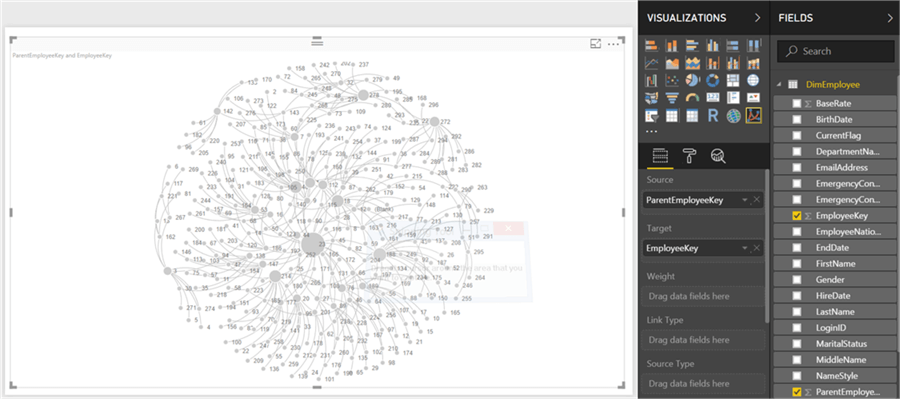
9) If you hover over the biggest node is the graph, it will highlight the other nodes that are related to it. From the size of the node it looks like it must be the most important node (i.e. employees in the organization). The size is largest due to the number of relationships it has with other nodes.
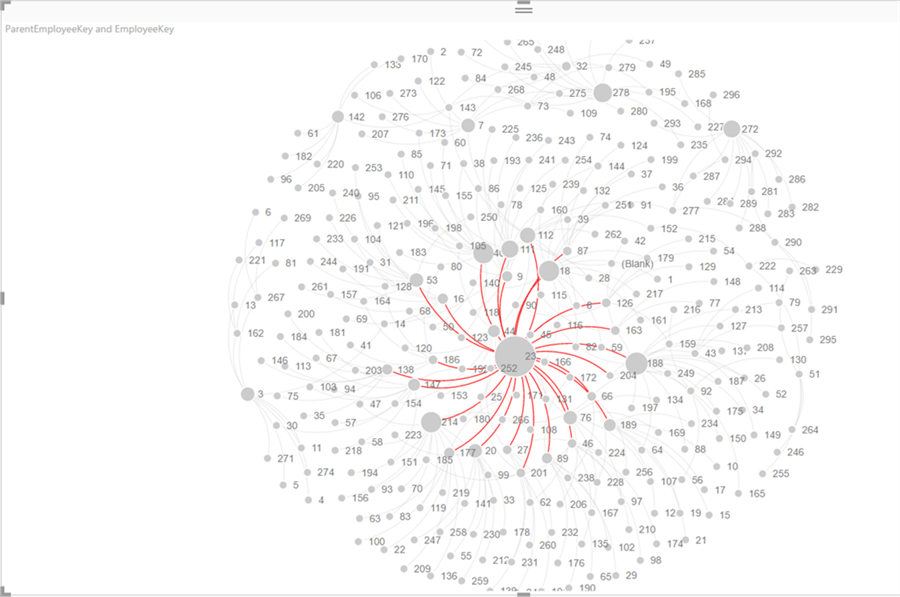
10) Drag and drop the BaseRate field to the weight section. This should make the width of an edge (i.e. relationship) proportional to the chargeable rate of the employee. You would find that the widest edge is not with the biggest node. This means that the employee that relates to the maximum number of nodes (which means having maximum direct reports) does not have the highest charge rate as seen below.

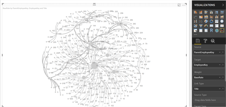
11) This makes the edges important to analyze. So, let’s add the Title field (designation of the employee) to the Link Type section. This would mean that an employee is connected to another employee as CEO, Vice President, Supervisor, etc. This is a way to bring in designations in the data relationships to analyze the edges.
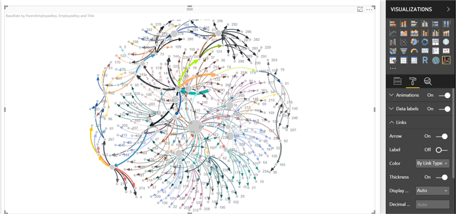
12) Let’s navigate to the format section and under the links area to enable the Arrows option to On. Also change the color from the default value of “Interactive” to “Link Type”, which means that employee (nodes) with the same level and reporting to the same supervisor would have the same color. This would create arrows on every target node. If you analyze the dataset you would find that only the CEO does not have a parent employee key, which means that only one node in the entire graph would not have an arrow pointing at it. If you look at the graph shown below, it loaded with too much information to analyze in a limited space.
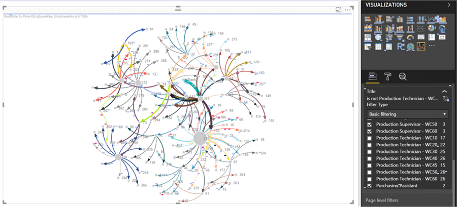
13) Let’s filter this data to remove nodes that are not of interest to us. Navigate to the filter section, and checkout the Production Technicians as shown below. These are the nodes having the maximum population and employees at junior career levels are not of interest to us. Now the graph looks as shown below.
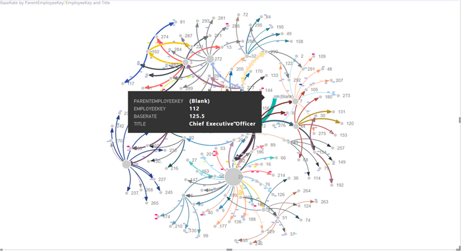
14) If you carefully analyze the node having the widest edge in green, you will find a node that is mentioned as Blank. Hover your mouse over this node / edge and you would find a tooltip as shown below. This shows that the CEO has the highest base rate, but is not connected directly with a lot of other employees as their supervisor. This is obvious as the CEO might not directly manage a lot of employees.
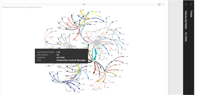
15) If you hover the mouse over the biggest node that is connected to the maximum of other nodes, you would find that the employee is a Production Control Manager and reports to the CEO.
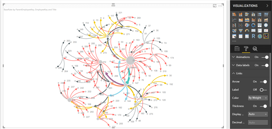
16) If we want to categorize and color employees by their rates, we can change the color option from “By Link Type” to “By Weight” as we have configured the Weight section with the BaseRate attribute. This shows employees with same rates in the same color.
In this way, without learning any D3 coding, one can easily develop and analyze relationships in a data using a force directed graph in Power BI Desktop.
Next Steps
- Try modifying other cosmetic options in the forced directed graph visualization to analyze the data from different perspectives.
- Check out all of the Power BI tips on MSSQLTips.com.

Siddharth has more than 14 years of experience in the IT Industry, with more than a decade of experience in Business Intelligence and Analytics, for clients banking, logistics, government, Media Entertainment, products, life sciences and other domains. He has been a lead architect for a portfolio of 40+ apps, containing apps in web, mobile, BI, Analytics, data warehousing, reporting, collaboration, CMS, NoSQL and other technologies. He has several certifications and is a published author for online and print-media publications, as well as the MSDN Library.
In his present role, he remains responsible for architecture design, technology stack selection, infrastructure design, 3rd party products evaluation and procurement, and performance engineering. These applications use technologies like Elasticsearch / Lucene, MongoDB, SharePoint 2013 and 2010, jQuery-based framework like Highcharts and GoJS, SQL Server and the Microsoft Business Intelligence stack (SSIS, SSAS, SSRS, MDX, PowerPivot, PowerView), jQueryMobile, Bootstrap, iOS xCode framework, and many others.
- MSSQLTips Awards: Champion (100+ tips) – 2018 | Author of the Year – 2017 | Author Contender – 2016, 2018-2019
