Problem
Hierarchical data is typically stored in multiple normalized tables in relational databases or even dimensional models. Relating normalized tables to create a uniform view of data for analysis is a standard practice. One of the regular needs of business analysts is to perform quantitative analysis on hierarchical data. This analysis becomes even more complex when it contains attributes that are to be analyzed based on a workflow.
For example, product related data can be stored in product categories, product sub-categories and product details table. In a product manufacturing process, consider a workflow where there is a manufacturing cost. After manufacturing, the product is sold to a dealer with a margin, so there is a dealer cost. And dealer will finally sell it with his/her margin directly to client or to retailers which will become the retail price of the list price. So, if you analyze the data model, we have hierarchical data with attributes like StandardCost, DealerPrice and ListPrice that are formed in a workflow. The need for a business analyst is to perform analysis on this hierarchical data that has attributes which must be assessed with each other as well as other values at the same level in the dataset. A visualization that can support this use case can make the analysis a lot easier.
Graphs can be used to study relationships in data using visualizations like Force Directed Graphs. But this graph focuses on relationships only and not quantitative analysis or any workflow. In this tip we will learn how to analyze such data in Power BI Desktop for the above mentioned use case.
Solution
Power BI provides Journey Chart visualization in the Power BI Visuals Gallery to analyze hierarchical data, quantitative analysis, and also arrange attributes in a workflow.
In this tip we will use a Journey Chart in Power BI Desktop using three dimensions from the Adventure Works DW database. It is assumed that Power BI Desktop is already installed on the development machine, as well as the sample Adventure Works DW database is hosted on SQL Server on the same machine. Follow the steps as mentioned below.
1) The first step is to download the force directed graph package from here, as it is not available by default in Power BI Desktop. This visualization is available from a third-party vendor but free of cost.

2) After downloading the file, open Power BI Desktop. You can click on the ellipsis in the visualization tab and select “Import from file” menu option. This will open a dialog box to select the visualization package file, to add the visualization in Power BI. Select the downloaded file and it should add the graph control to Power BI Desktop visualizations gallery.
3) After the graph control is added to the report layout, enlarge the same to occupy the entire available area on the report. After you have done this, it would look as shown below.
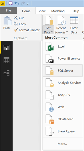
4) Now that we have the visualization, it is time to populate some data on which analysis can be performed for the problem in question. We need a dataset that has hierarchical data in multiple tables, with attributes that can form a workflow. There are three different dimension tables in the Adventure Works DW database named DimProductCategory, DimProductSubcateogry, and DimProduct that contain data of interest. Click on the Get Data menu and select SQL Server as shown below.
5) This will open a dialog box to provide server credentials. Provide these as shown below and click OK.

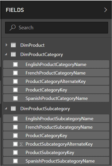
6) Select the tables from the database as shown below and click Load.

7) After the loading is complete, the model should get created in Power BI Desktop as shown below.
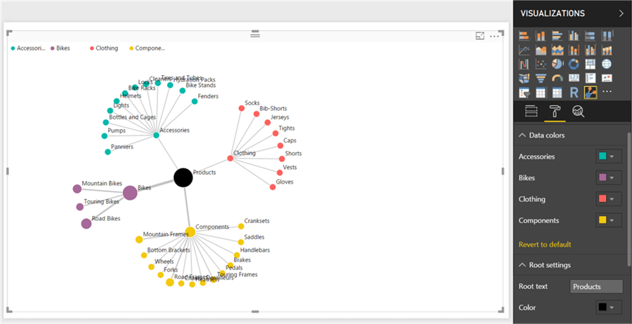
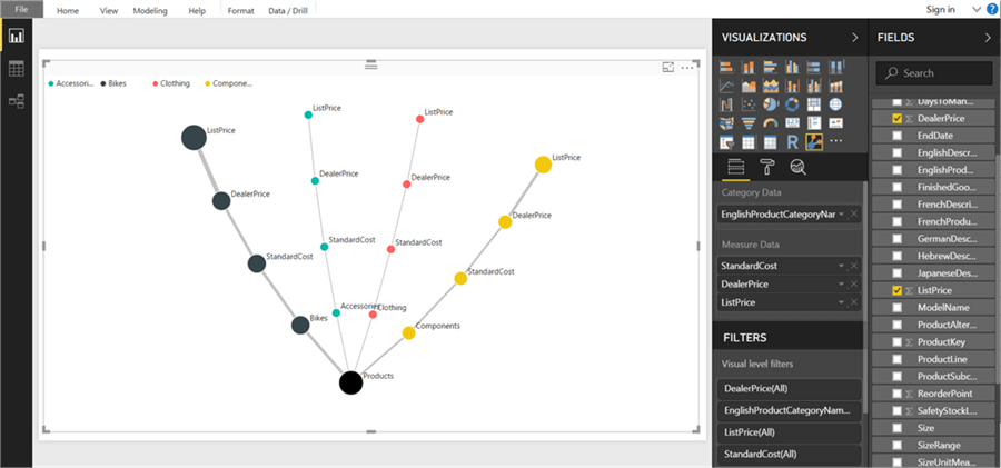
8) Now it is time to select the fields and add the same to the visualization. Drag the EnglishProductCategoryName field from Category table and EnglishProductSubcategoryName field from Subcategory table on the Category Data section. Drag the StandardCost field from the Product table on the Measure Data section. This will create the graph as shown below.
The first interesting part is that all the data from these tables gets related in the background without the need of writing any joins or queries. This graph has a central root node which is a starting point of the graph. It shows that there are four categories, each of which has subcategories. The size of the node is based on the standard cost, calculated relatively to its siblings of the same parent. Each category is given a distinct color, and its related sub-category have the color of the category. If you analyze, the standard cost attribute is at a product level, not at a category or subcategory level. But this graph used the aggregated data and the size of the nodes are proportional to the value of the cost. From this graph, Bikes have the biggest manufacturing cost. As an analyst, one would be interested in learning how much profit is being generated considering a lot of investment goes into manufacturing a product.

9) Before we add more attributes and this graph gets bigger, let’s make some cosmetic changes. Open the format section, and change the color of the Bikes category as it looks like the root color. The font size can be decreased and the root text can be changed to “Products” as we are analyzing product related data.
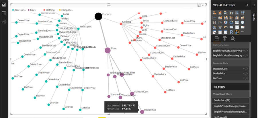
10) Now we can head on to the Bikes category for more detailed analysis. Remove the product subcategory name, and add Dealer Price and List Price in the Measure Data section, and the graph will look as shown below. Even category has a standard cost followed by dealer price and list price. This shows a workflow of the change in prices from manufacturing until it reaches the end client.
11) If you hover your mouse over the dealer price of Bikes, you will find that the total dealer price of all bikes is shown, and the percentage of this relative to the standard cost is also calculated and shown in the tooltip. It seems that the collective total margin earned by the company after selling all the bikes to dealers is just 0.87%. If you hover the mouse over the dealer price of other categories, you will find that the margin earner in bikes is lowest of all. The nodes look larger in size and the dollar value of the bikes is much higher compared to other products.

12) As the margin earned in Bikes is not that big, it can be the case that there may be some products that are performing poorly and the dealers are not able to sell it at a higher price. So, we need to drill down into the details. Add the EnglishProductSubcategoryName field again from the DimProductSubcategory table. Hover your mouse over dealer price and list price of each category. For example, as shown below the dealer price is 97.35% of the standard cost. So, it means the company is selling products at a loss to the dealers.
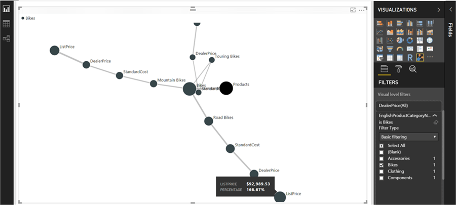
13) If you filter the data to show only Bikes to focus on data of interest, and hover mouse over dealer price, you will find that dealers are making almost a 65% margin, but the company is selling the Bike for less than 1% margin. Remember that this margin is the total of all the product margins. It’s time to drill into the details to the next level.
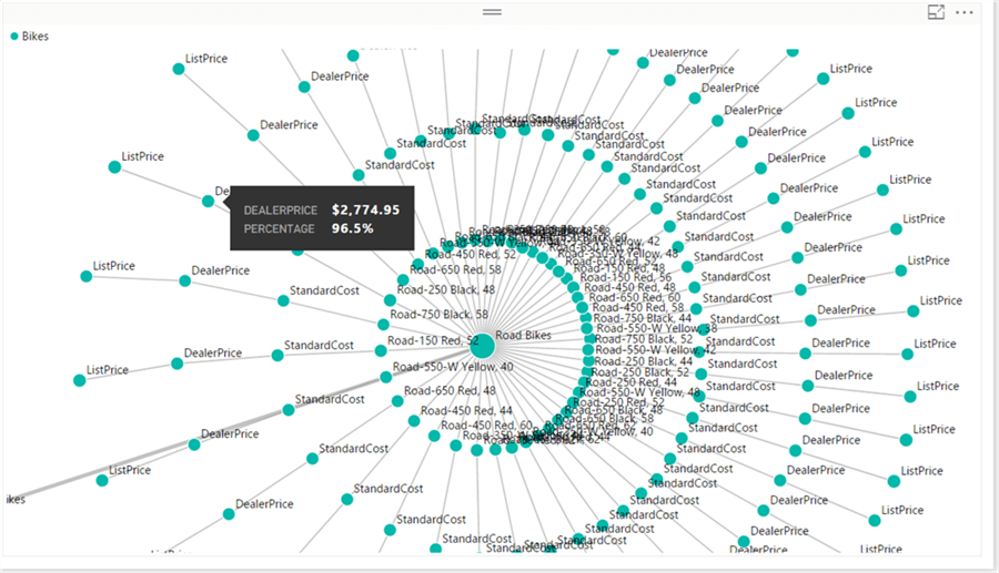
14) Add product name from DimProduct table and the graph will look as shown below. If you quickly glance through dealer price of different bikes in all the three subcategories of bikes, you will find that mountain bikes are the only bikes where the company is making a margin / profit. But road bikes and touring bikes are being sold to dealers for a loss. Without mountain bikes, the bikes business would be at a complete loss. So, this provides an insight to analyze the sales of the mountain and road bikes business.
Graphs that deal with proportional data like a bar chart, column chart, pie charts, stacked charts etc. can be used while dealing with categorical data, but these cannot be used for relative quantitative analysis especially on attributes that form a workflow. A Journey Chart can make this analysis more intuitive and make the comparison across the entire hierarchical data easier as we saw in the above example.
Next Steps
- Try adding more attributes to the visualization, and analyze the data from different perspectives.
- Check out these other Power BI tips.

Siddharth has more than 14 years of experience in the IT Industry, with more than a decade of experience in Business Intelligence and Analytics, for clients banking, logistics, government, Media Entertainment, products, life sciences and other domains. He has been a lead architect for a portfolio of 40+ apps, containing apps in web, mobile, BI, Analytics, data warehousing, reporting, collaboration, CMS, NoSQL and other technologies. He has several certifications and is a published author for online and print-media publications, as well as the MSDN Library.
In his present role, he remains responsible for architecture design, technology stack selection, infrastructure design, 3rd party products evaluation and procurement, and performance engineering. These applications use technologies like Elasticsearch / Lucene, MongoDB, SharePoint 2013 and 2010, jQuery-based framework like Highcharts and GoJS, SQL Server and the Microsoft Business Intelligence stack (SSIS, SSAS, SSRS, MDX, PowerPivot, PowerView), jQueryMobile, Bootstrap, iOS xCode framework, and many others.
- MSSQLTips Awards: Champion (100+ tips) – 2018 | Author of the Year – 2017 | Author Contender – 2016, 2018-2019
