Problem
In decision analysis, Classification and Regression Trees (CART) are typically used for data analysis. Once the optimal tree structure is derived using the CART technique, business users are provided with a tree structure, and advised to navigate and analyze the data in the hierarchy for faster analysis. In this tip, we will learn how to explore, drill-down and analyze data in a tree hierarchy using Power BI Desktop without any dependency of creating a hierarchical data model in the underlying data source.
Solution
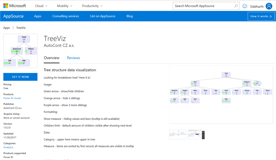
Power BI provides TreeViz visualization in the Power BI Visuals Gallery to create a decomposition tree for data exploration and analysis.
In this tip we will create decision trees in Power BI Desktop using a view from the Adventure Works DW database. It is assumed that Power BI Desktop is already installed on the development machine, as well as the sample Adventure Works DW database is hosted on SQL Server on the same machine. Follow the steps below.
1) The first step is to download the treeviz chart from here, as it is not available by default in Power BI Desktop. This visualization is available from a third-party vendor, but free of cost.
2) After downloading the file, open Power BI Desktop. You can click on the ellipsis in the visualization tab and select “Import from file” menu option. This will open a dialog box to select the visualization package file, to add the visualization in Power BI. Select the downloaded file and it should add the decision tree chart to Power BI Desktop visualizations gallery.
3) Click on the tree chart to add it to the report layout. After the tree chart is added to the report layout, enlarge it to occupy the entire available area on the report. After you have done this it will look like below.

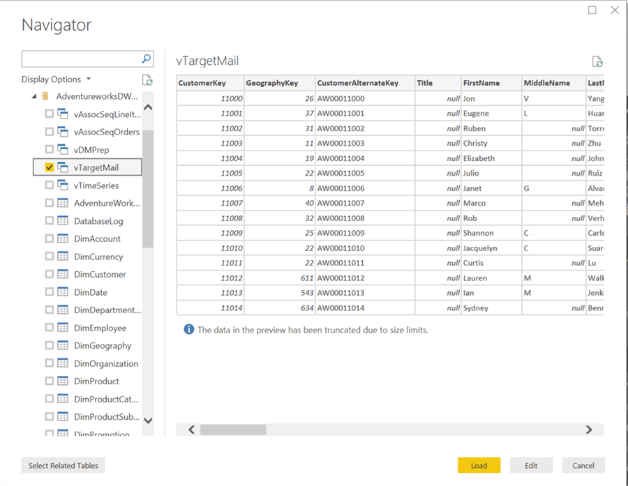
4) Now that we have the visualization, it is time to populate some data on which analysis can be performed. There’s a view in the Adventure Works DW database named “vTargetMail” that contains data of Bike Sales to customers. This view is originally designed to be used as source data for developing data mining models. So, it is a suitable candidate to be used with decomposition trees as well. Click on the Get Data menu and select SQL Server as shown below.

5) This will open a dialog box to provide server credentials. Provide the credentials and click OK.

6) Select the vTargetMail view from the database and click Load.
7) After loading is complete, the model should get created in Power BI Desktop as shown below.

8) Now it is time to select the fields and add them to the visualization. Click on the visualization in the report layout, and add the Region field first. This will add it to the Category Data section by default. The intention is to create a categorical hierarchy which the user can drill down to explore the data. Generally, time or geography are the two most used parameters for drill down analysis, and hence we chose the Region field. Once you add the field, it will immediately create a visualization as shown below.
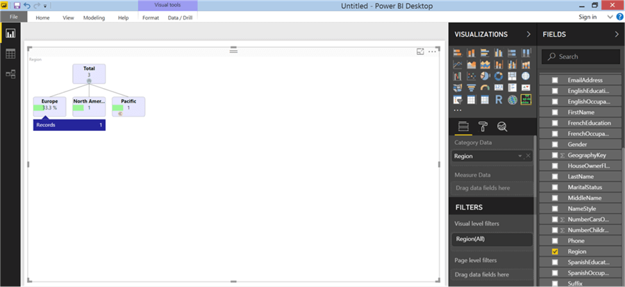
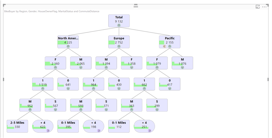
9) Now add the Bike Buyers field which will add it to the Measure Data section. After adding the field, you will find that the value in the visualization changes. Bike buyer is a Boolean field which can have a value of 1 or 0. Each node in the tree would show the aggregated value of the measure. Hence in this visual it shows us the total number of bike buyers, i.e. number of records where the value of bike buyer field is 1. From the visualization, one can easily figure out that the total number of bike buyers is 9132. The arrow at the bottom of the visualization is meant to expand / collapse the node. The green bar in each node shows the proportion / weight of the measure relative to other nodes at the same level. It is evident below, that North America has the highest number of bike buyers.

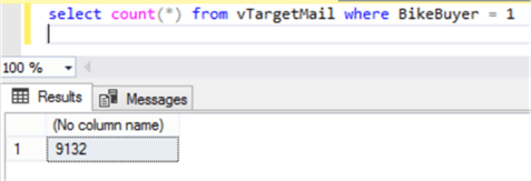
10) If you intend to validate these figures, you can query the bike buyer view in SSMS and you will find the same values as shown below.
11) We intend to create a hierarchy that users can drill down to explore and analyze data. So, add the fields as shown below to create a hierarchy of categories.

12) If you expand the tree until the last level, you will find the visualization as shown below. The orange arrow on the bottom-right node titled 10+ Miles is to wrap the number of nodes, which allows you to control the total information shown on the visualization. Nodes at any given level are sorted in descending order of the measure value from left to right. When you hover over the node, records indicate the number of child nodes under the node. Also, the total aggregated value of the measure contained by the node is displayed in the tooltip.

13) In the below visualization, we have expanded the nodes with the maximum value of the measure. At the last level, using the orange arrow we have wrapped the number of child nodes that are displayed on the visual. This allows us to represent a lot of information and wrap up the unnecessary detail. Once the nodes are wrapped in a common node, you will find the purple arrow which can be used to unwrap the nodes. Orange and Purple arrows acts as toggle buttons.
14) One other detail to note is that when the mouse is hovered over a node, it will show the percentage relative to the parent node as well as percentage relative to other nodes at the same level. In the below example, females in the North America region form 23.7% of total bike buyers globally and 51.1% of bike buyers in North America.
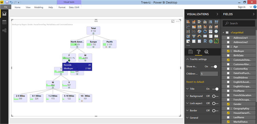
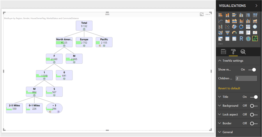
15) Finally, one can manage the number of nodes shown at any level of the tree by default. To configure this, navigate to the settings and change the Children limit option. In the below example, we have changed the value of this to 2 from the default value of 5. When we expand the tree to the last level, by default only two nodes will be visible and the rest will be wrapped up in a common node.
In this way, without any data modeling effort or dependency, one can easily create a tree hierarchy for data exploration, drill-down navigation and data analysis.
Next Steps
- Try modifying the chart to add a title to blend it with the theme of the report.

Siddharth has more than 14 years of experience in the IT Industry, with more than a decade of experience in Business Intelligence and Analytics, for clients banking, logistics, government, Media Entertainment, products, life sciences and other domains. He has been a lead architect for a portfolio of 40+ apps, containing apps in web, mobile, BI, Analytics, data warehousing, reporting, collaboration, CMS, NoSQL and other technologies. He has several certifications and is a published author for online and print-media publications, as well as the MSDN Library.
In his present role, he remains responsible for architecture design, technology stack selection, infrastructure design, 3rd party products evaluation and procurement, and performance engineering. These applications use technologies like Elasticsearch / Lucene, MongoDB, SharePoint 2013 and 2010, jQuery-based framework like Highcharts and GoJS, SQL Server and the Microsoft Business Intelligence stack (SSIS, SSAS, SSRS, MDX, PowerPivot, PowerView), jQueryMobile, Bootstrap, iOS xCode framework, and many others.
- MSSQLTips Awards: Champion (100+ tips) – 2018 | Author of the Year – 2017 | Author Contender – 2016, 2018-2019
