Problem
Gantt charts are arguably the default visualization for project management discussions by project management executives. Project management involves a large variety of status and tracking reports and these reports are typically driven by a time slice which is tracked on a Gantt chart. In a Power BI report, different visualizations interact with each other. So, any report that is driven by the Gantt chart visualization with the break-down of details in other visualizations in an interactive manner can prove to be very valuable as well as convenient to management executives. In this tip, we will learn how to create a Gantt chart in Power BI Desktop for schedule analysis using a dataset that resembles real-life project planning data.
Solution
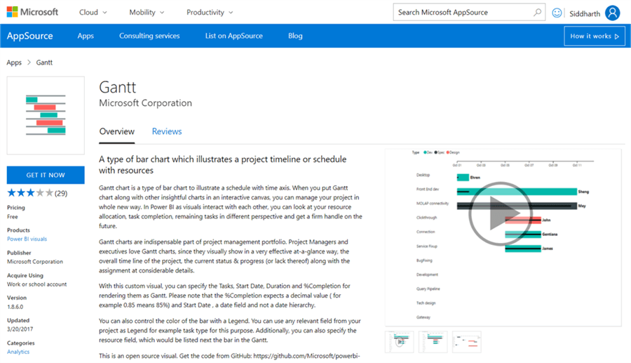
Power BI provides Gantt charts in the Power BI Visuals Gallery to perform schedule analysis on project planning data.
A Gantt chart can be generalized as a type of bar chart, where each bar represents a section of data on a time axis. The key elements portrayed on this chart generally are tasks, resources, duration, progress, time-axis, completion and inter-dependencies. The Gantt chart that we will be using has these features except inter-dependencies visually.
In this tip we will create a Gantt chart in Power BI Desktop using some sample data. It is assumed that Power BI Desktop is already installed on the development machine. The sample data used in this tip can be downloaded from here. Follow the steps as mentioned below.
1) First step is to download the Gantt chart from here, as it is not available by default in Power BI Desktop.
2) After downloading the file, open Power BI Desktop. You can click on the ellipsis in the visualization tab and select “Import from file” menu option. This will open a dialog box to select the visualization package file to add the visualization in Power BI. Select the downloaded file and it should add the Gantt chart to the Power BI Desktop visualizations gallery.
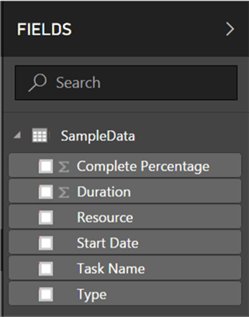
3) First, we need to import the sample data which we will be used to create the visualizations for data analysis. Select the Get Data menu as shown below, and select “Text/CSV” as our sample data is stored in a CSV file.

4) This will open a dialog box to select the CSV file. Navigate to the path where you have stored the CSV file, select the file and click OK. This will open a dialog box as shown below. A few rows from the file are read to preview the data as shown below. Click Load to load this data into the data model.

5) After the data is loaded in the data model, it should like look below in the Power BI Desktop.
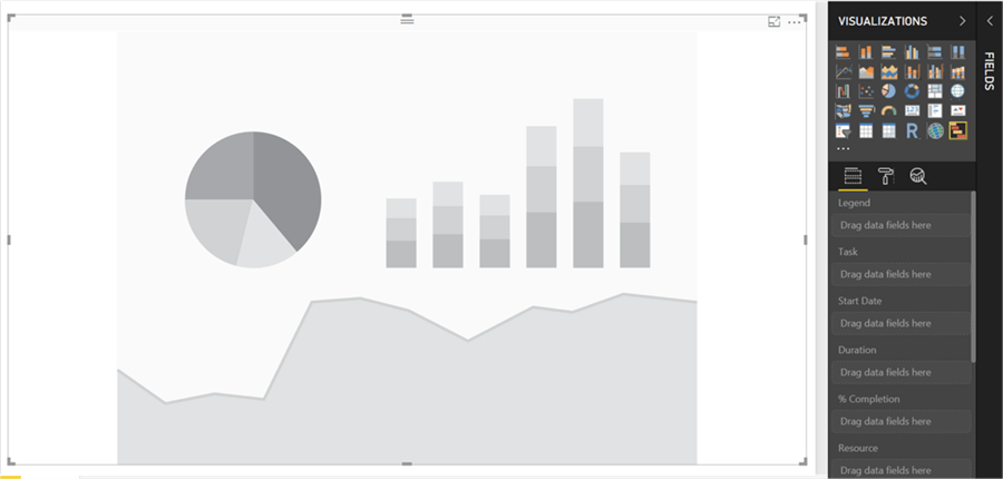
6) Let’s first add the Gantt chart to the report layout. Click on the Gantt chart and this will add the control on the report layout as shown below.
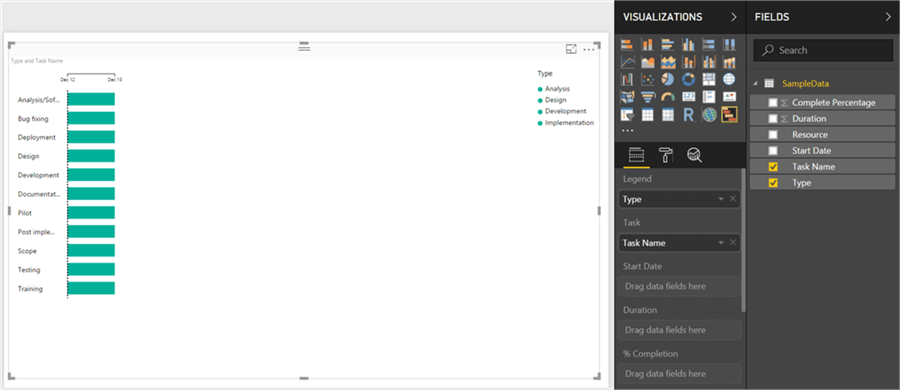
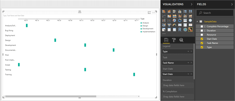
7) Select the data fields Task Name and Type, and those will be added to the Gantt chart as shown below. Tasks will be added in the task section, as it is relevant there. We need to categorize diverse types of tasks as there can be many tasks in a detailed project plan. So, that categorical field should be added to the legend section. As we have not provided start dates yet, by default it will add tasks in the date range of the current date until the next date.
8) Add the start date field to the Start Date section, and all the tasks will be shown based on their start dates. Also, the time axis on the top will automatically change to accommodate all the start data ranges in the data.
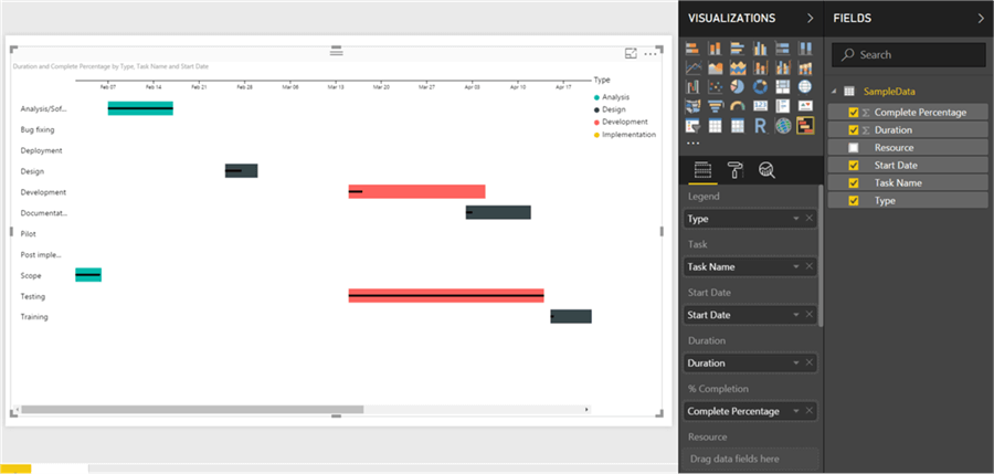
9) All the tasks are not showing the corresponding start date, but they seem to be of equal duration as we have not provided the duration for these tasks yet. Add the duration field and the tasks will start reflecting the duration and the color of the tasks will start reflecting the type, as now the data is sufficient to create a Gantt chart.

10) Now that the tasks are represented correctly on the time axis, we need to show progress of those tasks. At the start of the project there might be no progress, which is obvious. But as time progresses, the progress of the tasks need to be shown. Add the Complete Percentage field to the %Completion section, and the visualization will show the progress in the form of a thin bar within the bar that represents the tasks. This visualization is like a bullet graph the only difference being that a bullet graph will have a target and in a Gantt chart there’s no target.
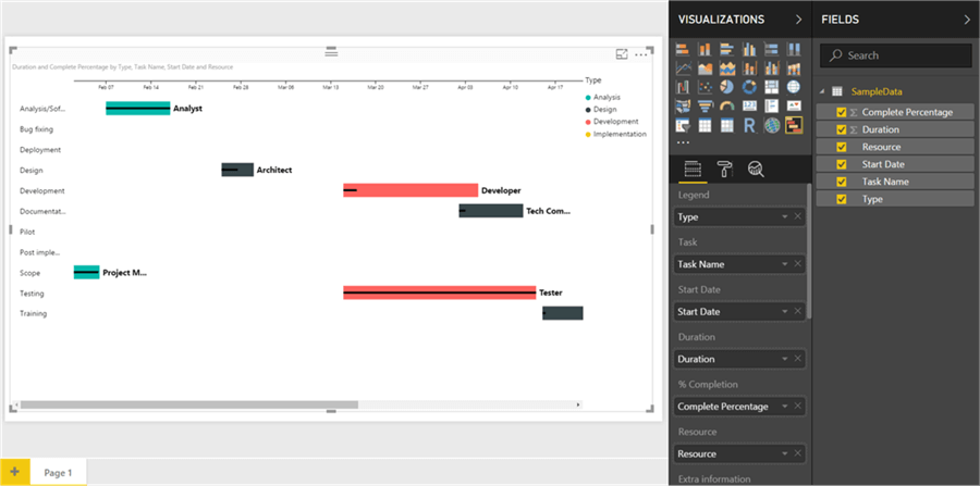
11) Tasks are performed by a person or a team, who are identified as the owners of the task in the plan. So, executives would be interested in identifying the owners of the task, in case they want to address the owners of the task. To add the owners against each task, add the resource field to the resource section and this will show owner names against each task as shown below.
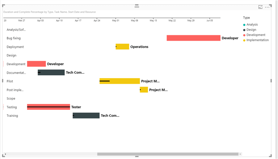
12) Finally if you have not noticed, there is a scroll-bar at the bottom of the visualization. Project plans tend to be lengthy due to substantial number of tasks, and wide as they can contain day-wise or week-wise details spanning several weeks to several months typically. With just 11 records in our data model, we are not able to fit the details in the screen space of the report layout. So, the visualization can get extremely wide with a lot of planning data shown on a time axis. If one tries to fit the entire graph in the fixed report layout, the details can get too tiny to read and analyze. So, it is inevitable to have the floating graph that can be scrolled. Scroll to the right and you should be able to see the rest of the data based on the timeline associated with it.
So, in this way we can create a Gantt chart. We can add more visualizations apart from the Gantt chart on the report, to create a comprehensive and intuitive project management report that are driven by the Gantt chart.
Next Steps
- Gantt charts provide options to format all the data elements on the chart. Try exploring the format options to change the font size, color, etc.
- Check out all of the Power BI tips on MSSQLTips.com.

Siddharth has more than 14 years of experience in the IT Industry, with more than a decade of experience in Business Intelligence and Analytics, for clients banking, logistics, government, Media Entertainment, products, life sciences and other domains. He has been a lead architect for a portfolio of 40+ apps, containing apps in web, mobile, BI, Analytics, data warehousing, reporting, collaboration, CMS, NoSQL and other technologies. He has several certifications and is a published author for online and print-media publications, as well as the MSDN Library.
In his present role, he remains responsible for architecture design, technology stack selection, infrastructure design, 3rd party products evaluation and procurement, and performance engineering. These applications use technologies like Elasticsearch / Lucene, MongoDB, SharePoint 2013 and 2010, jQuery-based framework like Highcharts and GoJS, SQL Server and the Microsoft Business Intelligence stack (SSIS, SSAS, SSRS, MDX, PowerPivot, PowerView), jQueryMobile, Bootstrap, iOS xCode framework, and many others.
- MSSQLTips Awards: Champion (100+ tips) – 2018 | Author of the Year – 2017 | Author Contender – 2016, 2018-2019
