By: Siddharth Mehta | Comments | Related: > Power BI Charts
Problem
Hierarchical data exists almost everywhere in an organization. Examples of hierarchy are geography, employee structure, sales and distribution channels, etc. As the hierarchy grows large, the drill-down method becomes too hard for analyzing the distribution of data in the hierarchy. Nested hierarchies may reduce the depth of the hierarchy, but will make the structure too complex to analyze.
One method of analyzing distribution in a hierarchy is by categorizing the hierarchy with another attribute, and using this attribute to visualize the spread of an entity in the hierarchy. Visualization that supports this mechanism can enable this form of analysis. In this tip we will learn how to perform this type of analysis using Power BI Desktop.
Solution
Power BI provides a Hierarchy chart in the Power BI Visuals Gallery to perform this type of analysis on hierarchical data.
Employees are one of the most fundamental hierarchies in any organization. With a substantial number of employees, the hierarchy becomes deep as well as wide. To manage this hierarchy efficiently, sub-hierarchies are created which are called departments. This attribute can work as the categorical attribute using an entire organization hierarchy that can be easily identified and the distribution of it can be compared to the overall distribution of employees in the organizational hierarchy.
In this tip we will create a Hierarchy Chart in Power BI Desktop using hierarchical employee data that has all the fields needed for the analysis in question. It is assumed that Power BI Desktop is already installed on your development machine, as well as the sample Adventure Works DW database is hosted on SQL Server on the same machine. Follow the steps mentioned below.
Step 1
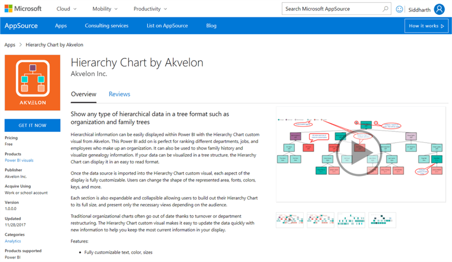
The first step is to download the Hierarchy chart from here, as it is not available by default in Power BI Desktop. It is available in the gallery.
Step 2
After downloading the file, open Power BI Desktop. You can click on the ellipsis in the visualization tab and select “Import from file” menu option. This will open a dialog box to select the visualization package file, to add the visualization in Power BI. Select the downloaded file and it should add the hierarchy chart to Power BI Desktop visualizations gallery.
Step 3
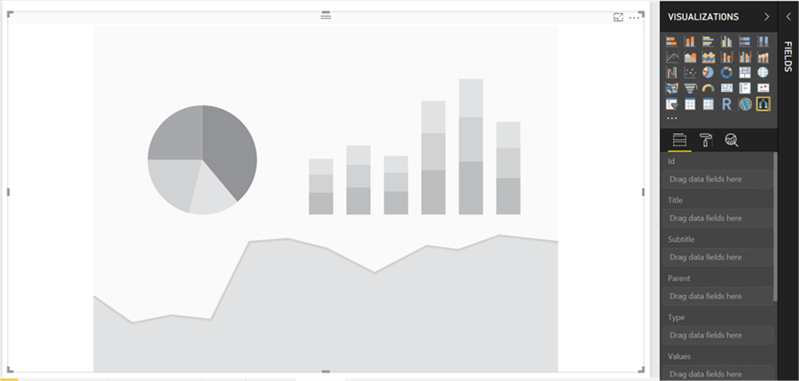
After the graph control is added to the report layout, enlarge the layout to occupy the entire available area on the report. After you have done this it will look like the image below.
Step 4
Now that we have the visualization, it is time to populate some hierarchical data on which distribution analysis can be performed.
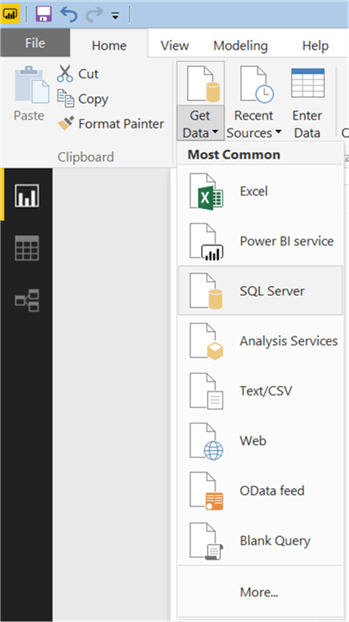
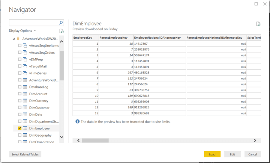
We need a dataset that has relationships explicitly / implicitly embedded into it. There’s a dimension table in Adventure Works DW database named “DimEmployee” that contains data of employees and their supervisors. This table contains employee key, employee parent key with their demographic details like name, title, charge rate, etc. So, it is a suitable candidate to be used for graph analysis. Click on the Get Data menu and select SQL Server as shown below.
Step 5
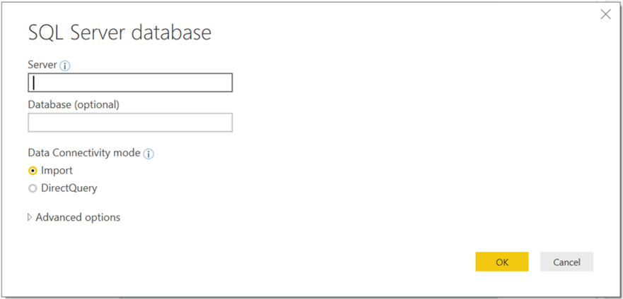
This will open a dialog box to provide server credentials. Provide these and click OK.
Step 6
Select the DimEmployee table from the database and click Load.
Step 7
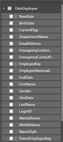
After the loading is complete, the model should be created in Power BI Desktop as shown below.
Step 8
As we have the data model loaded, it’s time to add the fields to the hierarchy chart.
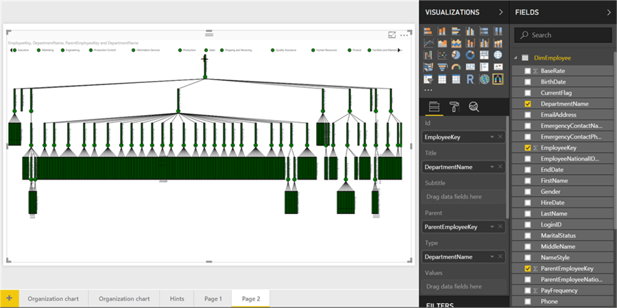
Select the chart, and add fields as shown below. Add the EmployeeKey on ID section and ParentEmployeeKey in the parent section. Add DepartmentName to the title section. Our intention is to analyze the spread of each department within an organization. Each node in this chart represents an employee. Every node that has sub-nodes, contains an expand \ collapse button. This chart shows the hierarchy of employees in an organization. We are not interested in any specific employee, but the hierarchical organization of employees.

Step 9
One unique feature of this chart is the ability to customize color. Drag and drop DepartmentName field on the type section.
Step 10
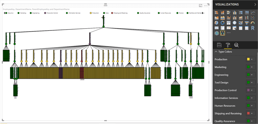
Once we have added a field in the type section, all the unique values of department name field would be available for color customization. Navigate to the format section and update the colors as shown below. We are interested in analyzing the spread of the Production Department, so we are coloring only three departments with a new color.
Step 11
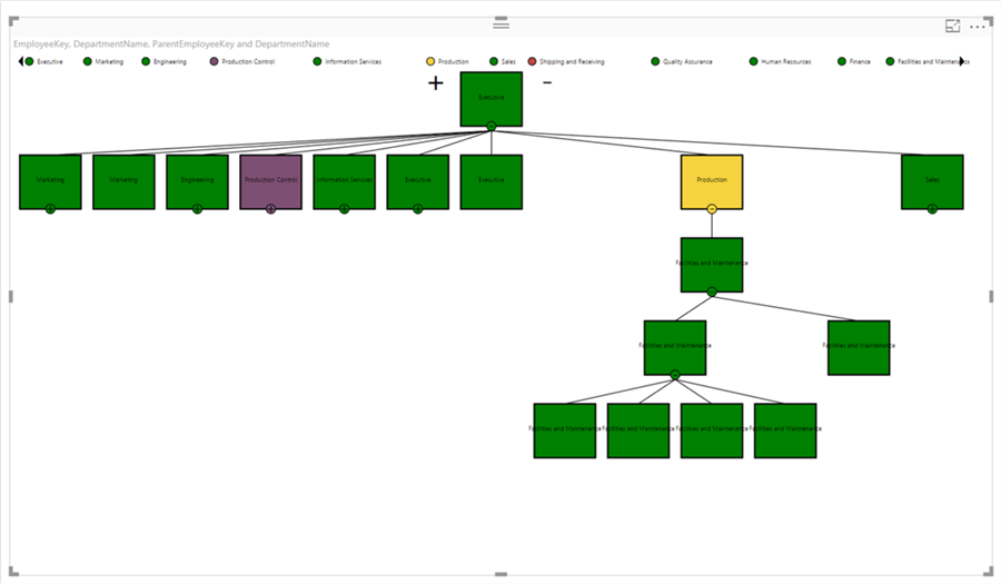
From the chart, it looks like the Production department seems to have the maximum spread in the organization. Almost 99% of the production department looks to be under one person, but just one person in the production department seems to be isolated on the top right. This is a valid candidate for more investigation. Collapse all the nodes to the second level and this should make the visualization as shown below. If you carefully look at the details, the Production Control executive seems to be managing the entire production organization and another production control executive seems to be managing facilities and maintenance department which is no way tied to the production department.
Step 12
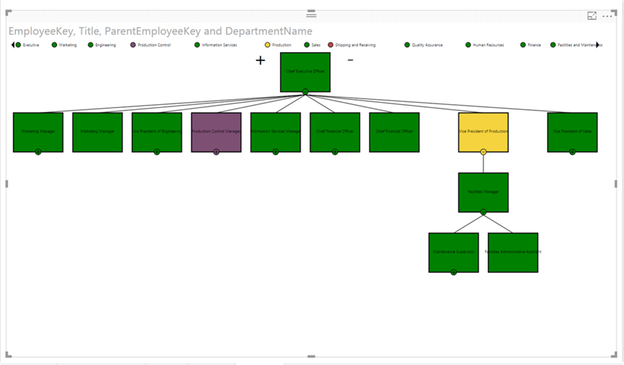
Let’s remove the DepartmentName field from the Title field and instead add the Title field which is shown in the designation of the employee. It seems like the Vice President of Production reports to the CEO and manages the facilities and maintenance, but does not directly manage any part of the production department.
Step 13
If you expand the Production Control Manager node, you will find that this executive is managing the entire production departments of the organization as shown below. So, if we analyze, the VP of Production manages just facilities and reports to CEO and the Production Control Manager, manages the entire production organization, but is still just a Manager. This can be actionable insights for an organization to balance the hierarchy in an organization.

Step 14
A Hierarchy chart also provides a lot of customization options to format the data as shown below.
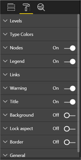
Using a Hierarchy chart, we can analyze the distribution in hierarchical data by categorizing hierarchies using a color coding method with the use of Hierarchy charts in Power BI Desktop.
Next Steps
- Hierarchy charts provide options to format all the data elements on the chart. Try exploring the format options to change the font size, color, etc.
- Check out these other Power BI tips
Learn more about Power BI in this 3 hour training course.
About the author
 Siddharth Mehta is an Associate Manager with Accenture in the Avanade Division focusing on Business Intelligence.
This author pledges the content of this article is based on professional experience and not AI generated.
View all my tips


