Problem
Performance comparison and analysis is a standard exercise in any organization and is widely applicable from employee performance to product performance. There are different charts that can be used for this purpose like: line charts, waterfall charts, stacked column charts, etc. The frequent problem with all these charts is that the values of the data field in each category or legend is shown in the same order. This method of ordering data is useful in many scenarios, but while measuring performance, one would want to order the data in each category starting from best performers to lowest performers, so that one can easily identify the points of interest.
In this tip we will learn how to address this problem using Power BI Desktop.
Solution
Ribbon charts are available in Power BI Desktop starting with the September 2017 release, which can be used for performance analysis.
Sales performance is typically a very closely and actively monitored metric in any organization. This analysis is directly tied to the performance of sales personnel. Sales is generally tracked on a time hierarchy like Year, Quarter and Month. Performance patterns of personnel is tracked on this time hierarchy to analyze performance patterns. In this tip we will use a dataset that has this type of data and then analyze the data using a Ribbon chart in Power BI Desktop.
It is assumed that Power BI Desktop is already installed on the development machine, as well as the sample Adventure Works database is hosted on SQL Server on the same machine. Follow the steps below.
Step 1 – Add Ribbon Chart in Power BI
Open Power BI Desktop and from the visualizations pane add a Ribbon chart to the report layout. After the control is added to the report layout, enlarge it to occupy the entire available area on the report. After you have done this it will look like the image below.
Step 2 – Get Data in Power BI
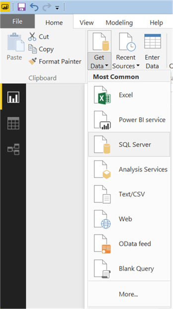
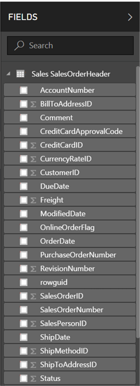
Now that we have the visualization, it is time to populate data on which performance analysis can be performed. There’s a table in the Adventure Works database named “Sales.SalesOrderHeader” that contains sales data of various products by salesperson as well as through other mediums like internet sales or reseller sales. So, it is a suitable candidate to be used for performance analysis. Click on the Get Data menu and select SQL Server as shown below.
Step 3 – Add Credentials in Power BI
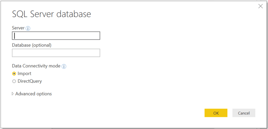
This will open a dialog box to provide server credentials. Provide these as shown below and click OK.
Step 4 – Load Data in Power BI
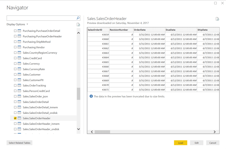
Select the Sales.SalesOrderHeader table from the database and click Load.
Step 5 – Create Model in Power BI
After loading is complete, the model should get created in Power BI Desktop as shown below.
Step 6 – Add Fields in the Power BI Ribbon Chart
As we have the data model loaded, it’s time to add the fields to the Ribbon chart. Select the chart and add the “TotalDue” field to the Value section. This will create a visualization as shown below.

Step 7 – Categorize Data in Power BI
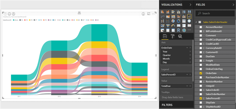
As we want to analyze performance of sales people, lets add the SalesPersonID field to the legend section, so the data is categorized by this field as shown below.

Step 8 – Add Hierarchy in Power BI
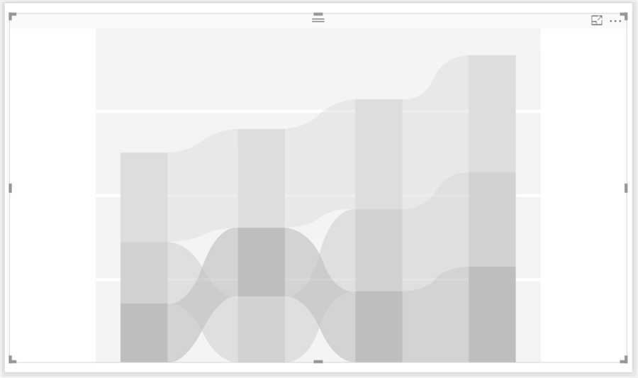
We have just a single bar on the chart as we have not specified the time axis yet. Let’s add the Order Date field to the Axis section, which will automatically create a hierarchy. This will enable us to drill down into the data for performance analysis on a time hierarchy. Once you add this field, the visualization will get created as shown below. This is the actual visualization of a Ribbon chart.
Step 9 – Analyze Sales Data in Power BI
There are multiple details that can be read or analyzed from this chart. Each section on the time axis contains a bar in the background as well as a ribbon on the top of it. The values in each section are sorted in ascending order with highest value at the top. The green color on the top has employee id blank, which means the sales was not from any sales person, but from a different medium. So that data or color can be ignored for sales person performance. If you click on the Yellow section on the bar in the year 2013, you would be able to see a tooltip as shown below. This shows the total sales value of salespersonid 276 in year 2013.

Step 10 – Ribbon Chart Detailed Data in Power BI
In the year 2013 section, if you hover the mouse on the area outside the vertical column, you would be able to see the sales figures of employee 276 in 2013 and 2012, i.e. the previous year and selected year. It also calculates and shows the percent change and rank change as shown below. Each color represents an employee and the employee id can be seen on the top as color legends. This allows us to clearly see the projection of how an employee has performed over the years. It seems like employee 276 has been on the top overall. It would be interesting to dig into the details.

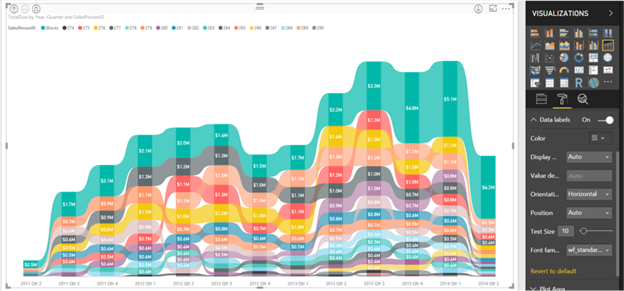
Step 11 – Data by Quarter in Power BI
On the top left section, click on the last icon from left which will drill down the entire data to the next level in the hierarchy i.e. at the quarter level. You can navigate to the format menu and switch on the data labels as well, so that you can see the sales figures on the chart itself as shown below. If you analyze the flow of colors, you would find that employee 276 and 290 have been competing on the top positions. Also, on careful analysis you would find that employee 276 (yellow color) drastically improved his performance from second quarter of 2013 by jumping three ranks up compared to others. Employee 290 has always been in 1st and 2nd position, though he joined in 2nd quarter of 2012 unlike employee 276 who has been working in the organization from the start.
Step 12 – Data by Month in Power BI
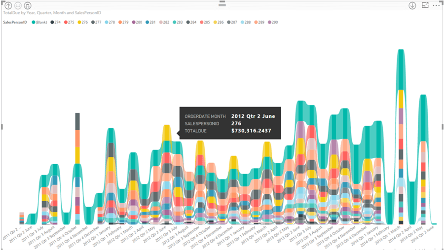
As employee 276 seemed to have drastically improved sales performance from the 2nd quarter of 2013, we may want to analyze in detail if the employee is consistently performing well. Drill down to the next level in the same way we did in the last step. This will show the data at month level as shown below. The yellow color seems to follow a pattern where it is at the top at a distance of every 3 months.

Step 13 – Detailed Data Analysis in Power BI
If you carefully analyze, the performance of this employee is at the top in the last month of every quarter starting 2nd quarter of 2012. As shown below, if you hover your mouse in the center of any column of the yellow color, you would be able to see the value of the sales. Here we can conclude that the employee’s performance is not the best in every month, but s/he catches up in the last month of every quarter, ultimately taking the employees performance on the top.
In this way, we can analyze performance related data by using a Ribbon chart in Power BI Desktop.
Next Steps
- Ribbon charts provide a lot of formatting options to format all the data elements on the chart. Try exploring the format options to change the font size, color, data labels, legends, etc.
- Check out these other Power BI tips.

Siddharth has more than 14 years of experience in the IT Industry, with more than a decade of experience in Business Intelligence and Analytics, for clients banking, logistics, government, Media Entertainment, products, life sciences and other domains. He has been a lead architect for a portfolio of 40+ apps, containing apps in web, mobile, BI, Analytics, data warehousing, reporting, collaboration, CMS, NoSQL and other technologies. He has several certifications and is a published author for online and print-media publications, as well as the MSDN Library.
In his present role, he remains responsible for architecture design, technology stack selection, infrastructure design, 3rd party products evaluation and procurement, and performance engineering. These applications use technologies like Elasticsearch / Lucene, MongoDB, SharePoint 2013 and 2010, jQuery-based framework like Highcharts and GoJS, SQL Server and the Microsoft Business Intelligence stack (SSIS, SSAS, SSRS, MDX, PowerPivot, PowerView), jQueryMobile, Bootstrap, iOS xCode framework, and many others.
- MSSQLTips Awards: Champion (100+ tips) – 2018 | Author of the Year – 2017 | Author Contender – 2016, 2018-2019
