By: Siddharth Mehta | Comments (7) | Related: > Power BI Charts
Problem
Datasets related to domains like Energy, Finance, Manufacturing, Logistics, etc. tend to have data that has multiple interconnected entities. These entities are organized, but not necessarily in a hierarchical structure. So, any tree-based visualizations cannot be used. The association or links between these entities are also progressive in nature. So even a graph-based visualization would not be the best fit, though it can show relations through edges. So, there is a need for a specialized visualization that can visualize the inter-relationship between the entities proportionately in a relative manner without losing the progressive projection of the visualization.
Solution
Sankey charts are available in Power BI Desktop in the Power BI Visuals Gallery, which can be used for entity data flow analysis.
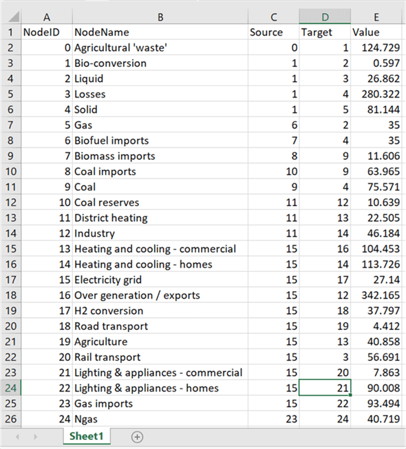
To address the problem in question, we need a specific type of dataset which resembles a near real life dataset. One publicly available dataset that we can use to understand the data problem in question is available from here. This is the EU Energy dataset which shows the energy generated from different mediums in a common unit called mote (million tons of oil equivalent). It’s a very large dataset, but it we aggregate the data it can be simplified enough to add it to a visualization. If you analyze this data you will find that each entity is associated with few other entities and have a value with can be considered as the association value. This data after simplification look as shown below and can be downloaded from here.
Here we have two datasets in a single file. Columns A and B is a single dataset, and Columns C, D and E is another dataset. We will understand it in more detail shortly.
In this tip, we will create a Sankey chart using the above energy dataset. Sankey chart is used to visualize highly connected progressive data with multiple levels of source and target entities. It is assumed that Power BI Desktop is already installed on the development machine.
Follow the steps as mentioned below to develop a Sankey chart.
Step 1
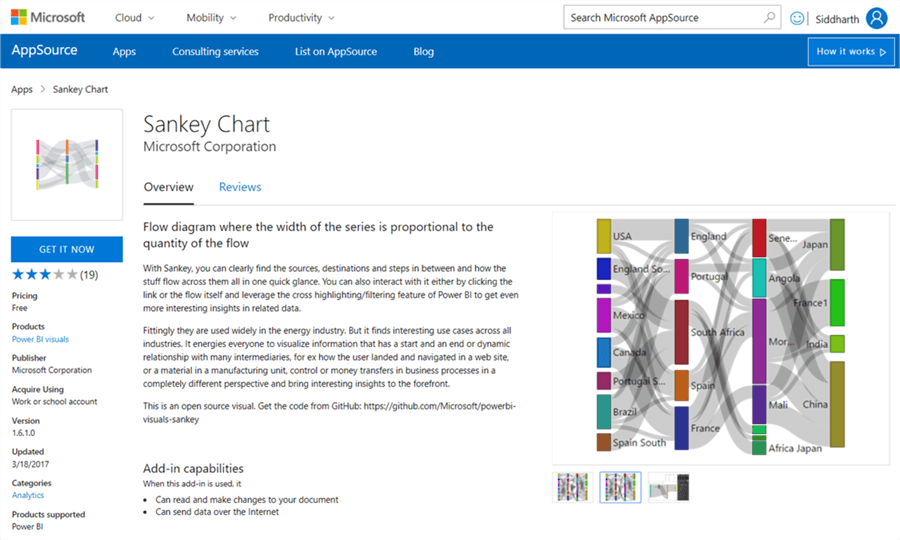
The first step is to download the Sankey chart from here, as it is not available by default in Power BI Desktop.
Step 2
After downloading the file, open Power BI Desktop. You can click on the ellipsis in the visualization tab and select “Import from file” menu option. This will open a dialog box to select the visualization package file, to add the visualization in Power BI. Select the downloaded file and it should add the Sankey chart to Power BI Desktop visualizations gallery
Step 3
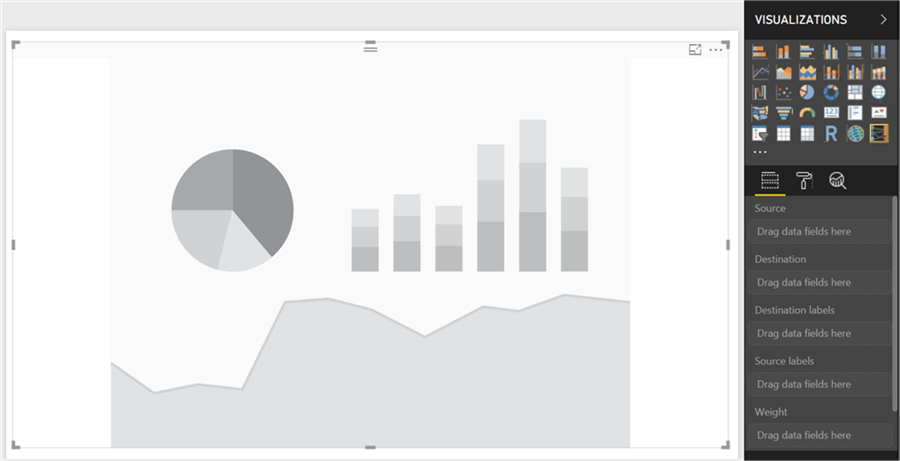
Click on the Sankey Chart and that would add it on the reports layout. Enlarge the control to occupy the screen space and it should look as shown below.
Step 4
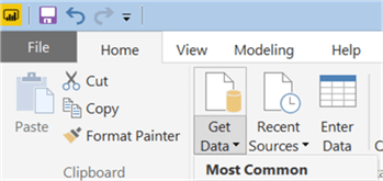
Now that we have the visualization, it is time to populate data. Click on the Enter Data screen and this will bring up a pop-up window.
Step 5
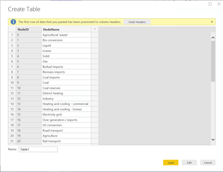
Copy column A and B from the sample data and paste the same in the pop-up window. This would look as shown below. Rename this table as Source and click on Load button which will add the table to the model.
Step 6
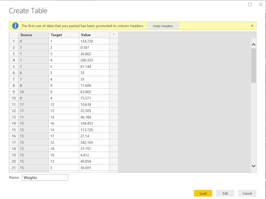
Follow step 5 again, and this time copy column C, D and E. This would look as shown below. Save this table as Weights as we are having the inter-connections of different entities along with their weights in this table.
Step 7
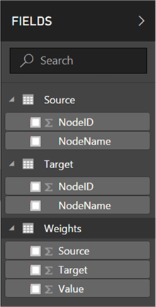
After all the tables are loaded the data model should look as shown below.
Step 8
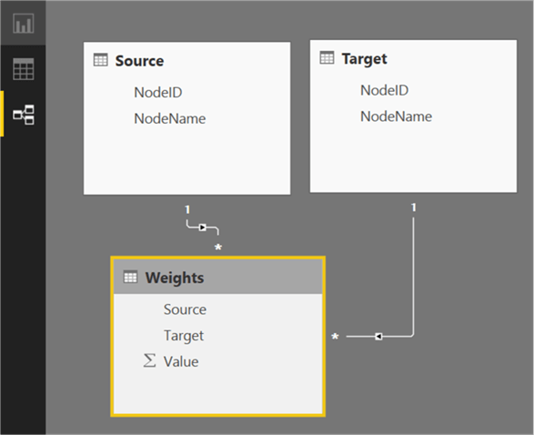
If you analyze the data, you would find that this is a normalized dataset where source and destination are entity masters and Weights is a transaction table. We need to slightly modify this data model to build relationships. Click on the relationship pane and you would find the model like this.

Step 9
Drag and drop the NodeID from source table to source field on Weights table. After that, drag and drop the NodeID from destination table to target field on Weights table. This will build relationships between tables and the model will look as shown below.
Step 10
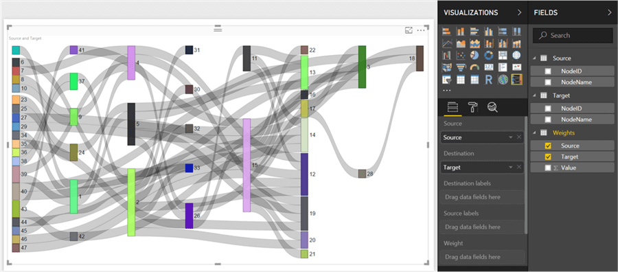
Now let us add the fields to the visualization. Select the Sankey chart and add source and target fields from weight table in the source and destination section, and this would bring up with visualization as shown below. This is a very raw form of a Sankey chart, where the curved paths represent connections and the vertical bars represent entities. As there are multiple layers of entities, it is called a multi-level Sankey chart.
Step 11
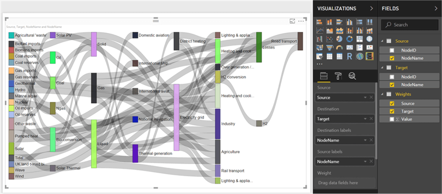
Here we have NodeID all over. We need to have entity names to identify the relationship that is shown by the flow paths in black color. Add NodeName from Source table to source labels section and NodeName from Destination table to DestinationLabels section. This would make the visualization as shown below. One point to note is that the entities and data flow paths are organized from source (starting from left) to destination (towards the right). A graph would not have this style of projection typically.
Step 12
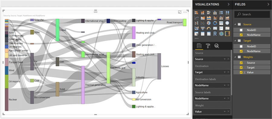
The data flow paths or the links from one entity to another is of the same weight. We need to proportionately represent the collective weight of each entity and the split of that weight in data flow paths. To reflect that add value field from weights table and add it to Weight section as shown below.
Step 13
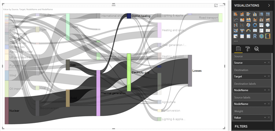
Now the height of the entity and width of data flow path is reflecting the weights and split of the same from one entity to another. If you select thermal generation entity, you would find the incoming and outgoing paths highlighted as shown below.
Step 14
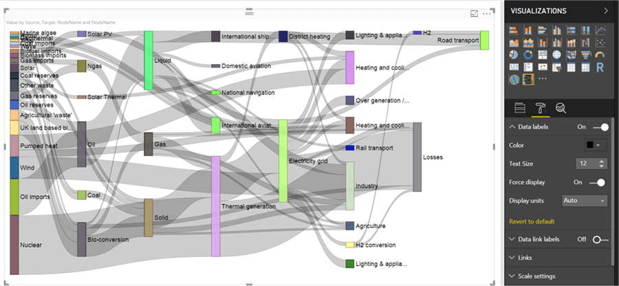
Here all the entity labels are not visible, so let us navigate to format section, and from the data labels section, enable the force display option which will make all the entity labels visible irrespective of their weight in the chart.
Step 15
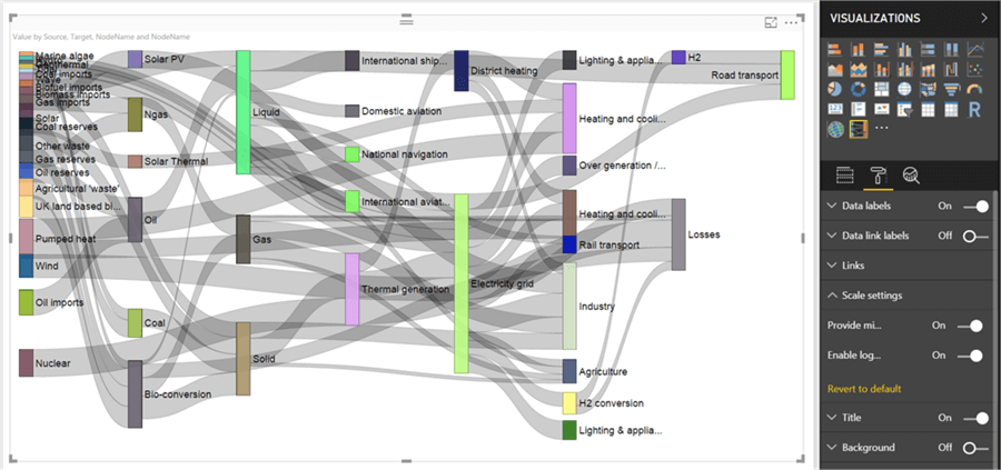
The reason all the other entities are compressed is because Nuclear and Oil entities are having a much larger power generation value compared to others. And the same is applicable to their energy flow paths too. To deal with this issue, navigate to the Scale section and set the Enable Logarithmic Scale to on. This will apply logarithmic transformation to the dataset, which will help to see the variations in smaller weights clearly.
Step 16
If you make the background color to black and fonts to white, and select Thermal Generation entity again, you would be able to see the energy transmission in and out of this very clearly as shown below. Also, if you hover the mouse over any entity or the data flow paths, you would find the relevant details in the tooltip as shown below.
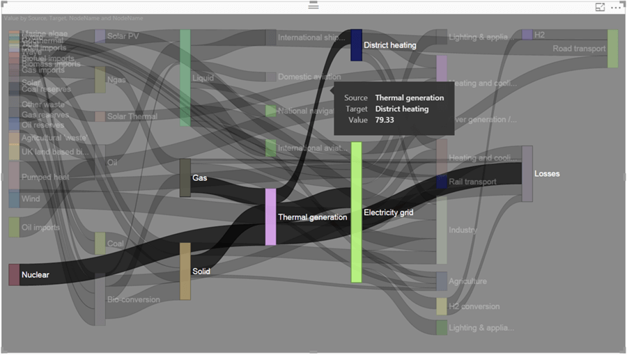
From this visualization, you can easily make out that thermal generation uses energy from Solid Fuel, Gas and Nuclear fuel. The energy generated from thermal means, is used in turn for District Heating from Gas and Electricity generation by electricity grid from solid fuel, and a significant part of energy from nuclear means is lost in transmission as well. Also, you can analyze a number of such inter-connections for each entity using this Sankey chart, and this is not possible to analyze from the data in a tabular format.
In this way, we can analyze entity data flow in a dataset directed by a progressive projection using a Sankey chart in Power BI Desktop.
Next Steps
- Try to use a more complex dataset and use the Sankey chart to analyze complex data flows.
- Check out these other Power BI tips
Learn more about Power BI in this 3 hour training course.
About the author
 Siddharth Mehta is an Associate Manager with Accenture in the Avanade Division focusing on Business Intelligence.
This author pledges the content of this article is based on professional experience and not AI generated.
View all my tips


