Problem
A matrix is generally one of the most common and connected forms of datasets where each item shares a common set of comparable attributes. The more the data is connected, the more it becomes complex to inter-analyze in a comparative manner. There are different visualizations to represent flow or relationships in a dataset like Graphs, Trees, and Sankey Charts. Most of these visualizations are efficient at representing unidirectional relationships. Consider a scenario where employees from different companies are joining competitor companies. An employee from Facebook may join Google, an employee from Google may join Apple, and employees from Apple may join Facebook as well as Google. So, there is an inward as well as outward relationship between each company. A specialized diagram suited to represent bi-directional inter-relationships in data matrices is required. In this tip we will learn how to visualize such data using Power BI Desktop using a chord diagram visualization.
Solution
Chord diagrams are available in Power BI Desktop from the Power BI Visuals Gallery, which can be used for visualizing matrix data with inter-connected relationships.
Before we understand the details of the chord diagram, we need a real-life dataset which can be used to simulate the problem in question. World Bank publishes many public datasets that can be used for the problem in question. One such dataset is the remittance datasets. People work in foreign countries and they send part of their earnings to their home country, which is generally known as remittance. All the countries have inward and outward remittances, where each country receives foreign exchange as well as local currency is being remitted out to other countries. You can download the remittance datasets from here.
Below is how the world outward remittance dataset looks.

These are the top 25 countries in terms of outward remittances from 2006 till 2016. I have transformed this matrix into a simpler form for easy consumption in our report. This can be easily done using Excel. To quickly get started, you can download this curated and transformed dataset from here.

Building a Chord Diagram Visualization with Power BI
In order to study the inter-relationship in this dataset in a comparative manner, we would visualize this dataset on a chord diagram in Power BI Desktop. It is assumed that Power BI Desktop is installed on the development machine.
Step 1
The first step is to download the chord diagram from here, as it is not available by default in Power BI Desktop. Chord diagram is ideal for visualizing comparing similarities between different entities, relationships and proportions in a dataset.

Step 2
After downloading the chord diagram control, open Power BI Desktop. You can click on the ellipsis in the visualization tab and select “Import from file” menu option. This will open a dialog box to select the visualization package file, to add the visualization in Power BI. Select the downloaded file and it should add the chord diagram to Power BI Desktop visualizations gallery.
Step 3
Click on the chord diagram and that would add it on the reports layout. Enlarge the control to occupy the screen space and it should look as shown below.

Step 4
Now that we have the visualization, it is time to populate data. Click on the Get Data menu and select Excel as shown below.

Step 5
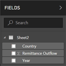
Navigate and point to the Excel file that you would have downloaded earlier. After you select it, you would be able to preview the data as shown below. Select Sheet2 and load the data.

Step 6
After loading the data, the data model should look as shown below.
Step 7
Select the control on the report layout, add Country to source, Year to destination and Remittance Outflow to values section. This should bring up the chord diagram as shown below. The matrix we are dealing with is large and as you can see the diagram becomes extremely complex and almost illegible. At this point we can derive that the larger blocks represent the total outward remittance from the entire world in a fiscal year. Also all the top 25 countries listed have outward remittance.

Step 8
As every country has outward remittance in each fiscal year, the volume of relationships is at its maximum. So, to make the diagram legible let’s focus on the remittance in the latest 3 years. For the same navigate to the visual filters and filter the year as shown below. This will remove the rest of the years from the diagram, reducing the volume of relationships shown on the diagram. The three biggest blocks or arcs represent the total of the fiscal year. Each of the other arcs represent the total of each country. And the connection arcs show the volume of remittance by each country in each year.
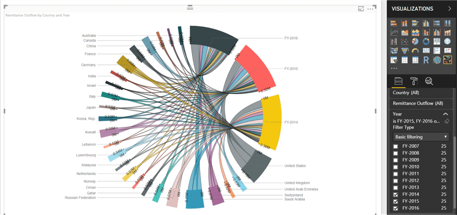
Step 9
Each legend has an axis associated with it. If you carefully study the yellow, red and black blocks, you can read 0M and 0.3M at different ends for example in the yellow block. This shows the total range of remittance. If you hover your mouse, you will also be able to see the value as shown below.

Step 10
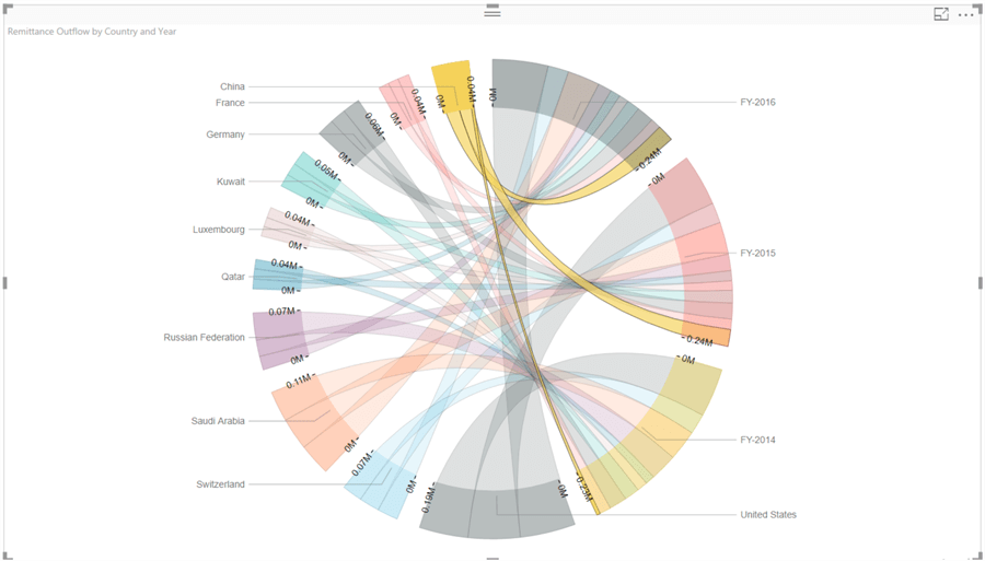
Let’s reduce the volume of relationships further by limiting the top 10 countries in the dataset. From the visual filters, and apply the filter on country fields as Top 10. This would change the diagram as shown below. It’s easier to make out that United States, Saudi Arabia, Russia and Switzerland have the maximum outward remittance in the world.

Step 11
Click on the United States block and it will highlight the connecting arcs. You can compare that the outward remittances are almost similar in all the three fiscal years. Also, its higher as compared to the rest of the world. This is also a common pattern for most of the other countries too.

Step 12
But this may not be true for all the countries. If you select China as shown below, you would find that the outward remittance from China in 2014 was very low compared to rest of years and compared to the rest of the world. This means outward remittances grew in the past 2 years, which could mean change in geo-politics or government policies. This could be an observation of interest for analysts. The breadth of the connection arcs and legend arcs is proportional to the relative values in the dataset, making it convenient to compare any value in the entire dataset just with a glance.
Step 13
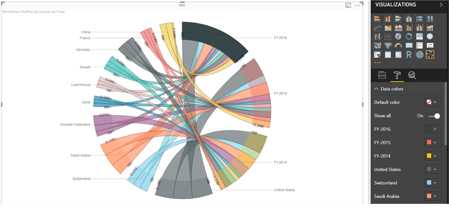
With such a large variety of colors overlaying over one another through connecting arcs, it can be confusing at times. Let’s say we intend to show only the top 3 countries in one color and rest all in one common color, to emphasize on the top 3 countries versus rest of the world. To customize the colors, navigate to the format options tab and set the Show All options to On in the data colors section. It will show all the colors used for each legend and provide the option to customize the same.
In this way, we can use a Chord diagram to study the inter-relationships and proportions in a matrix format dataset with Power BI Desktop.
Next Steps
- Try to use the World Inward Remittance dataset to perform the same exercise and derive new insights.
- Check out these other Power BI tips

Siddharth has more than 14 years of experience in the IT Industry, with more than a decade of experience in Business Intelligence and Analytics, for clients banking, logistics, government, Media Entertainment, products, life sciences and other domains. He has been a lead architect for a portfolio of 40+ apps, containing apps in web, mobile, BI, Analytics, data warehousing, reporting, collaboration, CMS, NoSQL and other technologies. He has several certifications and is a published author for online and print-media publications, as well as the MSDN Library.
In his present role, he remains responsible for architecture design, technology stack selection, infrastructure design, 3rd party products evaluation and procurement, and performance engineering. These applications use technologies like Elasticsearch / Lucene, MongoDB, SharePoint 2013 and 2010, jQuery-based framework like Highcharts and GoJS, SQL Server and the Microsoft Business Intelligence stack (SSIS, SSAS, SSRS, MDX, PowerPivot, PowerView), jQueryMobile, Bootstrap, iOS xCode framework, and many others.
- MSSQLTips Awards: Champion (100+ tips) – 2018 | Author of the Year – 2017 | Author Contender – 2016, 2018-2019
