By: Siddharth Mehta | Comments | Related: > Power BI Charts
Problem
In this era of big data, high voluminous data is available in almost every industry. The need to analyze high volumes of data can be solved in a variety of ways. But the method of visualizing a very large number of data points can be a tedious task. Consider a use-case where one is required to plot fifty thousand data points to visualize trends and patterns. The key challenges with this requirement is that it’s not easily visible to the human eye to distinguish so many points on a single plot. Secondly, with the limited screen space of any chart or graph, the visual itself would become unreadable with so many data points plotted on the graph. A scatterplot is generally the first graph of choice when it comes to plotting a very large number of data points and it suffers from the limitations mentioned above.
In this tip we will learn about how to solve these problems and plot high voluminous data points to derive some insights into trends or patterns or clusters on a high-volume dataset.
Solution
Power BI provides Hexbin Scatterplot Chart visualization in the Power BI Visuals Gallery to analyze and plot high voluminous data points.
Hexagonal binning is a technique that is commonly used in data science applications, to understand the spread of the dataset. It’s a richer alternative to a scatterplot chart. The technique of binning uses aggregation of data points as a method to group data points in a range or scale, that is represented by shapes like squares and hexagons (typically) and the color or saturation of these shapes represents the density of data points inside the range of these shapes. This makes it easier to identify clusters of data and can depict patterns or trends as well. The size of these shapes can be adjusted to analyze data at a micro or macro level.
In this tip we will use a hexbin scatterplot chart in Power BI Desktop using data from Adventure Works DW database. It is assumed that Power BI Desktop is already installed on the development machine, as well as the sample World Wide Importers DW database is hosted on SQL Server on the same machine.
Follow the steps below.
Step 1 - The first step is to download the hexbin scatterplot chart package from here, as it is not available by default in Power BI Desktop. This visualization is available free of cost.
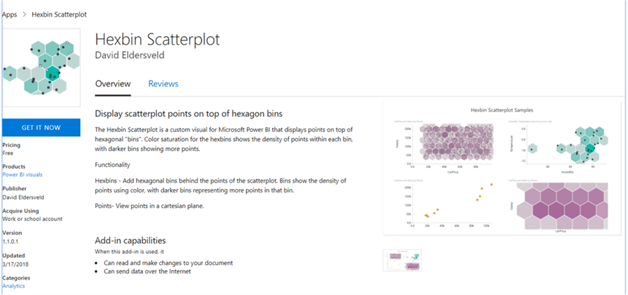
Step 2 - After downloading the file, open Power BI Desktop. You can click on the ellipsis in the visualization tab and select “Import from file” menu option. This will open a dialog box to select the visualization package file, to add the visualization in Power BI. Select the downloaded file and it should add the graph control to Power BI Desktop visualizations gallery.
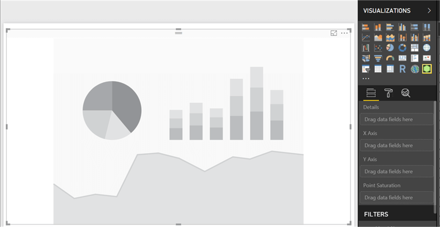
Step 3 - After the graph control is added to the report layout, enlarge the graph to occupy the entire available area on the report. After you have done this it would look as shown below.
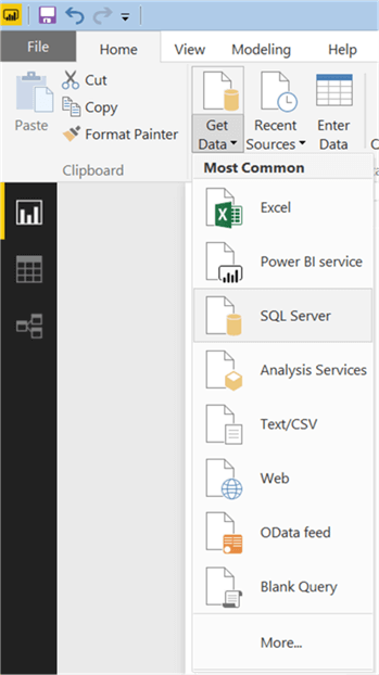
Step 4 - Now that we have the visualization, it is time to populate some data on which analysis can be performed for the problem in question. We need a dataset that has a lot of data points to plot, which can be easily found in any fact table in a data warehouse. We are going to use the Sales fact table that contains data of interest. Click on the Get Data menu and select SQL Server as shown below.
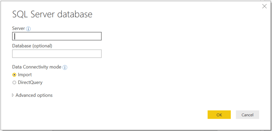
Step 5 - This will open a dialog box to provide server credentials. Provide the credentials and click OK.
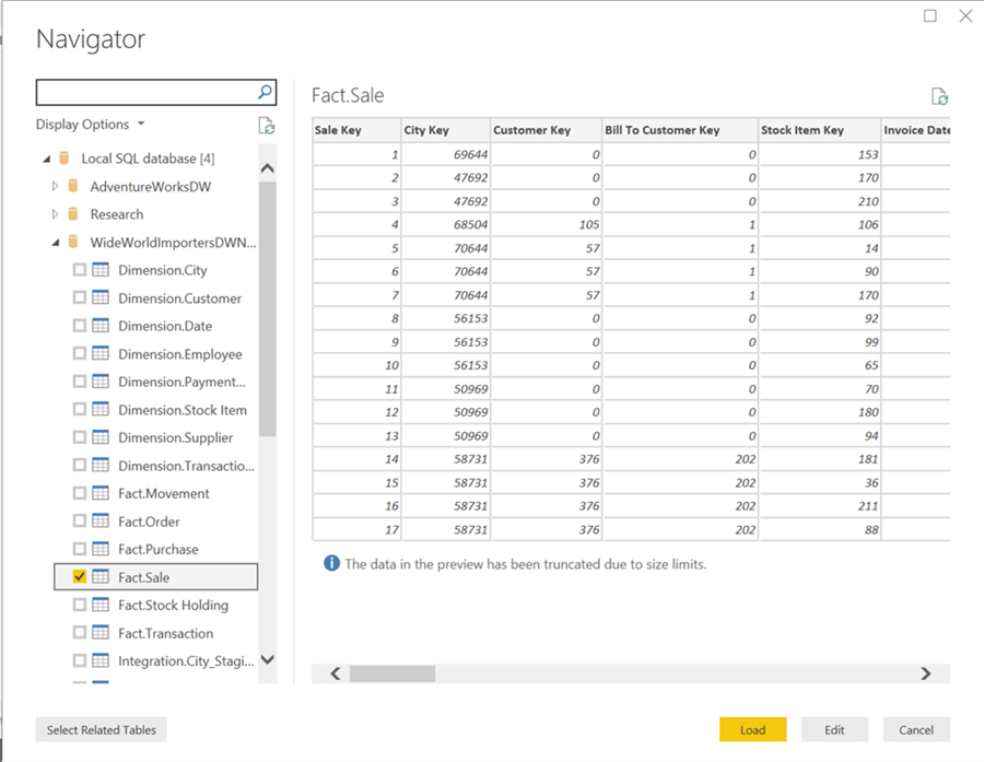
Step 6 - Select the tables from the database as shown below and click Load.
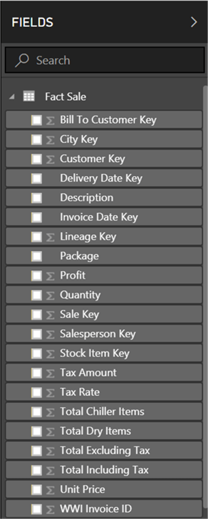
Step 7 - After loading is complete, the model should get created in Power BI Desktop as shown below.
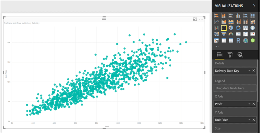
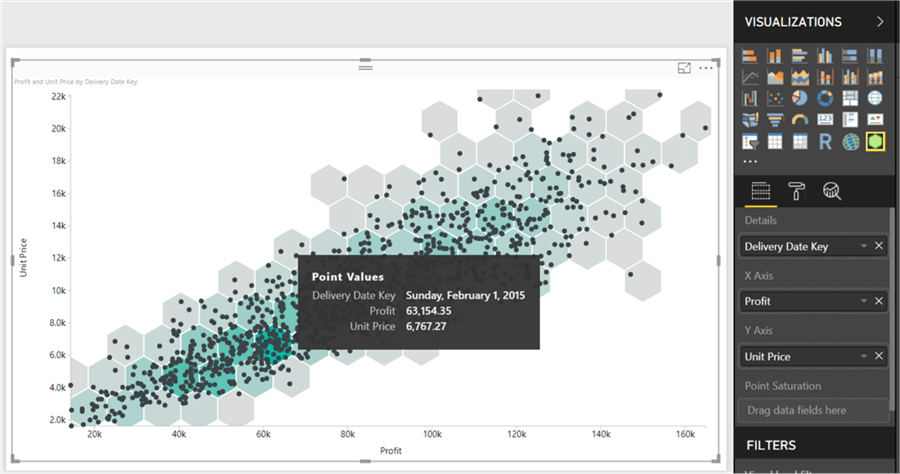
Step 8 - Let’s create a scatterplot chart first to understand and visualize the problem. From the visualization tab, select the add the scatterplot chart to the report layout. Once the chart is added, select it and add the data fields to the chart as show below. Add the Delivery Date Key to the Details section, Profit to X-axis and Unit Price to Y-axis. Once done, your scatterplot chart would look as shown below. As evident, it is hard to visualize these data points. The only aspect visible is that as profits increase, unit price also seems to be increasing.
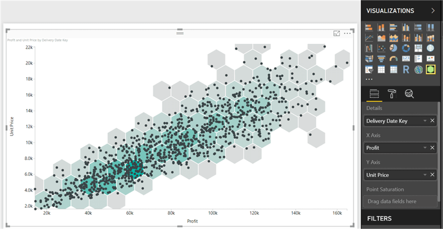
Step 9 - Now let's analyze this data on the hexbin scatterplot chart. We already added the hexbin chart to the report in Step 3. Add data to this chart as shown below. Add the Delivery Date Key to the Details section, Profit to X-axis and Unit Price to Y-axis. Once done, you should be able to see the chart as shown below. If you carefully look at the hexagonal bins, you would be able to see colored bins with varying levels of saturation, which shows the concentration of data points in respective hexagons.
Step 10 - If you hover your mouse on any data point, a tooltip would pop-up as shown below and it would show values of all the three data fields we have added to the chart. The tooltip makes it easier to identify a data point, but it is not the primary intention of analysis to analyze any given data point unless one is performing an outlier analysis. Generally, the intention of visualizing high-voluminous data points is to find clusters or patterns in data that would be of interest to analysts.
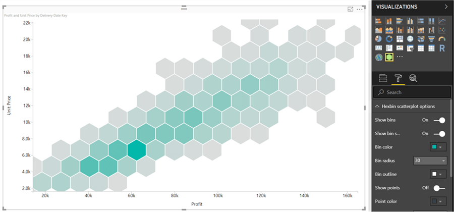
Step 11 - We need to take the data points out of the plot and concentrate on the color saturation of hexagons. The color saturation can be configured based on a aggregated value of a desired data field, if we do not want the saturation to be derived based on the concentration of data points in respective hexagons. For now, we will proceed with the default setting. To abstract the data points from this plot, select the options tab and change the value of Show Points menu option to Off as shown below. This setting would take off the data points from the plot as shown below. If you carefully analyze the hexagons now, you can easily find the hexagons and ranges from the scale of X and Y axis where most of the data is concentrated. In data science applications, typically for machine learning, the ranges where the maximum concentration of data lies can be a very valuable input for training diverse types of machine learning models.
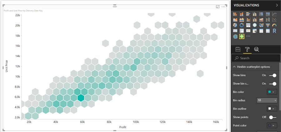
Step 12 - To analyze this data more minutely, you can change the Bin Radius property from its default value of 30 to its minimum value of 10. After this change, the plot would look as shown below. The number of hexagonal bins would increase as each bin is three times smaller than the bins shown in the plot shown above.
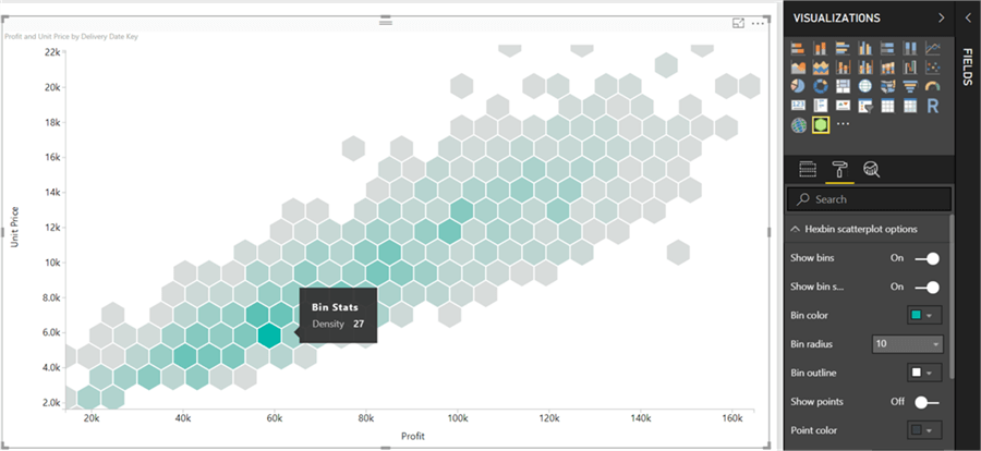
Step 13 - If you hover your mouse over any bin, you would find the number of data points in the range of the bin as a tooltip as shown below. Using this info from the tooltip, you can decide what is the range that would may want to select to extract clusters with maximum concentration of data.
Summary
A hexbin plot contains a variety of formatting and coloring options. For example, in the case where you do not want to visualize the bins and instead want to visualize data points only, which technically makes it a scatterplot again, you can do this by changing the value of the Show Bins property. In this way you can use this plot for dual purposes – as a scatterplot as well as a hexbin plot. And based on the intent of analysis, you can abstract data points or hexagons as required, making it easier to analyze high voluminous data on a single chart.
Next Steps
- Try experimenting with different volumes of dataset on hexbin scatterplot chart and trying out different formatting options to test the limits of this chart.
Learn more about Power BI in this 3 hour training course.
About the author
 Siddharth Mehta is an Associate Manager with Accenture in the Avanade Division focusing on Business Intelligence.
This author pledges the content of this article is based on professional experience and not AI generated.
View all my tips


