Problem
Detection of anomalies in quality control, financial frauds, web log analytics for intrusion detection, medical applications, etc. have immense importance as well as applications. Almost all the anomaly detection employs one or other form of outlier analysis. Exploratory data analysis is the fundamental step for machine learning models, and outlier analysis, identification and removal is very crucial to preparation of test datasets to train machine learning models. Outliers can be detected based on distance from other data points, cluster thresholds, density distribution and/or depth of data.
Data Science programming languages like R and Python have packages that can be used to develop programs that can develop plots to detect outlier visually as well as programmatically. This poses a hurdle to those who are not fluent with these programming languages or those who do not have access to sophisticated statistical software that provide a GUI based interface to perform sophisticated outlier analysis using standard data science methods for anomaly detection in datasets. In this tip, we will learn how to detect anomalies in datasets without any coding.
Solution
Microsoft provides Outliers Detection Chart visualization in the Power BI Visuals Gallery to detect anomalies by using different methods of outlier analysis.
To understand some of details employed by this chart and the concepts used in this tip, it requires some fundamentals of data science and statistics. For those who are new to the world of data science and statistics, below are some useful links that provide detailed explanation of these fundamentals.
- Z-Score – A z-score indicates how many standard deviations an element is from the mean. To understand z-score, you would need to learn mean, median, mode, Inter-quartile range (IQR), variance, standard deviation, probability distribution, normal distribution and standardization. You would find links to Wikipedia for all or most of these terms from the Z-score wiki page.
- Tukey’s method – You need to understand IQR and Box-plots to understand the logic employed by this method for outlier detection.
- Local Outlier Factor – This method uses the logic of comparing density of every data point with the density of given number of neighbors, to determine outliers. This method is capable of detecting outliers within a given local portion of the dataset, but may not be considered an outlier if scoped at the entire dataset level.
- Cook’s distance – This method measures the influence of each observation on the fitted response values. An observation with Cook’s distance larger than three times the mean Cook’s distance might get considered as an outlier. This is one of the standard methods of detecting outliers while analyzing training datasets for regression based models.
It takes time to understand these concepts clearly, if you have no background in data science or statistics. In case if you find these hard to understand, you can just follow the tip to understand the applications of these methods without any coding by using Power BI.
In this tip we will use Outliers Detection chart in Power BI Desktop using data from World Wide Importers DW database. It is assumed that Power BI Desktop is already installed on the development machine, as well as the sample World Wide Importers DW database is hosted on SQL Server on the same machine. Follow the steps as mentioned below.
1) First step is to download the Outliers Detection chart package, as it is not available by default in Power BI Desktop. This visualization is available from Microsoft free of cost.

2) After downloading the file, open Power BI Desktop. You can click on the ellipsis in the visualization tab and select “Import from file” menu option. This will open a dialog box to select the visualization package file, to add the visualization in Power BI. Select the downloaded file and it should add the graph control to Power BI Desktop visualizations gallery. After you add the package, it may ask to install the script visuals as shown below.

3) After enabling script visuals, you may be prompted to install certain R packages as shown below. Install these packages to enable this chart to function properly.

4) After the graph control is added to the report layout, enlarge the same to occupy the entire available area on the report. After you have done the same, it would look as shown below.

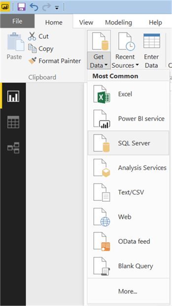
5) Now that we have the visualization, it is time to populate some data on which analysis can be performed for the problem in question. We need a dataset that has got a lot of data points to plot, which can be easily found in any fact table in a data warehouse. We are going to use the Sales fact table that contains data of interest. Click on the Get Data menu and select SQL Server as shown below.
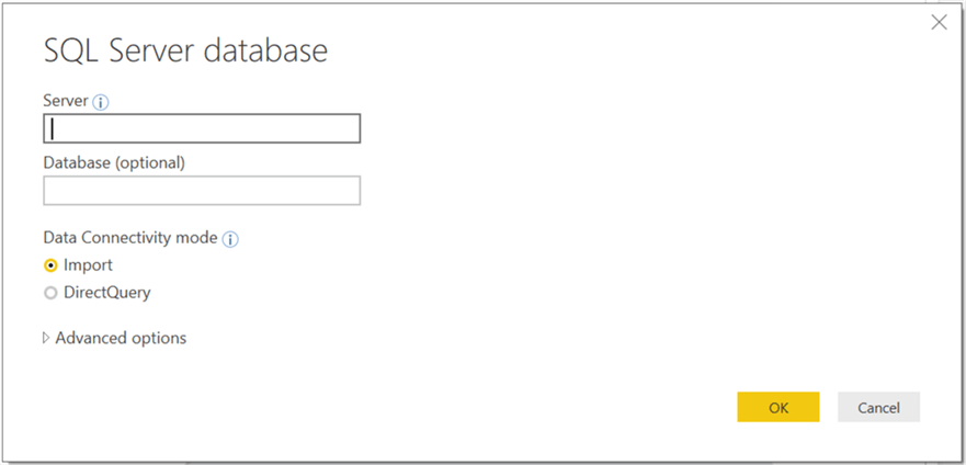
6) This will open a dialog box to provide server credentials. Provide the same as shown below and click OK.
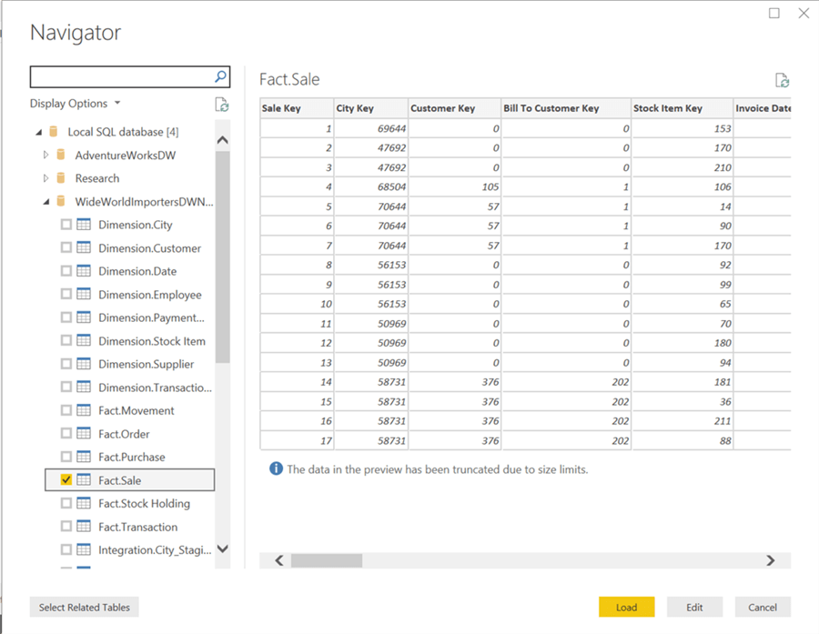
7) Select the tables from the database as shown below and click Load.
8) After the loading is complete, the model should get created in Power BI Desktop as shown below.

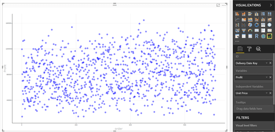
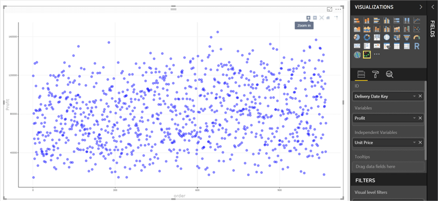
9) Let’s add data to this chart to populate it and start detecting outliers. For the same, add the fields as shown below to this chart. Add Unit Price field to Independent Variables section, Profit field to Variables section and Delivery Date Key field to ID section. This would bring up the chart as shown below.
10) Hover your mouse on any data point and you would be able to see the details in the tooltip as shown below.

11) If you hover your mouse on the top right section of the chart, you would find different options to work with the chart like zoom-in, zoom-out, reset axes etc.
12) Once you find an outlier you may want to focus your attention on data points of interest. For the same this chart allows to select range of interest by dragging your mouse and selecting the range, which would change the axes of the chart to the selected range.

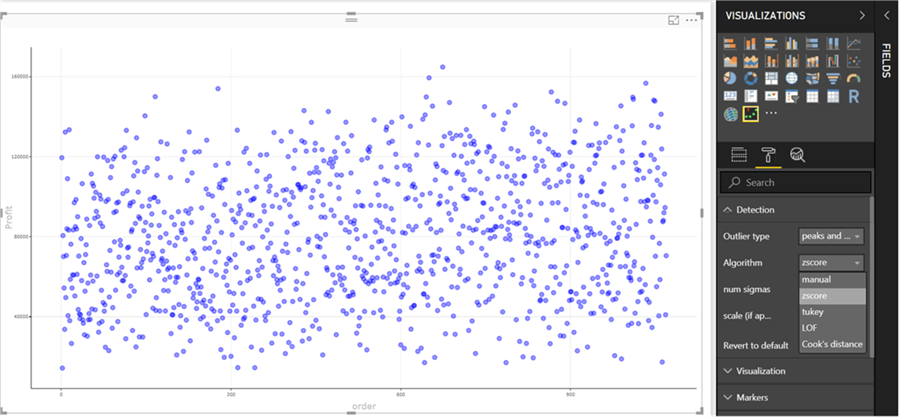
13) Now it is time to implement the outlier analysis methods discussed earlier. Navigate to the options menu, and under the detection section, you would find the list of outlier detection algorithms. We discussed four algorithms above, the one extra here is the manual mode when the user can manually set thresholds to visualize outliers. This mode is generally useful where you want to perform simple threshold cut-off criteria and classify data points that fall outside the thresholds as outliers.
14) Select Cooks distance as the algorithm and change the threshold value to 10. This would bring up the data in the chart as shown below. The points colored in red are the outliers as per the algorithm. You can hover your mouse on these points to check the details of these data points.

15) Change the algorithm as LOF and this would change the chart as shown below. Take a note that the outliers here may be different than the outliers in the previous step, as this algorithm finds outliers in a local space by comparing the density of data point with its neighbors. The number of neighbors is determined by the threshold and neighbor setting of the chart.

16) From the markers section, you can change the formatting of these data points as shown below.

17) There are three types of visualization available which can be used for this chart. We have been using the default scatterplot visualization. Let’s change the algorithm to Tukey and the visualization from the visualization section to box-plot as this algorithm uses the same method used by a box-plot to display outliers. Once you apply this setting the chart would change as shown below. Interesting point to note here is that if the IQR setting is 1.25, then there are no outliers as per this algorithm. If you hover your mouse over the chart, you would be able to see median and IQR ranges of the box-plot as well.

In this way, a variety of anomaly detection using outlier analysis can be performed without any coding in R or Python by using Outlier Detection chart in Power BI.
Next Steps
- Try experimenting with different algorithms and corresponding options in this chart with a variety of datasets for a variety of purpose to exploit the maximum potential of this chart.

Siddharth has more than 14 years of experience in the IT Industry, with more than a decade of experience in Business Intelligence and Analytics, for clients banking, logistics, government, Media Entertainment, products, life sciences and other domains. He has been a lead architect for a portfolio of 40+ apps, containing apps in web, mobile, BI, Analytics, data warehousing, reporting, collaboration, CMS, NoSQL and other technologies. He has several certifications and is a published author for online and print-media publications, as well as the MSDN Library.
In his present role, he remains responsible for architecture design, technology stack selection, infrastructure design, 3rd party products evaluation and procurement, and performance engineering. These applications use technologies like Elasticsearch / Lucene, MongoDB, SharePoint 2013 and 2010, jQuery-based framework like Highcharts and GoJS, SQL Server and the Microsoft Business Intelligence stack (SSIS, SSAS, SSRS, MDX, PowerPivot, PowerView), jQueryMobile, Bootstrap, iOS xCode framework, and many others.
- MSSQLTips Awards: Champion (100+ tips) – 2018 | Author of the Year – 2017 | Author Contender – 2016, 2018-2019
