Problem
There are many straight-forward approaches to visualizing numerical data and categorical data. In cases where the need is to visualize a spread of categorical data in numerical values or vice-versa, specialized approaches are required to visualize such data. A scatterplot is one of the first plots that gets considered when it comes to distribution analysis. Generally, scatterplots required numeric values on the X and Y axis, and it can use the color dimension to represent category, and any other numeric attribute to represent size of the plotted points. But it cannot support visualizing the spread of categorical data in more than two numeric fields at the same time. In this tip we will learn how to visualize data using categorical scatterplots in Power BI.
Solution
Swarmplot is a specialized visualization in Python Seaborn library, which can be used with the Python script control in Power BI to render categorical scatterplots.
In this tip, we will go through a series of steps to create a swarmplot and populate it with data using Python code. A local installation of Python along with Power BI would be required, which Power BI can use to render visualization from the Python script control.
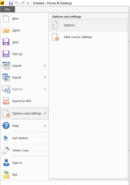
1) Python control in Power BI is a preview feature. Open the File menu and navigate to the Options menu item under Options and Settings menu as shown below.
2) Ensure that Python support preview feature is enabled, so that our Python control appears in the visualization gallery for use. Check the Python support option and click OK.

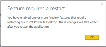
3) Click OK and restart Power BI as the changes do not take effect until restart.
4) Once you open Power BI you should be able to see the Python control in the visualization gallery as shown below.

5) Now we need some data to generate the swarmplot. Any dataset with categorical values would be suitable to create a swarmplot. Typical datasets used for machine learning are freely available on the web and are often used for exploratory data analysis. We will use one such dataset called Iris. This dataset is available on github at this url. Once you open this url, you can see the actual data as seen below. Once we click on the Raw button, the data would be accessible in CSV format. So, we would import the data in CSV format from Power BI.

6) Open Power BI Desktop, click on the Get Data menu, select CSV option as shown below. Paste the raw data url of the iris dataset and click on Open.

7) After Power BI parses the data, you would be able to see the data in Preview mode as shown below. Click on the Load button.

8) After the data is loaded, fields would appear in the fields list as shown below.

9) Check out the loaded data in the data view as shown below, to understand the values and structure of the data.

10) Let’s check if a scatterplot will allow us to render more than one numerical fields on the same axis and visualize categorical data in it. If you see the below visual, we have added two numeric fields on X-axis in the scatterplot and categorical data in the legends, but a scatterplot does not support such form of rendering as it’s not the purpose of a scatterplot here. We need a specialized approach to visualize this data.

11) Let’s use the Python visualization control now. Add this control on the report layout. You would receive the warning as shown below to execute scripts. Click Enable to add the control to the report layout.

12) Select the control first and then select all the fields as shown below.

13) With the selection of these fields, the Python control would add all these fields in a dataset. This code for this dataset can been seen in the script of the Python visual control as shown below.

14) Now we need to add the code in the Python control. Type the code below.
import pandas as pd
import seaborn as sns
import matplotlib.pyplot as plt
sns.set(style="whitegrid", palette="muted")
iris = pd.melt(dataset, "species", var_name="measurement")
sns.swarmplot(x="measurement", y="value", hue="species", palette=["r", "c", "y"], data=iris)
plt.show()
Before we execute the above code to generate swarmplot, let’s understand this code in detail. In the first three lines of code, we are importing the required libraries pandas, seaborn and matplotlib. Seaborn is the library which contains the function to generate swarmplot. Before we create this visualization, we are configuring the background of the visual in clear white format. The data that we loaded in our model is not in the required format to generate the plot. We need to pivot this data. This can be done using the melt function available in the pandas library. After applying the melt function, the data structure would get transformed as shown below.

15) In the second last line of the code, we are passing the required parameters to the swarmplot function and executing the function. On execution the plot is created but not rendered. So, in the last line of code, we are calling the show function of the matplotlib library to render the visualization in the control. Once the code is executed, the visualization gets rendered as shown below.

16) The above swarmplot renders a concise distribution of values for individual fields. This form of rendering would have been efficient if we have many fields and a wide spread of values on both extremes. Here we just have four fields to render, and the real estate of the graph is not getting used efficiently. So, lets reverse the X and Y dimension of the graph so the values are plotted more efficiently taking advantage of the available screen space. Change the below line of code in the Python script, where we are swapping the values of X and Y, and upon execution the swarmplot will get generated as shown below.
sns.swarmplot(x="measurement", y="value", hue="species", palette=["r", "c", "y"], data=iris)

If you analyze the visualization carefully, you can easily figure out the distribution of different species across different attributes. This form of distribution analysis in each field cannot be done using visuals like histograms or scatterplot which either applies binning techniques or encapsulates the details of individual data points or works only on numeric data. Swarmplot deals with the need of visualizing categorical data in numerical values in a very efficient manner. In this way, we can use Python scripts in Power BI to generate swarmplots and extract this analysis.
Next Steps
- Consider using swarmplot with datasets having a large number of categorical and numerical fields to exploit the true potential of swarmplot in visualizing distribution of data in these attributes.

Siddharth has more than 14 years of experience in the IT Industry, with more than a decade of experience in Business Intelligence and Analytics, for clients banking, logistics, government, Media Entertainment, products, life sciences and other domains. He has been a lead architect for a portfolio of 40+ apps, containing apps in web, mobile, BI, Analytics, data warehousing, reporting, collaboration, CMS, NoSQL and other technologies. He has several certifications and is a published author for online and print-media publications, as well as the MSDN Library.
In his present role, he remains responsible for architecture design, technology stack selection, infrastructure design, 3rd party products evaluation and procurement, and performance engineering. These applications use technologies like Elasticsearch / Lucene, MongoDB, SharePoint 2013 and 2010, jQuery-based framework like Highcharts and GoJS, SQL Server and the Microsoft Business Intelligence stack (SSIS, SSAS, SSRS, MDX, PowerPivot, PowerView), jQueryMobile, Bootstrap, iOS xCode framework, and many others.
- MSSQLTips Awards: Champion (100+ tips) – 2018 | Author of the Year – 2017 | Author Contender – 2016, 2018-2019
