By: Siddharth Mehta | Comments | Related: > Power BI Charts
Problem
The Power BI Team recently announced the support for Python as a preview feature. This opens a range of possibilities for Python professionals to use Power BI for different reporting and analytics purposes. With the support for Python in Power BI, a new Python control has been added which allows using Python scripts for generating visualizations using Python code, like the R visuals control. In this tip, we will learn using this control to generate a visualization using Python code.
Solution
Python scripts executed from the Python control and powered by Python installation of SQL Server enables creation of visualizations in Power BI.
In this tip, we will go through a series of steps to create a pie chart and populate it with data using Python code. Pie-charts are available out-of-box in Power BI too, and the objective is not to focus on creating a pie-chart, but to learn how to create visualizations using Python script in Power BI.
1) The Python support in Power BI is a preview feature as of the draft of this tip. Preview features are not enabled by default, so you may not see the Python control in your visualizations list. To verify the same, Open the Power BI Desktop, as look for Python control in the visualization gallery as shown below. You won't find the Python control in this list.
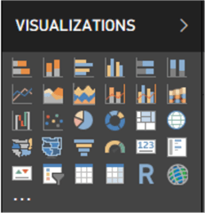
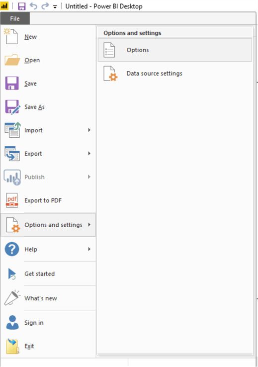
2) As the Python control is not available for use, as the preview features would not have been enabled, our first task is to activate preview features. Open File menu and navigate to Options menu item under Options and Settings menu as shown below.
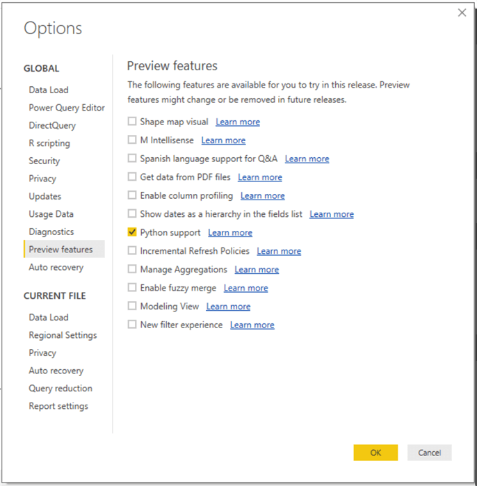
3) Ensure that Python support preview feature is enabled, so that our Python control appears in the visualization gallery for use. Check the Python support option and click OK.
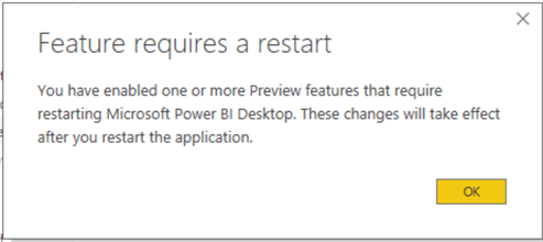
4) Click OK and restart Power BI as the changes do not take effect until restart.
5) Once you open Power BI you should be able to see the Python control in the visualization gallery as shown below.
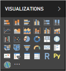
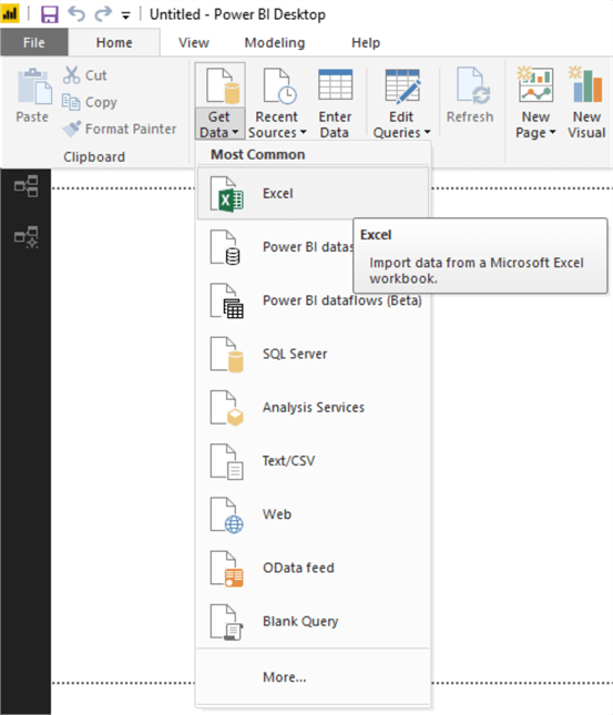
6) Now that we have the Python control available for use, let's get some data for use with this control. Click on Get Data menu item and select Excel as the data source. You can use any data source that you may have too. For demonstration, I will be using a sample Excel file.
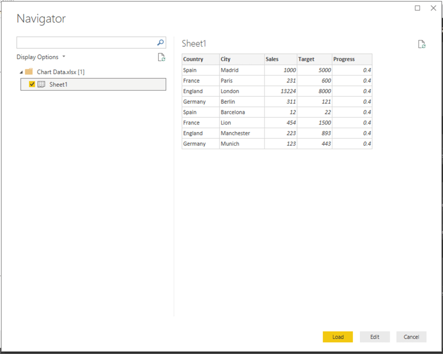
7) Select any data file that you may have. In this case I have selected the file and it looks as shown below in preview mode. It has got the following fields: Country, City, Sales, Target. And Progress. Create any such file of your interest if you don't have one already and import data from that file into the Power BI.
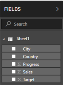
8) Once the data is loaded, fields would appear in the fields list as shown below.
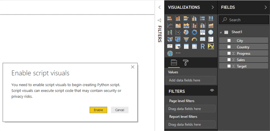
9) Now that the data is ready, it's time to use the Python visualization control. To add this control to the report layout, click on the control. You would receive the warning as shown below, that the control requires to execute scripts, and you are okay to enable this feature. Click Enable and the control should get added to the report layout.
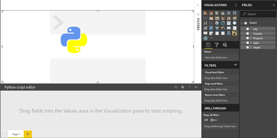
10) Once the control has been added to the report layout, it would look as shown below. When the control is selected, you would be able to see the Python Script Editor at the bottom section of the layout window. Python control won't allow to start adding script to this control until data fields have been added to this control.
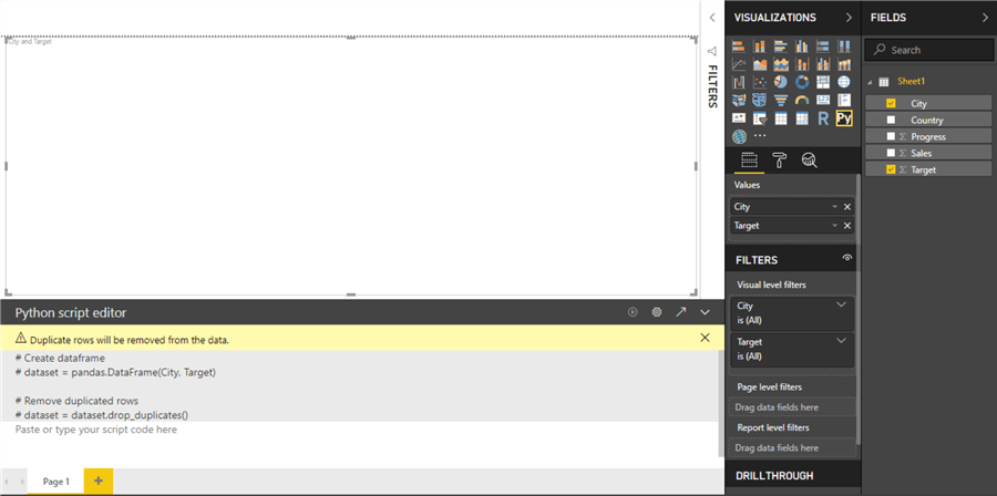
11) Select City and Target fields and it would get added to the Values section of the control as shown below. Now the scripting window is open for editing. If you carefully look at this window, you would find that a pandas data frame has been created using the fields we selected, and the code to drop duplicates has also been added automatically. This data frame's name is dataset and is available for use in the Python code.
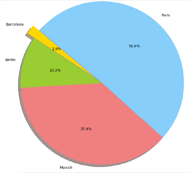
12) Now we are ready to develop a Python script and generate a visualization. Type the below code in the script. Matplotlib is a popular and built-in library available with Python code. In this code we are importing this library in our script, so we can use the functions to create a pie-chart. In the next line, we are extracting few rows from specific columns of the data frame that got created when we selected the fields. Then we are setting the properties like color and size, and finally executing the pie function from the matplotlib library with the required input parameters to create a pie chart. To execute this code, click on the execute button (2nd from left in the top-right corner of script editor window).
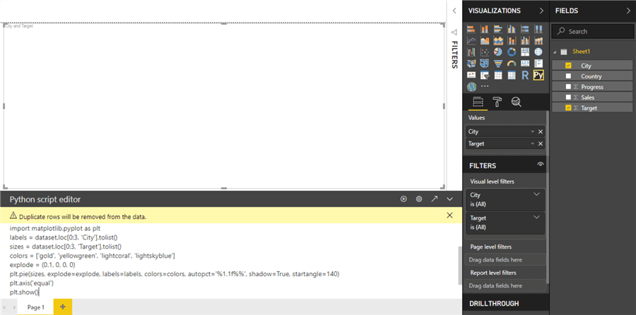
import matplotlib.pyplot as plt
labels = dataset.loc[0:3, 'City'].tolist()
sizes = dataset.loc[0:3, 'Target'].tolist()
colors = ['gold', 'yellowgreen', 'lightcoral', 'lightskyblue']
explode = (0.1, 0, 0, 0)
plt.pie(sizes, explode=explode, labels=labels, colors=colors, autopct='%1.1f%%', shadow=True, startangle=140)

plt.axis('equal')
plt.show()
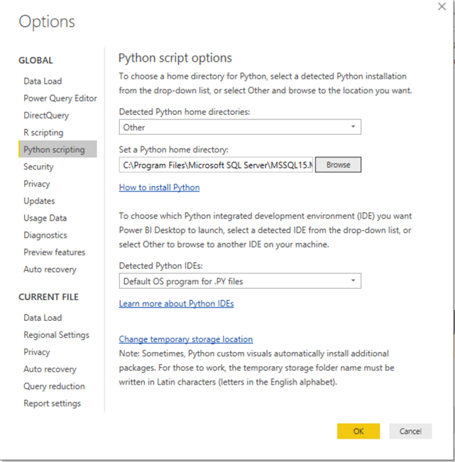
13) Once the code is executed, it will attempt to make a connection to the Python environment. If your environment is not already pointing to any Python environment, the code will fail with an error. This environment path can be found in the File > Options and Settings > Options > Python Scripting menu item. As you can see below, the Python Home Directory points to the Python_Services directory under Microsoft SQL Server database engine installation. You can point to any installation of Python accessible to you.
14) Once the code executes successfully, you would be able to see the pie chart in the Python visualization control. Also, you can see that the data in the pie like labels and values are the ones from the file with we imported in Power BI. This means that the visualization is using the data we fed to it.
In this way, we can use Python scripts in Power BI to generate any visualization that Power BI supports.
Next Steps
- Consider modifying the properties of the pie-chart in the pie function to improve the aesthetics of the visual like magnifying the labels, adding titles, adding color legends, etc.
- Check out all of the Power BI tips.
Learn more about Power BI in this 3 hour training course.
About the author
 Siddharth Mehta is an Associate Manager with Accenture in the Avanade Division focusing on Business Intelligence.
This author pledges the content of this article is based on professional experience and not AI generated.
View all my tips


