Problem
Data distributions are generally numeric and aggregable in nature. Aggregations or roll-ups of data implicitly or explicitly contain a hierarchy. When a distribution is analyzed using visualizations, the primary choices are a pie-chart, bar-chart, column-chart and other descriptive charts. Some of these charts employ drill-down features to display values broken-down by levels, which is an effective means of displaying aggregate values by levels. The shortcoming in this approach is that only one level of the aggregation is visible at a time, and the user is often required to navigate back and forth between different levels of the chart to visualize rolled-up values. This can be alleviated by presenting aggregated values at different levels in the form of a tree. In this tip we will learn about one such visualization in Power BI to analyze hierarchical distributions using a tree-based approach.
Solution
A pie-chart tree is a custom visualization in the Power BI visuals gallery, which can be used to analyze rolled-up values in Power BI using a tree-based approach. In this tip, we will develop one such chart of raw data to auto-generate rolled up values and analyze them in a tree-based approach. It is assumed that a local installation of Power BI is already available on the development machine.
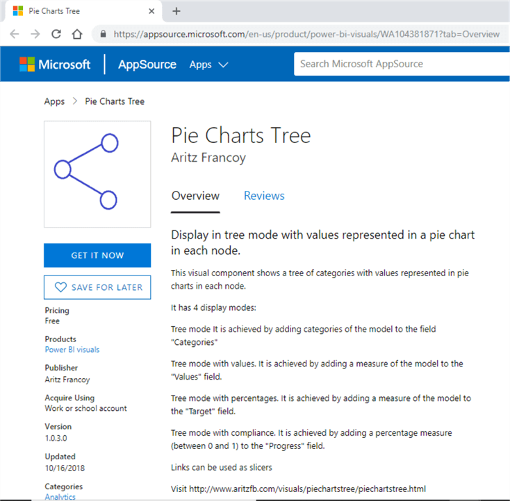
The first step is to install the Pie Chart Tree control from the Power BI visuals gallery. This is a free user control that you can download on your local machine from this URL. The home page of this visual looks as shown below. Consider reading more about the features, description and download this visual on the same machine on which Power BI is installed.
After the visual is downloaded, open Power BI and from the visuals gallery, click on ellipsis and select Import File. You would be prompted to select the visuals file. Select the Pie Charts Tree visual that we downloaded in the previous step. Once you do that, this visual will get added to your visualization gallery as shown below.

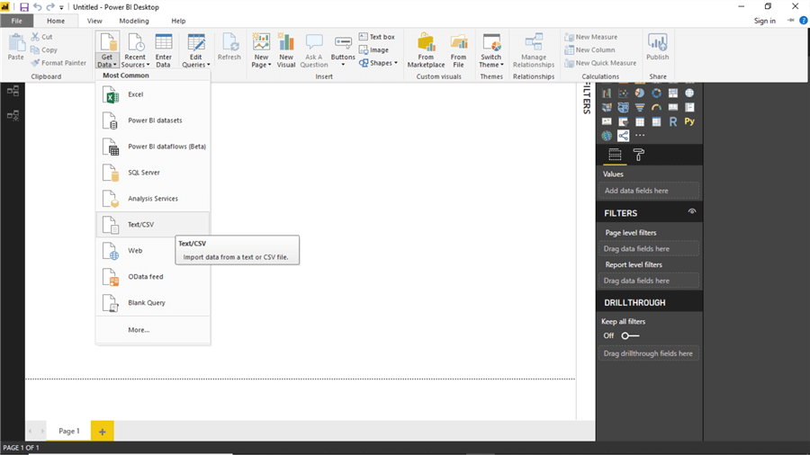
Now the we have the visualization available for use, the next step is to import data in Power BI that can be used with this visualization. We need data that should have a few mandatory attributes like some categorical values, actual and target to measure some progress. I have created a CSV file to import this data in Power BI. You can use any data source you may have that contains these types of attributes. As in this case, we have data in CSV format, we will go to the Get Data menu and select Text/CSV to import data from the csv file-based data source.
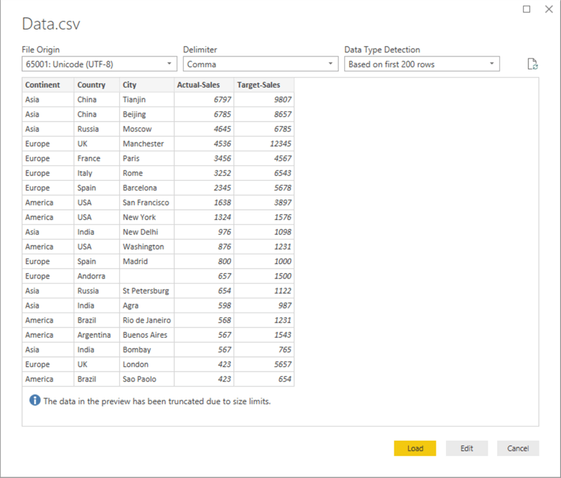
Select the data file and you will be shown data in preview mode, which in this case looks as shown below. Here we have Continent, County and City fields which forms a categorical hierarchy. Each record has an actual and target sales value associated with it. This forms distribution of sales by geography as a use-case, which can be analyzed using any descriptive charts. Analyzing this data using a pie-chart would need several pie charts or would need a lot of drill-down and drill-up navigation for distribution analysis. In this tip, we will look at how the pie charts tree control can add the required power to a simple pie chart and make it usable for this type of analysis. After previewing your data, click on Load button to load this data into Power BI.
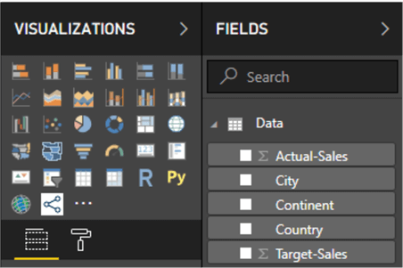
Once the data model with data is loaded in Power BI, it will look as shown below in the fields list. If you observe carefully, the actual and target sales fields are auto-detected as numeric by Power BI and have been aggregated in the model. This solves one task for us where we need the data to be aggregated.
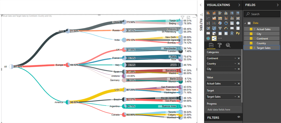
It’s now time to add pie charts tree visualization to the report layout. Click on the visualization and enlarge it to occupy the available screen-space so that the visualization is big-enough to read granular details that will be shown on the layout.

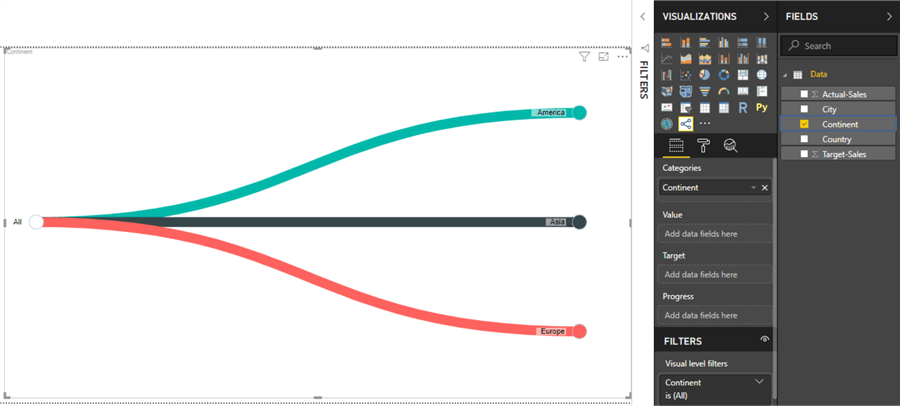
Drag the Continent field from the categories section of the visualization properties, and you will see the visual as shown below. You will find three branches from a top-level item named "All". This visual has already filtered distinct continent names in the data and tied them under a root node. We did not have to do any data modeling to make it appear this way, which is an advantage.
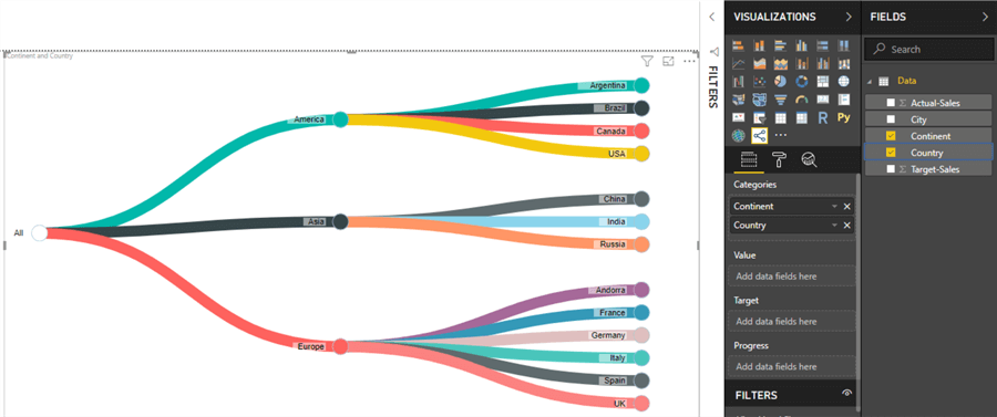
Now add the Country field right below the Continent and you will see that more branches are added to the Continent nodes as per the data. Each branch / node is given a different color and the names of the Country appears as labels on the node, which is the same as Continents.
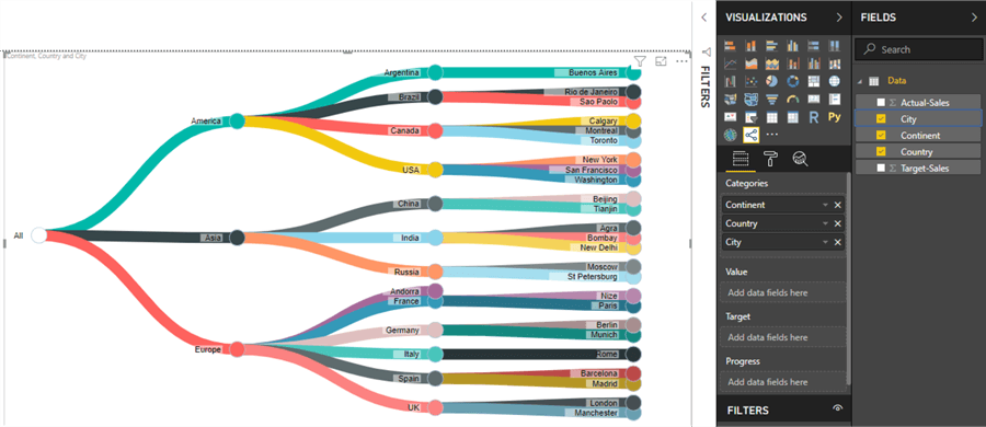
Add City under the Country field to make the hierarchy complete and the visualization will appear as shown below. Now the visualization has started looking very dense with a lot of details. This brings up one fact that if we continue to add more levels of hierarchy, it may become unreadable or hard to analyze at the least.
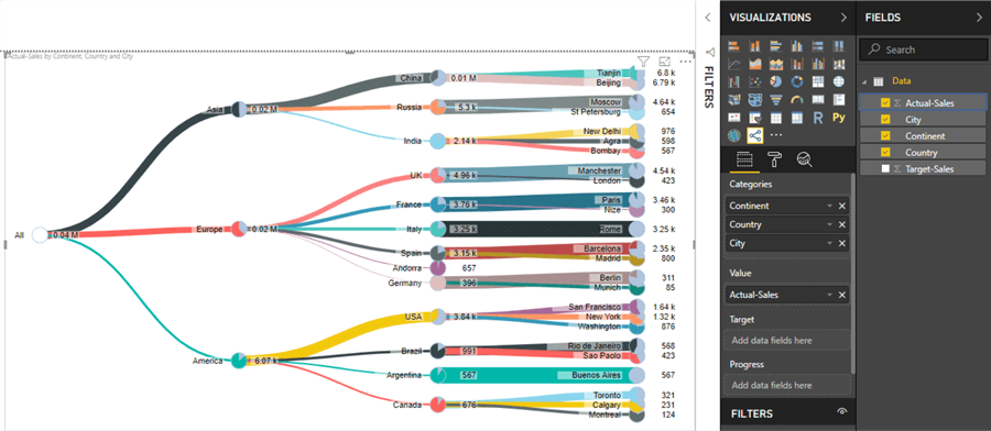
Add Actual-Sales field to the value section of the visual. In response to that, you will find the actual sales values added at every level – All, Continent, Country, and City. Also, it is properly allocating units like thousands "k", and millions "M". The good part is that we did no data modeling or processing, so the data gets properly rolled-up or gets proper units assigned to it. This comes out-of-box from the visualization.
If we want to analyze progress, we need to add Target-Sales to the target property of the visual as shown below. Once you do that, you will see that the values change to percentage. The calculation represented here is actual vs. target percentage, which in other words can be also called progress percentage. If you have this calculation available instead of actual and target values, you can assign a progress field to the progress property of the visual. Not only the progress field is shown, but it has been rolled-up at a category level too.
If you add Tianjin and Beijing percentages, it will not add up to 100% as these percentages are not calculated level-wise. But if you calculate average of Tianjin and Beijing, the value will be equal to the percentage shown for China, and China is the roll-up level of these cities. The cumulative average distribution of City level makes up the Country level. In the same way, if you sum up Country level, it will not make 100%, but if you find average of all Country levels, you will find the value represented in the All level. This form of roll-up and distribution is appropriate for distribution analysis in hierarchical data.
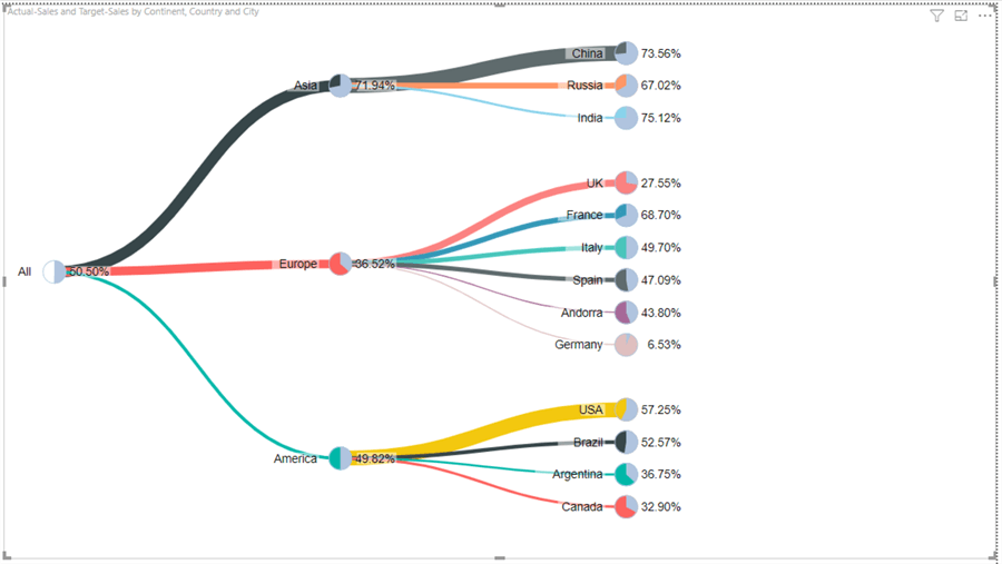
Now that we understand how this visual works mathematically, it’s time to address the aesthetic side of the visualization. The nodes in this visual are toggleable, so if you click at any level, it will expand or collapse as shown below. This helps to reduce the clutter that would typically happen when the data has a deep hierarchy with lots of data points.
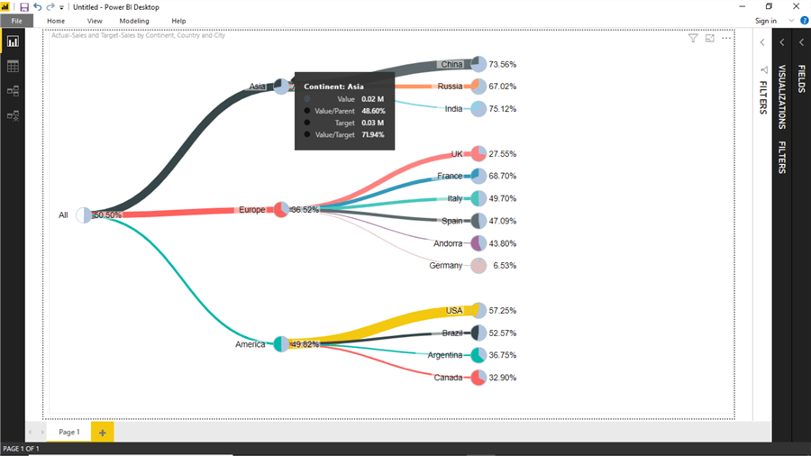
In cases, where the visualization becomes quite dense and one needs to look at individual data points of a node, one can hover the mouse over the desired data point and the values will appear as a pop-up as shown below.
There are several formatting related properties of this visual, which can be used to control the format of the visualization. For example, if we want to increase the size of each pie, we can increase the arc radius to make the pie appear large on each node, as shown below. Also, there are options to customize color schemes.

In this way, the pie chart tree control can be used to navigate and analyze hierarchical distribution data for preliminary distribution analysis.
Next Steps
- Consider optimizing and exploring the visual properties of this control to adjust the aesthetic of the visualization as per the theme of the report.
- Check out these other Power BI tips

Siddharth has more than 14 years of experience in the IT Industry, with more than a decade of experience in Business Intelligence and Analytics, for clients banking, logistics, government, Media Entertainment, products, life sciences and other domains. He has been a lead architect for a portfolio of 40+ apps, containing apps in web, mobile, BI, Analytics, data warehousing, reporting, collaboration, CMS, NoSQL and other technologies. He has several certifications and is a published author for online and print-media publications, as well as the MSDN Library.
In his present role, he remains responsible for architecture design, technology stack selection, infrastructure design, 3rd party products evaluation and procurement, and performance engineering. These applications use technologies like Elasticsearch / Lucene, MongoDB, SharePoint 2013 and 2010, jQuery-based framework like Highcharts and GoJS, SQL Server and the Microsoft Business Intelligence stack (SSIS, SSAS, SSRS, MDX, PowerPivot, PowerView), jQueryMobile, Bootstrap, iOS xCode framework, and many others.
- MSSQLTips Awards: Champion (100+ tips) – 2018 | Author of the Year – 2017 | Author Contender – 2016, 2018-2019
