Problem
Time is an attribute that can be associated with almost any data element. Almost every analysis use-case directly or indirectly, sooner or later involves time as an attribute or dimension for analysis. Specialized visuals are often employed for analyzing and reporting data over time as the primary attribute. Gantt chart, Stream chart, etc. are examples of such visualizations. Typical use-cases that need detailed analysis of time-series data are project planning, merchandise tracking, event monitoring, etc. In this tip we will learn the use of a visualization in Power BI to support time series analysis to support these types of use-cases.
Solution
The Power BI visuals gallery provides a timeline visual which can be used for time series analysis.
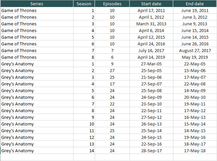
Typically, the general impression of time series analysis is usage of visuals like a Gantt chart and datasets like project planning tasks and stock movement. But there are some atypical use-cases of time series analysis like comparative analysis of width and progression of data over time. For this we would need a dataset that has such characteristics. In this tip we are going to perform time series analysis on a dataset. To make the exercise interesting, we will be performing analysis on the dataset containing details of two very popular TV series – Game of Throne’s and Grey’s Anatomy. The dataset looks as shown below.
As simple as this dataset looks, there is still some time series analysis that can be done on this dataset. It is assumed that Power BI is installed on the development machine. To start with the time series analysis, we would be using the “as Timeline” chart.

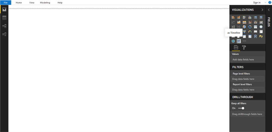
Once you have downloaded this chart, open Power BI Desktop. From the visual’s gallery, click on the ellipsis to import a custom visual. Once the dialog box opens to import the visual, select the downloaded visual and add it to the gallery. Upon successful import, the control should look as shown below.
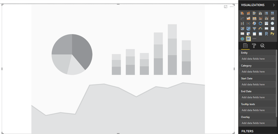
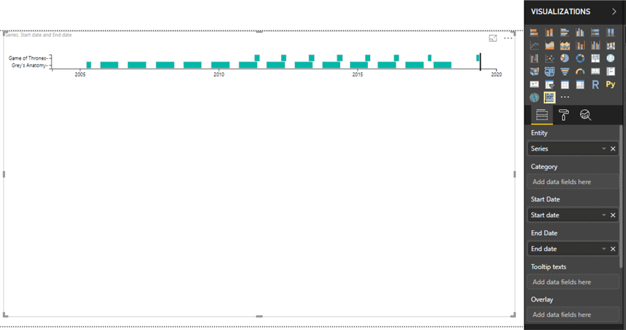
Now that we have the visual available for use, let’s add this visual to the gallery and enlarge the visual to occupy the full layout of the screen space.
To populate the visual, we need the data that we saw earlier. Click on the Get Data menu item from the Home menu, select the appropriate data source, and point to the corresponding table or file. Before importing the data, preview it and make sure that the dataset has all the desired attributes. It’s very important to ensure that the date fields are imported correctly. If the resulting data type is not date, then you would not be able to build the date hierarchy using the date fields, which can cause the visual to not render the visualization.

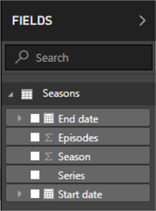
Once the data is imported, the field list would look like the image shown below.
Add the fields to the chart as shown below. We need both the series on the Y-axis and timeline on the X-axis. So, add the series field in the Entity section and Start Date as well as End Date in the relevant section. Once you add it, the visual would appear as shown below. You can see some bars on the visual, but its not clear enough to perform any time series analysis.
Navigate to the format section and change the element height from 15 to 100 so that the bars appear clearly on the visual. The first derivation you can make from the visual is that the Grey’s Anatomy seasons are longer than the Game of Throne’s seasons. Another derivation we can make out is that Game of Thrones seasons always started towards the end of the Grey’s Anatomy season. It looks more than a coincidence for 8 consecutive years. Though it’s famously said in statistics that correlation does not mean causation. But it’s an interesting fact that you can derive from the visual.

The color of the bars is the same, which can make is hard to visualize the difference in categories if the data is voluminous. Add the Series field to Category as well, and that would add individual colors to each series as shown below.

This visual does not clearly show the progression over time for individual seasons of the series. Add seasons to the Category section, and the visual would look as shown below. Now the visual clearly shows the progression of seasons in each series over time. The progression of seasons also shows that Grey’s Anatomy seasons had almost the same number of breaks and same duration for almost every season. If you visually analyze the distance between seasons, you can make out that the distance between last two seasons of Game of Thrones seasons is more than the rest of seasons. The reason is that no season of Game of Thrones was aired in 2018, which becomes evident from the visual.
Another derivation you can make is that the first season of Grey’s Anatomy was very short comparatively to other seasons, and these seasons are longer than Game of Thrones seasons. The black vertical line at the end of the visual shows today’s date. We can switch off this line by navigating to format menu and turning off the today’s bar indicator from behavior menu.

You can view the tooltip by hovering the mouse over any data point, and you would be able to see the attributes in the tooltip as shown below.

The seasons represented in the visual does not show the number of episodes. You can overlay data on the top of the data points. This can be very useful in cases when one is looking for a specific data point. To overlay data, add the episodes field in the Overlay section, and the episodes would be shown on each data point as shown below.

Finally, if you analyze the X-axis only 4 data points are shown in a duration of 15 years. In time series analysis, at times it becomes necessary that the axis is comprehensive. Change the X-axis labels to 15 from the setting of 5, which will change the visual as shown below.

In this way, you can use the “as Timeline” visual for different types of time series analysis and make quick derivations from the data.
Next Steps
- Consider trying out this visual to perform the time series analysis and explore a variety of configuration options to fine tune the visual to make it suit the requirements.

Siddharth has more than 14 years of experience in the IT Industry, with more than a decade of experience in Business Intelligence and Analytics, for clients banking, logistics, government, Media Entertainment, products, life sciences and other domains. He has been a lead architect for a portfolio of 40+ apps, containing apps in web, mobile, BI, Analytics, data warehousing, reporting, collaboration, CMS, NoSQL and other technologies. He has several certifications and is a published author for online and print-media publications, as well as the MSDN Library.
In his present role, he remains responsible for architecture design, technology stack selection, infrastructure design, 3rd party products evaluation and procurement, and performance engineering. These applications use technologies like Elasticsearch / Lucene, MongoDB, SharePoint 2013 and 2010, jQuery-based framework like Highcharts and GoJS, SQL Server and the Microsoft Business Intelligence stack (SSIS, SSAS, SSRS, MDX, PowerPivot, PowerView), jQueryMobile, Bootstrap, iOS xCode framework, and many others.
- MSSQLTips Awards: Champion (100+ tips) – 2018 | Author of the Year – 2017 | Author Contender – 2016, 2018-2019

I don’t see the app anymore on Microsoft’s site. Did it go away?