Problem
"The higher up the organizational chart you go, the more pictures you need in the report," Kellenberger jokes [1]. We, these days, widely use charts to present data in reports. SQL Server Reporting Services (SSRS) provides many visual elements [2] to interpret data. Choosing an appropriate chart type can effectively and precisely convey information to audiences. Charts that are hard to read waste time and create extra work for audiences. How can we choose appropriate chart types for our SSRS reports, and how can we add these visual aids to the reports? Additionally, report viewers may want to see data presented in charts in different orders; so, how can we make the sorting option interactive?
Solution
This article presents step-by-step instructions for the production of a practical SSRS report with charts and interactive buttons. The report should look like Figure 1, which has a bar chart, ten sparklines, and two tables. We use Dr. Abela’s chart chooser [3,4] to select appropriate charts; we then add these charts to the report [5]. To dynamically change the sort order of data in the charts and table, we add interactive sort buttons to the report [6].
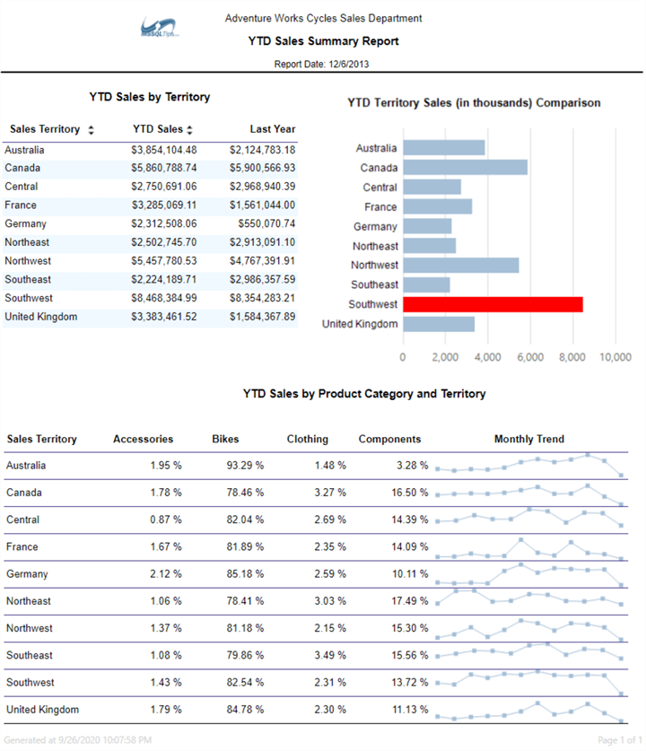
Figure 1 The SSRS Report with Charts and Tables
After we add interactive sort buttons to the column headers and view the report, arrow icons appear beside these header titles. The report always sorts data in ascending order when we first time click on a sort button. We can toggle between ascending and descending order for rows in the table and bars in the chart by clicking on the sort buttons again. As shown in Figure 2, the sales amount in both the chart and table are in the descending order of the YTD sales amount when we click the second time on the arrow icons beside the column header "YTD Sales."
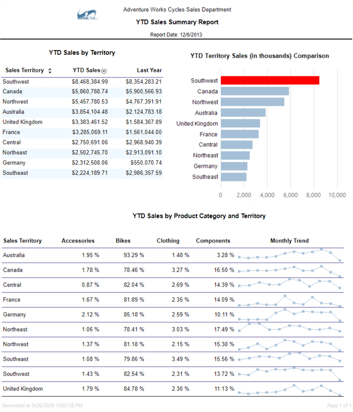
Figure 2 Interactive Sorting for the SSRS Report
The sales data presented in this sample report is from the fake company called Adventure Works Cycles. We can find the data in the Microsoft sample database "AdventureWorksDW2019.bak" [7]. The report satisfies the following requirements:
- The company divides customers into ten segments (i.e., sales territories) based on location. Sales managers want to compare rep's performance in these segments.
- The products fall into four categories. Customer buying behaviors may vary from territory to territory. These managers want to know the proportion of sales received from each product category in a territory.
- The trends in sales data can imply both opportunities and potential problems. The company wants to monitor monthly sales trends.
We organize the remaining sections of this article as follows: Section 1 briefly introduces chart selection techniques and presents a three-step process to choose charts. Then, Section 2 covers step-by-step instructions to produce a practical report with charts and tables. The section also demonstrates a technique to highlight the maximum data point in a series. Next, in Section 3, we add interactive sort buttons to allow viewers to change the sort order of data in both the chart and table.
The author created this report using Microsoft Visual Studio Community 2019 on Windows 10 Home 10.0 <X64> and deployed the report to SQL Server 2019 Reporting Services (Version 15.0.7243.37714). The DBMS is Microsoft SQL Server 2019 Developer Edition (64-bit).
1 – Selecting Charts for SSRS Reports
We may use these two terms – graph and chart – interchangeably; however, there is a difference between them. A graph illustrates relationships in data while a chart presents information using more broad data visualization techniques such as graphs, diagrams, and tables. As Blaettler claims in her article: All graphs are charts, but not all charts are graphs [8]. We accept her point and use the term "chart" to represent all these visual elements, as shown in Figure 4, provided in SSRS.
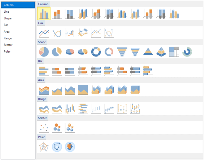
Figure 3 Chart Types in SSRS
1.1 Adopting Best Practices of Chart Selection
Of these chart types in SSRS, we often use only five primary chart forms: pie charts, bar charts, column charts, line charts, and dot charts [9]. Pie charts are the least practical because differences in a pie chart's angles may not be as apparent as differences in bars' length in a bar chart or column chart. Many types provided in SSRS are variations of these forms. Using charts in reports, we always need to determine what charts we should select. We should adopt some best practices to select and design charts. Sometimes we have to be ruthless in our judgments. We must put our audience's best interest first.
We first should delve into the data and discover what knowledge we want to convey to audiences through charts. We then categorize the knowledge and, consequently, determine a chart type. We should always choose charts to fit the information we want to illustrate. Moreover, we should ensure that audiences' understanding of the chosen charts should be the same as ours. As a result, before determining a chart for inclusion in our reports, we should know the data and audiences.
Tufte, a pioneering expert on data visualization, points out that we should use charts to induce viewers to think about the insight in the data rather than the report developer's skills [10]. This advice reminds us that we should prefer to choose primary chart forms to make the charts concise. We should resist any temptation to choose a flashy chart or decorate a chart. If a 2-D chart can tell stories in data, for example, we do not need to use a 3-D chart. Any bit of graphic ink added to the chart should present unique information in data. We should avoid any redundant or irrelative bits of ink that may mislead or confuse audiences. However, to make a chart reasonable and clear, we may carefully add descriptions, colors, or other kinds of decorations.
We should not intend to mislead audiences and misrepresent the data. Either intentionally or unintentionally, the misleading of audiences in data visualization can be categorized in four primary ways: hiding relevant data, presenting too much data, distorting the data presentation, and providing inaccurate descriptions [11]. A chart should tell a complete and accurate story to all viewers. Intentionally misleading viewers is unethical. We should strengthen education and practices in the area of data visualization to prevent deceptive practices.
1.2 Selecting Charts for SSRS Reports
Since the SSRS designer provides many chart types, some people may use flashy elements to improve the report’s appearance. When the selected charts do not fit knowledge in the data, we unintentionally deceive viewers. Numbers do not lie, but charts may illustrate those numbers in a way that skews information in data. Therefore, to avoid bias in chart selection, we should use a systematic approach to select a chart. Dr. Abela created a chart chooser diagram [3], shown in Figure 4. When working on BI projects, for example, creating SSRS reports and Power BI reports, we frequently need to present information in chart forms. We can add this diagram to our toolbox and use it to select charts for our BI projects.
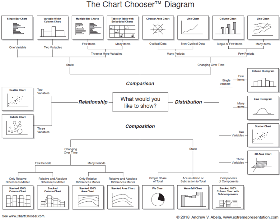
Figure 4 Copyright Dr. Andrew V. Abela, 2020, www.ExtremePresentation.com
When including charts in our reports to help interpret data, as the chart chooser diagram illustrated, we should first study the data to discover what we want to show viewers. Next, we must determine the tasks that the charts need to achieve. As a rule of thumb, we use one chart to perform one task. Dr. Abela arranges all tasks accomplished by charts into four categories: Comparison, Distribution, Composition, and Relationship [4]. After putting tasks into these categories, we then follow the lines in the diagram to choose charts. We can conclude a three-step chart selection process to choose charts: (1) discovering knowledge in data, (2) determining tasks for charts, and (3) choosing charts.
1.2.1 Discovering Knowledge in Data
The first step in the chart selection process is to determine what we want to show audiences. We also expect audiences to receive the same message as the one we convey through the charts. Suppose we work in Adventure Works Cycles as data analysts, and we are responsible for designing the charts. When we have sales data from different territories, we run the following SQL statements to look at the sales revenues in each sales territory in the year 2013:
SELECT ST.Name, SUM(DET.UnitPrice * DET.OrderQty) AS Sales
FROM Sales.SalesOrderHeaderSOH
INNER JOIN Sales.SalesOrderDetail DET ON SOH.SalesOrderID = DET.SalesOrderID
INNER JOIN Sales.SalesTerritory ST ON SOH.TerritoryID = ST.TerritoryID
WHERE Year(SOH.OrderDate) = 2013
GROUP BY ST.Name
ORDER BY SUM(DET.UnitPrice * DET.OrderQty) DESC
The query results shown in Figure 5 indicate a significant difference in sales revenues among territories. When reporting analysis results, we should present this difference to sales managers or other management teams. Based on this information, they may conduct further investigation or even consider redesigning the sales territories. The message we want to convey can be the chart title [9], for example, "Significant Difference of Sales Revenues Among Sales Territories."
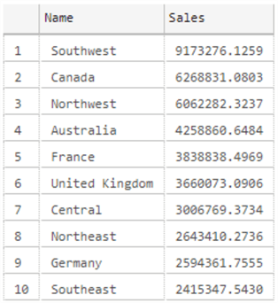
Figure 5 Sales Revenue by Territory
Provided that we work as report developers, we usually have business requirements from stakeholders. The requirements often specify the purpose of a chart. For example, in this article, the business requirements ask us to show the difference in the rep’s performance. We use sales revenues received from each territory to measure rep’s performance in the territory. The requirements also ask us to illustrate the change in monthly sales over time. However, developers may not always have business requirements before designing a report. In this case, as the data analysts did, we should discover knowledge in data and then discuss report requirements with stakeholders.
By the end of this step, we identify two messages we want to convey to report viewers:
- The difference in sales revenues among territories;
- Monthly sales trend in each territory;
1.2.2 Determining Tasks for Charts
Knowing the messages that we want the charts to convey, we can translate these messages into action plans that create the charts to deliver these messages. We define two tasks for the charts to perform:
- To compare sales revenue among territories;
- To show how sales are changing over time in each territory;
Task 1 provides comparison among items, while task 2 compares the same item through time. Therefore, these two tasks perform a comparison, one of four categories defined by Dr. Abela [3].
The other three categories are distribution, composition, and relationship. Tasks in the distribution category are to show frequency distribution in data sets. When highlighting every component in a total, we perform tasks in the composition category. If we want to show relationships between quantitative variables, we perform the relationship category tasks. Almost every message that we discover from data leads to one task in these four categories.
1.2.3 Choosing Charts
Corresponding to the four task categories, the chart chooser diagram shown in Figure 4 has four branches. We have already determined the desirability of performing comparison tasks through charts. Of the eight charts in the Comparison branch, we find two simple forms: the single bar chart and the line chart. When describing the observed values from one perspective, i.e., one variable, we use simple forms. Other charts in this branch are variations of these two primary forms.
A bar chart presents categorical data with rectangular bars at lengths proportional to the measured values they represent. The categories appear along the vertical axis. By comparing the bar lengths, we see the difference among categories. This article wants to compare sales revenues among ten territories; therefore, we choose the bar chart to compare revenues. We did not use a column chart, in which the categories appear along the horizontal axis, because the column chart is preferred for fewer than eight categories [9].
A line chart demonstrates changes in an observed variable (i.e., the first variable) over time (i.e., the second variable) when many time points are available. We arrange these time points on the horizontal axis in ascending order from left to right and use the vertical axis to report observed values associated with each time point. Each data point corresponds to a time point plotted on the horizontal axis and an observed value on the vertical axis. We connect these data points with line segments to form a line. The slope of the line shows the change of the observed values. To display monthly sales changes over time in this SSRS report, we use a line chart.
By the end of the three-step process, we determine the selection of the following two charts for the report:
- A single bar chart;
- A line chart;
2 –Producing a SSRS Report with Charts
We should not always believe the old proverb "One picture is worth a thousand words" [12]. Charts, working alone, may not convey the complete story we discover in data. In some situations, for example, in the interpreting a small data set, we may prefer to present data in well-formatted tabular forms. This section explores techniques to add a bar chart and sparklines, a simple version of line charts, to the SSRS report. We also show that charts and tables can work together to present a comprehensive knowledge of data.
2.1 Creating a New SSRS Project
We begin by launching Visual Studio 2019. After the IDE initializing process completes, a dialog should appear like Figure 6.
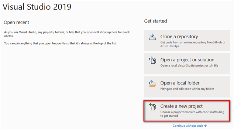
Figure 6 Launching Visual Studio 2019
Select the "Create a new project" item in the dialog. A new dialog appears, which should look like Figure 7. If we already installed the "Microsoft Reporting Services Projects," the template "Report Server Project" shows up in the template list.
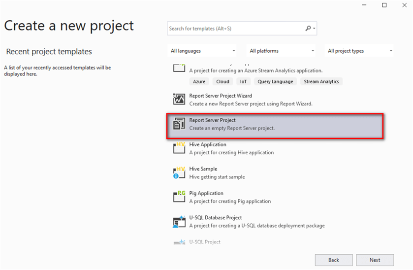
Figure 7 Creating a New Project Dialog
Select the "Report Server Project" template and click on the "Next" button. The "Configure your new project" dialog appears. As we create other projects in Visual Studio 2019, we fill in the project name and project location, as shown in Figure 8. By default, the solution name is the same as the project name. One solution may contain multiple projects. When we uncheck the "Place solution and project in the same directory" checkbox, we can change the solution name and place the solution file outside of the project folder.
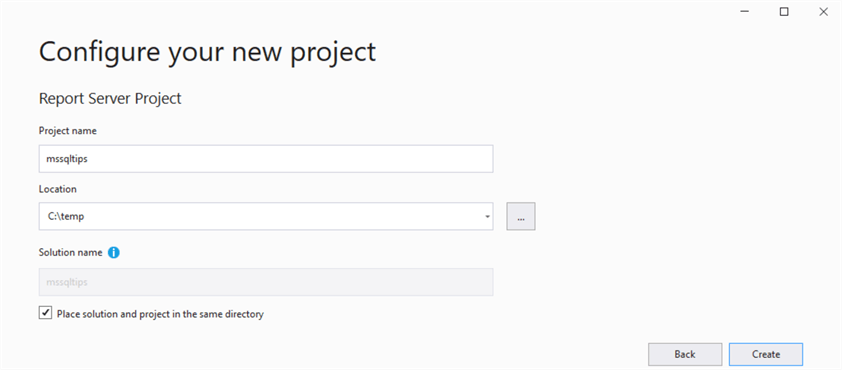
Figure 8 Configuring Your New Project Dialog
Clicking on the "Create" button, we create a new report server project and access the report development environment, as shown in Figure 9.
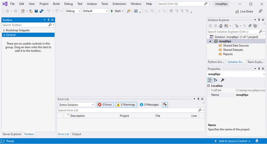
Figure 9 The SSRS Report Development Environment
An alternative path to create a new report server project is to select "File -> New -> Project…" as shown in Figure 10. When we click on the "Project…" menu item, the dialog shown in Figure 7 appears. We then follow the instructions to create a new project.
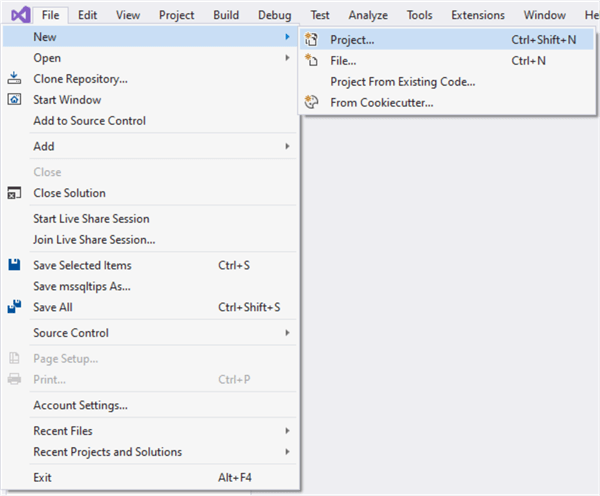
Figure 10 Create a New Project through the File Menu
Right-click on the project name "mssqltips" in the "Solution Explorer" pane. While a context menu appears, we select the "Properties" item to bring up the project property pages, as shown in Figure 11. If we want to deploy the report through Visual Studio 2019, the "TargetServerURL" property should point to a report server. We also should not change the default setting of "OverwriteDatasets" and "OverwriteDataSources" properties. We manage these settings through the SSRS web portal. We do not expect the deployment to overwrite these settings.
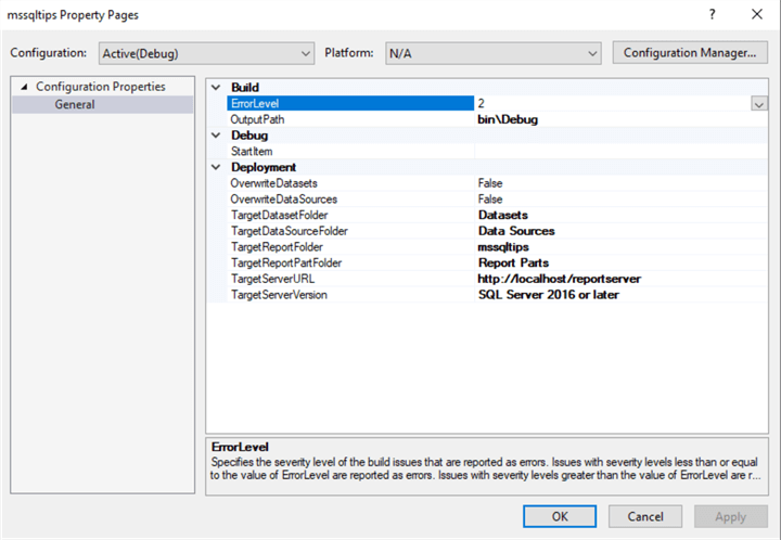
Figure 11 Project Property Pages
2.2 Creating a Shared Data Source
A data source includes the data source type, connection information, and user credentials. When presenting data to audiences, we use connection strings to tell SSRS reports the source data's location. We can embed the connection strings in a report and make data sources be part of the report definition. We may have a development server, testing server, staging server, and production server; dedicated IT professionals manage these reports. If we embed connection strings inside reports, any changes with the connection strings ask us to update all reports. The best practice is to use shared data sources and manage connection strings in a central place.
Right-click on the "Shared Data Sources" folder in the "Solution Explorer" pane. A context menu appears, and we select the "Add New Data Source" item to bring up the "Shared Data Source Properties" dialog. Fill in the name box with a value of "mssqltips_datasource." In practice, we may define naming conventions for report development so that it is easy to recognize connection information from the data source name. Select "Microsoft SQL Server" from the Type dropdown list. The dialog should look like Figure 12.
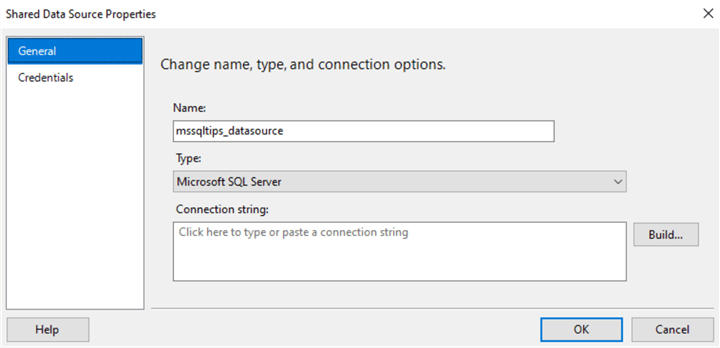
Figure 12 Shared Data Source Properties
Click on the "Build…" button to bring up the "Connection Properties" dialog. Fill in the server name and logon properties. If the connection is successful, we can select the database "AdventureWorks2019" from the dropdown list. The dialog should resemble Figure 13.
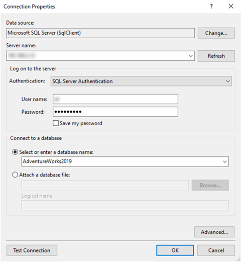
Figure 13 The Connection Properties
Click on the "OK" button to accept the connection properties settings. The connection string text box in Figure 12 should become automatically populated with a value that reflects the connection properties. When we click on the "OK" button to accept the data source setting, the new data source become visible in the "Solution Explorer" pane, as shown in Figure 14. If we want to update the data source, we can double-click on the data source name to bring up the "Shared Data Source Properties" shown in Figure 12. One project may have more than one data source.

Figure 14 The Shared Data Source
2.3 Adding a Shared Dataset
Datasets, representing report data returned from running a query, usually are specific to reports; therefore, reports often do not share datasets. We embed datasets in the report definitions in order to manage these datasets in the reports. However, some datasets provide values for multiple reports. We create shared datasets to increase productivity and maintain consistency. If the queries' results do not change frequently, we can cache the shared dataset to boost the report performance. A shared dataset must use a shared data source.
The annual sales revenue by sales territory is a small dataset with ten tuples. Given the reporting date and territory, we want to find the territory's sales revenue in the year before the reporting year. Multiple reports may need to lookup annual sales revenue by territory and year; thus, we create a parameterized shared dataset. To load the annual sales revenues to reports, we create the following stored procedure:
CREATE PROCEDURE [dbo].[uspGetAnualSalesByTerritory]
@Year INT
AS
BEGIN
   BEGIN TRY
SELECT ST.[Name],
SUM(DET.UnitPrice * DET.OrderQty) AS Sales
FROM    Sales.SalesOrderHeader SOH
INNER JOIN Sales.SalesOrderDetail DET ON SOH.SalesOrderID = DET.SalesOrderID
INNER JOIN Sales.SalesTerritory ST ON SOH.TerritoryID = ST.TerritoryID
WHERE Year(SOH.OrderDate) = @Year
GROUP BY ST.[Name]
   END TRY
   BEGIN CATCH
        DECLARE @ErrorMessage NVARCHAR(4000);
        DECLARE @ErrorSeverity INT;
        DECLARE @ErrorState INT;
        SELECT  @ErrorMessage = ERROR_MESSAGE(),
                @ErrorSeverity = ERROR_SEVERITY(),
                @ErrorState = ERROR_STATE();
        RAISERROR (@ErrorMessage, @ErrorSeverity, @ErrorState );
        RETURN 1
    END CATCH
    RETURN 0
END
GO
Right-click on the "Shared Datasets" folder in the "Solution Explorer" pane. A context menu appears, and we select the "Add New Dataset" item to bring up the "Shared Dataset Properties" dialog. Fill in the name box with a value of "uspGetAnualSalesByTerritory," which is the stored procedure's name. We do not have to use the stored procedure name, but using the procedure name can easily link the dataset defined in the report to the database procedure. Select the shared data source on the dialog and choose "Stored Procedure" as Query Type. We then can expand the dropdown list to choose the new stored procedure "uspGetAnualSalesByTerritory." The dialog should look like Figure 15.
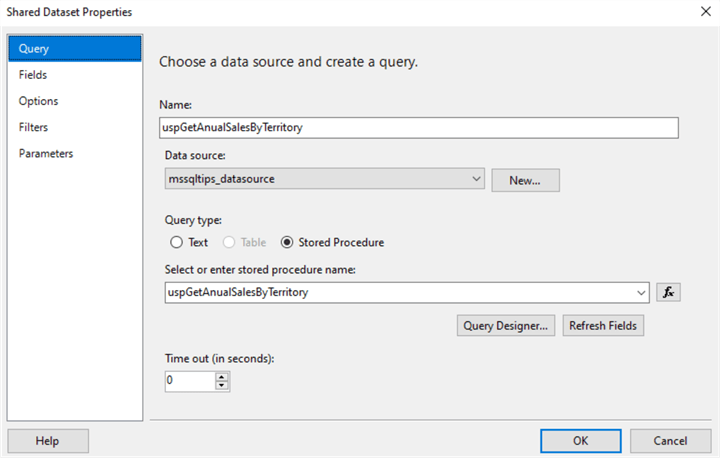
Figure 15 Configure Shared Dataset Properties
Click on the "OK" button to accept the shared dataset properties settings. The new shared dataset should be in the "Shared Datasets" folder, as shown in Figure 16. If we want to update the shared dataset, we can double-click on the dataset name to bring up the "Shared Dataset Properties" shown in Figure 15. The dataset "uspGetAnualSalesByTerritory.rsd" is a physical file in the project folder. We can use a text editor to open the file, the content of which is in the XML format. When adding the project to version control software, we can track changes in datasets.
Figure 16 The New Shared Dataset in the Solution Explorer
2.4 Using the Shared Data Source and Dataset in an SSRS Report
SSRS stores shared data sources and datasets on the report server. All reports on the report server can use them. However, when we create reports using Visual Studio 2019, we cannot browse the report server and select them to add to our report designer. After creating shared data sources and datasets in an SSRS project, we add them to our reports. Through the web portal, we can change shared data sources or datasets for a report.
First, we add a new report to the project. After we right-click on the "Reports" folder in the "Solution Explorer" pane, a context menu appears. Select "Add -> New Items…" to bring up the "Add New Item" dialog. Select the "Report" item in the dialog and name the new report "YTD_Sales_by_Sales_Territory.rdl." The "Add New Item" dialog should look like Figure 17.
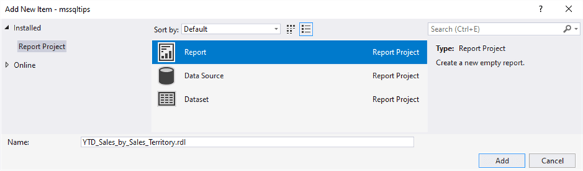
Figure 17 Add a New Report
Click on the "Add" button in the dialog to create the new report, "YTD_Sales_by_Sales_Territory." In the "Solution Explorer" pane, the new report is in the "Reports" folder. The IDE interface should look like Figure 18. The "Report Data" pane is on the left. Clicking on the "Toolbox" tab on the bottom, brings the "Toolbox" pane to the front. The "Solution Explorer" and "Properties" panes are on the right. The center is the design canvas, where we will add visual elements. On top of the canvas is the parameter pane, and below the canvas is the group pane. When designing an SSRS report, we frequently operate on all these panes.
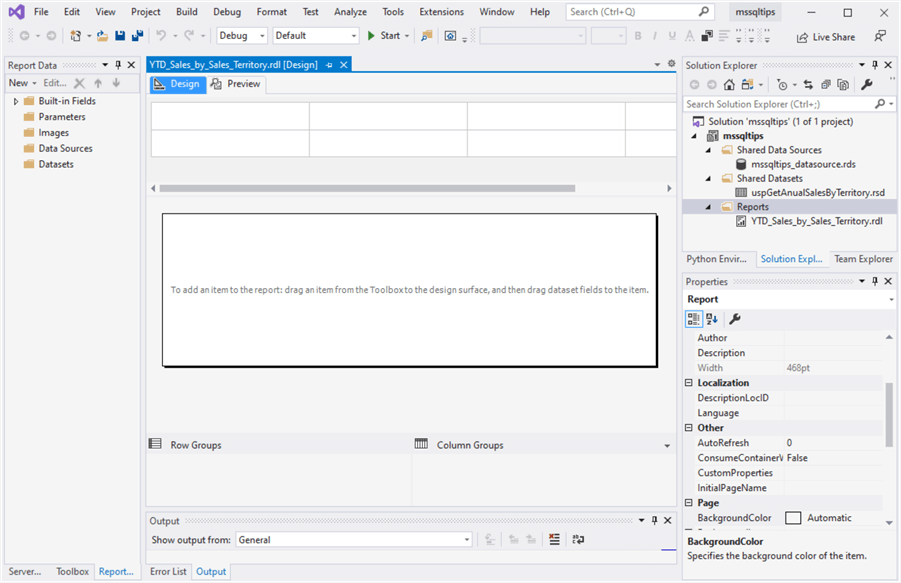
Figure 18 The Report Design Environment
To add shared data sources and datasets to the new report, we use items on the "Report Data" pane. Right-click on the "Data Sources" folder. We select "Add Data Source…" to open the "Data Source Properties" dialog in the context menu. We select the "Use shared data source reference" option and select "mssqltips_datasource" from the dropdown list. We name the data source the same as the shared data source. However, the data source can have any meaningful name. The dialog should look like Figure 19.
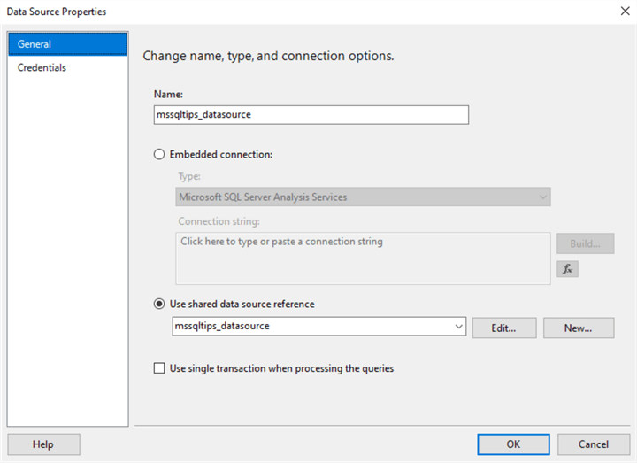
Figure 19 Data Source Properties Dialog
There is a checkbox displaying "Use single transaction when processing the queries" in the dialog. When multiple datasets use this data source, checking this option can reduce the network traffic and increase performance because the report uses only one connection to retrieve all the datasets. We leave this checkbox unchecked because we may cache the shared dataset. Click on the "OK" button to accept settings. We should see the new data source in the "Data Source" folder, as shown in Figure 20. The icon with an arrow in the lower-left corner indicates that the data source in the report points to a shared data source.
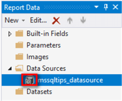
Figure 20 The New Data Source in the Report
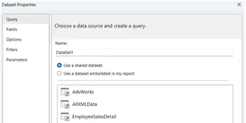
In the "Report Data" pane, Right-click on the "Datasets" folder to bring up a context menu. We select "Add Dataset…" to open the "Dataset Properties" dialog from the context menu. We select the "Use a shared dataset" option. A list of shared datasets should show in the list box. There is only one shared dataset in this exercise, and we select this shared dataset. We name the dataset "uspGetAnualSalesByTerritory." The dialog should look like Figure 21.
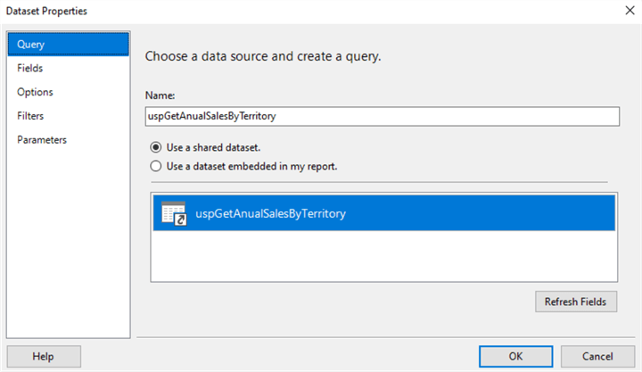
Figure 21 Dataset Properties Dialog
Click on the "OK" button to accept settings. We should see the new dataset in the "Datasets" folder, as shown in Figure 22. The icon with an arrow indicates that the dataset in the report points to a shared dataset. The process also creates a new report parameter under the "Parameters" folder. When users run the report, the stored procedure parameter automatically gets a value from the report parameter.
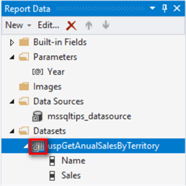
Figure 22 The New Dataset in the Report
2.5 Adding an Embedded Dataset
When we want to load data from a data source to a single report, an embedded dataset is preferred. According to the business requirements, we should read the following data into the report: year-to-date sales revenues, product category, sales month, and sales territory. We use stored procedures to retrieve data on the SQL server database to reduce the risk of exposing underlying database tables. We first create a stored procedure on the database; we then add an embedded dataset that references the stored procedure. Here is the definition of the stored procedure "[dbo].[ uspGetYTDSalesByTerritory]:"
CREATE PROCEDURE [dbo].[uspGetYTDSalesByTerritory]
   @ReportDate datetime
AS
BEGIN
   BEGIN TRY
SELECT
DATEPART(mm, SOH.OrderDate) AS [Month],
ST.[Name] AS SalesTerritory,
PC.[Name] AS Category,
SUM(DET.UnitPrice * DET.OrderQty) AS Sales
FROM    Sales.SalesOrderHeader SOH
INNER JOIN Sales.SalesOrderDetail DET ON SOH.SalesOrderID = DET.SalesOrderID
INNER JOIN Production.Product P ON DET.ProductID = P.ProductID
INNER JOIN Production.ProductSubcategory PS ON PS.ProductSubcategoryID = P.ProductSubcategoryID
INNER JOIN Production.ProductCategory PC ON PS.ProductCategoryID = PC.ProductCategoryID
INNER JOIN Sales.SalesTerritory ST ON SOH.TerritoryID = ST.TerritoryID
WHERE SOH.OrderDate <= @ReportDate and datediff(year, SOH.OrderDate, @ReportDate) = 0
GROUP BY DATEPART(mm, SOH.OrderDate), ST.[Name], PC.[Name]
ORDER BY ST.[Name]
   END TRY
   BEGIN CATCH
        DECLARE @ErrorMessage NVARCHAR(4000);
        DECLARE @ErrorSeverity INT;
        DECLARE @ErrorState INT;
        SELECT  @ErrorMessage = ERROR_MESSAGE(),
                @ErrorSeverity = ERROR_SEVERITY(),
                @ErrorState = ERROR_STATE();
        RAISERROR (@ErrorMessage, @ErrorSeverity, @ErrorState );
        RETURN 1
    END CATCH
    RETURN 0
END
Right-click on the "Datasets" in the "Report Data" pane. Select the "Add Dataset…" command from the context menu to open the "Dataset Properties" dialog. We select the option "Use a dataset embedded in my report" and fill in the form according to Figure 23. After we click on the "OK" button to accept the setting, the new embedded dataset shows up in the "Datasets" folder. We also can observe the new parameter "ReportDate" in the parameters folder. The new report parameter automatically passes the value to the stored procedure parameter when we run the report.
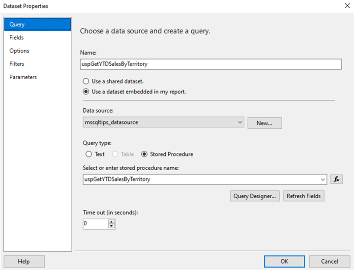
Figure 23 Create the Embedded Dataset
2.6 Creating Cascading Parameters
After adding two datasets to the report, we see two parameters in the "Parameters" folder. The "ReportDate" parameter asks viewers to enter a date; then, the report presents year-to-date (YTD) sales revenue. The "Year" parameter asks viewers to enter the previous year of the "ReportDate." We notice there is a dependency between these two parameters. After users enter a date for the "ReportDate" parameter, we can calculate the "Year" parameter value. We call these two parameters cascading parameters [13].
When there is a dependency between report parameters, the order of the parameters in the "Report Data" pane is critical. The independent parameters should come before the dependent parameters. As shown in Figure 24, we use the up arrow button or down arrow button to change the parameter order. We should click on the up arrow to move the "ReportData" parameter to the top of the "Year" parameter.
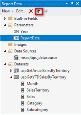
Figure 24 Change the Parameter Order
We want the "Year" parameter automatically to be assigned a value from the "ReportDate" parameter. The parameter should be invisible to viewers. Besides, we do not allow other programs to alter the parameter value. SSRS provides two options to control parameter visibility: Hidden and Internal. Users can set a hidden parameter value through an URL; therefore, the internal parameter is favorable. Let us double-click on the "Year" parameter to bring up the "Report Parameter Properties" dialog. We set the parameter visibility to "Internal," as shown in Figure 25.
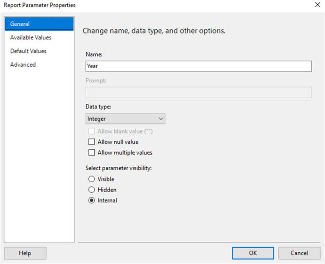
Figure 25 Set Parameter Visibility
The internal parameter must have a default value. Switch to the "Default Values" tab and select the "Specify values" option. After clicking on the "Add" button, a Value textbox appears. We use the expression, i.e., =Year(Parameters!ReportDate.Value) – 1, to compute the default value based on the "Report Date" parameter. After we copy the expression to the Value box, the dialog should resemble Figure 26. Click on the "OK" button to accept the setting. We also notice that the parameter "Year" in the parameter pane becomes disabled.

Figure 26 Add a Default Value to the Year Parameter
Since the maximum order date in the sample database is 2014-06-30, we set a default value for the "ReportDate" parameter to not select a past date from the calendar during testing. We double-click on the parameter to bring up the "Report Parameter Properties" dialog and switch to the "Default Values" tab. We set the default value according to Figure 27. Click on the "OK" button to accept the setting.
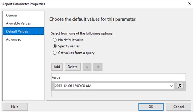
Figure 27 Assign a Default Value to the Report Date Parameter
When the default value of the "ReportDate" parameter is "2013-12-06", the default value of the internal parameter "Year" should be 2012 according to the expression. If we set the "ReportDate" parameter to another date, the "Year" parameter should change accordingly. To quickly test the cascading parameters, we drag the parameter "Year" to the design canvas. A textbox appears on the canvas, as shown in Figure 28.
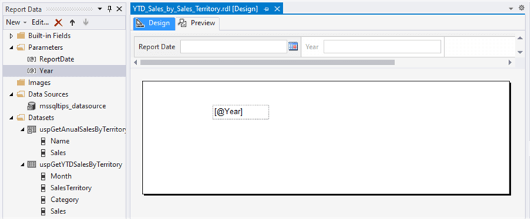
Figure 28 Test the Cascading Parameters
By clicking on the "Preview" button, we run the report in the "Preview" mode. As illustrated in Figure 29, the textbox displays the "Year" parameter's default value, i.e., "2012". We can change the "Report Date" value in the textbox and click on the "View Report" button to check the "Year" value. The "Year" parameter is always the preceding year of the Report Date. After testing, we select the textbox in the "Design" mode and hit the "Delete" button to clear the testing setup.
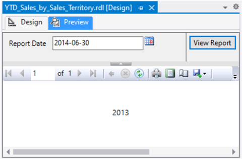
Figure 29 Test the Cascading Parameters
2.7 Adding a Table
We have seen the "Report Data" pane on the left of the report development environment. By clicking on the "Toolbox" at the bottom of the pane, we bring the "Toolbox" pane to the front. There are many report items on the "Toolbox" pane. Of these items, the table control is a popular one. We frequently use a table to display detail data or grouped data. Sometimes, viewers are comfortable with small data sets presented in tables.
2.7.1 Adding a Table Data Region to the Report
Before adding any items to the report, we should check the report properties that define pages, sizes, and margins for the report. To access these properties, let us right-click on any area outside the report body. A context menu should resemble Figure 30.
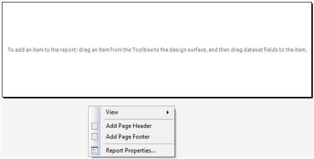
Figure 30 Bring up Report Properties Menu Item
Select the "Report Properties…" menu item to bring up a dialog. Under certain circumstances, we may need to print a letter-sized report. We configure the report properties according to Figure 31. We may increase margins to 0.5in if our printers do not support narrow margins(i.e.,0.25in). After we set the page units to inches, the SSRS designer measures all newly added controls in inches.
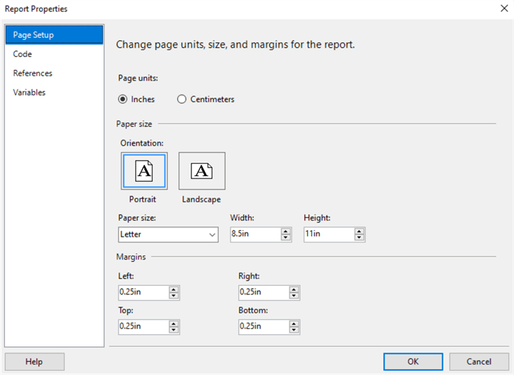
Figure 31 Change Page Units, Size, and Margins for the Report
We need to place a summary table in the report to show year-to-date sales revenues by sales territories. We also want to compare the YTD sales revenues of the reporting year to the previous year. We use table control to present this information. The numbers in a table can provide precise information to audiences.
Double-click on the "Table" item in the "Toolbox" pane to add a table control to the design canvas. By default, the table has two rows: the header row and the data row. We can select a table cell by right-clicking on the cell. When we click on any area inside the table, two grey bars (row handles and column handles) appear to the table's left and top, respectively. We can right-click on the grey bar's upper-left corner, i.e., the corner handle, to select the table and right-click on the gray bar beside a row to select the row.
First, add a table header row. Let us right-click on the header row and select "Insert Row Above" from the context menu to add a new row above the header. We use this row as the table header. Then, we assign a name and dataset to the table. When selecting the table control, we find the property settings in the "Properties" pane. We can update properties through the pane. According to Table 1, we configure the table control.
| Property | New Value |
|---|---|
| Name | tblYTDSalesByTerritory |
| DataSetName | uspGetYTDSalesByTerritory |
| Location: Left | 0.05in |
| Location: Top | 0.05in |
Table 1 Configure the Table Properties
We can link one dataset to one table. After establishing this link, the field selector icon shows up when we move the mouse over a data cell. Click on the icon to bring up the field selector, as shown in Figure 32. Besides, the grouping information appears in the group pane below the report body. By default, the group is at the deepest level of detail.
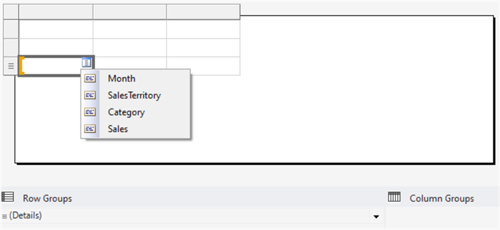
Figure 32 Link the Dataset to the Table
Move to the group pane and double-click on the "Details" line to bring up the "Group Properties" dialog. Click on the "Add" button to add a group to the table. We set the level of grouping according to Figure 33. Click on the "OK" button to accept the settings.
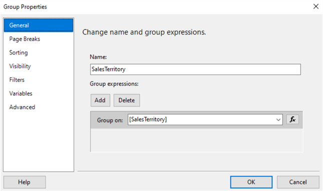
Figure 33 Create a Sales Territory Group
We use the field selector to add the "Sales Territory" and "Sales" field to the table. Since we grouped the data in the table by the "Sales Territory" field, the report designer automatically sums up the sales revenues. We can use the Lookup function to link values in one dataset to another. The following expression passes the value of a sales territory in one dataset to the function and, then, finds the sales revenue for the sales territory in another dataset:
=Lookup(Fields!SalesTerritory.Value, Fields!Name.Value, Fields!Sales.Value, "uspGetAnualSalesByTerritory")
We copy the expression to the data cell in the last column, as shown in Figure 34, and add a column header. The other column headers automatically get populated with filed names. Notice that the report designer automatically adds a space before the upper-case letters. We can change the column headers by entering text to the cell directly. We click on the second column header. When the textbox becomes editable, we change the title to "YTD Sales."
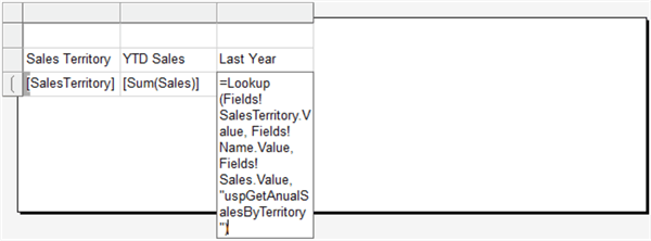
Figure 34 Add Fields to the Table
Since this report has multiple data regions, we give a title to each region. To add a table title, we select the three cells in the first row and right-click on them to bring up a context menu containing the "Merge Cells" item. We select the "Merge Cells" menu item to merge these three cells and enter a text "YTD Sales by Territory" in the merged cell. The table should look like Figure 35.
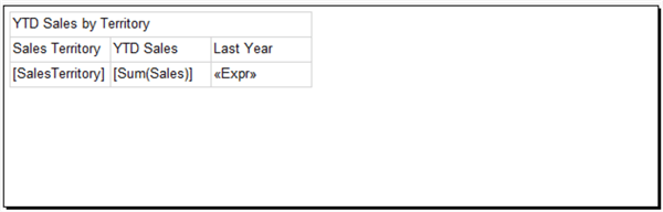
Figure 35 The Table Layout
2.7.2 Improving the look and feel of the Table
When an object on the design canvas (such as a table, row, column, or cell) is selected, the object's properties display in the pane. We then can adjust the look and feel of these objects by modifying corresponding properties in the "Properties" pane. For first time users, selecting an object in the SSRS design canvas seems inconvenient. We can click on any area inside the table to bring up row handles, column handles, and the corner handle. We use these handles to select rows, columns, and the table, respectively. We can select a table cell by right-clicking on the cell. Follow these steps as we set up the appearance of the table:
(1), Select the first row, i.e., the merged textbox. Change the setting in the "Properties" pane based on Table 2.
| Property | New Value |
|---|---|
| BorderStyle: Default | None |
| Color | Black |
| TextAlign | Center |
| Font:FontFamily | Arial |
| Font: FontSize | 10pt |
| Font: FontWeight | Bold |
| Size:Width | 3.6in |
| Size:Height | 0.4in |
Table 2 Set up the Table Header Properties
(2), Select the second row, i.e., the column headers. Change the setting in the "Properties" pane based on Table 3.
| Property | New Value |
|---|---|
| BorderColor: Bottom | DarkSlateBlue |
| BorderStyle: Default | None |
| BorderStyle: Bottom | Solid |
| Color | Black |
| Font:FontFamily | Arial |
| Font: FontSize | 9pt |
| Font: FontWeight | Bold |
Table 3 Set up the Column Header Properties
(3), Each column header in the second row contains a textbox. We modify these textbox properties according to Table 4.
| Column Header | Property | New Value |
|---|---|---|
| Sales Territory | Size: Width | 1.2in |
| Size: Height | 0.25in | |
| TextAlign | Center | |
| YTD Sales | Size: Width | 1.2in |
| Size: Height | 0.25in | |
| TextAlign | Right | |
| Last Year | Size: Width | 1.2in |
| Size: Height | 0.25in | |
| TextAlign | Right |
Table 4 Set up the Textboxes in Column Headers
(4), Select the third row. Change the setting in the "Properties" pane based on Table 5. If we cannot change the Font setting of the entire row, we can configure each textbox in the row through the toolbars in the ribbon on the top.
| Property | New Value |
|---|---|
| BorderStyle: Default | None |
| Color | Black |
| Font:FontFamily | Arial |
| Font: FontSize | 9pt |
| BackgroundColor | =IIF(RUNNINGVALUE (Fields!SalesTerritory.Value,CountDistinct,Nothing) Mod 2, "White", "AliceBlue") |
Table 5 Set up the Data Row Properties
(5), Each column in the third row contains a textbox. We change these textbox properties according to Table 6.
| Data Field | Property | New Value |
|---|---|---|
| Sales Territory | Size: Width | 1.2in |
| Size: Height | 0.23in | |
| TextAlign | Left | |
| YTD Sales | Size: Width | 1.2in |
| Size: Height | 0.23in | |
| TextAlign | Right | |
| Last Year | Size: Width | 1.2in |
| Size: Height | 0.23in | |
| TextAlign | Right |
Table 6 Set up the Data Cell Properties
(6), Run the report in the "Preview" mode. The table should look like Figure 36.
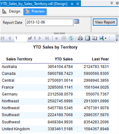
Figure 36 Preview YTD Sales by Territory in the Table
2.8 Adding a Matrix
To know the proportion of sales received from each product category in a territory, we can use a cross-tabulation, the matrix data region in SSRS. The row groups display different sales territories, and the column groups show different product categories. The intersection of rows and columns contains summarized information. We also want to include a line chart in each row to show how the sales revenues change over time.
2.8.1 Adding a Matrix Data Region to the Report
Double-click on the "Matrix" item in the "Toolbox" pane to add a matrix control to the design canvas. By default, the report designer places the control on the upper-left corner of the design canvas. With the matrix selected, we configure the matrix properties according to Table 7. The report body automatically expands to include the new control. We also observe that the table and the matrix use the same data set.
| Property | New Value |
|---|---|
| Name | matYTDSalesByCategoryTerritory |
| DataSetName | uspGetYTDSalesByTerritory |
| Location: Left | 0.05in |
| Location: Top | 1.4in |
| BorderStyle: Bottom | Solid |
Table 7 Configure the Matrix Properties
By default, the matrix has a row group and column group. We want to add a new row on the top to place a title. We also want to add a new column on the right to hold line charts. Let us add the title row first. Right-click on the column header "Columns" to bring up a context menu, as shown in Figure 37.
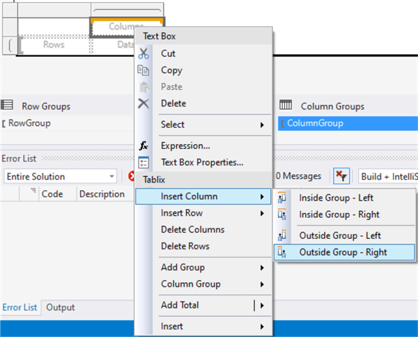
Figure 37 Bring up the Context Menu to Insert a Column and Row Outside the Group
We select "Insert Column -> Outside Group – Right" and "Insert Row -> Outside Group Above" to add a column and row, respectively. Next, we add fields "SalesTerritory" and "Category" to the matrix using the field selectors. The matrix should look like Figure 38. When adding the field "SalesTerritory" to rows, we created a row group "SalesTerritory1" shown in the grouping pane. To show the percentage of each category contributing to the YTD sales, we copy the following expression that computes the percentage to the data cell:
=Sum(Fields!Sales.Value)/SUM(Fields!Sales.Value,"SalesTerritory1")
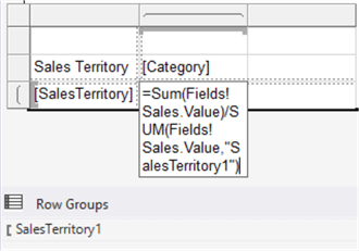
Figure 38 Add Fields to the Matrix
Select the two right cells on the first row and merge them. We enter the text "YTD Sales by Product Category and Territory" in the merged cell. We also add a column header, "Monthly Trend." All these texts are outside of the column group. They do not repeat when we run the report. So far, we added two data regions into the SSRS report, and both used the same dataset. The report body should look like Figure 39.
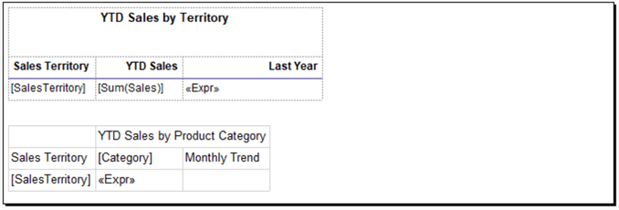
Figure 39 The Report with a Table and Matrix
The report has three numeric data cells. We keep two decimal places for all numeric values and add the symbol "%" to denote percentage. We subsequently select these three data cells and change the format in the "Properties" pane according to Table 8. In practice, we may format these data cells through the "Text Box Properties" dialog.
| Property | New Value |
|---|---|
| YTD Sales: Format | '$'#,0.00;('$'#,0.00) |
| Last Year: Format | '$'#,0.00;('$'#,0.00) |
| Category: Format | 0.00 % |
Table 8 Format Numeric Data Cells
2.8.2 Improving the look and feel of the Matrix
As we adjust the table's look and feel, we can apply the same method to improve the matrix's look and feel. We select a matrix cell by clicking on the cell; then, the cell's properties display on the "Properties" pane. When we click on any area inside the matrix, row handles and column handles appear to the matrix left side and top. We can right-click on the corner handle to select the matrix and right-click on row handles, the gray bar beside a row, to select the row. Use the following steps to set up the appearance of the matrix:
(1), Right-click on the merged data cell on the first row to select the textbox. Change the setting in the "Properties" pane based on Table 9.
| Property | New Value |
|---|---|
| BorderStyle: Default | None |
| Color | Black |
| TextAlign | Center |
| Font:FontFamily | Arial |
| Font: FontSize | 10pt |
| Font: FontWeight | Bold |
| Size:Width | 3.6in |
| Size:Height | 0.56in |
Table 9 Set the Table Header Properties
(2), Select the first cell on the first row. Change the setting in the "Properties" pane based on Table 10.
| Property | New Value |
|---|---|
| BorderStyle: Default | None |
| Size:Width | 1.2in |
| Size:Height | 0.56in |
Table 10 Set Width of the First Column in the Matrix
(3), Select the second row, i.e., the column headers. Change the setting in the "Properties" pane based on Table 11.
| Property | New Value |
|---|---|
| BorderColor: Bottom | DarkSlateBlue |
| BorderStyle: Default | None |
| BorderStyle: Bottom | Solid |
| Color | Black |
| Font:FontFamily | Arial |
| Font: FontSize | 9pt |
| Font: FontWeight | Bold |
Table 11 Set the Column Header Properties
(4), Each column header contains a textbox. We modify these textbox properties according to Table 12.
| Column Header | Property | New Value |
|---|---|---|
| Sales Territory | Size: Width | 1.2in |
| Size: Height | 0.25in | |
| TextAlign | Left | |
| Category | Size: Width | 1.0in |
| Size: Height | 0.25in | |
| TextAlign | Center | |
| Monthly Trend | Size: Width | 2.4in |
| Size: Height | 0.25in | |
| TextAlign | Center |
Table 12 Set the Column Header Sizes
(5), Select the third row. Change the setting in the "Properties" pane based on Table 13.
| Property | New Value |
|---|---|
| BorderColor: Bottom | DarkSlateBlue |
| BorderStyle: Default | None |
| BorderStyle: Bottom | Solid |
| Color | Black |
| Font:FontFamily | Arial |
| Font: FontSize | 9pt |
| VerticalAlign | Middle |
Table 13 Set the Data Row Properties
(6), Each column in the third row contains a textbox. We change these textbox properties according to Table 14.
| Data Field | Property | New Value |
|---|---|---|
| Sales Territory | Size: Width | 1.2in |
| Size: Height | 0.32in | |
| TextAlign | Left | |
| Category | Size: Width | 1.0in |
| Size: Height | 0.32in | |
| TextAlign | Center | |
| Monthly Trend | Size: Width | 2.4in |
| Size: Height | 0.32in | |
| TextAlign | Center |
Table 14 Set the Data Cell Properties
(5), Run the report in the "Preview" mode. The report should look like Figure 40.
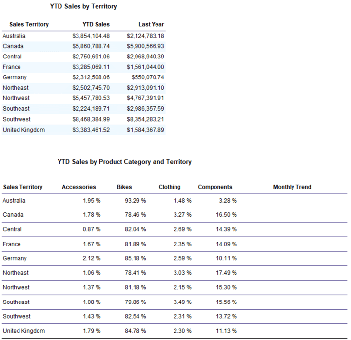
Figure 40 Preview the Table and Matrix
2.9 Adding Sparklines
The company wants to monitor monthly sales trends over time in each sales territory. Since this report serves as a summary report, we show the general shape of changes in sales. If users notice opportunities or potential problems in the trends, they can conduct further investigation. Sparklines, simplified charts without axes, can convey rich information in a little space. We can put sparklines in line with other values in tables or matrices. This exercise adds sparklines to the matrix to present monthly sales trends for each sales territory. Sales trends for all sales territory are in one table; viewers can easily make a comparison.
We drag the Sparkline control from the "Toolbox" pane to the data cell in the "Monthly Trend" column. The "Select Sparkline Type" dialog should appear like Figure 41. There are several sparkline types, and we select the type "Line with Markers." Click on the "OK" button to insert the sparkline to the data cell.
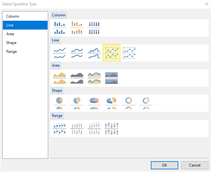
Figure 41 Select the Line with Markers
Double-click on the sparkline control in the data cell to open the "Chart Data" dialog, as shown in Figure 42. The "Chart Data" dialog contains three sections: Values, Categories Groups, and Series Groups. The way a chart groups data is very similar to the way that a matrix does. The category group in the "Chart Data" dialog is comparable to a matrix column group, and the series group is equivalent to a matrix row group. The Values section, as the matrix data cell does, sums up the measured values. The sparkline's task is to show the sales revenues' changes along the months; therefore, we do not need the series group. We use the following steps to configure the sparkline control.
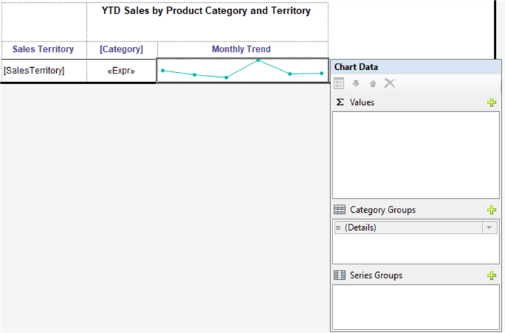
Figure 42 The Chart Data Dialog
(1), Click on the plus sign in the "Values" section to show the field selector, as shown in Figure 43. We select the "Sales" field in the Values section and the "Month" field in the Category Groups section.
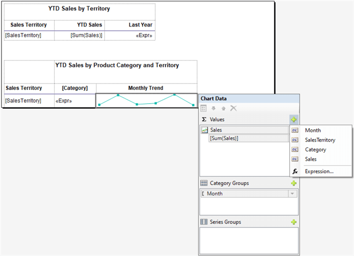
Figure 43 Add Fields to the Chart
(2), With the chart selected, we go to the "Properties" pane and change the border properties according to Table 15.
| Property | New Value |
|---|---|
| BorderColor: Bottom | DarkSlateBlue |
| BorderStyle: Default | None |
| BorderStyle: Bottom | Solid |
Table 15 Configure Sparkline Properties
(3), To change the line color in the sparkline control, we first click on the chart to select the chart, then click on the line to select the series. The "Chart Series" properties appear in the "Properties" pane, as shown in Figure 44. We change the color to "#a5bfd6."
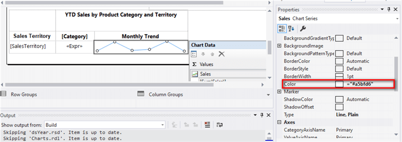
Figure 44 Change the Line Color
(4), Run the report in the "Preview" mode. The matrix should look like Figure 45.
Figure 45 Preview the Matrix with Sparklines in the Report
2.10 Adding a Bar Chart
We use a bar chart to compare YTD sales revenue among sales territories. The bar chart can provide more spaces for category names. By default, the original point is at the lower-left corner of the chart, and values on the vertical axis in the ascending order are from bottom to top. We placed a table in the report, and the ascending order of a column is from top to bottom. To make the table and the chart display categorical data in the same order, we reverse the chart and plot data on the second axis. We also highlight the bar with the highest value.
2.10.1 Adding a Bar Chart
Double-click on a chart from the "Toolbox" pane to add the chart to the design canvas. A dialog appears, and we select the bar chart, as shown in Figure 46. Click on the "OK" button to accept the selection. By default, the chart overlaps with the table and matrix.
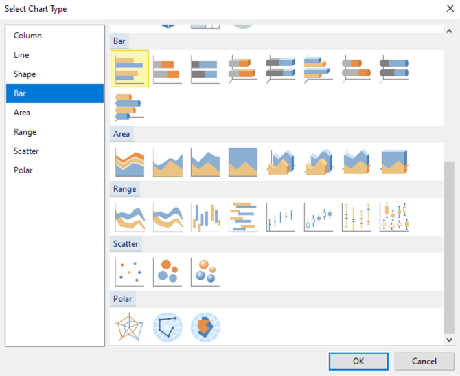
Figure 46 Select the Bar Chart
With the chart selected, we go to the "Properties" pane and configure the chart properties according to Table 16. The report body automatically expands to include the new control.
| Property | New Value |
|---|---|
| Name | crtYTDSalesByTerritory |
| DataSetName | uspGetYTDSalesByTerritory |
| Location: Left | 3.7in |
| Location: Top | 0.0in |
| Size:Width | 4.2in |
| Size:Height | 3.6in |
Table 16 Configure the Chart Properties
Since there is an overlap between the chart and matrix, we move the matrix to this position: "Top:3.7in." The report design pane should look like Figure 47. When clicking on any blank area in the report body, we can access the report body properties on the "Properties" pane. We should set the report body's width to 7.96in to print the report on a letter-sized paper. Furthermore, when exporting to a PDF file, we obtain one page only.

Figure 47 The Report Layout with Three Data Regions
Double-click the chart to bring up the "Chart Data" dialog. As if we connect the data to the sparkline, we add the "Sales" field to the "Values" section and "Sales Territory" to the "Category Groups" section, respectively. The "Chart Data" dialog should look like Figure 48. Notice that the original point is at the lower-left corner.
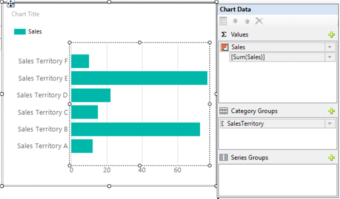
Figure 48 Add Fields to the Bar Chart
We can run the report by clicking on the "Preview" button. The chart and table should look like Figure 49. By default, the bar chart shows categorical labels in ascending order, from bottom to top. If the table and the chart both use the ascending order of sales territory, they sort differently. The bar chart has several elements, such as chart title, legend, and axis. We can configure every element on the chart.
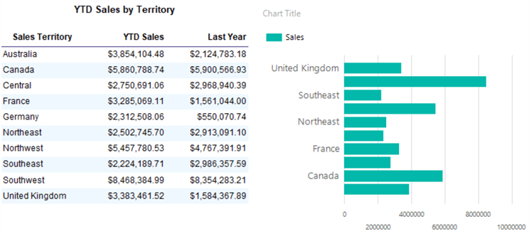
Figure 49 View the Chart and Table in the Preview Mode
2.10.2 Changing the Chart Title
Right-click on the "Chart Title" area. A context menu should look like Figure 50.
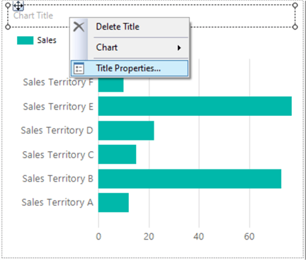
Figure 50 Change the Chart Title
Select the "Title Properties…" menu item to bring up the "Chart Tile Properties" dialog. We enter the text "YTD Territory Sales (in thousands) Comparison" in the Title textbox. The title should be in the top middle of the chart. The dialog should look like Figure 51.
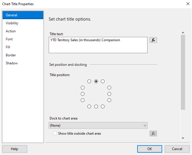
Figure 51 Set Chart Title Properties
Switch to the "Font" tab. To keep consistency with the table title, we change font, size, and color options based on Figure 52. Click on the "OK" button to accept the settings.
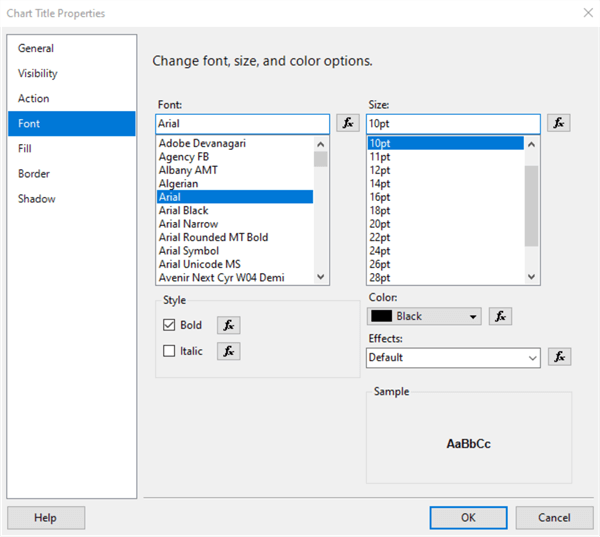
Figure 52 Set Chart Title Font
2.10.3 Removing the Legend
In a bar chart, each legend key represents a single data series. Since the chart in this exercise has only one series, we do not need a legend. After we add fields to the chart, the chart shows "Sales" in the legend section. Right-click on the legend area. From the context menu, as shown in Figure 53, select the menu item "Delete Legend" to delete the legend from the chart.
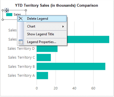
Figure 53 Remove the Legend from the Chart
2.10.4 Displaying All Axis Labels
When there are many categories, for example, the ten categories in this exercise, the chart may not display every category group label along the vertical axis. We need to show all sales territories. By specifying an axis interval, we can change the number of labels. We right-click on the vertical axis and select the "Vertical Axis Properties…" menu item from the context menu. As shown in Figure 54, we set the axis interval to 1.
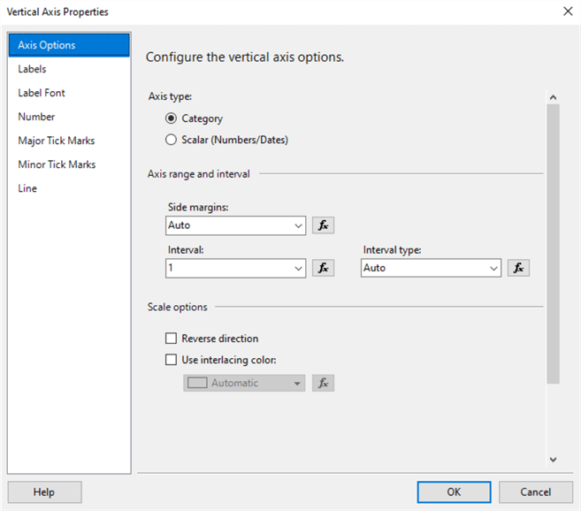
Figure 54 Set Axis Interval
Switch to the "Label Font" tab. Change the label font based on Figure 55. Click on the "OK" button to accept the setting.
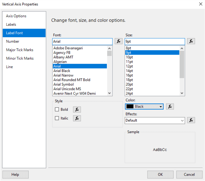
Figure 55 Change Axis Label Font
2.10.5 Highlight the Maximum Data Point in a Series
To increase readability, we want to highlight the maximum data point with a different color. We first select the chart and click on the bars on the chart. The "Chart Series" pane appears, as shown in Figure 56. Change the value of the "Color" property to the following expression:
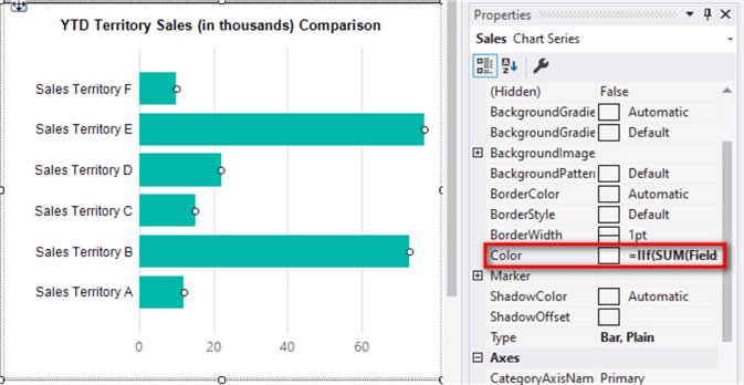
Figure 56 Highlight the Maximum Data Point in a Series
To observe the effects of our setup, we view the report in the "Preview" mode. The chart and the table should look like Figure 57. As we mentioned, the sales territories are in a different order in the table and chart even though we sort them in ascending order.
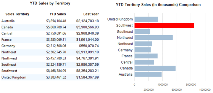
Figure 57 Highlight the Maximum Data Point
2.10.6 Plotting Data on the Secondary Axis
By default, the origin point of the bar chart is at the lower-left corner of the chart. Select the Chart Axis, as shown in Figure 58. In the "Properties" pane, change the "Reverse" property to "True." Now the origin point is at the upper-left corner of the chart. When we arrange the vertical axis labels in ascending order, the values increase from top to bottom, which is the same as the table does.
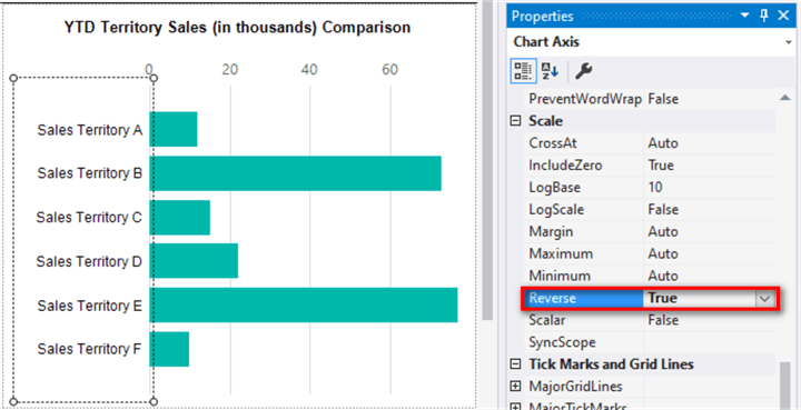
Figure 58 Change the Vertical Axis to the Reversed Direction
The horizontal axis is on the top of the chart; we want to move it to the bottom. Let us right-click on bars to bring up the context menu, as shown in Figure 59.
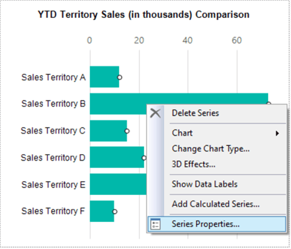
Figure 59 Configure the Chart Series Properties
Select the menu item "Series Properties…" to bring up the "Series Properties" dialog. Switch to the "Axes and Chart Area" tab and select the "Secondary" option for the horizontal axis, as shown in Figure 60. Click on the "OK" button to accept the changes.
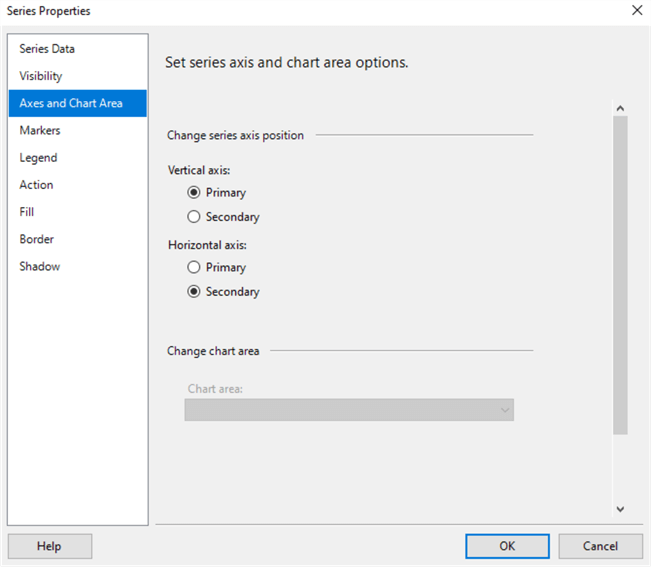
Figure 60 Use the Secondary Horizontal Axis
The horizontal axis does not have enough space to show all digit of labels. We want to show numbers in thousands format. Let us right-click on the horizontal axis to bring up a context menu, as shown in Figure 61.
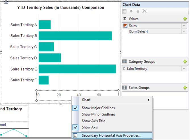
Figure 61 Configure Secondary Horizontal Axis Properties
Select the "Secondary Horizontal Axis Properties…" menu item to bring up the corresponding dialog. Switch to the "Number" tab and set number format according to Figure 62.
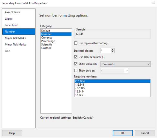
Figure 62 Set Number Formatting Options for the Secondary Horizontal Axis
We view the report in the "Preview" mode. The table and chart should look like Figure 63.
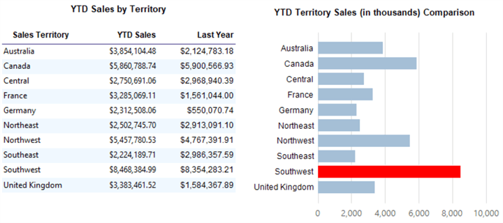
Figure 63 Preview the Table and Chart
2.11 Adding a Header and Footer
An SSRS report usually includes a header and footer to display some general information about the report owners, users and reports. The header section may contain company name, report name, report date, and report parameters; the footer section may contain report execution time, paging, and data source [14]. A good practice is to create a template for report developers so that all reports have the same look and feel by using the template. For completeness, we follow Sections 2.7 and 4 in tip [15] to add a header, footer, and logo into this report. The report on the canvas should look like Figure 64.
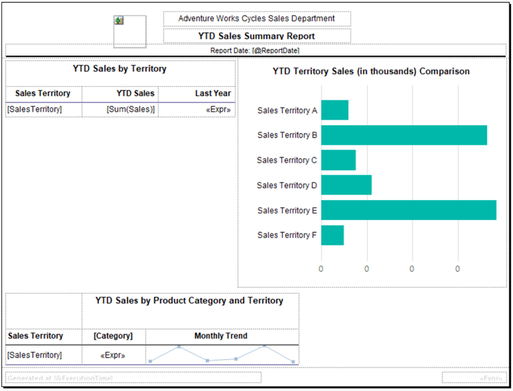
Figure 64 The Report Layout
3 – Implement Interactive Sorting in SSRS Reports
By default, the bar chart sorts categorical labels in alphabetic order. Viewers may want to sort bars by the sales amount. They may also want to sort the table interactively. SSRS provides a feature that viewers can change the order of rows and columns in tables and matrices [16]. To interactively sort the table and chart, we add two interactive sort buttons to the column headers, "Sales Territory" and "YTD Sales," and we apply the sorting to the dataset used by these two data regions. Therefore, when clicking on the sort buttons to sort the table, we also sort the chart. We use the following steps to implement interactive sorting in SSRS reports:
(1), Double-click the chart to bring up the "Chart Data" dialog. Right-click on the "Sales Territory" group, as shown in Figure 65, to open the context menu.
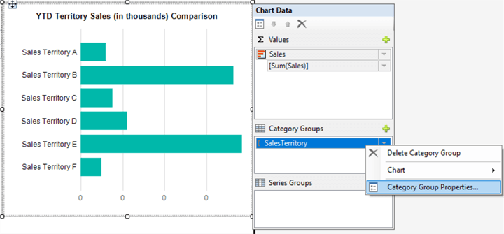
Figure 65 Access Category Group Properties
(2), Select the menu item "Category Group Properties…" to open the dialog and switch to the "Sorting" tab, as shown in Figure 66. We should delete any sorting settings. Select the "Sort by" textbox and click on the "Delete" button to delete the sort. Click on the "OK" button to accept the change.
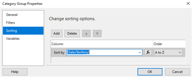
Figure 66 Category Group Properties Dialog
(3), Right-click on the "Sales Territory" column header. A context menu should look like Figure 67.
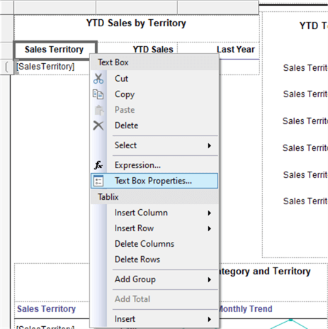
Figure 67 Access Sales Territory Text Box Properties
(4), Select the menu item "Text Box Properties…" to open the corresponding dialog and switch to the "Interactive Sorting" tab. We change the properties in this tab based on Figure 68. Click on the "OK" button to accept the changes.
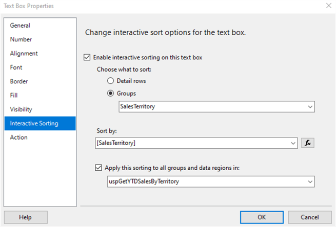
Figure 68 Enable Interactive Sorting on the Sales Territory Column
(5), We repeat steps 3 and 4 to bring up the properties dialog of the column header "YTD Sales." We switch to the "Interactive Sorting tab" and set properties based on Figure 69. Click on the "OK" button to accept the setting.
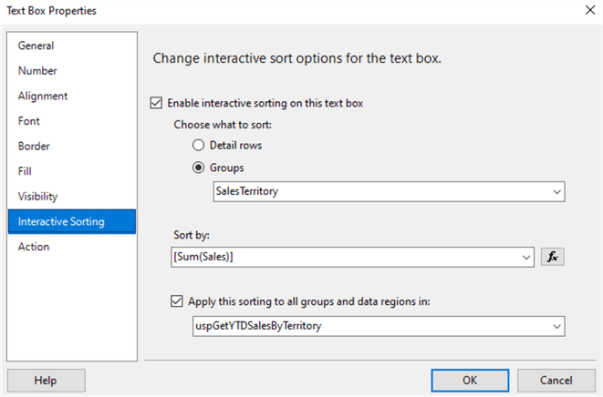
Figure 69 Enable Interactive Sorting on Sales
(6), We can quickly test the interactive sort buttons by previewing the report in the report designer. Figure 71 shows the data in the default order. The two columns support interactive sorting and we can observe the arrow icons beside the column headers.
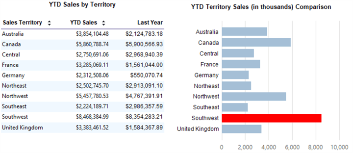
Figure 70 Sort the Table and Chart by Sales Territory
When first time clicking on an interactive button, we sort the data in ascending order. Next, we click on the button to sort data in descending order, as shown in Figure 71. Then, we can toggle between ascending and descending order for rows in the table and for bars in the chart.
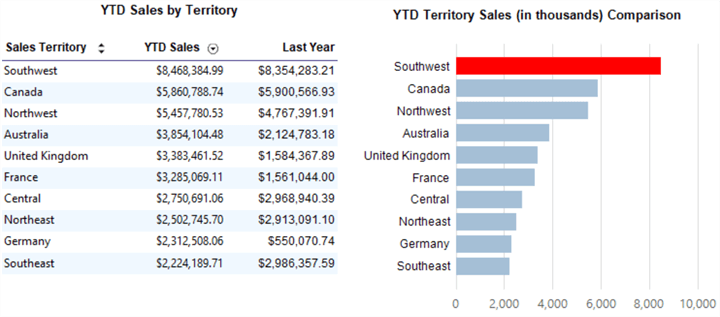
Figure 71 Sort the Table and Chart by YTD Sales
We tested the interactive sort buttons by previewing the report in the report designer. To ensure this solution can work in a production environment, we deployed the report to a report server. Section 4.4 in the article [15] describes how to deploy reports to a report server using Visual Studio 2019 and access them through the web portal. Figures 1 and 2 demonstrate the interactive sorting function when we view the report through the web portal.
Summary
We can use charts to present knowledge contained in data. Appropriate charts in reports allow viewers to discover insights drawn from data without intensive study. Since there are various chart types, selecting appropriate charts is becoming a crucial task in designing reports. The chart chooser diagram can provide a systematic approach to select charts.
We, first, introduced some best practices in chart selection. The article, then, explored the three-step process to choose charts. Next, we created a summary report with a table, matrix, bar chart, and sparklines. The reports used a shared data source, a shared dataset, and an embedded dataset, and we dived into more detail on adding them into the SSRS report. We linked these two datasets by the lookup function. Then, we explored steps to configure sparklines and the bar chart. The articles also covered some handy techniques: displaying all axis labels, highlighting the maximum data point in a series, and plotting data on the secondary axis.
After placing a header and footer to the report, we added interactive sort to the table and synchronized the sorting to the bar chart. When we clicked on the sort buttons in the table, the table and chart were sorted accordingly. Finally, we deployed the report to the report server and tested the report through the web portal. We can, additionally, export the report to a PDF file and print the report on a letter-sized paper.
Reference
[1] Kellenberger, K. (2016). Beginning SQL Server Reporting Services. Edwardsville, Il: Apress.
[2] Murray, S. (2013). SQL Server Reporting Services Advanced Charting. Retrieved from Redgate Hub: https://www.red-gate.com/simple-talk/sql/reporting-services/sql-server-reporting-services-advanced-charting/.
[3] Abela, A. (2010). Extreme Presentation Tools. Retrieved from: https://extremepresentation.com/tools/.
[4] Abela, A. (2008). Advanced Presentations by Design: Creating Communication That Drives Action. San Francisco, CA: Pfeiffer.
[5] Guyer, C., Hamilton, B., Sparkman, M., Milener, G., Rabeler, C., Ghanayem, M., Keller, L., Kumar, S., Howell, J. & Rigney, R. (2017). Charts (Report Builder and SSRS). Retrieved from SQL Docs: https://docs.microsoft.com/en-us/sql/reporting-services/report-design/charts-report-builder-and-ssrs?view=sql-server-ver15.
[6] Guyer, C., Hamilton, B., Sparkman, M., Milener, G., Rabeler, C., Ghanayem, M., Keller, L., Kumar, S., Howell, J. & Rigney, R. (2017). Add Interactive Sort to a Table or Matrix (Report Builder and SSRS). Retrieved from SQL Docs: https://docs.microsoft.com/en-us/sql/reporting-services/report-design/add-interactive-sort-to-a-table-or-matrix-report-builder-and-ssrs?view=sql-server-ver15.
[7] Kess, B. (2017). AdventureWorks sample databases. Retrieved from GitHub: https://github.com/Microsoft/sql-server-samples/releases/tag/adventureworks.
[8] Blaettler, G. K. (2018). The Difference Between Charts & Graphs. Retrieved from Sciencing: https://sciencing.com/difference-between-charts-graphs-7385398.html.
[9] Zelazny, G. (2001). Say It With Charts: The Executive’s Guide to Visual Communication (4th edition). New York, NY: McGraw-Hill.
[10] Tufte, R. E. (2001). The Visual Display of Quantitative Information (2nd edition). Cheshire, CT: Graphics Press.
[11] Hogle, P. (2018). Misleading Data Visualizations Can Confuse, Deceive Learners. Retrieved from Learning Solutions: https://learningsolutionsmag.com/articles/misleading-data-visualizations-can-confuse-deceive-learners.
[12] Rozakis, R. L. (2000). The Complete Idiot’s Guide™ to Writing Well. Indianapolis, IN: Alpha.
[13] Guyer, C., Sparkman, M., Hamilton, B., Rabeler, C., Ghanayem, M., Keller, L., Kumar, S., Howell, J. & Milener, G. (2018). Add Cascading Parameters to a Report (Report Builder and SSRS). Retrieved from SQL Docs: https://docs.microsoft.com/en-us/sql/reporting-services/report-design/add-cascading-parameters-to-a-report-report-builder-and-ssrs?view=sql-server-ver15.
[14] Murray, S. (2012). Creating a Reporting Service Report Template. Retrieved from MSSQLTips: https://www.mssqltips.com/sqlservertip/2649/creating-a-reporting-service-report-template/.
[15] Zhou, N. (2020). Multiple Row Grouping Levels in SSRS Report. Retrieved from MSSQLTips: https://www.mssqltips.com/sqlservertip/6533/multiple-row-grouping-levels-in-ssrs-report/.
[16] Guyer, C., Hamilton, B., Sparkman, M., Rabeler, C., Ghanayem, M., Keller, L., Kumar, Hu, J., S., Howell, J. & Milener, G. (2017). Add Interactive Sort to a Table or Matrix (Report Builder and SSRS). Retrieved from SQL Docs: https://docs.microsoft.com/en-us/sql/reporting-services/report-design/add-interactive-sort-to-a-table-or-matrix-report-builder-and-ssrs?view=sql-server-ver15&viewFallbackFrom=sql-server-ver15.
Next Steps
- The author provided step-by-step instructions to create a summary report with three different data regions: a table, matrix, and bar chart. At each step, there were several ways to customize the look and feel of these data regions. Before thinking of using alternative techniques, we can follow these instructions to create a report. We then spend time exploring different options. Since we read from left to right, for example, we may put the bar chart in the upper left of the report to emphasize the difference in sales amount presented in the chart. Well-designed reports create satisfactions and show that we value our audiences. It is worth the time and effort to select appropriate chart forms and design the report's appearance. If we have a tight project schedule, we can make a report work first, and make it work better later.
- Check out these related tips:
- Enter and Edit Data in SQL Server Reporting Services
- SQL Server 2017 Machine Learning Services Visualization and Data Analysis
- Creating a Detailed SQL Server Reporting Services Report Containing External Images and Repeated Table Header
- SQL Server Reporting Services Empty Report from a Data Driven Subscription
- SQL Server Reporting Services Report and Group Variable References
- Cross Tab Report in SSRS
- Multiple Row Grouping Levels in SSRS Report
- Interactive Sorting for a SQL Server Reporting Services Report
- SQL Server Reporting Services Lookup, LookupSet and MultiLookup Functions
- Join Multiple SharePoint Lists to build SQL Server Reporting Services SSRS Report
- Visual Studio 2019 Configuration for the Production DBA

Nai Biao Zhou has twenty years of experience in software development, with strong analytical skills and a broad range of computer expertise.
He has fifteen years of experience in development and maintenance of database applications on SQL Server in OLTP/OLAP/BI environments.
He has a master’s degree in Control Engineering and is pursuing a Master of Science degree in Predictive Analytics.
Knowledge/Skills
Advanced computer programming skills and well versed with C/C#, Java, ASP.NET, JavaScript, and SQL.
In depth knowledge of Solution Architecture, and Software Development Life Cycle (SDLC).
Microsoft Certified Application Developer (MCAD) since 2004.
- MSSQLTips Awards: Author of the Year – 2021 | Rising Star (50+ tips) – 2024 | Author Contender – 2020, 2023