Problem
These days we widely use tables, graphs and charts to describe data and turn data into knowledge. In fact, a graphical illustration may be more revealing than data in tabular form, and it allows viewers to discover insight in the data without intensive study [1]. Various types of graphs and charts are available for our selection. When inappropriate types of visual aids are selected to represent data, they may serve more to confuse than to clarify. We need a comprehensive method to choose appropriate types of graphs and charts, and we also want to know how to create these graphs or charts through SQL Server 2017 Machine Learning Services (SQL MLS).
Solution
We are going to select an appropriate chart by using the chart chooser [2][3], a well-equipped tool created by Dr. Andrew. Please note that the terms, graph and chart, sometimes used interchangeably. To avoid confusion, I adopted Blaettler’s point [4]: all graphs are charts, but not all charts are graphs; hereafter I will use the term chart to represent both graph and chart. According to [5], quantitative variables can be described by these five basic chart forms: pie chart, bar chart, column chart, line chart and scatter chart. Each basic chart form has several variations. I would like to use these five chart forms and their variations to visualize both qualitative and quantitative variables.
I have already discussed several variable types in the tip "Getting Started with Data Analysis and Visualization with SQL Server and R". To elaborate on the process to create charts through SQL MLS, we assume some business requirements from Adventure Works Cycles [6]:
- Adventure Works Cycles created ten sales territories based on geography. Sales managers should balance these sales territories and fairly distribute sales potential. To determine whether they need to redesign the sales territories, managers want to look at the sales revenue received in each sales territory.
- Salespersons in this company have been assigned sales quotas every year, and the variance between sales quota and actual sales reflects performance of a salesperson. To understand the overall performance of the sales team, sales managers would like to monitor variance between total sales quotas and total actual sales in every month and compare the changes of variance over time.
- Assuming all employees in this company are paid an hourly rate for each hour they work. Many factors, for example, occupation, experience, educational level and location, influence the hourly rate. Human resource managers would like to know how frequency distribution of hourly rates look and what base rate range most employees fall in.
- Adventure Works Cycles organized products into four categories: bikes, components, clothing and accessories. These products categories help customers and investors to understand the business model. Financial analysts would like to know every category’s share of total sales revenue.
- Marketing managers like to investigate customer’s buying behavior. They want to know, for a certain product category, whether male customers or female customer prefer to place orders through Internet.
- Normally, we expect customers at higher income tend to spend more. However, this does not imply that these customers are willing to buy more products from Adventure Works Sales. Marketing managers want to know whether a customer’s total purchase amount at this company and that customer’s income are related.
It is said that one picture is worth 1,000 words. Nevertheless, there are some situations where a chart is not necessary [5]:
- Sometimes, a chart may denote a sense of accuracy that distort our intentions.
- Sometimes, viewers are comfortable with small data sets presented in well-formatted tabular forms.
- Some individuals may prefer not to use charts.
We are going to use data from the AdventureWorks sample database "AdventureWorksDW2017.bak" [7]. We will use "R Tools for Visual Studio (RTVS)", introduced in my other tip "Getting Started with Data Analysis on the Microsoft Platform — Examining Data".
The solution was tested with SQL Server Management Studio V17.4, Microsoft Visual Studio Community 2017, Microsoft R Client 3.4.3, and Microsoft ML Server 9.3 on Windows 10 Home 10.0 <X64>. The DBMS is Microsoft SQL Server 2017 Enterprise Edition (64-bit).
1 – The Chart Chooser
I downloaded the chart chooser from Extreme Presentation Tools [2]; the tool provides a diagram to select a chart. To use the diagram, we should first ask what we want to present through a chart. Then, we identify a task of the chart, for example, making a comparison or discovering a relationship. Based on variable types, number of variables and size of the data set, we follow the lines in the diagram, then we will find a chart that the diagram suggests [8]. Bear in mind that the diagram is a guideline rather than a rule. The selection process implied in the diagram is like Zenlazny’s three-level decision tree: (1) Message;(2) Comparison and (3) Chart form [5].
Step 1: Determine what you want to show your viewers.
IT professionals usually obtain requirements from business users. The requirements should state actionable insight that the chart wants to present. If such a statement does not exist in the requirement document, developers should find out what the specific points the business users want to delivery to their viewers. Adventure Works Cycles, for example, plans to broaden its market share. One proposal is to extend the product availability through an external Web site [6]. They compared male and female customers’ buying behavior in each product category. They have found, in each product category, the number of orders placed by male customers was similar to the number of orders placed by female customers. They would like to create a chart to show this point to web designers. The web pages for each product category should be attractive to both male and female customers. The point they want to make can be the title of the chart [5], for example, "No Significant Difference of Online Shopping between Male and Female Customers".
Step 2: Identify the task of a chart.
The outcome from the first step determines the task that we want to accomplish through a chart. Dr. Abela have identified four tasks that charts can perform [3]:
- Comparison: compare among items or compare the same item through time.
- Distribution: display data frequency distribution.
- Composition: highlight the component parts of total.
- Relationship: show the relationships between quantitative variables.
The example given in the first step indicates that the chart should show the number of orders placed by each gender group as a percentage of total. Therefore, the task of this chart should be composition. Usually one chart accomplishes one task. If we discover more tasks in this step, we may end up with producing more charts.
Step 3: Select a chart.
The chart chooser has four branches: comparison, distribution, composition and relationship. According to the task identified in the second step, we can drill down into a branch and then select a chart. The chart chooser covers five basic chart forms and their variations. We usually use variations to provide additional information. Provided these basic forms can correctly deliver business insight, we do not need to use these variations.
There are eight chart forms in the comparison branch. When we make a comparison among items, we use a column chart for few items and use a bar chart for many items. For a comparison of same item changes over time, we use a column chart for few data points and select a line chart for many data points. Other charts, such as table with embedded charts, variable width column charts and circular area charts, are also used in comparison.
The distribution branch has four charts. Mostly, we use a histogram, in which the range across the horizontal scale are equal and discrete [5], to study a frequency distribution of a single variable. When there are many continuous data points in a data set, we prefer to use a line histogram whose horizontal scale shows the values lined up against the ticks rather than expressed as groups [5]. We are also able to use scatter charts to describe frequency distribution of two quantitative variables and use 3D area charts to study frequency distribution of three quantitative variables.
Charts in the composition branch are used to highlight the component parts of total. When we want to show a simple share of total, we can select a pie chart. For time-series data, a stacked column chart is chosen to show the relative or absolute difference or both. If we only care about the relative differences, we can select a stacked 100% column chart. When we have many data points in the data set, we use lines rather than columns, therefore, we can choose a stacked area chart or a stacked 100% area chart. Other charts, like waterfall charts and stacked 100% column charts with subcomponents, are used for static data.
We only have two options in the relationship branch. We choose a scatter chart to study the relationship between two quantitative variables and find out whether two variables follow an expected pattern. For three quantitative variables, we can use a bubble chart to show their relationship, where the size of bubble represents the third variable.
Given the example in the second step, the qualitative variable gender has two values and the qualitative variable has five values. We choose a stacked 100% column chart to emphasize that there is no significant difference of online shopping between male and female customers.
2 – Best Practices of Excellence and Integrity
Tufte, a pioneering expert on data visualization [9], presented five principles of graphical excellence and six principles of graphical integrity in his book [10]. He also introduced nine best practices to achieve excellence in statistical graphics. Dr. Anil Maheshwari has interpreted these practices in his book [9]. It is better to adopt some best practices for creating professional charts:
- We should know what specific points we want to make through charts. Then we choose a visualization technique.
- There always are several techniques to show data. We should choose one to fit specific points we want to convey, and to fit viewers we want to deliver.
- We should not intend to mislead viewers and misrepresent what the data have to say. We let a chart tell a complete and true story to all viewers.
- We should avoid unintentionally misrepresenting data through a chart. The message we intend to convey must be the same as what viewers understand the chart.
- We should let data shine. Charts induce viewers to think about insight in the data rather than the techniques to produce these charts [10].
- Any bit of graphic ink should present unique statistical information in the data set. Any redundant and irrelative bits of ink should be removed from the charts [10].
- We can add description, exploration, tabulation, or decoration into visual display to serve a reasonable clear purpose [10].
- Use color with purpose, for example, emphasizing, identifying, distinguishing, and symbolizing [5]. We also can use color as a means of encoding extra dimensions. However, color is best used to encode no more than two dimensions of data [11].
- Simpler is better. If a simple chart can show the data, we use the simple chart. The five basic chart forms are the pie chart, the column chart, the line chart and the scatter chart. In general, pie charts are the least practical of the five chart forms [5].
- Fewer is better. More charts create more confusion and boredom [5].
3 – Producing Charts
We will follow the three-level decision tree to select charts. In each sub-section, we start with a question: what do we expect viewers to learn from the chart? Then we answer this question, and subsequently identify the task of the chart. Next, we select a chart based on all these principles and best practices we have discussed. Finally, we are going to use RTVS to create stored procedures to plot these charts.
3.1 Using a Bar Chart to Compare Sum of a Quantitative Variable Grouped by a Qualitative Variable
Sales managers want to rank the store sales in each sales territory to make sure that the ten sales territories are in balance. The data in the tabular form reveals that sales revenue differs sharply across sales territories in fiscal year 2012. Sales managers want to demonstrate this message. Therefore, we should design a chart to illustrate comparisons between these ten sales territories, and we can use the message as the chart title. Patently, the task of this chart is to make a comparison. The title of this chart can be denoted as "Sales Revenue Differs Sharply across Sales Territories in Fiscal Year 2012".
From the data warehouse, we retrieved a data set which contains the total store sales revenue grouped by each sales territory group. The sales revenue is termed a quantitative variable. The sales territory group is termed a qualitative variable that takes ten nominal values. Through the three-level decision tree, the chart chooser suggests a bar chart. Certainly, a column chart can also fulfill this task. However, I prefer to a bar chart due to two reasons. Firstly, we conventionally use a column chart to present time-series data. Secondly, the sales territory names have lengthy labels, such as "United Kingdom" [5].
We are going to call R function "barplot()" in R codes within a SQL stored procedure to obtain the bar chart. We will use "R Tools for Visual Studio sample projects" as a starting point. This sample project from Microsoft provides an in-depth introduction to R through the extensive comments in two source files [12]. If you are the first time user of RTVS, my other tip "Getting Started with Data Analysis on the Microsoft Platform — Examining Data" elaborated a step-by-step approach to create a stored procedure containing R codes.
3.1.1 Create a New Stored Procedure "sp_store_sales_by_territory"
Add a new stored procedure to the sample project. As shown in Figure 1, three files were added into the project. The final version of the stored procedure on the target SQL server contains SQL script and R codes. With RTVS tool, we separate these codes into three files, thus we do not mix R codes and SQL codes in one file. We are going to write R codes in the R file, write a SQL query in the query file, and modify the template file to integrate R codes and the SQL query into a stored procedure.

Figure 1 – Add a new stored procedure in the project through RTVS
3.1.2 Write a SQL Query to Retrieve Store Sales Revenue by Territory
Open the file "sp_store_sales_by_territory.Query.sql" and place the following SQL codes into the file. The query reads stored sales amount for every territory in fiscal year 2012.
SELECT d.SalesTerritoryRegion
   ,SUM([ExtendedAmount])/1000.0 AS ExtendedAmount
FROM [dbo].[FactResellerSales] f INNER JOIN [dbo].[DimSalesTerritory] d
               ON f.SalesTerritoryKey = d.SalesTerritoryKey
               INNER JOIN [dbo].[DimDate] a
               ON f.OrderDateKey = a.DateKey
WHERE a.FiscalYear = 2012
GROUP BY d.SalesTerritoryRegion
ORDER BY ExtendedAmount
It is worth noting that we can stress the ranking by a suitable sequence [5]. We can sort the data set by territory name, or by the magnitude of the sales amount. The purpose of this chart is to compare the amount; thus, we arranged the data set by the sales amount in the magnitude order.
3.1.3 Plot a Bar Chart Using R
Open the R script file "sp_store_sales_by_territory.R"; use the following R codes to replace the existing codes. Note that we un-comment test codes so that we can test these R codes through RTVS. We must comment these test codes before publishing the stored procedure.
# @InputDataSet: input data frame, result of SQL query execution
# @OutputDataSet: data frame to pass back to SQL
# Test code
library(RODBC)
channel <- odbcDriverConnect(settings$dbConnection)
InputDataSet <- sqlQuery(channel, iconv(paste(readLines('auto-generated file location/sp_store_sales_by_territory.query.sql', encoding = 'UTF-8', warn = FALSE), collapse = '\n'), from = 'UTF-8', to = 'ASCII', sub = ''))
odbcClose(channel)
# End of test code
OutputDataSet <- InputDataSet
#Save the graph to a pdf file
pdf(paste("C:\\Development\\workfolder\\", as.character(Sys.Date()), "_store_sales_by_territory.pdf"))
#Make a copy of the current settings
opar <- par(no.readonly = TRUE)
#Increase size of margin
par(mar = c(4, 10, 2, 1))
#Make label text perpendicular to axis
par(las = 1)
#Plot the bar chart
barplot(height=OutputDataSet$ExtendedAmount,
        names = OutputDataSet$SalesTerritoryRegion,
        horiz =  T,
        main = "Sales Revenue Differs Sharply across Sales Territories in Fiscal Year 2012",
        xlab = "Sales Revenue (in Thousands)",
        col = "skyblue",
        cex.main = 2,
        cex.lab = 1.5,
        cex.names = 1.5,
        cex.axis = 1.5)
#Restore the original settings
par(opar)
#Shut down the current device
dev.off()
We run these codes to create a PDF file with a bar chart as shown in Figure 2. To serve a reasonable clear purpose, I used the color sky-blue to decorate the bar. In addition, we usually make space between the bars smaller than the width of the bars.
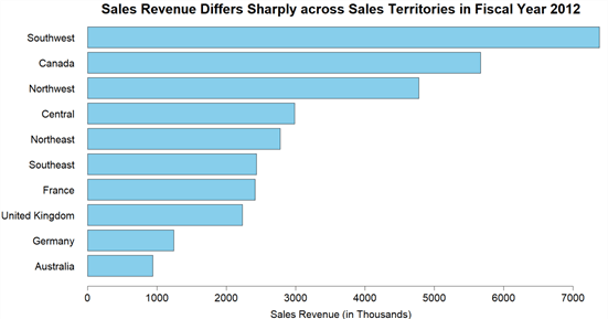
Figure 2 – Sales Revenue Differs Sharply across Sales Territories in Fiscal Year 2012
The chart obviously shows the significant difference on sales revenue among the territories in fiscal year 2012. The Southwest territory generated the most revenue, which is about seven times as many as revenue received in the Australia territory. The sales manager may propose a strategy to re-design the territories, for example creating new territories from southwest, or combining some territories.
3.1.4 Modify the Stored Procedure Template
Open the template file "sp_store_sales_by_territory.Template.sql", use the following script to replace the existing codes.
CREATE PROCEDURE [sp_store_sales_by_territory]
AS
BEGIN
EXEC sp_execute_external_script @language = N'R'
    , @script = N'_RCODE_'
    , @input_data_1 = N'_INPUT_QUERY_'
--- Edit this line to handle the output data frame.
    WITH RESULT SETS ((
      SalesTerritoryRegion nvarchar(50),
      TotalExtendedAmount  money
   ));
END;
3.1.5 Publish the Stored Procedure to the Database
Before publishing the stored procedure, we should comment testing codes in the R file. Then, we use the "Publish Stored Procedure" menu command from the menu "R Tools -> Data" to publish the stored procedure.
To verify the successful publishing process, we run the stored procedure through SSMS. The result should look like Figure 3. In the meanwhile, a PDF file with a bar chart, as shown in Figure 2, was generated.

Figure 3 – Run the stored procedure through SSMS
We compared the total sales revenue among sales territories. Sales revenue received in territories differ significantly in fiscal year 2012, and sales managers may need to investigate whether some territories are under-servicing of customers and some territories are over-servicing customers. The company may need to determine re-designing the sales territory. We looked at the sum of revenues grouped by each sales territory in this exercise. The pattern can also apply other aggregated measures, for example, mean and median. To make an enhancement, we can add some parameters, such as, "@fiscal_year", to the stored procedure.
3.2 Using a Multiple Line Chart to Compare Sum of the Quantitative Variables Changed Over Time
To evaluate the sales team performance and discover the performance trend, sales managers have compared sales quotas and actual sales of all salespersons in every month of calendar year 2012. The comparison reveals that revenue received from actual sales does not hit sales quota in second half calendar year 2012. Sales managers want to use a chart to make this point. Sales managers expect viewers to understand their point and adopt some marketing strategies to boost sales. The task of this chart calls for presenting magnitude changes of two quantitative variables over time.
Through using the three-level decision tree, the tool suggests a multiple line chart that is constructed from multiple data sets. To convey the point that sales managers want to make, the chart will be entitled "Actual Sales Does Not Meet Sales Quota in 2nd Half Calendar Year 2012". One challenge in designing multiple line chart is to decide how many trend lines we can show simultaneously before the chart looks more like spaghetti than trends [5]. I prefer to present two lines in a multiple line chart.
We will call "plot()" function in R codes within a SQL stored procedure to obtain the multiple line chart. We will continue to use the sample project. When the project is ready, we add a new stored procedure "sp_sales_quotas_and_actual_by_month" to the project, then work on contents in the three auto-generated files.
3.2.1 Write a SQL Query to Read Sales Quotas and Actual Sales
Sales Quotas and Actual Sales data are in two fact tables, and they are in two data sets. We will union these two datasets into one since we can pass only one data set to the stored procedure "sp_execute_external_script". In the data warehouse, the grain of sales quota is at quarter level, we need to allocate the sales quota to month level. In addition, we attempt to pass a parameter "@CalendarYear" to the stored procedure. Hence, we can reuse this stored procedure in other calendar years. Since the query is not a simple select statement, we are going to create a view to wrap all these logics:
USE [AdventureWorksDW2017]
GO
SET ANSI_NULLS ON
GO
SET QUOTED_IDENTIFIER ON
GO
CREATE VIEW [dbo].[vEmployeeSalesMonthly]
AS
   With  SalesQuota
   AS
   (
   SELECT 'Sales Quota'   AS Scenario
        ,[CalendarYear]
         ,CASE   [CalendarQuarter]
           WHEN 1 THEN '1,2,3'
           WHEN 2 THEN '4,5,6'
           WHEN 3 THEN '7,8,9'
           ELSE '10,11,12'
         END   AS Months
        ,[SalesAmountQuota]/3.0 AS SalesAmount
     FROM [dbo].[FactSalesQuota]
   )
   SELECT Scenario,
         CalendarYear,
         CAST(value as int) as MonthNumberOfYear,
         SalesAmount
   FROM SalesQuota
     CROSS APPLY STRING_SPLIT(Months, ',')
   UNION ALL
   SELECT 'Actual Sales'   AS Scenario
        ,d.CalendarYear
        ,d.MonthNumberOfYear
        ,f.[SalesAmount]
     FROM [dbo].[FactResellerSales] f
     INNER JOIN [dbo].[DimDate] d ON f.[OrderDateKey] = d.DateKey
GO
Open the file "sp_sales_quotas_and_actual_by_month.Query.sql" and place the following SQL codes into the file. Note that each row in the data set represents actual sales or sales quotas for one employee. To obtain the overall performance, we will aggregate data in R codes.
-- Place SQL query retrieving data for the R stored procedure here
--Testing Codes, should be commented before publishing
DECLARE @paramCalendarYear int
SET @paramCalendarYear = 2012
--End
SELECT [Scenario]
      ,[CalendarYear]
      ,[MonthNumberOfYear]
      ,[SalesAmount]
  FROM [dbo].[vEmployeeSalesMonthly]
WHERE [CalendarYear] = @paramCalendarYear
3.2.2 Plot a Multiple Line Chart Using R
Since the data set obtained from the SQL query contains sales amount for each employee, we will use "aggregate(x, by, FUN)" function in R to collapse data. In addition, we will use sub-setting techniques to split the data set into two data sets: actual sales data set, and sales quotas data set.
Open the R script file "sp_sales_ quotas_and_actual_by_month.R"; use the following R codes to replace the existing codes. It is noteworthy that we un-comment test codes so that we can test these R codes through RTVS. We must comment these test codes before publishing the stored procedure.
# @InputDataSet: input data frame, result of SQL query execution
# @OutputDataSet: data frame to pass back to SQL
# Test code
library(RODBC)
channel <- odbcDriverConnect(settings$dbConnection)
InputDataSet <- sqlQuery(channel, iconv(paste(readLines('auto-generated file location /sp_sales_quotas_and_actual_by_month.query.sql', encoding = 'UTF-8', warn = FALSE), collapse = '\n'), from = 'UTF-8', to = 'ASCII', sub = ''))
odbcClose(channel)
# End of test code
OutputDataSet <- InputDataSet
#Add the data frame to the R search path
attach(OutputDataSet)
#Group the data by Scenario, CalendarYear and MonthNumberOfYear
TotalSalesAmount <- aggregate(SalesAmount,
                              by = list(grp.Scenario = Scenario,
                                        grp.CalendarYear = CalendarYear,
                                        grp.MonthNumberOfYear = MonthNumberOfYear),
                              FUN = sum,
                              na.rm = TRUE)
#Convert amount to be in thousands
TotalSalesAmount$x <- TotalSalesAmount$x/1000
#Remove the data frame from the search path.
detach(OutputDataSet)
#Add the data frame to the R search path
attach(TotalSalesAmount)
#Split the data set into two data sets
TotalSalesAmountActual <- TotalSalesAmount[grp.Scenario == "Actual Sales",]
TotalSalesAmountQuota <- TotalSalesAmount[grp.Scenario == "Sales Quota",]
#Remove the data frame from the search path.
detach(TotalSalesAmount)
#Rename column name
names(TotalSalesAmountActual) <- c("Scenario", "CalendarYear", "MonthNumberOfYear", "Actual.Sales")
names(TotalSalesAmountQuota) <- c("Scenario", "CalendarYear", "MonthNumberOfYear", "Sales.Quota")
#Exclude(drop) the first variable
vars_actual <- names(TotalSalesAmountActual) %in% c("Scenario")
vars_quota <- names(TotalSalesAmountActual) %in% c("Scenario")
Total.Sales.Amount.Actual <- TotalSalesAmountActual[!vars_actual]
Total.Sales.Amount.Quota <- TotalSalesAmountQuota[!vars_quota]
#Save the graph to a pdf file
pdf(paste("C:\\Development\\workfolder\\", as.character(Sys.Date()), "_actual_sales_and_sales_quota.pdf"))
#Make a copy of the current settings
opar <- par(no.readonly = TRUE)
#Use par(mar) to increase the plot margins and par(mgp) to move the axis label.
par(mar = c(8, 8, 2, 2), mgp = c(5, 1, 0))
#Plot a multiple line chart
colors <- c("black","skyblue")
#Set up the plot canvas
#The plot() function creates a new graph when invoked.
plot(range(TotalSalesAmount$grp.MonthNumberOfYear),
     range(TotalSalesAmount$x),
     type = "n",
     bty = "n",
     xlab = "Calendar Month",
     ylab = "Sales Amount (in Thousands)",
     main = paste("Actual Sales Does Not Meet Sales Quota in 2nd Half Calendar Year ",
            TotalSalesAmount$grp.CalendarYear[1]),
     cex.main = 2,
     cex.lab = 1.5,
     cex.axis = 1.5)
#Add lines from different data sets
#The lines() function adds information to an existing graph but can ’t produce a graph on its own.
lines(Total.Sales.Amount.Actual$MonthNumberOfYear,
      Total.Sales.Amount.Actual$Actual.Sales,
      type = "l",
      lty = 1,
      lwd = 2,
      col=colors[1])
lines(Total.Sales.Amount.Quota$MonthNumberOfYear,
      Total.Sales.Amount.Quota$Sales.Quota,
      type = "l",
      lty = 1,
      lwd = 2,
      col = colors[2])
#Add grid only in y-direction
grid(NA, NULL, lwd = 1)
#Add a legend
legend(min(TotalSalesAmount$grp.MonthNumberOfYear),
       max(TotalSalesAmount$x),
       c("Actual Sales","Sales Quotas"),
       col = colors,
       lty = c(1, 1))
#Restore the original settings
par(opar)
#Shut down the current device
dev.off()
#Clean up the output
OutputDataSet <- OutputDataSet[FALSE,]
Through RTVS, these codes should be able to create a PDF file with a multiple line chart, which should look like Figure 4. Note that the colors used in this chart represent extra dimensions, and horizontal grid lines are for reference purpose. In addition, we usually make the trend lines bolder than baselines, and baselines bolder than grid lines.
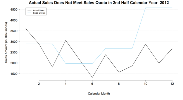
Figure 4 -Actual Sales Does Not Meet Sales Quota in 2nd Half Calendar Year 2012
The chart reveals that the difference between the actual sales and sales quotas in the fourth quarter of year 2012 is significant. The company may overestimate the seasonal factors, or something may have happened unexpectedly. This finding is worth of further investigation. The trend of actual sales amount is fluctuating in this chart.
3.2.3 Modify the Stored Procedure Template
Open the template file "sp_sales_quotas_and_actual_by_month.Template.sql", use the following script to replace the existing codes. Note that the procedure accepts a parameter "@intCalendarYear", and the value of "@intCalendarYear" pass to the parameter "@paramCalendarYear" that is used by the SQL query.
CREATE PROCEDURE [sp_sales_quotas_and_actual_by_month]
   @intCalendarYear INT
AS
BEGIN
EXEC sp_execute_external_script @language = N'R'
    , @script = N'_RCODE_'
    , @input_data_1 = N'_INPUT_QUERY_'
    , @params = N'@paramCalendarYear INT'
    , @paramCalendarYear = @intCalendarYear
--- Edit this line to handle the output data frame.
END;
3.2.4 Publish the Stored Procedure to the Database
Before publishing the stored procedure, we should comment testing codes in the R file and the sql file. Then, we use the "Publish Stored Procedure" menu command from the menu "R Tools -> Data" to publish the stored procedure. The confirmation message in the output window ensured the successful publishing process:
Publishing complete. Connection Data Source=(local);Initial Catalog=AdventureWorksDW2017;Integrated Security=True;TrustServerCertificate=False
We created a stored procedure to plot a multiple line chart, which was also called as a grouped line chart. The chart can compare trends of two or more groups. In this exercise, we compared the trends of actual sales and sales quotas. The chart clearly illustrates the significant variance in the last quarter in 2012. The procedure accepts a parameter so that we can re-use this procedure to plot time-series data in different years. We also used R functions to manipulate data before plotting it. To serve a reasonably clear purpose, we added grid lines and legend to the chart.
3.3 Using a Line Histogram to Illustrate Frequency Distribution of a Single Quantitative Variable
Employees with same qualifications should be paid equally. Inequality may produce unhappy employees and therefore reduce productivity and increase turnover rate. A reasonable frequency distribution of compensation, like a bell-shaped curve, is normally expected. Due to minimum wage law, the curve likely is skewed to right, which means base rates of most people are lower than the mean of the base rates. The data analysis reveals that base rates for most employees are between 10 and 30 dollars and HR managers want to convey this message through a chart. Therefore, the task of this chart is to display frequency distribution.
There are 296 employees in the data warehouse, which means we have many data points in the data set. we are going to select a line histogram as the chart chooser suggests. We use the chart title "Base Rates of Most Employees Are Between 10 and 30 Dollars". If HR managers only want to split the base rate into several groups and show the number of employees fall into these groups, we use a column chart that is also named as histogram. Then, the chart title will be "Number of Employees by Base Rate Group".
We consider density plots as smoothed histograms. In general, kernel density plots can be an effective way to illustrate the frequency distribution of a quantitative variable [13]. In R, the "density()" function computes kernel density estimates. We will use a SQL stored procedure to call this function. We continue to use the sample project. First of all, we add a new stored procedure "sp_employee_base_rates_distribution" to the project. Then, we are going to write codes in each file.
3.3.1 Write a SQL Query to Retrieve Employee Base Rates
Open the file "sp_employee_base_rates_distribution.Query.sql" and place the following SQL codes into the file.
-- Place SQL query retrieving data for the R stored procedure here
SELECT [BaseRate]
FROM [dbo].[DimEmployee]
WHERE [Status] = 'Current'
3.3.2 Plot a Kernel Density Plot Using R
Replace the content of the R script file "sp_employee_base_rates_distribution.R" with the following codes. We must comment those test codes before publishing the stored procedure.
# @InputDataSet: input data frame, result of SQL query execution
# @OutputDataSet: data frame to pass back to SQL
# Test code
library(RODBC)
channel <- odbcDriverConnect(settings$dbConnection)
InputDataSet <- sqlQuery(channel, iconv(paste(readLines('auto-generated file location/sp_employee_base_rates_distribution.query.sql', encoding = 'UTF-8', warn = FALSE), collapse = '\n'), from = 'UTF-8', to = 'ASCII', sub = ''))
odbcClose(channel)
# End of test code
OutputDataSet <- InputDataSet
#Save the graph to a pdf file
pdf(paste("C:\\Development\\workfolder\\", as.character(Sys.Date()), "_employee_base_rate.pdf"))
#Plot the Kernel Density Plot
plot(x = density(OutputDataSet$BaseRate),
     bty = "n",
     xlab = "Employee Base Rate (Dollars)",
     main = "Base Rates of Most Employees Are Between 10 and 30 Dollars")
#Shut down the current device
dev.off()
#Clean up the output
OutputDataSet <- InputDataSet[FALSE, FALSE]
Run these codes and create a PDF file with a line chart. The chart should resemble to Figure 5. The chart illustrates a bimodal distribution, which has two peaks. One peak represents a major mode, and the other represents minor mode. The bimodal distribution indicates there are two groups in the data set. Further investigation reveals that the minor mode represents the sales representatives. The base rates of most employees are between 10 and 30 dollars. And several base rates are more than 60 dollars. The chart implies that mean is greater than median, and we also call this distribution right-skewed.

Figure 5 – Base rates of most employees are between 10 and 30 dollars
3.3.3 Modify the Stored Procedure Template
Modify the template file "sp_employee_base_rates_distribution.Template.sql" with the following codes:
CREATE PROCEDURE [sp_employee_base_rates_distribution]
AS
BEGIN
EXEC sp_execute_external_script @language = N'R'
    , @script = N'_RCODE_'
    , @input_data_1 = N'_INPUT_QUERY_'
--- Edit this line to handle the output data frame.
    WITH RESULT SETS NONE;
END;
3.3.4 Publish the Stored Procedure to the Database
Comment testing codes in the R file; then, use the "Publish Stored Procedure" command from the menu "R Tools -> Data" to publish the stored procedure. We received an error message shown in Figure 6. The root cause is that the publishing process replaced the "_INPUT_QUERY_" in the template file with the content in the sql file. The single quotes around the "Current" value caused this issue. To solve this issue, we should use two single quotes to escape the single quotes.

Figure 6 – The error message received from the publishing process
Update the "sp_employee_base_rates_distribution.Query.sql" file with the following sql codes. Then, publish the procedure again. We receive a confirmation message in the output window.
-- Place SQL query retrieving data for the R stored procedure here
SELECT [BaseRate]
FROM [dbo].[DimEmployee]
WHERE [Status] = ''Current''
We created a SQL stored procedure to call the R function "density()" to construct kernel density estimates. Then the basic function "plot()" was referenced to produce the density plot, which visualize the distribution of base rates over a continuous interval. The distribution shape presented by a density plot is better than the one illustrated by a typical histogram because number of bins used in a histogram has an influence on the shape. Two peaks have been observed through the chart, meaning that, when most employees are paid in an expected pattern, the sales team are paid in a different pattern. One reason is that the company also paid commission to sales staff.
3.4 Using a Pie Chart to Describe a Data Set with a Qualitative Variable and a Quantitative Variable
The company has the four product lines: bicycles, bicycle components, bicycle apparel and bicycle accessories [6]. These products have been categorized according to the products lines. Financial analysts would like to know how revenues received from these categories make up the total revenue. They expect viewers to focus on the product category that contributed most to the total revenue. The chart should show revenue received from each product category as a percentage of the total revenue. Therefore, the task of this chart is to highlight the component parts of data. The chart title can be denoted as "Bikes Accounted for 86% of Total Revenue".
Following lines in the chart chooser, the tool suggests a pie chart. Usually, a pie chart does not contain more than six components [5]. Note that pie chart is not for comparison. If we want to make a comparison, a bar chart or a column chart is an excellent tool because our brains are good at comparing through the length of bars in a bar chart or column chart rather than the angles in a pie chart.
Add a new stored procedure "sp_sales_revenue_by_product_category" to the sample project. We are going to use the "pie()" function to plot the pie chart. The following steps will modify the three source files of the stored procedure:
3.4.1 Write a SQL Query to Retrieve Sales Revenues Grouped by Product Categories
Place the following codes into the file "sp_sales_revenue_by_product_category.Query.sql". The query reads both internet sales and store sales for every product category.
-- Place SQL query retrieving data for the R stored procedure here
SELECT SUM([ExtendedAmount]) AS Revenue,
      EnglishProductCategoryName AS CategoryName
FROM
(
   SELECT f.[ExtendedAmount], c.EnglishProductCategoryName
   FROM [dbo].[FactInternetSales] f
   INNER JOIN [dbo].[DimProduct] p ON f.ProductKey = p.ProductKey
   INNER JOIN [dbo].[DimProductSubcategory] sub ON p.ProductSubcategoryKey = sub.ProductSubcategoryKey
   INNER JOIN [dbo].[DimProductCategory] c ON sub.ProductCategoryKey = c.ProductCategoryKey
   UNION ALL
   SELECT f.[ExtendedAmount], c.EnglishProductCategoryName
   FROM [dbo].[FactResellerSales] f
   INNER JOIN [dbo].[DimProduct] p ON f.ProductKey = p.ProductKey
   INNER JOIN [dbo].[DimProductSubcategory] sub ON p.ProductSubcategoryKey = sub.ProductSubcategoryKey
   INNER JOIN [dbo].[DimProductCategory] c ON sub.ProductCategoryKey = c.ProductCategoryKey
)a
GROUP BY a.EnglishProductCategoryName
ORDER BY SUM([ExtendedAmount]) DESC
3.4.2 Plot the Pie Chart Using R
Use the following R codes to replace the existing codes in the file "sp_sales_revenue_by_product_category.R". Those testing codes are used to reference the query file, and then load the data from the SQL query. We must comment these test codes before publishing the stored procedure.
# @InputDataSet: input data frame, result of SQL query execution
# @OutputDataSet: data frame to pass back to SQL
# Test codes
library(RODBC)
channel <- odbcDriverConnect(settings$dbConnection)
InputDataSet <- sqlQuery(channel, iconv(paste(readLines('auto-generated query file location /sp_sales_revenue_by_product_category.query.sql', encoding = 'UTF-8', warn = FALSE), collapse = '\n'), from = 'UTF-8', to = 'ASCII', sub = ''))
odbcClose(channel)
# End of test codes

OutputDataSet <- InputDataSet
#Calculate percentage of each component.
percentage <- round(OutputDataSet$Revenue / sum(OutputDataSet$Revenue) * 100)

#Create a label with percentage in the second line.
label_pie <- paste(OutputDataSet$CategoryName, "(", percentage,"%)",sep = "")
#Save the graph to a pdf file
pdf(paste("C:\\Development\\workfolder\\", as.character(Sys.Date()), "_revnues_by_product_categories.pdf"))
#Produce the pie chart
pie(
    x = OutputDataSet$Revenue,
    labels = label_pie,
    col = rainbow(length(label_pie)),
    cex = 0.8,
    main = "Bikes Accounted for 86% of Total Revenue"
    )
#Shut down the current device
dev.off()
We should be able to run these codes and create a PDF file with a pie chart. The chart should look like Figure 7. Note that the "rainbow(n)" function was used to generate a vector of n contiguous colors. We use contrasting colors in the pie chart to add emphasis. The pie chart presents the share of total revenue by each product category. The bikes category contributed the largest share of total revenue and the accessories category contributed the least share of total revenue.

Figure 7 – Bikes accounted for 86% of total revenue
3.4.3 Modify the Stored Procedure Template
Open the template file "sp_sales_revenue_by_product_category.Template.sql"; Replace the existing codes with the following codes:
CREATE PROCEDURE [sp_sales_revenue_by_product_category]
AS
BEGIN
EXEC sp_execute_external_script @language = N'R'
    , @script = N'_RCODE_'
    , @input_data_1 = N'_INPUT_QUERY_'
--- Edit this line to handle the output data frame.
    WITH RESULT SETS ((
      [Revenue] Money,
      [Product Category] NVARCHAR(20)
   ));
END;
3.4.4 Publish the Stored Procedure to the Database
Note that we should comment test codes in the R file before publishing the stored procedure. We use the "Publish Stored Procedure" menu command from the menu "R Tools -> Data" to publish the stored procedure. The confirmation message in the output window ensured the successful publishing process. We can run the stored procedure through SSMS to generate a PDF file with the pie chart.
3.5 Using a Stacked 100% Column Chart to Show Relative Frequency of One Qualitative Variable Grouped by Another Qualitative Variable
The company plans to extend their product availability through an external web site [6]. Sales managers want to provide some hints to web site designers. Sales managers would like to know, for a certain product category, if male customers are more likely to purchase products through Internet than female customers. The web pages should satisfy the group of customers who more frequently buy products online.
Sales managers want to use a chart to illustrate the analysis result of customer buying behavior; whereby it is shown, in each category, the proportion of orders made by male customers and the proportion of orders made by female customers. The chart should highlight the proportion of each component. The title of the chart can be "Proportion of Internet Sales by Customer Gender in Each Product Category". We select a stacked 100% column chart as the chart chooser recommended. We do not need to include subcomponents in the chart.
To obtain the stacked 100% column chart, let’s add a new stored procedure "sp_internet_sales_by_customer" to the sample project. Then, we are going to edit each file. We continue to use the "barplot()" function to plot the chart. When passing a matrix to the function with using a default value of the "beside" argument, we will obtain a stacked column chart.
3.5.1 Write a SQL Query to Retrieve Internet Sales by Customers
Open the file "sp_internet_sales_by_customer.Query.sql" and place the following SQL codes into the file. The query read the customer gender and the product category in every internet sales transaction.
-- Place SQL query retrieving data for the R stored procedure here
SELECT pc.EnglishProductCategoryName AS Product_Category, c.[Gender]
  FROM [dbo].[FactInternetSales] f INNER JOIN[dbo].[DimCustomer] c
               ON f.CustomerKey = c.CustomerKey
               INNER JOIN [dbo].[DimProduct] p
               ON f.ProductKey = p.ProductKey
               INNER JOIN [dbo].[DimProductSubcategory] sub
               ON p.ProductSubcategoryKey = sub.ProductSubcategoryKey
               INNER JOIN [dbo].[DimProductCategory] pc
               ON sub.ProductCategoryKey = pc.ProductCategoryKey
3.5.2 Plot the Stacked 100% Column Chart Using R
We can use R function "table(var1, var2, …, varN)" to create an N-way contingency table from N qualitative variables. A contingency table show the frequency or proportions of cases for each combination of the variables that make up the table. Table 1 is an example of a two-way table generated by the table function. The qualitative variables are labeled at the top and the left side of the table. The table indicates that 17,859 times of internet sales have been made by female customers who bought accessories. When we study these numbers in depth, we may obtain a point that the buying behavior between male customers and female customers are not significant.
| Accessories | Bikes | Clothing | |
|---|---|---|---|
| F | 17,859 | 7,680 | 4,478 |
| M | 18,233 | 7,525 | 4,623 |
Table 1 – An example of a two-way table generated by R table function
Let’s use a stacked 100% column chart to illustrate the contingency table. Viewers can immediately recognize that there is no significant difference between male and female when they determine to buy a product from a store or through Internet. Open the R script file "sp_internet_sales_by_customer.R"; use the following R codes to replace the existing codes.
# @InputDataSet: input data frame, result of SQL query execution
# @OutputDataSet: data frame to pass back to SQL
# Test code
library(RODBC)
channel <- odbcDriverConnect(settings$dbConnection)
InputDataSet <- sqlQuery(channel, iconv(paste(readLines('auto-generated file location /sp_internet_sales_by_customer.query.sql', encoding = 'UTF-8', warn = FALSE), collapse = '\n'), from = 'UTF-8', to = 'ASCII', sub = ''))
odbcClose(channel)
# End of test code
OutputDataSet <- InputDataSet
# Create a contingency table
contingency_table <- table(
    OutputDataSet$Gender,
    OutputDataSet$Product_Category)
# Create a proportional frequency table
proportions <- apply(contingency_table, 2, function(x) { x / sum(x) })
#Save the graph to a pdf file
pdf(paste("C:\\Development\\workfolder\\", as.character(Sys.Date()), "_internet_sales_by_customer.pdf"))
# Create a 100% stacked frequency bar chart
barplot(
   height = proportions,
   beside= FALSE,
   main = "Proportion of Internet Sales by Customer Gender in Each Product Category",
   xlab = "Product Category",
   ylab = "Proportion of Internet Sales",
   space = 0.8,
   legend.text = rownames(proportions),
   # list of additional arguments to pass to legend();
   args.legend = list(title = "Gender", x = "top")
   )
#Shut down the current device
dev.off()
#Clean up the output
OutputDataSet <- InputDataSet[FALSE, FALSE]
These R codes generate a PDF file with the stacked 100% column chart as shown in Figure 8. Note that the space between bars should be smaller than the width of bars. It seems the components category was not available online. The internet sales of other three categories reveal that the number of orders in each product category placed by male customers is the almost same as the number placed by female customers. Web designers should take this result into considerations.

Figure 8 – Proportion of Internet sales by customer gender in each product category
3.5.3 Modify the Stored Procedure Template
Open the template file "sp_internet_sales_by_customer.Template.sql", use the following script to replace the existing codes.
CREATE PROCEDURE [sp_internet_sales_by_customer]
AS
BEGIN
EXEC sp_execute_external_script @language = N'R'
    , @script = N'_RCODE_'
    , @input_data_1 = N'_INPUT_QUERY_'
--- Edit this line to handle the output data frame.
    WITH RESULT SETS NONE;
END;
3.5.4 Publish the Stored Procedure to the Database
Comment test codes in the R file; use the "Publish Stored Procedure" menu command from the menu "R Tools -> Data" to publish the stored procedure. The confirmation message in the output window ensured the successful publishing process. Then, we run the stored procedure through SSMS to generate a PDF file with the stacked 100% column chart.
3.6 Using a Scatter Chart to Illustrate the Relationship between Two Quantitative Variables
Marketing managers want to find out whether there is a relationship between customer income and total purchase amount. We normally think that income has an influence on customer’s buying decision, and customers with higher income would buy more products than one with lower income. If this is true for Adventure Works Cycles customers, managers may make strategies to encourage customers with higher income to buy more products.
However, the analysis of order data reveals that there is no relationship between customer income and customer purchase amount. Managers would like to convey this point to viewer. The chart will be entitled as "There Is No Relationship between Customer Income and Purchase Amount". To present the relationship between two quantitative variables, the chart chooser recommends a scatter chart.
The function "plot()" in R base installation is able to produce a scatter chart. We will create a SQL stored procedure to call this function. Add a new stored procedure "sp_customer_income_and_purchase" to the sample project. Then, we modify the three auto-generated files.
3.6.1 Write a SQL Query to Retrieve Customer Income and Purchase Amount
Place the following SQL codes into the file "sp_customer_income_and_purchase.Query.sql". The query read the customer income data and purchase amount in the system.
-- Place SQL query retrieving data for the R stored procedure here
SELECT d.YearlyIncome,
      t.TotalPurchase
FROM [dbo].[DimCustomer] d
CROSS APPLY
   (
   SELECT [CustomerKey]
        ,SUM([ExtendedAmount]) AS TotalPurchase
     FROM [dbo].[FactInternetSales] f
     WHERE d.CustomerKey = f.CustomerKey
     GROUP BY [CustomerKey]
   ) t
3.6.2 Plot the Scatter Chart Using R
Open the R script file "sp_customer_income_and_purchase.R"; use the following R codes to replace the existing codes. To successfully run these codes through RTVS, we un-comment test codes.
# @InputDataSet: input data frame, result of SQL query execution
# @OutputDataSet: data frame to pass back to SQL
# Test code
library(RODBC)
channel <- odbcDriverConnect(settings$dbConnection)
InputDataSet <- sqlQuery(channel, iconv(paste(readLines('auto-generated query file location /sp_customer_income_and_purchase.query.sql', encoding = 'UTF-8', warn = FALSE), collapse = '\n'), from = 'UTF-8', to = 'ASCII', sub = ''))
odbcClose(channel)
# End of test code
OutputDataSet <- InputDataSet
#Save the graph to a pdf file
pdf(paste("C:\\Development\\workfolder\\", as.character(Sys.Date()), "_customer_income_vs_purchase.pdf"))
# Create a scatter chart
plot(
   x = OutputDataSet$YearlyIncome,
   y = OutputDataSet$TotalPurchase,
   main = "There Is No Relationship between Customer Income and Purchase Amount",
   xlab = "Yearly Income ($)",
   ylab = "Total Purchase Amount ($)",
   cex = 0.8,
   # Suppress the x and y axis respectively
   xaxt = "n",
   yaxt = "n")
# draw an axis on the below
axis(1, at = x <- seq(0, 200000.00, by = 20000), labels = paste(x / 1000, "k", sep = ""))
# draw an axis on the left
axis(2, at = x <- seq(0, 16000.00, by = 2000), labels = paste(x / 1000, "k", sep = ""))
#Shut down the current device
dev.off()
#Clean up the output
OutputDataSet <- InputDataSet[FALSE, FALSE]
Run these codes to create a PDF file with a pie chart as shown in Figure 9. We expected that customer total purchase amount increases as customer income increases. However, the scatter chart shown failed to follow this pattern. As the chart reveals, there is no such relationship. The chart also implies some customers with moderate income have spent more money than customers who received higher income. In addition, the R script used "axis()" function to create custom axis labels.

Figure 9 – There is no relationship between customer income and purchase amount
3.6.3 Modify the Stored Procedure Template
Open the template file "sp_customer_income_and_purchase.Template.sql", use the following script to replace the existing codes.
CREATE PROCEDURE [sp_customer_income_and_purchase]
AS
BEGIN
EXEC sp_execute_external_script @language = N'R'
    , @script = N'_RCODE_'
    , @input_data_1 = N'_INPUT_QUERY_'
--- Edit this line to handle the output data frame.
    WITH RESULT SETS NONE;
END;
3.6.4 Publish the Stored Procedure to the Database
Comment test codes in the R file, and use the "Publish Stored Procedure" menu command from the menu "R Tools -> Data" to publish the stored procedure. The confirmation message in the output window ensured the successful publishing process. We run the stored procedure through SSMS to generate a PDF file with the scatter chart.
Summary
To provide viewers with important, meaningful and useful insight, we should select appropriate charts. In this exercise, we started with an introduction of several business cases in Adventure Works Cycles. Each instance needs a chart to convey specific messages from business users to viewers. Next, we have discussed how to use Dr. Andrew’s chart chooser. Then, we summarized some best practices of creating well-conceived and well-designed charts.
Next, we have created and interpreted six charts: we used a bar chart to compare subtotal of a quantitative variable grouped by a qualitative variable; we used a multiple line chart to show time series quantitative data; we used a line chart to display a quantitative variable frequency distribution; we used a pie chart to visualize a data set containing a qualitative and a quantitative variable; we used a stacked 100% column chart to illustrate a data set with two qualitative variables; finally, we use a scatter chart to present the relationship between two quantitative variables.
Reference
[1] Hummelbrunner, S. A., Rak, L. J., Fortura, P., & Taylor, P. (2003). Contemporary Business Statistics with Canadian Applications (3rd Edition). Toronto, ON: Prentice Hall.
[2] Andrew, V. A. (2010, December 10). Extreme Presentation Tools. Retrieved from https://extremepresentation.com/tools/.
[3] Andrew, V. A. (2008). Advanced Presentations by Design: Creating Communication That Drives Action. San Francisco, CA: Pfeiffer.
[4] Blaettler, G. K. (2018, May 17). The Difference Between Charts & Graphs. Sciencing. Retrieved from https://sciencing.com/difference-between-charts-graphs-7385398.html.
[5] Zelazny, G. (2001). Say It With Charts: The Executive’s Guide to Visual Communication (4th edition). New York: McGraw-Hill.
[6] Microsoft. (2010, September 30). Adventure Works Cycles Business Scenarios. Retrieved from https://docs.microsoft.com/en-us/previous-versions/sql/sql-server-2008/ms124825(v%3dsql.100).
[7] Kess, B. (2017, December 12). AdventureWorks sample databases. Retrieved from https://github.com/Microsoft/sql-server-samples/releases/tag/adventureworks/.
[8] Andrew, V. A. (2010). The Presentation: A Story About Communicating Successfully with Very Few Slides. Toronto, ON: Prentice Hall.
[9] Maheshwari, K. A. (2015). Business Intelligence and Data Mining Made Accessible. South Carolina: CreateSpace.
[10] Tufte, R. E. (2001). The Visual Display of Quantitative Information (2nd edition). Cheshire, Connecticut: Graphics Press.
[11] Iliinsky, N. & Steele, J. (2010). Beautiful Visualization. Cambridge: O'Reilly Media.
[12] Brockschmidt, K., Hogenson, G., Warren, G., McGee, M., Jones, M., & Robertson, C. (2017, December 12). R Tools for Visual Studio sample projects. Retrieved from https://docs.microsoft.com/en-us/visualstudio/rtvs/getting-started-samples?view=vs-2017.
[13] Kabacoff, R. (2015). R in Action, Second Edition: Data analysis and graphics with R. Shelter Island, NY: Manning Publications.
Next Steps
- I have placed my focus on using five basic charts and their variation forms to describe two variables. The analysis of two variables is called bivariate analysis. The chart forms and data visualization techniques that have been discussed do not cover every possible scenario that you may run into in your environment. You can use the key word "multivariate analysis" to search in your available resources to find more materials about multivariate data visualization. In addition, chapter 7 in the book [3] explains how to use the chart chooser in more detail. I also recommend a tutorial video on YouTube: Data Visualization with R by Matthew Renze.
- Check out these related tips:
- Getting Started with Data Analysis on the Microsoft Platform — Examining Data
- Getting Started with Data Analysis and Visualization with SQL Server and R
- Multivariate data analysis with Tableplot using SQL Server 2017 and R
- SQL Server CROSS APPLY and OUTER APPLY
- Predicting Customer Spend with a Neural Network using R and SQL Server
- SQL Server 2016 R Services: Display R plots in Reporting Services
- Unable to communicate with the runtime for 'R' script in SQL Server
- Multivariate data analysis with Tableplot using SQL Server 2017 and R
- Processing external data with SQL Server 2017 and R

Nai Biao Zhou has twenty years of experience in software development, with strong analytical skills and a broad range of computer expertise.
He has fifteen years of experience in development and maintenance of database applications on SQL Server in OLTP/OLAP/BI environments.
He has a master’s degree in Control Engineering and is pursuing a Master of Science degree in Predictive Analytics.
Knowledge/Skills
Advanced computer programming skills and well versed with C/C#, Java, ASP.NET, JavaScript, and SQL.
In depth knowledge of Solution Architecture, and Software Development Life Cycle (SDLC).
Microsoft Certified Application Developer (MCAD) since 2004.
- MSSQLTips Awards: Author of the Year – 2021 | Rising Star (50+ tips) – 2024 | Author Contender – 2020, 2023