Problem
We have covered many different aspects of analyzing stock data in various MSSQLTips articles, but one thing that is extremely helpful when working with data is to use charts effectively. In this article we will look at how to create charts for price time series data from both Yahoo Finance and Stooq.com. More particularly, we will look at candlestick and Heikin Ashi charts.
Solution
It is sometimes said that a picture is worth a thousand words. The same general thought applies to chart images and the numerical values that they display. One chart can convey more insight than all the numbers in it.
A prior MSSQLTips.com article, Migrating Time Series Data to SQL Server from Yahoo Finance and Stooq.com, demonstrates how to download to SQL Server financial security price and volume time series data from Yahoo Finance and Stooq.com. Analysts may want to graphically preview the data on Yahoo Finance or Stooq.com before downloading them into SQL Server. Additionally, database professionals may have a requirement from end-users to capture selected chart images along with price time series data that are downloaded for ticker symbols. This tip equips you to start achieving either of these goals with candlestick or Heikin Ashi charts.
Candlestick charts were originally created in Japan during the 18th century for rice market trading. Three centuries later candlestick charts are still widely used, but in the current timeframe, candlestick charts are used by financial securities analysts and traders. You can use candlestick charts to display open, high, low, and close prices across market trading days. If you are a database engineer or a data scientist who works with financial securities time series price data, it would serve you well to become acquainted with how to create and interpret candlestick charts. If you are charged with tracking price data for any market, such as stocks, commodities, currency, or bonds, you are likely to derive value from learning how to display and interpret candlestick charts.
Heikin Ashi charts also display candles to display market price action for financial time series. However, Heikin Ashi charts combine data from two consecutive trading days in the candles that they display. The expressions for combining open, high, low, and close prices smooth the path of candles across trading days. Many analysts and traders find it easier to discern likely future market prices from the smoothed Heikin Ashi charts relative to traditional candlestick charts.
What is a candlestick chart?
A candlestick chart includes a candle for each date in a range of trading dates. Each candle depicts open, high, low, and close prices for a trading date.
There are two basic kinds of candle images.
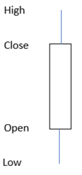
When the open price is less than the close price, the candle can appear as below. This is for a candle with a rising price over the timeframe for the candle, which is often a trading day, but can also be one minute, one hour, one week, etc.
- There is a rectangular body with optional wicks extending from the top and bottom of the rectangle.
- The top border of the rectangle denotes the close price.
- The bottom border of the rectangle denotes the open price.
- The rectangle’s color is clear (or optionally green).
- The wick extending from the top of the rectangular body denotes the high price. If the close price is the high price, then there is no wick extending from the top of the rectangular body.
- The wick extending from the bottom of the rectangular body denotes the low price. If the open price is the low price, then there is no wick extending from the bottom of the rectangular body.
- The length of the rectangular body as well as the two wick end points represent currency units.
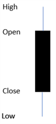
When the open price is greater than the close price, the candle can appear as below. This is for a candle with a declining price over the timeframe for the candle.
- There is a rectangular body with optional wicks extending from the top and bottom of the rectangle.
- The top border of the rectangle denotes the open price.
- The bottom border of the rectangle denotes the close price.
- The rectangle’s color is black (or optionally red).
- The wick extending from the top of the rectangular body denotes the high price. If the open price is the high price, then there is no need for a wick extending from the top of the rectangular body.
- The wick extending from the bottom of the rectangular body denotes the low price. If the close price is the low price, then there is no need for a wick extending from the bottom of the rectangular body.
- The length of the rectangular body as well as the two wicks represent currency units.
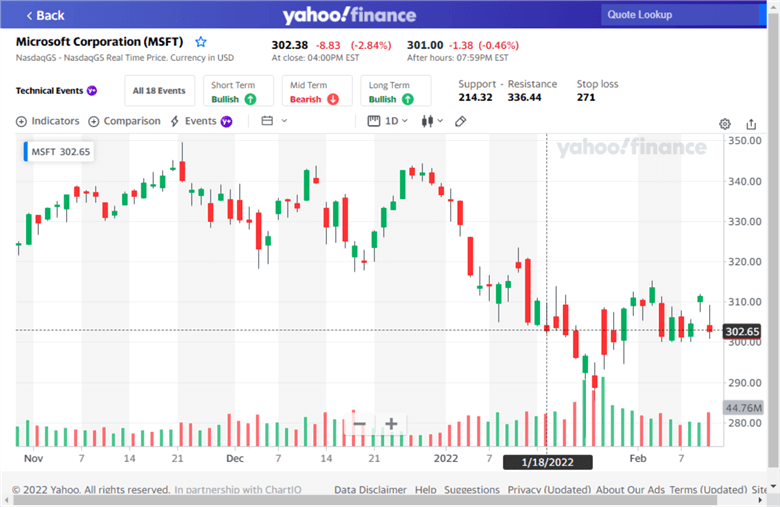
The following screen shot denotes a basic candlestick chart generated with Yahoo Finance for the MSFT ticker symbol running from October 28, 2021 through February 10, 2022. The horizontal time scale in a candlestick chart only has markers for dates during which the market is open. Therefore, the chart below does not have a marker for either October 30 and 31 in 2021 because these are weekend dates and markets are closed on weekends.
- The top left corner of the image indicates that the MSFT ticker symbol represents the Microsoft Corporation.
- Candles with a green body, such as the first two from the left border, are for trading days when the close price is greater than the open price.
- Candles with a red body, such as the third candle from the left border and the candle next to the right chart border, are for trading days when the close price is less than the open price.
- The red and green bars along the bottom of the chart indicate the number of shares traded on a trading date. Volume data is not strictly speaking a part of a candlestick chart, but many data and graphic vendors provide it automatically (just like Yahoo Finance). A red bar denotes the volume of shares traded when the close is below the open, and a green bar is for a trading date when the close price exceeds the open price.
How to create a candlestick chart
This section shows how to select a candlestick chart and save the chart image in a file. In addition, the section illustrates several common candlestick patterns. A candlestick pattern is a set of one or more candles that often leads to a likely result for subsequent candles. For example, the next several candles can denote a set of price gains or a set of losses after a candlestick pattern type. Many analysts believe that by learning candlestick pattern types, they can project likely future movements of subsequent candles.
This section has two subsections. The first subsection shows how to create candlestick charts in Yahoo Finance. The second subsection shows how to create candlestick charts in Stooq.com. Each subsection highlights a different selection of candlestick pattern types.
After you configure a chart with either Yahoo Finance or Stooq.com, you can save the chart by simply performing a screen capture. It is likely that you may not want the whole screen for a chart as it may contain ads that are sponsoring the web site or menu items that are no longer needed after you have configured a chart. This tip used the greenshot application for capturing screens, editing them, and cropping them to display just the key portion of a chart window. You can download a free copy of greenshot from this web page. The greenshot application along with many other screen capture applications allows you to save edited and cropped screen images.
Creating and using candlestick charts in Yahoo Finance
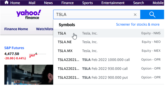
Start to create a candlestick chart in Yahoo Finance by navigating your browser to the Yahoo Finance home page. The next step is to enter the ticker symbol for which you want to show a candlestick chart. The following screen shot shows the entry of TSLA into the search box on the Yahoo Finance home page. Clicking the first entry in the drop-down box navigates your browser to the TSLA home page in the Yahoo Finance site.
From the TSLA home page, you can select the Full screen link next to the image for the chart on the home page. The following screen shows the Full screen link to the top right of the chart on the TSLA home page.

After you enter a Full screen view of the TSLA chart, select Candle from the chart type selector. The following screen image shows the selection of Candle for a candlestick chart.

When the candlestick chart opens, it shows the most recent set of candles. If you want to preserve these candles, then you can take a screen shot and save it. Alternatively, you can drag the chart image to a prior set of candles that you want to view and or share with others. For example, the following image was taken on February 11, 2022, but the chart image was dragged to a prior timeframe than the most recent candles. The candles in the screen image below start in late September and run through early December in 2021. You can drag the chart window to a prior set of dates before the most recent dates by holding down the left mouse near the left chart border and dragging it to the right.
The candles in the following chart image were selected to illustrate the big white candle pattern. This is an oversized white candle; recall that white and green denote the same type of candle in candlestick charts. The big white candle pattern typically initiates a sequence of increasing prices for a ticker symbol. There is a red box that extends from a big green candle upward toward the end of a progression of candles that indicate generally increasing prices. Designating the end of a progression of candles can be subjective.
- Notice that the progression was not halted by either of the two red candles immediately after the big green candle. If either of these red candles had a close price below the open price for the big green candle, it is normal to end the progression in order to avoid even steeper possible losses. You can end a progression by not buying stock shares or by selling stock shares after they are purchased.
- In this case, the progression remained open until the open of the second red candle in the top right corner of the red box.
- With the configuration of candles in the red box below,
- The buy date is on the open of October 26, 2021, which is the first trading date after the big green candle on October 25, 2021.
- The sell date is on the open of November 5, 2021, which is for the second red candle in the top right corner of the red box.
- Closing the trade on November 5, 2021 locks in accumulated gains from the buy date up through the sell date.
- The gain per share in this trade is the sell price of $1228.00 less the buy price of $1024.69.
- With the configuration of candles in the red box below,

Here’s another example of a candlestick chart from Yahoo Finance for the TSLA ticker. The red box denotes the start of the candlestick pattern and the progression of candles that follow it in a trade.
- This pattern starts on the day after a big white candle. The candle appears green in the following screen shot.
- The big white candle appears on November 18, 2020.
- The trade starts on November 19, 2020 with the open price for the day after the indicator.
- The trade for the pattern ends on the day after a big black candle which appears on January 11, 2021.
- The candle is red on January 11, 2021.
- The next trading day (January 12, 2021) the candle color transitions to green.
- The trade below starts the day after one pattern (big white candle) and ends the trading day after another pattern (big black candle). As the preceding chart shows, it is not necessary for one pattern to be ended by another pattern, but it is in this example.
- The gain per share is the sell price of $831.00 less the buy price of $492.00.

A third example of a candlestick chart from Yahoo Finance illustrates the three white soldier pattern for the MARA ticker symbol. MARA is the ticker symbol for a bitcoin mining company named Marathon Digital Holding, Inc.
- The three white soldier pattern is three white candles that follow one after another. The buy for the pattern occurs on the fourth candle.
- The candles in the red box start with the first of the three white soldier candles. The first white candle after the third white soldier starts the trade.
- The three white soldiers are respectively on November 19, 20, and 23 in 2020.
- The buy date for the trade is on November 24, 2020 – the first trading day after the third white soldier.
- The trade continues through the candle reversal on January 8, 2021 and January 11, 2021. When the price declines on the open for January 11 from the close on January 8, the shares of MARA are sold to end the trade.
- The gain per share from this trade is the sell price of $20.00 less the buy price of $6.01.

Creating and using candlestick charts in Stooq.com
Start to create a candlestick chart in Stooq.com by navigating to the Stooq.com home page. Then, enter a string value for the ticker symbol that you want to view in a chart. The following screen shot shows the ticker symbol for the Microsoft Corporation. Notice that a suffix for the home country market (US) trails a period at the end of the US ticker symbol. The Microsoft Corporation has a ticker symbol of msft in US markets.

After clicking the ticker symbol from the drop-down menu, a standard chart window displays with a menu of options to the left. From the menu on the left, choose Chart HTML 5.

Once you enter the Chart HTML 5 view of the chart, click the X in the VOLUME & OPENINT panel to remove the panel and allow more space to display the candlestick chart of the open, high, low, and close prices. The following screen shot shows the cursor in position to make this selection.

At this point, you can click the chart type selector. This allows you to view, the full selection of chart types available. The following screen shot shows Candle selected for a candlestick chart. In this tip’s next section, we will show charts with the Heikin Ashi chart type selected.

Just as with Yahoo Finance, Stooq.com initially shows the most recent dates. If that’s what you want to view, you are ready to start examining the candlestick chart. Alternatively, you can drag the chart image from left to right as many times as necessary to show candles for an earlier range of dates.
You can also use the wheel on your mouse to change the range of dates for which candles appear.
- The next screen shot shows just the most recent nine trading days ending on February 11, 2022.
- The screen shot after the next screen shot shows another transformation of the original most recent trading days to show dates from mid-August of 2017 through February 11, 2022.
- As you can see by comparing the two screen shoots, manipulating the mouse wheel can change the number and the size of candles that appear in a chart window. Changing the size of candles in a chart window can be useful for showing the candles in a pattern type as well as the candles that follow a pattern type.

The following candlestick chart from Stooq.com features a morning star pattern for the SPY ticker symbol; the prices for this symbol reflect the prices of the S&P 500 index. A morning star pattern is a collection of three candles that often signal the onset of a reversal from falling prices to rising prices.
- The candles in the pattern appear in the lower left corner of the red box within the following screen shot.
- The dates for the candles are March 20, 23, and 24, 2020. March 21 and March 22 are missing from the chart because they are weekend days.
- You can see prices are generally declining before March 20. The morning star pattern is a transition indicator between a set of generally declining candles to a set of generally rising candles.
- The candle for March 20 has a long black body.
- The candle on March 23 has a shorter body, which is typical for morning star patterns.
- The last candle in the pattern on March 24 is a white candle whose close price rises dramatically from the March 23 close price. This candle is the rising morning star at the end of the pattern.
- After the morning star pattern completes, you can buy on the open price of $239.44 for March 25.
- The top right candle in the red box on April 28 indicates when a sell is executed to close the sequence of candles trailing the morning star. The open price on this date is $284.57.
- The gain per share from this trade is the sell price of $284.57.00 less the buy price of $239.44.

The next pattern example from the Stooq.com site is for an evening star, which is like the opposite of a morning star. The evening star pattern marks a reversal pattern from generally rising prices to generally falling prices. The evening star pattern can serve as a signal to sell at the end of rising pattern or a failed pattern for rising prices. Alternatively, if a buy was planned for a ticker symbol exhibiting an evening star pattern, it should be deferred for a later date when its candlestick chart pattern is more likely to result in rising prices.
- The ticker symbol for the evening star example is BTCUSD; there is no trailing period followed by US for this ticker symbol. This symbol denotes the price of a single bitcoin currency unit in US dollars.
- The evening star pattern is based on three candles just like the morning star pattern.
- The first candle in the pattern is a long white candle that maintains the trend of generally rising prices before it. This candle is on November 8, 2021.
- The second candle on November 9 is a shorter candle, whose color can be white or black. Its color is white in this example. Its close price is above the first candle in the pattern.
- The third candle on November 10 is a longer black candle whose close price is below the close price of second candle in the pattern.
- The buy price for this pattern example is for the open price on November 11; its value is $65147.
- This example arbitrarily terminated the holding of bitcoin currency trade on January 24, 2022, which is the last candle in the red box.
- The color for this candle is white.
- Also, subsequent candles start a reversal from falling bitcoin prices to rising bitcoin prices.
- Most traders/analysts would terminate the trade well before January 24, 2022 or not enter a trade at all following an evening star pattern.

The last example pattern in this subsection is for a bullish harami. This is a two-candle pattern with a long black candle trailed by a shorter white candle. An easy way to remember the pattern is to think of it as resembling a "pregnant lady’s belly".
When this pattern follows a generally declining sequence of candles, it can signal a reversal to generally rising candles.
- The example in the red box below is for the Microsoft Corporation in June of 2019.
- The long black candle to start the pattern is on June 3, 2019.
- The shorter white candle is on June 4, 2019.
- The buy date is on June 5 at an open price of $122.03.
- The sell price is on June 26 at an open price of $131.20. Jun 26 is the date for the last candle in the red box.
- The gain in price per share is the sell price ($131.20) less the buy price ($122.03).
- It can sometimes be challenging to select the most profitable sell candle.
- The last candle in the red box has an open price of $131.20.
- However, the last black candle in the chart below occurs on July 19. Its open price is $136.92.
- If the sell was deferred until July 19 from June 26, the gain per share would be more than $5.50 greater.

How to create a Heikin Ashi chart in Stooq.com
Heikin Ashi charts, like candlestick charts, use candles to represent open, high, low, and close values over a set of periods. While candlestick charts use the observed values to specify the high, low, open, and close values for a period, the candles in Heikin Ashi charts display average bars that are typically based on the average of the prior period and the current period. As a result, Heikin Ashi charts are typically better at denoting general trends, but candlestick charts are better at revealing the granularity of values from one period versus the next period. Because of the smoothing for successive candles with Heikin Ashi charts, there is not a large selection of different patterns for interpreting Heikin Ashi charts.
With one exception, Heikin Ashi charts use candles that are based on the current period and the prior period high, low, open, and close price values. Because the Heikin Ashi values for the current period always require at least one prior period, the general approach does not work for the first period, which has no prior period. As a consequence, Heikin Ashi charts use an adaptation of the general approach to approximate what the first period Heikin Ashi values would be if there was a prior period. For this reason, Chart School at StockCharts.com recommends performing 7 to 10 iterations of smoothing before reporting Heikin Ashi values. StockCharts.com believes the adapted method results for the computing first period values will diminish to an indistinguishable magnitude by the seventh through the tenth period. Investopedia uses the same approach for estimating the first period Heikin Ashi candlestick, but ii does not indicate the need to wait for any number of subsequent periods before using the Heikin Ashi candles.
The expressions for the first period Heikin Ashi candle are as follow.
- Compute the arithmetic average of the high, low, open, and close values for the first period. Then, assign this value to the HA (Heikin Ashi) close for the first period.
- Compute the arithmetic average of the open and close values for the first period. Then, assign this value to the HA open for the first period.
- The first period HA high is the maximum of the first period values.
- The first period HA low is the minimum of the first period values.
The expressions for the second and subsequent period HA candles are as follow.
- HA close equals the arithmetic average of high, low, open, close values for the current period.
- HA open equals the arithmetic average of both the HA open and HA close from the prior period.
- HA high equals the maximum of high in the current period, HA open in the current period, or HA close in the current period
- HA low equals the minimum of low in the current period, HA open in the current period, or HA close in the current period
HA charts are not available from Yahoo Finance. HA charts are available from Stooq.com. The only difference in menu selections within Stooq.com for traditional candlestick charts versus HA charts is the selection of the chart type. The following screen shot shows the selection of Heikin Ashi in the chart type menu for the creation of a HA chart. Because you are relying on the Stooq.com website for computing HA values, a detailed understanding of the preceding expressions for HA values is not critical. Nevertheless, you may find it helpful for understanding the source of the values.

The next screen image shows a HA chart for the SOXL.US ticker symbol from Stooq.com.
- The date range in the HA chart is from October 11, 2020 through February 11, 2022. One uptrend and one downtrend are evident. These two trends are marked by red boxes. In between the two boxes are a set of candles that do not show a long-term consistent trend or at least one as consistent as the candles in either box.
- The uptrend begins on October 14, 2021 and runs through November 22, 2021.
- Nearly all the candles in the uptrend have a clear candle, and many of the candles have an upper wick with no lower wick.
- There are only two black candles in the uptrend contained in the first red box. Neither black candle immediately follows the other black candle.
- The very last candle in the uptrend has a lower wick.
- The downtrend begins on January 5, 2022 and ends on January 28, 2022.
- Many of the candles in the second box are long black candles with a lower wick.
- There are only two white candles in the second box, and one of these candles has a relatively long lower wick.
- The last candle in this box does not give any obvious indication that the downtrend is about to end. However, the subsequent white candles after the box indicate the downtrend has completed.

The following screen shot shows a traditional candlestick chart for the same overall date range as the preceding HA chart.
- It is relatively easy to spot an initial uptrend on the left side of the chart and a downtrend on the right side of the standard candlestick chart.
- However, there are more candles in the initial uptrend as well as the second downtrend of the HA chart versus the traditional candlestick chart. This outcome is consistent with HA charts being better at identifying long-running trends better than candlestick charts.

While the uptrend and downtrend patterns are not always as long as in this example for the SOXL.US ticker sample, they are often very obvious in HA charts relative to standard candlestick charts. Many traders and securities analysts find this feature particularly attractive.
To further illustrate how to spot an uptrend with a HA chart, three additional HA charts are presented and briefly described.
The chart below is for the NVDA.US ticker symbol at Stooq.com. The red box identifies a relatively strong uptrend.
- The uptrend starts on October 13, 2021. The candle is the white candle in the lower left corner of the red box.
- The uptrend ends on November 17, 2021. This date is chosen as an end point because it is the first time two consecutive black candles appear after the uptrend starts.
- There are other possible uptrends in the following chart image, but none are as long as the one in the red box.

The next chart is for the Ford Motor Company ticker symbol (F.US). This chart contains three uptrends, which are each of their own red box.
- The first uptrend begins on October 7, 2021 and ends on October27, 2021.
- The second uptrend begins on October 28, 2021 and ends on November 11, 2021.
- The third uptrend begins on December 22, 2021 and ends on January 11, 2022.

The final chart in this tip is for Laredo Petroleum, Inc., a gas and oil exploration and development company based in Texas. This chart reveals just one uptrend.
- This uptrend starts on August 23, 2021.
- The uptrend ends on September 30, 2021.

Next Steps
This tip describes the main steps for preparing traditional candlestick charts from Yahoo Finance and Stooq.com. It also presents a subset of traditional candlestick patterns with commentary about the likely direction of prices following patterns. Additionally, the tip describes Heikin Ashi charts and how to interpret them from Stooq.com.
One obvious next step is to follow the instructions in this tip and see if you can generate the same chart images as those that appear in the tip. If you have other ticker symbols that you watch besides those covered in this tip, they would be especially good ones to examine in next steps. Use both traditional candlestick charts as well as Heikin Ashi charts for whatever ticker symbols you include in your next steps.
Another next step is to look over other traditional candlestick patterns beyond those covered in this tip. Learn how to recognize them and see if subsequent candles follow expected paths. Just like any model, candlestick patterns sometimes fail to return expected results. Here are some resources for learning more about traditional candlestick patterns (here, here, and here). Here is a seven-part video series that may heighten your ability to interpret and apply Heikin Ashi charts (part 1, part 2, part 3, part 4, part 5, part 6, and part 7).

Rick Dobson is a SQL Server professional with decades of T-SQL experience that includes authoring books, running a national seminar practice, working for businesses on finance and healthcare development projects, and serving as a regular contributor to MSSQLTips.com. He has been a practicing Python developer for more than the past half decade – with a special emphasis for data visualization and ETL tasks with JSON and CSV files. His most recent professional passions include financial time series data and analyses, AI models, and statistics. If you are interested in growing your skills in any of these areas especially as they relate to financial securities, consider visiting his blog at https://securitytradinganalytics.blogspot.com/2023/12/.
- MSSQLTips Awards: Leadership (200+ tips) – 2025 | Author of the Year Contender – 2017-2024