Problem
Microsoft Power BI Desktop is a comprehensive visualization tool. Project managers usually like to track performance against targets, and looking at the raw data makes it difficult to understand the outcomes. In this case, a bullet chart is very helpful. This type of chart shows the performance against the target in a single column and, with its thermometer-like appearance, can show one or more color-coded columns. In this article, we will go through the steps to create this type of chart in Power BI.
Solution
You must have heard the phrase, “A picture is worth a thousand words.” But why is this the case, and how is this relevant to the domain of business communication? Our human brain is primarily wired to process visual information rather than text-based mediums. Therefore, to quickly grab the attention of senior managers and other stakeholders in important meetings, departments are likely to fare better if they convert monotonous data matrices into different statistical visualizations that tell a far bigger and better story. The message is easily conveyed and interpreted, giving a platform for uncomplicated decision-making.
One such type of visualization technique is a bullet chart. Developed by Stephen Few as an alternative to cluttered dashboard meters and gauges, a bullet graph is similar in function to a bar graph with more added visual elements. It is a univariate visualization consisting of a bar with further encodings to represent progress toward a set target level against a reference line, as shown below:

The anatomy of a typical bullet graph consists of the following:
- Text label: It tells the users what the bullet graph is all about. As seen in the illustration above, we can easily and instantly tell that the graph is plotting information about 2020 revenue in hundreds of dollars. This component is fundamental to all visualizations.
- Scale: It quantitatively marks the axis of the bullet graph, setting up different intervals that are used for measurement.
- Qualitative range: This is an ordinal categorical assignment of performance ratings of a certain variable. As seen in the background of the bullet graph above, we have three thresholds of revenue in red, orange, and green which indicate poor, average, and good intervals for the revenue that year.
- Comparative measure: This represents the target value of the variable being plotted. In the graph we have illustrated above, it can be seen as a white vertical line at around the 60 marker. This indicates that a certain entity would prefer to achieve its minimum target of $60,000 in revenue for the year 2020.
- Feature measure: This encodes the main data in the form of the bar that runs within the center of the bullet graph. In short, it conveys the actual performance of an entity against the variable that is being plotted. Thus, if the central bar has passed the comparative measure (as seen above), the entity has achieved its target.
Considering its functionality, how is the analysis supported by a bullet graph essential for businesses and other users?
- As seen from the example above, bullet graphs are best to visualize if you are meeting a target goal. For example, business analysts can check if they are registering target sales levels or not. On the reverse side, we can also use a bullet graph to visualize if the emission levels of a business are exceeding a certain value or not.
- Although this type of visualization is not suited to encode the rate of change of variables, we can still stack together sales bullet graphs of different months to allow for efficient comparative analysis.
- Bullet graphs also allow for encoding quantitative measures in different qualitative ranges. For example, economists can watch the GDP levels of a specific country and analyze it according to the categorical spectrum it falls within.
Now that we have introduced the basics of a bullet graph, we are ready to conduct an analysis for a business entity using MySQL and Microsoft Power BI, which is one of the most robust visualization platforms on the market. Our goal is to interpret the results of the yearly sales of five different products produced by a business relative to their target goal.
Create a Source Table
The first part of the demonstration includes creating a source table using MySQL Workbench, which consists of the actual sales of the products, our target value, and the thresholds values for ‘Excellent’, ‘Good’, ‘Satisfactory’, ‘Poor’, and ‘Alarming’ level of sales.
To get started, we will first create and access our database using MySQL Workbench:
CREATE DATABASE product_sales;
USE product_sales;
After the above statements have been executed, we create our yearly product sales table that consists of our five product categories, their total yearly sales, our target values, and sales thresholds. Execute the following commands:
CREATE TABLE yearly_sales
(
    product varchar(30),
    total_sales int unsigned,
    target_sales int unsigned,
    excellent int unsigned,
    good int unsigned,
    satisfactory int unsigned,
    poor int unsigned,
    alarming int unsigned
);
Now we are finally ready to populate our table with fictional values using the following statements:
INSERT INTO yearly_sales VALUES
("product_A", 400, 350, 380, 320, 230, 150, 50),
("product_B", 250, 240, 380, 320, 230, 150, 50),
("product_C", 130, 340, 380, 320, 230, 150, 50),
("product_D", 330, 360, 380, 320, 230, 150, 50),
("product_E", 70, 230, 380, 320, 230, 150, 50);
Our yearly_sales table is now as follows:

Create Bullet Graph Visualizations
Now we are ready to import our product sales table from MySQL to Power BI in order to create our bullet graph visualizations and conduct an analysis of each product relative to its target sales level and the performance of other products.
To create the visualizations, we will open Power BI Desktop and implement the following steps.
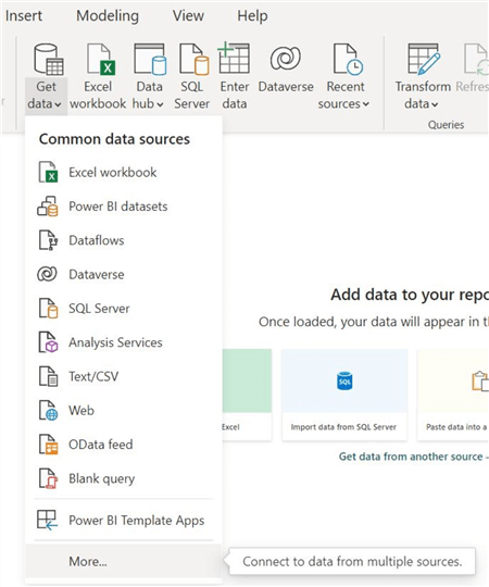
Step 1
In the main interface of Power BI desktop, click on “Get Data” in the data section as shown below to import our database from MySQL server. A list of sources will appear from which you can choose to import your dataset. For now, click on “More…” at the bottom of the list.
Step 2
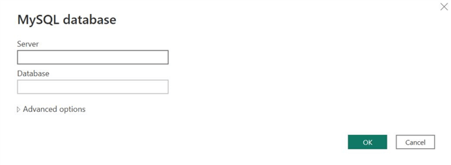
A new dialog box will appear. Click on “Database” below the search option and select the “MySQL database” option, as shown below. Click “Connect” at the bottom of the dialog box.

Step 3
Enter the relevant credentials regarding your server and database and click “OK.”
Step 4
Provided that Power BI has successfully established a connection with your MySQL database, the following dialog box will appear containing our yearly product sales table. As shown below, click the box beside the table to select it and press “Load”.
As we can see below, Power BI also enables users to preview the tables they will be working on. We also have the option of “Transform Data,” which allows users to clean their dataset by removing any erroneous entries, merging tables, dropping irrelevant variables, handling missing data, and so on. Since our product sales table is complete and clean, we don't need to go through this step.

Step 5
Now that we have successfully imported our source table from MySQL to Power BI, we are ready to conduct our visual analysis. Unfortunately, Power BI does not natively support bullet graph visualization. Therefore, below the “Visualizations” section, we will click on “…” and then “Get more visuals.”

Step 6
A new menu will appear containing various third-party extensions that can be integrated with Power BI. Either use the search option or click on “All” to find the “Bullet Chart” extension. Click “Add.” It is apparent from the blue verification tick that this extension is endorsed by Power BI. We can further click on the extension name for more information regarding its functionality and developer information. In our case, this bullet chart is developed by Microsoft itself.

Step 7
Upon successful installation, we can create our bullet chart using Power BI. In the “Visualizations” section, click on the bullet chart icon, as shown below.

Step 8
This will produce the outline of the desired visual in the main interface of Power BI. For now, we will be reshaping it to an appropriate size. This can be done by clicking its corners and manipulating it accordingly.

Step 9
It’s time to populate our bullet chart with relevant values. From the “Fields” section, drag the “product” column and insert it below the “Category” label, as shown below. This creates text labels for each item of the bullet chart with the relevant product name.

Step 10
Insert our “total_sales” column in the “Value” section, as shown below. Since our total_sales column represents the actual sales of each product over the year, this forms the feature measure (bar graph) that runs through the center of the bullet graph as it encodes the main data value.

Step 11
To implement our comparative measure, we will insert our “target_sales” column into the “Target Value” section, as shown below.

Step 12
For now, our bullet chart resembles something akin to a horizontal bar graph. We can see our product labels with their respective total sales and target values represented by a vertical bold line.

Step 13
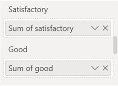
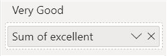
To complete our visualization, we need to construct the qualitative range. This visualization extension gives the option of creating six different ranges. For our purposes, let’s insert the “alarming” column into the “Minimum” section, “poor” into the “Needs Improvement”, “satisfactory” into the “Satisfactory” section, and so on, as shown below. It is not important for the names of our fields to align with the names of the sections.

Step 14
We have now successfully created our bullet chart. We can see that it is complete with its text labels, scale, qualitative range, comparative measure, and feature measure.

Customizations
But wait…we are not done yet! This bullet chart visualization tool offers a lot of customizations to ensure that there is flexibility in building the boxplots. To make our bullet chart more functional and appealing, we can undertake the following series of steps:
Visualizations
Under the “Visualizations” section, click on “Format your visual,” as shown below. We can use various different parameters, such as data values and category labels, that can be altered.

Data Values
Under the “Data values” section, we can manually create our qualitative range and comparative measure. However, since we had already constructed these fields in our MySQL source table, we have no need for this functionality.

Category Labels
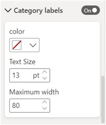
The “Category labels” option allows users to alter the font size and color of the text labels. We have increased the text size to ensure that the labels are easily interpreted.
Orientation
We also have the option of manipulating the orientation of our bullet chart. As shown below, we have four different options. For simplicity purposes, we will stick with the default orientation: Horizontal left.

Colors
Below the “Colors” section, we can also change the colors of the different sections of the qualitative range. To ensure that the axis, target value, and feature measure are easily distinguishable, we have chosen paler colors instead of the bright colors of the previous bullet chart visual. It is always advised to use softer colors with the same color scheme for our range, with a strong color for our feature measure.

General Formatting
We can now move on to general formatting options. As shown below, click on “General” in the “Visualizations” section. As we can see, we can now play around with the properties and titles of the bullet chart.

Properties. Under the “Properties” header, we can alter the size of our bullet chart visual. This is, however, also attainable by manually dragging and reshaping the visual, as we demonstrated previously in this tutorial.

Title. Under the “Title” section, we can also change the chart title to a more descriptive text. At the same time, we also can change its font, style, size, and color.

Conduct Analysis
Our formatting is complete, and our finalized version of the bullet chart is shown below:

Finally, we can implement comparative analysis on our visualization. At a glance, we can see that the bestselling commodity is product A, whose sales exceed well beyond the target level. If we notice closely, this is an ordinal visualization, with the best-selling product at the top and the worst selling at the bottom. Although product D has the second-best sales, it fails to achieve the target sales. The sales of product B are satisfactory and above its desired target. Unfortunately, products C and E are in the alarming range, with sales falling well below the desired target.
What do these results mean? Although the business should continue its operations for product A, some amendments are needed regardless. For critical products C and E, the business may discontinue their production or implement innovative measures in the production process, accompanied by enhanced marketing and distributive measures. For product D, it could simply revise the target sales level or implement measures to boost sales. Similar advice is recommended for product B. It should be noted that these decisions are never straightforward and cannot be taken in isolation without considering the business’s retained earnings and the industry sales averages.
In this article, we have successfully demonstrated how to create source tables in MySQL and import it to Power BI, where we have effectively summarized our dataset in the form of bullet graphs. The same steps can be done using other data sources as well like SQL Server.
Next Steps
- Check out all the Power BI Tips on MSSQLTips.com

Harris Amjad currently works as a Software Engineer at Strategic Systems International. He is Microsoft Certified Data Analyst and Microsoft Certified Trainer. A rigorous, task-driven Data Enthusiast with substantial experience in Data Science, Data Analysis, and Data Engineering.
- MSSQLTips Awards: Trendsetter (25+ tips) – 2024 | Author Contender – 2023, 2024 | Rookie Contender – 2022

I have been reading your Power Bi visual related articles. They are very helpful. Please continue writing such supportive articles.