By: Hristo Hristov | Updated: 2023-04-19 | Comments | Related: > Python
Problem
Considering two variables, we want to determine how much they correlate. Two types of correlation analysis depend on what function best describes the relationship: linear and non-linear. How do we check if two variables are linearly correlated? How do we measure and express their degree of correlation?
Solution
Correlation analysis allows us to uncover to what extent two variables depend on each other. To quantify this dependence, we calculate a correlation coefficient. All coefficients express the strength, and some also the direction of the dependence. Values close to 1 indicate a strong positive correlation, whereas values close to -1 indicate a strong negative correlation. Values around 0 tell us that the two variables are not dependent on each other. In this tip, we examine calculating a linear correlation coefficient. This type of coefficient covers cases when the dependency between the two variables can be mapped to a linear function, e.g., an additive one. Later we will also examine non-linear correlation where variables map to a non-linear function, such as an exponential or quadratic one.
Data
For this experiment, we will use a dataset containing machining data. You can download it here. Here is a preview of the first five out of the total ten thousand rows:

Linear Correlation
Let us focus on the air and process temperature vectors. I assume they will have a strong linear correlation: a higher ambient temperature also increases the process temperature. Before quantifying the dependency, we need to conduct two basic checks for linear correlation.
Check If the Linear Correlation Exists
We can do this with a scatter plot:
1: x = data['Air temperature [K]']
2: y = data['Process temperature [K]']
3:
4: fig, axs = plt.subplots(1, 1)
5: axs.scatter(x,y, color='green')
6: axs.set(xlabel='Air temperature [K]',
7:         ylabel='Process temperature [K]',
8:         title='Air vs Process T')
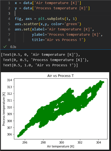
The scatter plot indicates there is indeed a certain correlation between the two variables: the points are concentrated along a particular area and are not completely scattered randomly.
Bin the Values
Binning and superimposing one variable on top of each other enables us to get a better visual idea of how their distributions compare:
01: data['Air temp norm'] = data['Air temperature [K]'] / np.linalg.norm(data['Air temperature [K]'])
02: data['Process temp norm'] = data['Process temperature [K]'] / np.linalg.norm(data['Process temperature [K]'])
03:
04: x_n = data['Air temp log']
05: y_n = data['Process temp log']
06:
07: fig, axs = plt.subplots(1, 1)
08:
09: axs.hist([x,y],
10:         bins='auto',
11:         cumulative=True,
12:         density=True,
13:         edgecolor='#301E67',
14:         histtype='stepfilled',
15:         alpha=0.55)
16: axs.set(xlabel='values',
17:         ylabel='probability',
18:         title='Air and Process T Normalized Values Histogram')
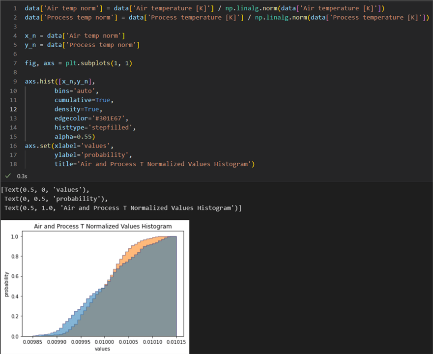
This histogram of cumulative distributions shows that the two distributions are comparable. Let us note some important points in the code:
- Lines 1 and 2: We have normalized our vectors so their ranges are the same.
- Line 9:
We pass a list of vectors to the
hist()method so that the two histograms get plotted together, one on top of the other. - Line 11: We configure the histogram to be a cumulative one. Therefore, each bin gives the counts in that bin plus all bins for smaller values.
- Line 12: We set the histogram to display the probability of values instead of the absolute count by using the density parameter.
Alternatively, we could also use a kernel density estimation (KDE) plot, and we will get a similar result. With these checks in place, we have verified that the two variables are most probably linearly correlated. Now we can proceed with calculating the correlation coefficient.
Pearson r
The Pearson correlation coefficient is used to quantify the linear relationship between two variables. There are some formal criteria to follow if we want to use Pearson's r:
Linear Relationship Between the Variables. This one was proved already with the cumulative histogram and distribution comparison.
No Outliers. To ascertain the lack thereof, let us calculate the inter-quartile ranges (IQR) to determine how spread the values are and find their respective lower and upper bounds. We will consider anything outside of those bounds to be an outlier:
1: def check_for_outliers(vector: pd.Series) -> tuple[bool]:
2:     q1, q3= np.percentile(vector,[25,75])
3:     iqr = q3 - q1
4:     lower_bound = q1 -(1.5 * iqr)
5:     upper_bound = q3 +(1.5 * iqr)
6:     result = np.min(x) < lower_bound, np.max(x) > upper_bound
7:     return result
8:
9: check_for_outliers(x), check_for_outliers(y)
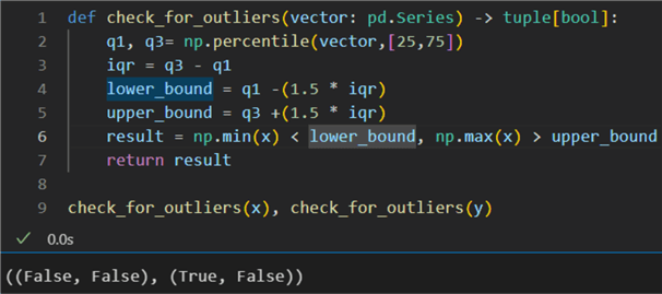
We build a function using np.percentile() to calculate
the IQRs. The result is that vector x does not have outliers. However, there is
at least one outlier beyond the lower bound of vector y. This conclusion means that
after using Pearson's r, we may also want to use another correlation coefficient
(e.g., Spearman's) to substantiate our results further.
The Distributions are Normal. One of the many tests for normality is the Shapiro-Wilk test. It tests the null hypothesis that the data was drawn from a normal distribution. Here is an example of Python implementation:
1: from scipy.stats import shapiro
2:
3: def check_normality(a: tuple[pd.Series]):
4:     result_x, result_y = shapiro(a[0]), shapiro(a[1])
5:     print(f'Vector x p_value: {result_x[1]}\r\n6:           Vector y p_value: {result_y[1]}')
7:
8: check_normality((x,y))
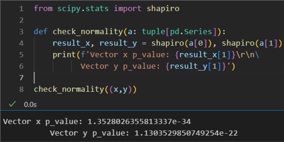
The resulting probability values are way below the required minimum of 0.05 for the distributions to be considered normal. This result strongly indicates that Pearson's r will not be a robust enough correlation measure.
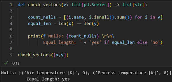
No Nulls and Vectors of Equal Length. Finally, a technicality. We must ensure there are no null values and the vectors have identical lengths:
1: def check_vectors(v: list[pd.Series]) -> list[str]:
2:
3:     count_nulls = [(i.name, i.isnull().sum()) for i in v]
4:     equal_len = len(x) == len(y)
5:
6:     print(f'Nulls: {count_nulls} \r\n7:           Equal length: ' + 'yes' if equal_len else 'no')
8:
9: check_vectors([x,y])
Having completed all these checks, we can calculate Pearson's r:
1: def calculate_Pr(x: pd.Series, y: pd.Series) -> None:
2:     cc, pv = stats.pearsonr(x,y)
3:     print(f'Correlation coeff {round(cc,2)}, p_value: {pv}')
4:
5: calculate_Pr(x,y)

The result is high: 0.88. The probability value is zero; therefore, we can reject the null hypothesis that the distributions underlying the samples are uncorrelated and normally distributed. In other words, there is a correlation, but working with non-normally distributed vectors, the result may not be representative enough of the dependence.
Spearman
Spearman's coefficient is a generalization of the Pearson coefficient. It is also called the sequential correlation coefficient or rank correlation coefficient. This coefficient is obtained by analyzing the linear correlation of the rank of observations, and its value also ranges from −1 to 1.
1: def calculate_SPr(x: pd.Series, y: pd.Series) -> None:
2:     cc, pv = stats.spearmanr(x,y)
3:     print(f'Correlation coeff {round(cc,2)}, p_value: {pv}')
4:
5: calculate_SPr(x,y)

The result here is 0.86. Due to vector y having some outliers close to the lower bound and the two distributions not being normal, this correlation coefficient is more representative of the dependence between air and process temperature in Kelvins.
Maximal Information Coefficient
Let us calculate one more correlation coefficient: the maximal information coefficient
(MIC). Unlike Pearson's and Spearman's coefficients, MIC can be applied
to both linearly and non-linearly related data. MIC values range between 0 and 1,
where 0 means statistical independence and 1 means complete interdependence. Therefore,
MIC cannot be used to capture the direction of the correlation, unlike Pearson's
and Spearman's coefficients. To calculate MIC in Python, you will need the
MINE package. Install it by running pip install minepy in your environment. Here is a sample function using MINE to calculate
MIC:
1: from minepy import MINE
2:
3: def compute_MIC(a: pd.Series, b: pd.Series) -> float:
4:     mine = MINE(alpha=0.6, c=15, est='mic_approx')
5:     mine.compute_score(a,b)
6:     return round(mine.mic(),2)
7:
8: compute_MIC(x,y)
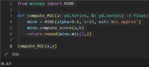
The result is 0.63, indicating a strong interdependence between air and process temperatures.
Conclusion
We examined three diverse ways to calculate a correlation coefficient between two linearly related vectors. The correct coefficient to use can depend on the bivariate data at hand. Do we have outliers? Are the data normally or non-normally distributed? Do we have enough samples, e.g., at least 500? How your data answer these questions will determine the correct method(s) to measure interdependence objectively.
Next Steps
- scipy.stats.pearsonr
- scipy.stats.spearmanr
- MIC explained
- Installing MINE
- Calculating MIC
- scipy.stats.shapiro
- numpy.percentile
About the author
 Hristo Hristov is a Data Scientist and Power Platform engineer with more than 12 years of experience. Between 2009 and 2016 he was a web engineering consultant working on projects for local and international clients. Since 2017, he has been working for Atlas Copco Airpower in Flanders, Belgium where he has tackled successfully multiple end-to-end digital transformation challenges. His focus is delivering advanced solutions in the analytics domain with predominantly Azure cloud technologies and Python. Hristo's real passion is predictive analytics and statistical analysis. He holds a masters degree in Data Science and multiple Microsoft certifications covering SQL Server, Power BI, Azure Data Factory and related technologies.
This author pledges the content of this article is based on professional experience and not AI generated.
View all my tips
Article Last Updated: 2023-04-19


