Problem
People may need to summarize large data sets and present the analysis results in a form that business stakeholders can understand and use to make decisions. In addition, these business stakeholders often ask more questions when they see the results. An Excel pivot table, which can quickly calculate data, is one of Microsoft Excel’s most powerful tools for dealing with these scenarios. We can answer various business questions through a few click-and-drag steps in the Excel interface. However, the pivot table is known to be complicated (Devaney, 2023). So, how do people with limited Excel backgrounds learn to create pivot reports?
Solution
A practical learning approach is first to use pivot tables to solve specific problems by following examples. Then, with experience and practice, we can remember commands, understand underlying theories, and perform data analysis independently. This tip provides a step-by-step guide to creating two pivot reports which answer typical business questions.
We use data from a Microsoft SQL Server database, the Microsoft sample database “AdventureWorks2019.” Adventure Works Cycles, a fictitious multinational manufacturing company, uses this relational database for daily business operations. The database collected data from these five subdomains (Velichety, 2020):
- Human Resources
- Person
- Production
- Purchasing
- Sales
Adventure Works Cycles has two types of customers (StudyMoose, 2016):
- Individuals – People who buy products from the Adventure Works Cycles online store.
- Stores – Businesses that purchase products for resale from Adventure Works Cycles sales representatives.
Adventure Works Cycles sells the following four categories of products:
- Bicycles – The products manufactured at Adventure Works Cycles.
- Components – The bicycle replacement parts manufactured at Adventure Works Cycles.
- Clothing – Clothing purchased from vendors for resale.
- Accessories- Accessories purchased from vendors for resale.
Sales managers want to evaluate sales representatives’ performance. So, we need to look at the data and answer the following two business questions:
- How does sales revenue vary by sales representative and year?
- How are these sales representatives doing this year?
When having business questions, we first translate these questions into data questions. We then retrieve and manipulate data to answer data questions. Next, we interpret the solutions in the business language and answer the initial business questions. Ultimately, we present the answers in a form (for example, a pivot table) that the general audience can understand.
In this tip, we create the two pivot reports using Microsoft® Excel® for Microsoft 365 MSO (Version 2303 Build 16.0.16227.20202) 32-bit to answer the two business questions. The first report should look like Figure 1, which has interactive elements, engaging designs, and navigation bars (Singh, 2022).

Figure 1 The annual sales revenue by salesperson report.
When answering business questions, we need to determine what data can help. The tip, Using Power Query in Excel for Data Extraction from a SQL Server Database, provides step-by-step instructions to get data from a relational database (Zhou, 2023). This tip aims to create pivot reports; therefore, we skip the data preparation process and assume that data is available in spreadsheets. We also modify the source data for the sake of simplicity. Click here to download the Excel workbook.
Opening the Excel workbook, we should see three spreadsheets. Each spreadsheet includes a tabular table containing information about a single entity, such as a salesperson, product, or sales order. Figure 2 illustrates the sample data.
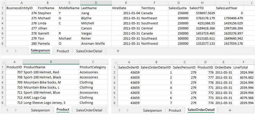
Figure 2 Sample Data in the workbook
We use data in these spreadsheets to create two fundamental pivot reports. While walking through the process of creating reports, we explore the following techniques:
- Turning a range of cells into an Excel table.
- Adding Excel tables to the data model.
- Cultivating a relational database mindset.
- Learning the concepts of databases, such as tables (entities), relationships, primary keys, and foreign keys.
- Adding a data table to a data model.
- Adding calculated columns to a data model using the DAX language.
- Creating relationships in a data model.
- Hiding columns from client tools.
- Creating a pivot table from a data model.
- Arranging pivot table fields.
- Using a slicer to filter data visually.
- Changing the layout of a pivot table.
- Adding built-in calculations using the Show Value As command.
- Rearranging pivot table fields to create new reports.
1 – Turning a Range of Cells into an Excel Table
An Excel table allows us to manage and analyze a group of related data easier. When we put data into an Excel table, an additional ribbon (i.e., Table Design) is available. This ribbon provides table tools, for example, Table Styles, to format the table. Furthermore, an Excel table has auto-expand capabilities. When adding new rows to the bottom of this table, the new rows become part of this table. Therefore, we can easily update the reports to include new data when using an Excel table as a data source. This section explores three methods to turn a range of cells into an Excel table.
1.1 Use the Insert -> Table Command to Create a Table
Go to the Salesperson worksheet and click any cell inside the data range. Next, select Table in the Tables group on the Insert tab to open the Create Table dialog box, as shown in Figure 3.
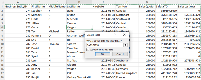
Figure 3 The Create Table dialog box for creating the Salesperson table
The command automatically selects a data range that contains all tabular data. The data range shows up in the Create Table dialog box. Since the first row contains column headings, we select the My table has headers checkbox. Next, click the OK button to create an Excel table. When clicking on any cell in the table, we access the Table Design tab. There is a Table Name textbox in the Properties group. We use this textbox to give the table a meaningful name. Figure 4 illustrates the table and the Table Design tab in the ribbon.
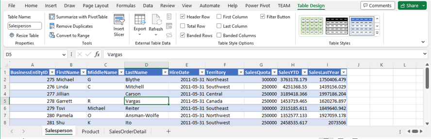
Figure 4 Create an Excel table and assign the table a meaningful name
1.2 Use the Home -> Format as Table Command to Create a Table
Switch to the Product worksheet and click somewhere within the data. Next, go to the Home tab and click the Format as Table button to open the dropdown menu. As shown in Figure 5, there are several table-style groups, each with predefined table styles.
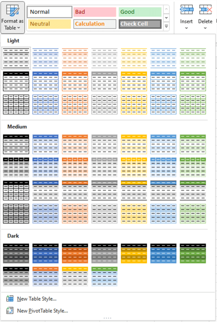
Figure 5 The predefined table styles
The theme used in Excel determines these table styles. An Excel theme is a collection of colors, fonts, and effects that we can apply to a workbook with a few clicks. We can change the theme through the Themes button in the Themes group on the Page Layout tab. Figure 6 illustrates how to access the predefined, built-in themes.
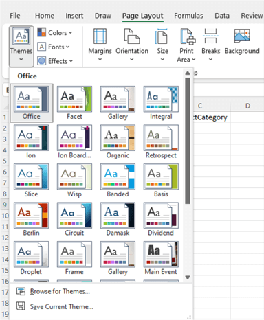
Figure 6 Themes in Excel
As soon as we select any table style, the Create Table dialog box appears, as shown in Figure 7. Next, click the OK button to place Product data into an Excel table. Next, we name the table Product.
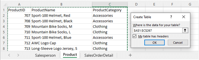
Figure 7 The Create Table dialog box for creating the Product table
1.3 Use the Shortcut “Ctrl + T” to Create an Excel Table
Open the SalesOrderDetail spreadsheet and place the cursor anywhere inside the data range. Next, press Ctrl + T keyboard shortcut to open the Create Table dialog, which should look like Figure 8. Then, click the OK button to create an Excel table and name it SalesOrderDetail.
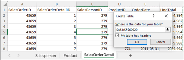
Figure 8 The Create Table dialog box for creating the SalesOrderDetail table
2 – Managing a Data Model
A data model is a set of tables linked by relationships (Ferrari & Russo, 2019). Even though we can create a pivot table from a single Excel table, we recommend learning to create a pivot table from a data model, which allows us to integrate data from multiple tables and better understand the data in these tables. A well-designed data model can also reduce the overall size of the Excel spreadsheet and improve report performance (Horne, 2020).
Furthermore, people often naturally think of business metrics in terms of business dimensions. For example, the business question “How does sales revenue vary by sales representative and year?” asks us to analyze the sales revenue along with the salesperson and calendar date dimensions. Using a data model, we can effectively build a relational data source inside an Excel workbook (MS Support, 2023). By the way, we should keep the data model as simple as possible. We suggest using a “star schema” design, as shown in Figure 9, to represent the relationships between business metrics and dimensions.
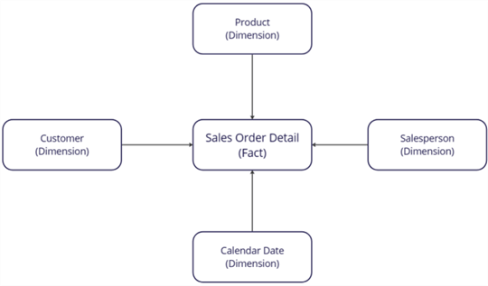
Figure 9 A star schema design (created in miro.com)
2.1 Cultivate a Relational Database Mindset
With powerful self-service BI tools, we expect the data analytics solution to answer strategic, diagnostic, predictive, and prescriptive questions, such as “How can we increase sales revenue?” Unfortunately, we cannot answer these questions by simply summarizing data in a single source (Tanuwidjaja, 2021). Instead, we should first identify the metrics in a business process event, then discover the “who, what, where, when, why, and how” context surrounding the event. Next, we study how the event context influences the metrics. Therefore, we need to find all data related to the data analysis projects.
Nowadays, we usually utilize relational databases for data storage. We should be able to explore the databases to discover the metrics of interest to us. We then create data models that reflect the database structures. Therefore, understanding core database principles and structures is becoming increasingly important (Alexander, 2022). Cultivating and applying a relational database mindset to day-to-day work can solve complex problems and advance our analytics capability. Let us look at some relational database terminologies.
A database is an organized collection of logically related tables. Each database table represents a specific type of entity. An entity is a thing of interest to us. For example, we can consider the workbook used in this article to be a database and three Excel tables as database tables. This way, a Salesperson is an entity (a person). Each row in the table represents one instance of the entity, and each column defines an attribute of the instance.
Every row in a database table should be unique. We can use a column or a combination of columns to identify a row. We call this column (or the combination of columns) the table’s primary key. For example, the column BusinessEntityID in the Salesperson table has unique values, and each value can determine a salesperson. Therefore, the BusinessEntityID is the primary key of the table Salesperson.
The SalesOrderDetail table has a column SalesPersonID, another name of the BusinessEntityID column. Therefore, we can link these two tables through the BusinessEntityID. In this way, we expand the SalesOrderDetail table with detailed salesperson information. We call the column SalesPersonID a foreign key. A foreign key is a column (or combination of columns) in one table that refers to a primary key in another.
Figure 10 illustrates the primary and foreign keys and the relationship between the two tables. The values of the BusinessEntityID in the Salesperson table are unique. This way, each BusinessEntityID only appears at the Salesperson table once. However, one salesperson may take multiple sales orders; therefore, a salesperson ID may appear numerous times in the SalesOrderDetail table. Furthermore, each sales order in the SalesOrderDetail table has only one salesperson ID. Thus, the relationship between these two entities is called a one-to-many relationship. In the figure, the symbol “crow’s feet” (or *) on the end of a line connecting two tables indicates that it is the “many” side of the one-to-many relationship.
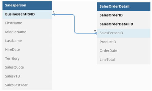
Figure 10 An example of a relationship between database tables (created in dbdiagram.io)
2.2 Identify Primary Keys and Foreign Keys
When studying relationships in a data model, we should identify primary and foreign keys. A primary key uniquely identifies each table row. For example, here are the primary keys of the three Excel tables:
- Salesperson: BusinessEntityID
- Product: ProductID
- SalesOrderDetail: SalesOrderID, SalesOrderDetailID
When a table uses its column to refer to another table’s primary key, the column is a foreign key. For example, the foreign key SalesPersonID in the SalesOrderDetail table establishes relationships between the SalesOrderDetail and the Salesperson tables. Likewise, the foreign key ProductID in the SalesOrderDetail table links this table to the Product table. Therefore, here are two foreign keys in the SalesOrderDetail table:
- SalesPersonID
- ProductID
Figure 11 illustrates the primary keys, foreign keys, and table relationships.

Figure 11 Primary keys, foreign keys, and table relationships
2.3 Add Excel Tables to the Data Model
Open the Salesperson worksheet and click anywhere inside the Salesperson table. Next, select the Add to Data Model command in the Tables group on the Power Pivot tab. The command opens the Power Pivot for Excel window, as shown in Figure 12. The window displays data in a worksheet format.

Figure 12 Add the Excel table from a spreadsheet to the data model
By default, the Power Pivot for Excel window displays the data model in a data view. We can switch to the diagram view of the model by selecting the Diagram View command in the View group on the Home tab. The diagram view of the model should look like Figure 13.
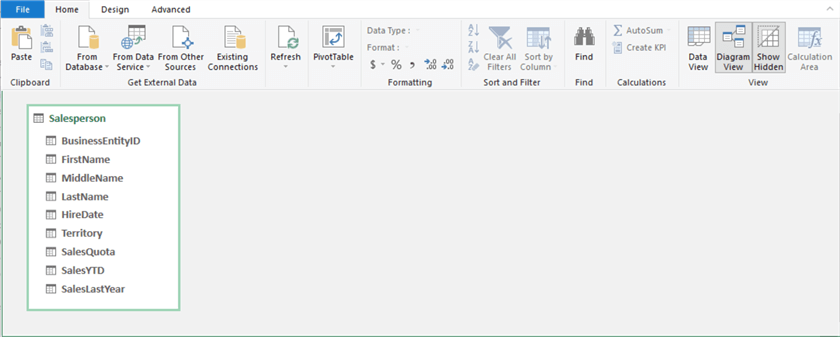
Figure 13 The diagram view of the model
We can use the same method to add the Product and the SalesOrderDetail tables to the data model. Figure 14 illustrates the diagram view of the model. When selecting a column, we can check the data type of the column through the Data Type dropdown menu in the Formatting group on the Home tab.
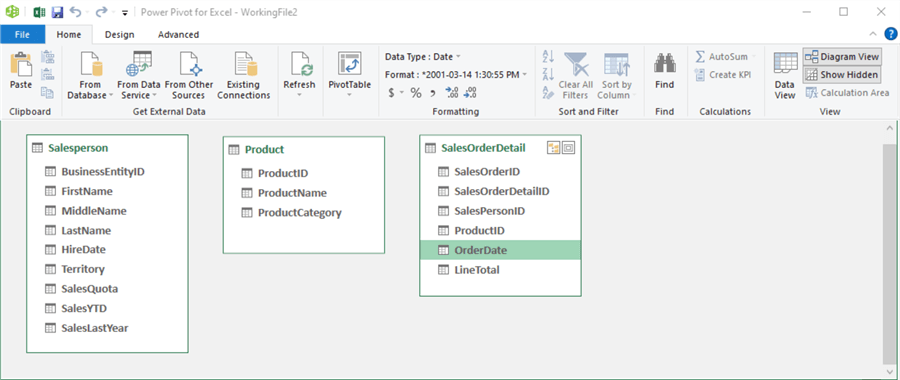
Figure 14 The diagram view of the updated model
2.4 Create a Calendar Date Table
The SalesOrderDeatil table has an OrderDate column. A date table is almost mandatory when evaluating metrics by various date periods (Lenning, 2018). In addition, a date table is also necessary for using DAX time intelligence functions. The Power Pivot for Excel window provides the Date Table -> New command that allows us to create a date table by clicking a single command icon.
Suppose the Power Pivot for Excel window is closed. In that case, we can open the window by selecting the Manage command in the Data Model group on the Power Pivot tab. Next, access the Design tab in the Power Pivot window. Then, find the Date Table button in the Calendars group. Click on the button to open a dropdown menu. Select the command New from the menu. The command adds a new date table to the data model. Figure 15 illustrates the first few rows of the table. Note that the time component in the Date column is 12:00:00 AM. Likewise, the time component in the OrderDate column of the SalesOrderDeatil table is also 12:00:00 AM.
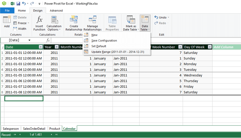
Figure 15 The calendar date table
By default, the date table considers all the date columns present in the model and creates the range of dates in the table. If we want to change the range of dates, we can select the Date Table -> Update Range command to set the start and end date for the date table.
The data model has four tables at this step, as shown in Figure 16. The Date column in the Calendar table is the primary key; therefore, the OrderDate is a foreign key in the SalesOrderDetail table. We have already known the entity relationships in the relational database. To make the data model reflect the relationships in the database, we must define relationships between SalesOrderDetail, Salesperson, Product, and Calendar tables in the model.
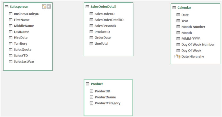
Figure 16 The data model with four tables
2.5 Establish the Table Relationships in the Data Model
We have already identified the primary keys of the three tables:
- Salesperson: BusinessEntityID
- Product: ProductID
- Calendar: Date
We also have discovered the three foreign keys in the SalesOrderDetail table:
- SalesPersonID: refer to BusinessEntityID in the Salesperson table.
- ProductID: refer to ProductID in the Product table.
- Orderdate: refer to OrderDate in the Calendar table.
We should ensure that the foreign and their corresponding primary keys have the same data types. Even though Excel can detect the relationships between tables, we should always create the relationships ourselves. We literally cannot create entity relationships because they depend on business processes. Therefore, we should understand the business processes before defining relationships in the data model. We can use three methods to create relationships in the data model.
2.5.1 Create a Relationship Between Two Tables Using the Diagram View. Activate the Power Pivot for Excel window and switch to the diagram view of the model. Next, click and drag a line from the BusinessEntityID column in the Salesperson table to the SalesPersonID column in the SalesOrderDetail table. The Power Pivot for Excel window illustrates a line between these tables, indicating successful relationship creation. Right-clicking on the line shows three options, as shown in Figure 17, that allow us to manage the relationship.

Figure 17 Create a relationship between the Salesperson and the SalesOrderDetail tables.
2.5.2 Define a Relationship Between Two Tables Using the Create Relationship Command. Open the Design tab in the Power Pivot for Excel window. Then, select the Product model. Next, click on the Create Relationship button in the Relationships group. The Create Relationship dialog box appears. First, select the ProductID column in the Product table. Then, select the SalesOrderDetail table and the ProductID column, as shown in Figure 18. Next, click on the OK button to create the relationship.

Figure 18 Create a relationship between the Product and the SalesOrderDetail tables
2.5.3 Specify a Relationship Between Two Tables Using the Manage Relationships Command. Open the Design tab in the Power Pivot for Excel window. Then, click on the Manage Relationship button in the Relationships group. The Manage Relationships dialog box appears, as shown in Figure 19, and we can see the two created relationships.

Figure 19 The Manage Relationships dialog
Click on the Create button to open the Create Relationship dialog box. Select tables and columns according to Figure 20. We notice that the time components in these two date columns are identical, i.e., 12:00:00 AM. Therefore, we link these two tables based on the date components.

Figure 20 Create a relationship between the Calendar and the SalesOrderDetail tables
Click on the OK button to create the relationship. Then, click the Close button to close the Manage Relationships dialog box. The diagram view of the model should look like Figure 21.

Figure 21 The diagram view of the data model
3 – Creating a Calculated Column in Data Model
The Salesperson table has three columns: FirstName, MiddleName, and LastName. We want to use the full name in the reports. Therefore, we need to concatenate these three columns into one column. We can use DAX (i.e., Data Analysis Expressions), a functional language that computes business formulas over a data model. It is not necessary for a beginner to study DAX when a data model is well-designed, and business requirements are simple. However, we may consider using DAX when the drag-and-drop technique does not work.
3.1 The CONCATENATE Function
Today, DAX has more than 250 functions, many of which are very similar to Excel functions (Horne, 2020). Therefore, Excel users may find it easy to learn the basics of DAX. For example, the CONCATENATE function joins two text strings into one text string. The following DAX expression calls the CONCATENATE function:
= CONCATENATE("Hello ", "MSSQLTips")
We can use the output from an expression as the input parameter to another function. The following example demonstrates a way to concatenate three string values:
= CONCATENATE("Hello! ", CONCATENATE("Welcome to ", "MSSQLTips"))
We also can use column references as the input parameters to the function. This way, we can combine multiple columns to create a new column. The following example returns the salesperson’s full name in the Salesperson table.
= CONCATENATE(Salesperson[FirstName], CONCATENATE(" ", Salesperson[LastName]))
3.2 Create a New Column in the Data Model
Activate the Power Pivot for Excel window and switch to the data view of the model. Then, select the Salesperson table. There is an empty column labeled Add Column on the right of the table. Click on the first empty cell in the empty column. Next, enter the following DAX expression on the formula bar:
= CONCATENATE(Salesperson[FirstName], CONCATENATE(" ", CONCATENATE(Salesperson[MiddleName], CONCATENATE(" ", Salesperson[LastName]))))
Press the Enter key to create a new column, Calculated Column 1. We then double-click on the column heading and change the label to Name. The Salesperson table should look like Figure 22.

Figure 22 Add a new column to the Salesperson table
3.3 Hide Columns from End Users
Since we create a new column, Name, we do not want end users to see the FirstName, MiddleName, and LastName columns. Therefore, we hide these columns from client tools.
Right-click on the column heading FirstName to open the dropdown menu, as shown in Figure 23. Next, select the Hide from Client Tools item to hide the First Name column.

Figure 23 Hide columns from client tools
We use the same method to hide the MiddleName and LastName columns. The table should look like Figure 24. Note that the Show Hidden button in the View group on the Home tab has been selected. We cannot see these three hidden columns when unselecting the Show Hidden command.

Figure 24 The Salesperson table with three hidden columns
4 – Developing Pivot Reports
To answer the question, “How does sales revenue vary by sales representative and year?” we can create an interactive view of the sales data. We want to group sales by salesperson and calendar year, then summarize the sales revenue for each group. A pivot table is good at translating large amounts of data into meaningful information. In addition, a pivot table can offer us many flexibilities. By using filters and slicers or rearranging report fields, we can have multiple views of the data model and answer more business questions.
4.1 Create a Pivot Table from a Data Model
Close the Power Pivot for Excel window if it is open. Then, drill down into the PivotTable button in the Tables group on the Insert tab. As shown in Figure 25, a dropdown menu appears.

Figure 25 The dropdown menu allows us to create a pivot table from a data model
Select the From Data Model menu item to open the PivotTable from the Data Model dialog box, as shown in Figure 26.

Figure 26 The PivotTable from Data Model dialog box
Select the New Worksheet in the dialog box, then click OK to place a pivot table in a new spreadsheet. We can observe two new tabs: PivotTable Analyze and Design. First, rename the new spreadsheet Sales Revenue Report. Meanwhile, rename the pivot table Sales Revenue Report in the PivotTable Name textbox in the PivotTable group on the PivotTable Analyze tab. Figure 27 shows the basic structure of a pivot table that includes five areas (Jelen, 2021):
- PivotTable Fields area: Expands and collapses each table to view its fields.
- Values area: Summarizes the metrics.
- Rows area: Groups and categorizes.
- Columns area: Shows trending over time or shows groups side by side.
- Filters area: filters the data items.

Figure 27 The basic structure of a pivot table
4.2 Add Fields to the Report
A pivot table is an effective tool for computing, condensing, and analyzing data. However, this tool cannot understand business questions as of this writing. Therefore, we should design the report. For example, we should know how to slice and dice data to describe data from different perspectives. We should also determine aggregation methods to convey important information. In addition, to create a visually interactive and engaging report, we can add filters to the report.
For demonstration purposes, we will create a report to show how sales revenue varies by sales representatives and years. The report calculates the sales revenue (i.e., a sum of the line total) for each sales representative and year group. We also allow report users to filter the salesperson list in the report using sales territories. Users can examine a few territories if the salesperson list is lengthy. We also want to implement a product category filter. As a result, report users can see how a salesperson is doing throughout each product area.
First, find the LineTotal field of the SalesOrderDetail table in the PivotTable Fields list. Then, drag and drop the field to the Values area. The pivot table automatically shows the sum of the LineTotal. Next, drag and drop the Name field of the Salesperson table to the Rows area, the Year field in the Calendar table to the Columns area, and the Territory field of the Salesperson table to the Filters area, respectively. The pivot table should look like Figure 28.

Figure 28 A simple pivot table
The audience may be interested in sales representatives in certain sales territories, such as Australia and Canada. We can use the following steps to filter the pivot table:
- Click on the inverted triangle beside the drop-down selector of the Territory filter.
- Select the Select Multiple Items checkbox.
- Expand the All item and uncheck the checkbox beside the item.
- Select Australia and Canada items, as shown in Figure 29.
- Click the OK button to confirm the selection.

Figure 29 The Territory filter
Then, the report only shows the salespersons in the Australian and Canadian regions, as shown in Figure 30. However, the drop-down selector displays a value of Multiple Items, which does not inform our selections. In this case, some people may prefer to use a slicer, introduced in the next section, to filter reports.

Figure 30 Show data in the Australian and Canadian Regions
4.3 Use a Slicer to Filter Data Visually
Select the All item in the drop-down selector to display data in all sales territories. Moreover, click anywhere inside the pivot table to enable the PivotTable Analyze tab. Then, select the Insert Slicer button in the Filter group to open the Insert Slicers dialog box, as shown in Figure 31. Next, switch to the All tab in the dialog and select the ProductCategory item.
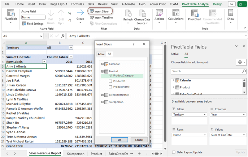
Figure 31 The Insert Slicers dialog box
Click the OK button to close the dialog box and add the slicer to the spreadsheet, as shown in Figure 32. We can see a new tab, Slicer. The Slicer group on this tab has a Slice Caption textbox. Change the caption to Product Category. We can drag the edges of the slicer to change the slicer’s size. To move the slicer, put the mouse pointer over it until the cursor changes to a four-headed arrow, and drag it to a new position (Cheusheva, 2023).

Figure 32 The product category slicer
After creating the slicer, we can click the filter values to filter the pivot table. By default, the slicer selects all values. When clicking on an item in the slicer, we select the item, and the pivot table automatically updates data. We can select multiple values by holding down the Ctrl key on the keyboard while selecting the needed filters. After selecting multiple items, we can see the selected items on the slicer.
4.4 Layout the Pivot Report
We want to exhibit individual salesperson performance; therefore, the report does not need to show grand totals. In addition, we want to show the row and column headings rather than Row Labels and Columns Labels.
We can use design commands on the Design tab to arrange the pivot table. First, place the cursor anywhere inside the pivot table to enable the Design tab. Next, drill down the Grand Totals command in the Layout group and select the Off for Rows and Columns command, as shown in Figure 33.
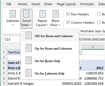
Figure 33 Hide grand totals from the report
Then, drill down the Report Layout command, as shown in Figure 34, and select the Show in Tabular Form menu item.

Figure 34 Show in Tabular Form
Next, select the Light Orange, Pivot Style Medium 10 style in the PivotTable Style group. Click anywhere inside the slicer to enable the Slicer tab. Select Light Orange, Slicer Style Light 2 style from the Slicer Styles group. The final report should look like Figure 1. There are dozens of customizable options available to pivot tables. We can experiment with different combinations of decorative features to create visually appealing reports (Gharani, 2023).
4.5 Use the Show Values As Command.
Suppose business stakeholders want to see the percentage of sales revenue for each salesperson every year. In that case, we can right-click any sales revenue cells to open the context menu, as shown in Figure 35.

Figure 35 The Show Values As command
Select the Show Values As -> % of Column Total command. The report shows the percentage of sales for each salesperson within each calendar year, as shown in Figure 35. We can add many other built-in calculations using the Show Values As command (Dalgleish, 2023).

Figure 36 Show values as percentage of annual revenue
4.6 Create a Sales Representative Report
When rearranging these four areas (i.e., Filters, Columns, Rows, and Values), we can immediately create new reports and answer additional questions. For example, we can drag and drop the fields in the Salesperson table to the Rows area and remove fields from the other areas (as shown in Figure 37) to create a Sales Representative Report showing each salesperson’s details. Note that we unselect the +/- buttons in the Show group.

Figure 37 The sales representative report
Summary
This tutorial described the following four stages of the creation of pivot reports using an Excel pivot table:
- Understanding the business requirements.
- Preparing data tables.
- Creating a data model.
- Developing pivot reports.
The article emphasized the importance of building a data model for reporting purposes. Creating a data model began with importing data into the tables and establishing relationships between them. Then, we added a date table to the model. Next, we explored adding a calculated column to the model. During the creation of the data model, the article pointed out that the cultivation of a relational database mindset could help build a well-structured data model.
We also demonstrated the flexibility of the pivot report. We could create a new report that answered further business questions in a few drag-and-drop steps. In addition, we scraped the surface of the DAX language. When we cannot create a pivot table by dragging and dropping fields into the table, we may think of using DAX.
Reference
Alexander, M. (2022). Excel Power Pivot & Power Query For Dummies, 2nd Edition. Hoboken, NJ: John Wiley & Sons.
Cheusheva, S. (2023). Excel slicers for pivot tables and charts. https://www.ablebits.com/office-addins-blog/excel-slicer-pivot-table-chart/.
Dalgleish, D. (2023). Pivot Tables Show Values As. https://www.contextures.com/xlpivot10.html.
Devaney, E. (2023). How to Create a Pivot Table in Excel: A Step-by-Step Tutorial. https://blog.hubspot.com/marketing/how-to-create-pivot-table-tutorial-ht.
Ferrari, A. & Russo, M. (2019). Definitive Guide to DAX, The: Business intelligence for Microsoft Power BI, SQL Server Analysis Services, and Excel, 2nd Edition. London, UK: Pearson Education, Inc.
Gharani, L. (2023). Excel Pivot Tables Explained in 10 Minutes. https://www.xelplus.com/pivot-tables-in-10-minutes/.
Horne, I. (2020). Hands-On Business Intelligence with DAX. Birmingham, UK: Packt Publishing.
Jelen, B. (2021). Microsoft Excel Pivot Table Data Crunching (Office 2021 and Microsoft 365). London, UK: Pearson Education, Inc.
Lenning, J. (2020). One-Click Data Model Date Table. https://www.excel-university.com/one-click-data-model-date-table/.
MS Support. (2023). Create a Data Model in Excel. https://support.microsoft.com/en-us/office/create-a-data-model-in-excel-87e7a54c-87dc-488e-9410-5c75dbcb0f7b.
Singh, A. (2022). 10 Report Design Tips to Create an Engaging Report. https://visme.co/blog/report-design/.
StudyMoose. (2016). The Adventure Works Cycles Case Scenario. [Online]. Available at: http://studymoose.com/the-adventure-works-cycles-case-scenario-essay [Accessed: 19 May. 2023]
Tanuwidjaja, O. (2021). Cultivating a Technical Mindset for Data Analysts. https://towardsdatascience.com/cultivating-a-technical-mindset-for-data-analysts-c19eb6090089.
Zhou, N. (2023). Using Power Query in Excel for Data Extraction from a SQL Server Database. https://www.mssqltips.com/sqlservertip/7666/power-query-in-excel-to-transform-data/
Next Steps
- When we answer business questions using data, understanding database principles (entities, relationships, primary keys, and foreign keys) can help create successful reports. We also should know how to convert business questions into data questions and then design reports to answer these questions. The reports should be straightforward so the general audience can quickly identify the critical information and find their answers. In addition, the reports should communicate the value we want the general audience to perceive. The pivot table is a tool that can facilitate the creation of reports. However, before using the tool to create a report, we should have a report design that visualizes data effectively.
- Check out these related tips:

Nai Biao Zhou has twenty years of experience in software development, with strong analytical skills and a broad range of computer expertise.
He has fifteen years of experience in development and maintenance of database applications on SQL Server in OLTP/OLAP/BI environments.
He has a master’s degree in Control Engineering and is pursuing a Master of Science degree in Predictive Analytics.
Knowledge/Skills
Advanced computer programming skills and well versed with C/C#, Java, ASP.NET, JavaScript, and SQL.
In depth knowledge of Solution Architecture, and Software Development Life Cycle (SDLC).
Microsoft Certified Application Developer (MCAD) since 2004.
- MSSQLTips Awards: Author of the Year – 2021 | Rising Star (50+ tips) – 2024 | Author Contender – 2020, 2023