Problem
Microsoft Power BI Desktop provides a wide variety of visuals. In this scenario, when there are a moderate number of categories, a clustered column or bar chart can be used to make fair comparisons. These data visualizations provide capabilities to analyze trends across categories such as time, groups, or regions. This tip will highlight all the steps to help create these charts on the Power BI Desktop.
Solution
In today’s data-driven world, the digitalization of everyday life has guaranteed that organizations generate and collect vast amounts of data. Analyzing this data helps businesses and other organizations gain a competitive advantage by revealing valuable insights that aid optimal decision-making. However, the raw and tabular datasets that are collected are rarely useful on their own as they do not demonstrate relationships and patterns within the data points at a glance. A chart is thus used to condense the tabular information into a graphical visual, simplifying complex datasets and aiding in a quicker decision-making process.
Amongst the various visualizations available, a clustered column and clustered bar charts are some of the most common visuals used when comparing multiple data series, with each series having more than one subcategory. A typical clustered column chart (left) and a clustered bar chart (right) are illustrated below.

Before we dissect the above illustration and delve into detail, let’s ponder for a minute. We are all familiar with the classic bar and column chart, right? Both of them encode categorical data in the form of rectangular bars, with their length proportional to the value that is being measured. And what about the difference between a column chart and a bar chart? Both charts have different orientations. On a column chart, the data categories are represented using vertical bars. However, the axes are flipped for a bar chart which uses horizontal bars to encode data.
So how do our clustered charts fit into this picture? Inspecting the above illustration reveals that a clustered column and clustered bar chart are similar to a simple column and bar chart, respectively. Clustered charts are extensions of their simple version; the only difference is that in the clustered counterparts, data can be compared in terms of subcategories, with all of them grouped to differentiate from the other categories. Like the simple column and bar chart, the only difference between a clustered column and clustered bar chart is their orientation.
Now let’s discuss the components of clustered charts in detail:
Categories: The categorical data categories or the groups in the dataset are being compared. Each category also has its associated subcategories that are clustered together. For instance, if we consider the above illustration of clustered charts, the blue bars represent a single category, and the individual blue bars encode the corresponding subcategories.
Bars: The numerical value associated with each subcategory is visually represented by stretching a bar whose height is proportional to the initial measured value. The bars are arranged so that related categories are clustered, as shown in the above illustration.
Axes: As discussed before, for a clustered column chart, the categories are presented on the x-axis, and the corresponding value of that category is shown on the y-axis. This orientation is flipped for a clustered bar chart.
Other than these main features, the axes of the charts must be appropriately scaled. For a good visualization, axes and categories should be properly labeled alongside a descriptive chart title.
Using a clustered visualization is a great approach when one needs to:
- Compare categories and subcategories in data effectively.
- Perform time series analysis.
- Measure product sales and performance.
- Compare multiple data series, subcategories, or metrics within each category.
Creating a Schema in SQL Server
Now that we understand the fundamentals of clustered column and bar charts, it is time for a more practical demonstration. We can assume that we are analyzing a leading cosmetics brand in Asia. We must conduct a time-series analysis to compare the sales trend in the company’s leading markets. Then we also need to evaluate how well the company’s products fared in the latest consumer survey. The power of clustered visualizations will be highlighted using these two use cases. Therefore, we will first be required to create a dataset using SQL Server before we can begin analyzing.
To get started, we will first create a database and access it using the following commands:
--MSSQLTips.com
CREATE DATABASE cosmetics;
USE cosmetics;
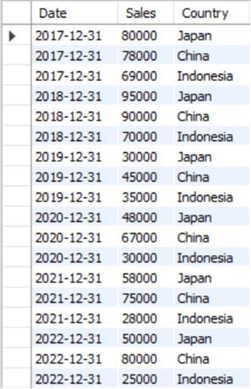
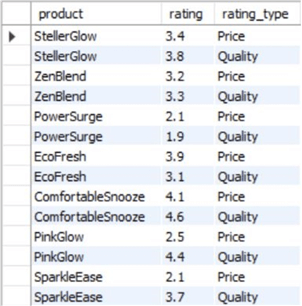
We can now create our tables. Our first table will reflect the sales trend between 2017-2022 across the three largest markets for the company’s product: Japan, China, and Indonesia. Our second table will encode the information related to the consumer survey, which attempts to evaluate product performance in two metrics: quality and price.
To create these tables, we will run the following queries:
--MSSQLTips.com
CREATE TABLE sales
(
[Date] DATE,
[Sales] INT,
[Country] VARCHAR(40)
);
--MSSQLTips.com
CREATE TABLE survey_results
 (
[product] VARCHAR(40),
[rating] DECIMAL (2,1),
[rating_type] VARCHAR(40)
);
Now we can populate these tables using the INSERT command:
--MSSQLTips.com
INSERT INTO sales VALUES
('2017-12-31', 80000, 'Japan')
('2017-12-31', 78000, 'China'),
('2017-12-31', 69000, 'Indonesia'),
('2018-12-31', 95000, 'Japan'),
('2018-12-31', 90000, 'China'),
('2018-12-31', 70000, 'Indonesia'),
('2019-12-31', 30000, 'Japan'),
('2019-12-31', 45000, 'China'),
('2019-12-31', 35000, 'Indonesia'),
('2020-12-31', 48000, 'Japan'),
('2020-12-31', 67000, 'China'),
('2020-12-31', 30000, 'Indonesia'),
('2021-12-31', 58000, 'Japan'),
('2021-12-31', 75000, 'China'),
('2021-12-31', 28000, 'Indonesia'),
('2022-12-31', 50000, 'Japan'),
('2022-12-31', 80000, 'China'),
('2022-12-31', 25000, 'Indonesia');
--MSSQLTips.com
INSERT INTO survey_results VALUES
('StellerGlow', 3.4, 'Price'),
('StellerGlow', 3.8, 'Quality'),
('ZenBlend', 3.2, 'Price'),
('ZenBlend', 3.3, 'Quality'),
('PowerSurge', 2.1, 'Price'),
('PowerSurge', 1.9, 'Quality'),
('EcoFresh', 3.9, 'Price'),
('EcoFresh', 3.1, 'Quality'),
('ComfortableSnooze', 4.1, 'Price'),
('ComfortableSnooze', 4.6, 'Quality'),
('PinkGlow', 2.5, 'Price'),
('PinkGlow', 4.4, 'Quality'),
('SparkleEase', 2.1, 'Price'),
('SparkleEase', 3.7, 'Quality');
To view our tables, we can now use the SELECT statement:
--MSSQLTips.com
SELECT * FROM cosmetics.dbo.sales;
--MSSQLTips.com
SELECT * FROM cosmetics.dbo.survey_results;
Creating a Visualization in Power BI
Now that we have a data model, we can import it into Power BI to create a clustered column and clustered bar chart.
Step 1
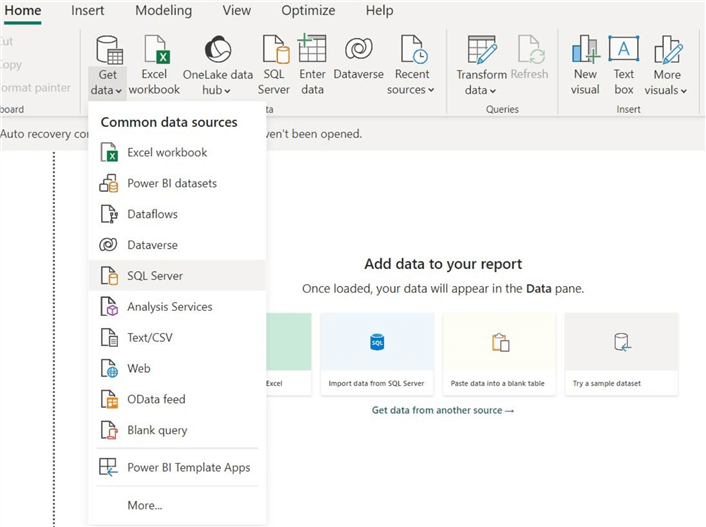
Our first task is to import the data model we made using SQL Server. To do that, click on the “Get data” option in the “Home” ribbon in the main interface of Power BI and then select the “SQL Server” option from the dropdown list, as shown below.
The “SQL Server database” window will open. Enter the correct server and database credentials, then click “OK” at the bottom.

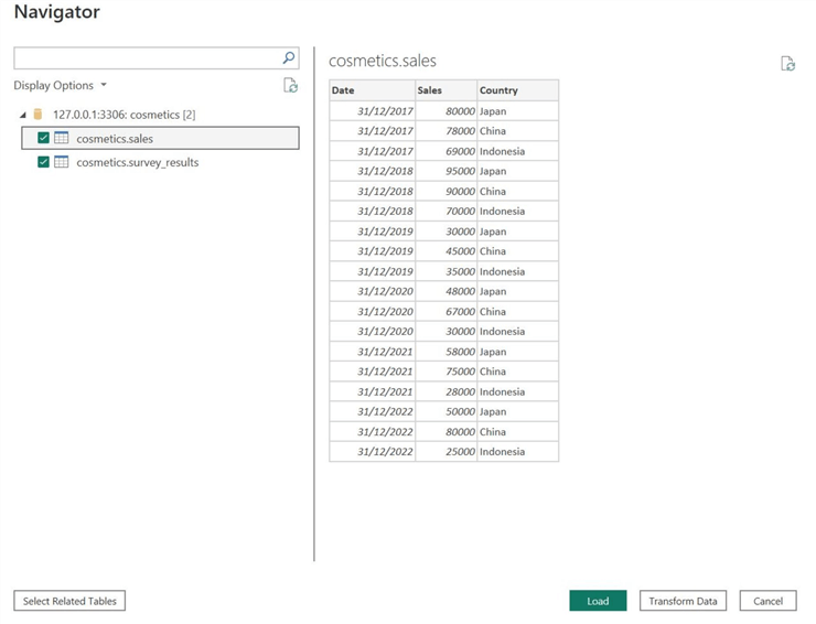
Afterward, the “Navigator” window will pop up if Power BI successfully connects with your database. Below the “Display Options,” select the required tables from our “cosmetics” database and then click “Load” at the bottom.
Power BI also allows users to preview the tables at this stage. In case there are any anomalies in the dataset, they can easily be rectified using the Power Query Editor after clicking the “Transform Data” option. We do not need to go through this step as our data is clean and complete.
Step 2.A: Clustered Column Chart
We are ready to create a visualization now that we have successfully loaded our dataset. We will opt for a clustered column chart for our time series analysis of sales trends per leading product market.
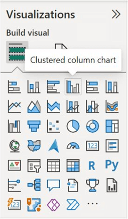
To get started, in the “Visualizations” panel, select the “Clustered column chart” icon shown below.
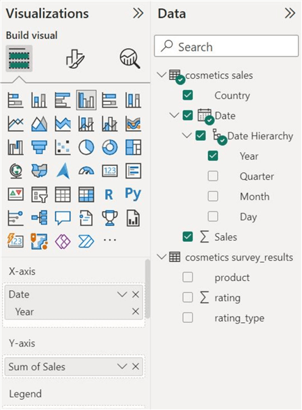
To populate the visual, we need to recall the orientation of a column chart–categories on the x-axis and values to be measured on the y-axis.
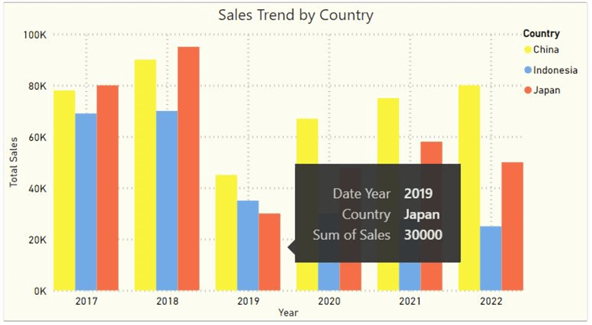
In this scenario, our main category for the time series analysis will be “Year.” In the “Data” section, we need to click on the dropdown arrow beside the “Date” column and select the “Year” data series for the “X-axis” field, as the comparison is yearly based.
For our y-axis, the value we are interested in measuring is the sales amount per year. Therefore, we will drag the “Sales” column from the “cosmetics sales” table to the “Y-axis” field.
Lastly, as we are also interested in visualizing the trend over the top-selling countries, we will drag the “Country” column to the “Legend” field, as shown below.
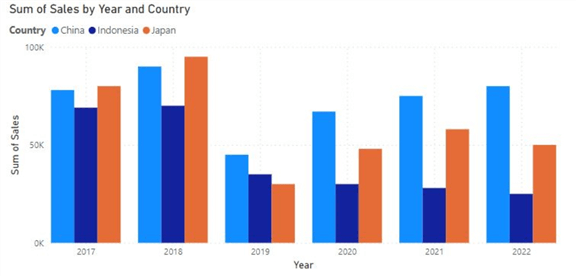
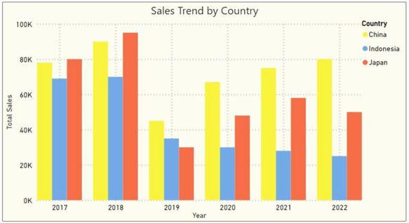
Here is a rudimentary version of our sales time series, which also breaks down data in terms of countries.
Step 2.B: Clustered Bar Chart
Moving onto the second task, we now need to use a clustered bar chart to visualize the results of a consumer survey regarding product satisfaction.
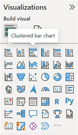
Click the “Clustered bar chart” icon in the “Visualizations” panel, as shown below.
We will use the “cosmetics survey_results” table below to populate this visual. Contrary to the previous visualization, the axes for the clustered bar chart will now be flipped.
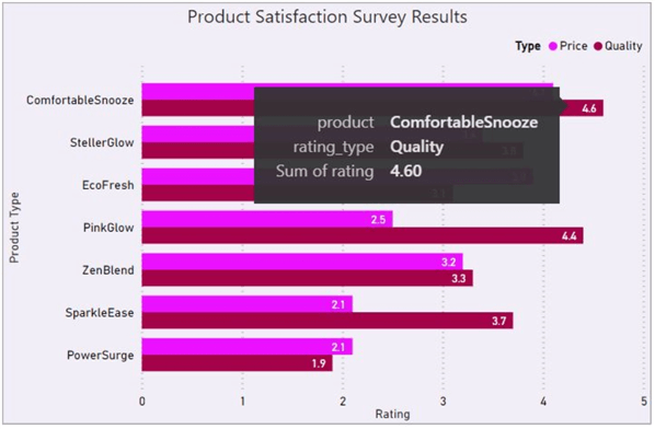
Our main category will now be the various business products. Therefore, drag the “product” column from the “Data” section and insert it into the “Y-axis” field.
Since we are interested in measuring the ratings of each product, the “rating” column goes to the “X-axis” field.
Lastly, since we want to view our results in terms of price and quality ratings per each product, we will drag the “rating_type” column to the “Legend” field as shown.

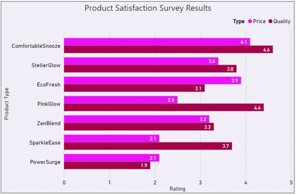
Here’s a simple version of a visual that summarizes the results of the consumer’s product satisfaction survey.

Customizations
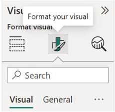
Although both of our visuals fulfill their base functionality, they are not exactly pleasing to the eye. Fortunately for us, Power BI offers a variety of parameters that users can alter to format the visual according to their requirements. As shown below, the two formatting streams are Visual and General.
While the clustered column chart is a separate visual from the clustered bar chart, we will only be going through the formatting style of the former visual as the formatting parameters of both visualizations are very similar.
Visual Formatting
The image below shows some editable aspects under the visual formatting stream. We will be going over a few of these in detail.

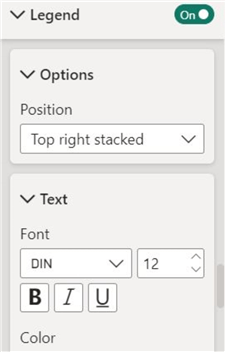
Legend. We can change the legend’s position, alongside its title and the formatting of the text, to make our visual more appealing.
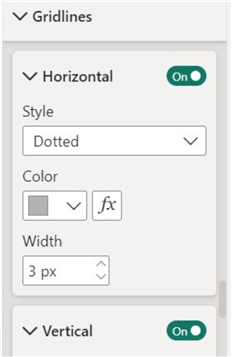
Gridlines. These help viewers easily measure the value that is being represented by a bar. We can disable them under this setting and change the appearance of horizontal and vertical gridlines separately.
Columns. This option allows us to alter our visual’s color scheme to convey the data story more efficiently. We are using contrasting colors to distinguish between the countries.

General Formatting
The following parameters can be edited under the general formatting stream, as shown below. We will again be reviewing some of the most important ones.
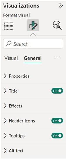
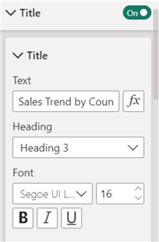
Title. We can change the title of our chart to make it more descriptive or concise. It is also possible to format the text with different sizes, styles, fonts, and alignments.
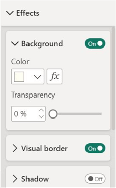
Effects. This option allows us to change the appearance of the whole chart. We can introduce a background color, border, and shadow to our visual.
The above formatting settings have allowed us to refine both visuals, ensuring seamless interpretation for the intended audience. The formatted charts are illustrated below:
Food For Thought…
There is a big elephant in the room. By now, you are probably wondering that although both the clustered column and clustered bar charts compare different data categories with rectangular bars, can they be used interchangeably, given that their orientation is the only difference?
Not quite.
So, when is it best to use one but not the other? We will soon realize that the orientation difference is indeed reflected in their uses, with each excelling over the other in specific functional aspects of data representation.
We use a clustered column chart to display negative values in our visuals. It will be more intuitive to display negative values in a column chart as they will be facing downwards instead of leftwards.
On the other hand, a clustered bar chart is preferable when we have many categories to compare. It is more convenient to place the data categories below each other in a bar chart for more optimal use of space. Furthermore, a clustered bar chart is preferred if your data categories have longer labels (like our product names).
Conduct Analysis
Now, let’s analyze the visuals presented and discern the narrative they convey about the cosmetics company we were working with.
Looking at the visual below, we are faced with a very peculiar story. Before 2019, the business performed quite well in all three countries, with Japan leading. However, in 2019, the sales slumped by a large degree. After 2020, the business activity began slowly recovering, with China now leading. As for Indonesia, sales are slowly falling every year.
So, what happened in 2019? The trend below is a simplified version of the global recession induced by COVID-19.
As for the product satisfaction survey, looking at the chart below, we can quickly proclaim with confidence that overall, ComfortableSnooze performed the best, whereas PowerSurge fell behind every other product. Furthermore, in most cases, the product quality is deemed better than the product prices.
Next Steps
- After you have derived insights from your visual, you can uncover additional insights and patterns by filtering and slicing data, provided the chart is interactive.
- In some use cases, one may also need to incorporate error bars on their clustered charts to incorporate standard error, standard deviation, or confidence intervals in your visual.
- Want to make your chart catchier? Perhaps you can try including icons in it! Since we were working with different cosmetic products in our example visualization, sometimes it’s easier to interpret labels and logos than text labels.
- Explore other charts in Power BI.

Harris Amjad currently works as a Software Engineer at Strategic Systems International. He is Microsoft Certified Data Analyst and Microsoft Certified Trainer. A rigorous, task-driven Data Enthusiast with substantial experience in Data Science, Data Analysis, and Data Engineering.
- MSSQLTips Awards: Trendsetter (25+ tips) – 2024 | Author Contender – 2023, 2024 | Rookie Contender – 2022

Detailed article. Great help.