Problem
Microsoft Power BI Desktop provides its users with a wide variety of visuals. The area chart is helpful when there is a need to emphasize the intensity of change and the cumulative total of values over a continual series of time. Overall, it is very similar to a line chart, but in this case, the area under the line is shaded, which assists in studying the relative contribution among categories. This tip provides steps to create an area chart in Power BI.
Solution
Across various organizational settings, the challenge of managing and making sense of extensive data is common. With terabytes of information flowing in annually, organizations need to make sense of it and leverage the insights present in the raw data to deploy a more efficient and effective decision-making process. Naturally, we humans find it much easier to observe and understand visual patterns, as opposed to, let’s say, staring at huge arrays of rows with crude numbers. This capability has given ground to data visualization, which is all about translating complex datasets into intuitive and simple visual diagrams that summarize key findings and patterns from the data. One such visualization technique we will discuss in this tip is the area chart.
An area chart can graphically encode quantitative data over a continuous interval. It is similar to a line chart, with the addition that the area below the graph is also shaded. This technique is very useful as it not only highlights how a quantity varies with respect to an independent variable but it also illustrates the cumulative totals. In short, it combines the elements of both a line and a bar chart. A typical area chart is shown below.

Some of the key characteristics and components of this chart include:
- Axes: The vertical or the y-axis represents the dependent variable whose quantity you want to monitor across the x-axis. On the other hand, the horizontal or the x-axis represents a continuous scale, such as time or categories.
- Data Series: This line with the shaded area represents how your y-axis variable changes. The illustration above is essentially the dashed line and the purple-shaded area below. In an area chart, it is also possible to have multiple data series in a single graph. An example of this is the overlapping area chart and the stacked area chart.
- Legend: Especially when we have multiple data series in our graph, it becomes a requisite that the chart also includes a legend that shows which data series is encoding which quantity.
So, where does one typically use an area chart? Some of the common use cases of this type of chart include:
- Trend Analysis: We can use an area chart to demonstrate how a specific variable changes over time. Therefore, this chart is an excellent fit when one needs to visualize metrics like annual sales, stock prices, and GDP. This enables the observers to better gauge the fluctuations and seasonality of data across time.
- Comparisons: This chart can also be used to quantitatively compare categorical data. For instance, this chart can be a good candidate for visualizing what percentage of KPIs are being met across different business departments.
- Part-to-Whole Relationships: Other types of area charts, like the 100% stacked area chart, are particularly useful to assess how individual components of a variable contribute to it. For example, we can use this approach to see the composition of a company’s revenue stream across different production lines.
Keeping these specific properties in mind, area charts are very useful across a range of use cases to visualize growth-related variables (like population growth), weather-related data, website traffic analysis, energy consumption, resource allocation, and financial reports, to name a few.
It is equally important to avoid some common pitfalls associated with this chart. It is often recommended that area charts not be used to plot a single data series, as a better alternative is a line chart or a bar graph. An area chart is thus typically used to visualize and compare the division of quantities across two or more data series. However, at the other end of the spectrum, it is also not a good practice to include too many series, as the chart becomes cluttered and overcrowded, making it difficult to make sense of the underlying data. The data should also be appropriately scaled to accurately represent the ‘bigger picture’ of the data without exaggerating minor fluctuations or minimizing the overall trend.
Creating a Schema in SQL Server
Now that we have covered the fundamentals of an area chart, it is time for a more practical demonstration. Suppose we have a hypothetical firm that sells Product A and Product B as its output. You are an analyst at this firm, and your manager has asked you to create a visual that demonstrates the difference in cost and revenue structures across time and products. However, before we can jump right to Power BI to create these visuals, we need a dataset. As an example, we can create one using SQL Server.
To get started, execute the following commands to create your database:
--MSSQLTips.com
CREATE DATABASE area;
USE area;
Now that we have a database, we can create our tables. We will create two tables representing the revenue and cost data of the two products across 2021 and 2022. First, we will create our tables using the following commands:
--MSSQLTips.com
CREATE TABLE cost_revenue_2021
(
[date] DATE,
product VARCHAR(255),
revenue INT,
cost INT
 );
--MSSQLTips.com
CREATE TABLE cost_revenue_2022
(
[date] DATE,
product VARCHAR(255),
revenue INT,
cost INT
 );
We can now populate our tables with relevant values using the following query:
--MSSQLTips.com
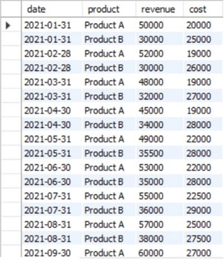
INSERT INTO cost_revenue_2021 VALUES
('2021-01-31', 'Product A', 50000, 20000),
('2021-01-31', 'Product B', 30000, 25000),
('2021-02-28', 'Product A', 52000, 19000),
('2021-02-28', 'Product B', 30000, 26000),
('2021-03-31', 'Product A', 48000, 19000),
('2021-03-31', 'Product B', 32000, 27000),
('2021-04-30', 'Product A', 45000, 19000),
('2021-04-30', 'Product B', 34000, 28000),
('2021-05-31', 'Product A', 49000, 22000),
('2021-05-31', 'Product B', 35500, 28000),
('2021-06-30', 'Product A', 53000, 22000),
('2021-06-30', 'Product B', 35000, 28000),
('2021-07-31', 'Product A', 55000, 22500),
('2021-07-31', 'Product B', 36000, 29000),
('2021-08-31', 'Product A', 57000, 25000),
('2021-08-31', 'Product B', 38000, 27500),
('2021-09-30', 'Product A', 60000, 27000),
('2021-09-30', 'Product B', 39000, 30000),
('2021-10-31', 'Product A', 62000, 29000),
('2021-10-31', 'Product B', 39000, 32000),
('2021-11-30', 'Product A', 65000, 33000),
('2021-11-30', 'Product B', 40000, 34000),
('2021-12-31', 'Product A', 69000, 38000),
('2021-12-31', 'Product B', 40000, 35000);
--MSSQLTips.com
INSERT INTO cost_revenue_2022 VALUES
('2022-01-31', 'Product A', 72000, 40000),
('2022-01-31', 'Product B', 42000, 35000),
('2022-02-28', 'Product A', 74000, 40000),
('2022-02-28', 'Product B', 42000, 34000),
('2022-03-31', 'Product A', 76000, 41000),
('2022-03-31', 'Product B', 41000, 35000),
('2022-04-30', 'Product A', 77000, 39000),
('2022-04-30', 'Product B', 39000, 34000),
('2022-05-31', 'Product A', 78000, 38000),
('2022-05-31', 'Product B', 39000, 33000),
('2022-06-30', 'Product A', 80000, 38000),
('2022-06-30', 'Product B', 38000, 33000),
('2022-07-31', 'Product A', 83000, 37000),
('2022-07-31', 'Product B', 36000, 30000),
('2022-08-31', 'Product A', 82000, 37000),
('2022-08-31', 'Product B', 35000, 28000),
('2022-09-30', 'Product A', 80000, 36000),
('2022-09-30', 'Product B', 36000, 28000),
('2022-10-31', 'Product A', 77000, 36000),
('2022-10-31', 'Product B', 37000, 28000),
('2022-11-30', 'Product A', 76000, 36000),
('2022-11-30', 'Product B', 36000, 25000),
('2022-12-31', 'Product A', 75000, 35000),
('2022-12-31', 'Product B', 35000, 24000);
We can view our created tables using the SELECT command as shown:
--MSSQLTips.com
SELECT * FROM area.dbo.cost_revenue_2021;
--MSSQLTips.com
SELECT * FROM area.dbo.cost_revenue_2022;

Creating a Visualization in Power BI
Now that we have a data model, we can export this dataset to Power BI from SQL Server. Afterward, we can create our area charts to display the underlying patterns in the data. We will be going through the following series of steps.
Step 1
We will start by importing our data from SQL Server. To do so, click on the “SQL Server” icon in the “data” section of the “Home” ribbon as shown below.

The “SQL Server database” window will open up. Enter the relevant server and database credentials, then click OK at the bottom.
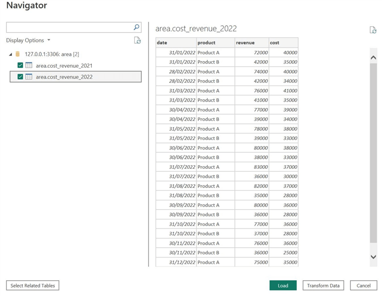
If Power BI has successfully established a connection with your SQL Server database, the “Navigator” window will open as shown below. In this window, select the checkboxes below the “Display Options” to the left. This step will allow you to select the tables you want to import from your database. Click Load at the bottom.
Power BI also enables us to preview our tables at this stage. The “Transform Data” option allows us to deal with any missing values or erroneous data entries in the Power Query Editor. Since our dataset is complete and clean, we do not need to go through this step.
Step 2
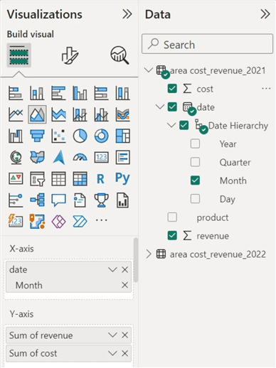
Now that we have our data model in Power BI, we are ready to build area visualizations off it. We will build two graphs, one indicating the cost and revenue structure of the firm in 2021 and one for 2022. To begin, click on the “Area chart” icon in the “Visualizations” section as shown below.

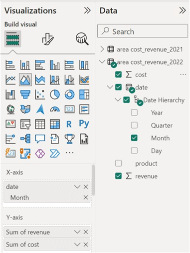
To populate the visual for 2021 statistics, select the “Month” column from the “Date Hierarchy” in the “Data” section and drag it to the “X-axis” field as demonstrated below.

We can then select the “revenue” and “cost” columns and drag them to the “Y-axis” field. Remember that the order of insertion of these columns determines the appearance of the visualization.
Step 3
We can now perform the same series of steps but for the area chart showing the cost and revenue statistics from 2022. Like the prior demonstration, we will select the “Month,” “revenue,” and “cost” columns from the “cost_revenue_2022” table and insert them into the relevant fields as shown below.
Step 4
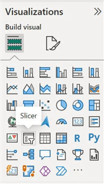
Lastly, to assess our data according to different product categories, we can also set up a slicer that partitions our dataset according to the categories given. In the “Visualizations” panel, click on the “Slicer” icon as shown below.
To build your slicer, select the “product” column and drag it into the “Field” section as shown. (To use the same slicer for both charts, you need to enable many-to-many relationships between the product columns of the two tables; otherwise, use two slicers separately).

We can now observe our visuals below.

Customizations
Judging from the area charts above, it is easy to convince ourselves that a lot still needs to be done. For instance, it is impossible to discern which visual belongs to which year. Therefore, we will utilize the various formatting options available for the area chart in Power BI. As shown below, Power BI offers two styles of formatting:

Visual Formatting
We can observe below the various settings we can use to make our visual more appealing and informative in the visual formatting stream. We will be going over some of these settings.

X-axis – Here, we can change the appearance of the x-axis, including its font, color, size, and title.

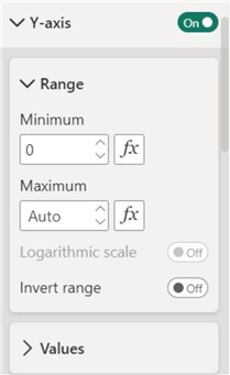
Y-axis – Similarly, here is the same functionality discussed above, with the addition of changing the scale of numerical values on the y-axis.
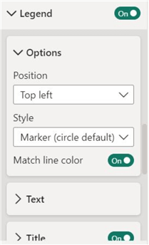
Legend – We can also change the location of the legend on our visual, including the style of its marker for different data series.
Gridlines – Enabling gridlines gives a visual and neat appearance, allowing observers to interpret a chart’s y and x values easily. Here, we can also change the style and size of these gridlines.

Lines – Under these settings, we can alter the color of the data series, the line style used, and the appearance of the shaded area of the chart.

General Formatting
As shown below, we can observe the various formatting options available under the general formatting stream. Again, we will be going over some of the available options.

Properties – Here, we can resize and change the location of our visual with greater precision.

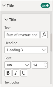
Title – We can also change the main title of our chart, along with its font size, color, border, and appearance.
Effects – We can also add a background color, border, and shadow to our visual to make it more visually appealing.

The changes that we have implemented are shown below. Now, we can easily discern the differences between the two area charts. While the color scheme is homogenous, there are still some differences to make the charts separable.

Conduct Analysis
Now that we have created and edited our area charts, it is time to interpret them and analyze the results. At a glance, we can easily see that the business profit remains positive throughout the two years, as revenue exceeds monthly costs. Overall, both the revenue and the cost increase at a decreasing rate. In the second half of 2022, we can observe the widening margin between revenue and costs, indicating higher profits. This could likely stem from economy of scales, causing the firm’s costs to decline as the output increases.
Now, we can utilize our slicer and inspect our charts relative to one product category. As shown below, Product A is currently selected using our slicer, causing our area charts to solely show the revenue and costs of only Product A across the two years. The trend is very similar to the aggregate cost and revenue structure we analyzed previously. Thus, it is very likely that Product A forms the dominant share of the total revenues and costs.

Now, inspecting Product B’s revenues and cost below, we can see that its total revenue is lower than Product A’s throughout the two years. Furthermore, the profit margin for Product B is also relatively lower, with the costs consuming a significant portion of the revenue.

Next Steps
- To explore this topic further, use the existing dataset and the Power Query Editor’s functionality to produce a single area chart that can be partitioned using a slicer to view the revenue and costs across different years and products.
- Explore other types of area charts, including the stacked area chart available natively in Power BI. Also, look into the custom Power BI visuals available in the Microsoft store, such as the Stream Graph and other variations of the area chart.
- Explore other charts in Power BI.

Harris Amjad currently works as a Software Engineer at Strategic Systems International. He is Microsoft Certified Data Analyst and Microsoft Certified Trainer. A rigorous, task-driven Data Enthusiast with substantial experience in Data Science, Data Analysis, and Data Engineering.
- MSSQLTips Awards: Trendsetter (25+ tips) – 2024 | Author Contender – 2023, 2024 | Rookie Contender – 2022
