Problem
Microsoft Power BI Desktop provides a wide variety of visuals. When there are a moderate number of categories and the contribution of each category value to the total is needed, a stacked column chart or stacked bar chart can be used to make fair comparisons. These graphs provide capabilities to analyze contributions across categories such as time, groups, or regions. This tip will highlight all the steps to help create these charts in Power BI Desktop.
Solution
In our current digital landscape, the success of a business entity is directly tied to how it can leverage its existing data architecture to implement data-informed decisions. Rather than employing experienced-driven, intuition-based decision-making, a data-driven model is more deterministic. It mines all relevant patterns and insights from an underlying dataset that directs decision-makers to useful factual information, thus allowing them to deploy decisions that directly impact the given problem. Even more so, the available data, power statistics, and probability can predict the consequences of the decisions being undertaken with a high likelihood. Therefore, data is a powerful tool that ensures the success of a business.
Equally important is the fact that we need to develop an effective strategy to communicate the insights from the data to the decision-makers in a highly interpretable and concise manner. The solution to this is data visualization. This tip will cover how stacked column and stacked bar charts can be employed for this purpose.
A stacked chart is a visualization that displays how a numerical variable varies across time or categories. In addition, it also shows the composition of each individual bar, which corresponds to the second categorical variable. It is an extension of a typical bar chart with the added functionality of further decomposing the categories encoded in a single bar. A typical stacked column and bar chart is illustrated below.
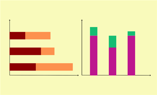
A typical stacked chart consists of the following components:
- Axes: In a stacked column chart, the bars are arranged vertically. The x-axis encodes the time series or the categorical variable, whereas the y-axis encodes the strength of the categorical variable. This orientation is flipped in a stacked bar chart. In the illustration above, the stacked bar chart is on the left.
- Bars: Each bar in the chart represents the categorical variable, and the height of the bar is proportional to the strength of the categorical variable.
- Stacks: Within each bar, a certain number of segments are stacked on top of each other to form the whole bar. These segments represent the decomposition of the categorical variable into further subcategories that add together to create the cumulative total.
Other features include the legend, title, and labels, which are standard for all visualizations.
So, why is a stacked chart relevant, and how can it be used?
- Comparison: A stacked chart also fulfills the basic functionality of a bar or a column chart. We can use it to clearly compare total values across different primary categories. Since the length of the bar is directly proportional to its value, we can swiftly conclude by observing the tallest and the shortest bar.
- Part-to-whole relationship: We cannot only compare the total values of categories, but we can also peek into the bars and see how different subcategories combine to contribute to the cumulative total of a bar. Again, we can inspect the length of each segment to understand the proportions of the decomposed variable better.
These properties make stacked charts ideal for financial reports, sales and revenue analysis, market share analysis, project resources allocation, budgeting and expenditure reports, etc.
But why do we need two types of stacked charts? After all, the only big visible difference between the stacked column and stacked bar chart is their orientation and, thus, the placements of their bars. Although both charts offer the same functionality, they have special use cases where they shine the most. For instance, stacked bar charts are particularly useful when the primary categorical variable on the x-axis has long category names. In a stacked column chart, these names will be truncated, making a stacked bar chart a more ideal visual. On the other hand, in time series analysis, stacked column charts are more appealing as it is more intuitive to see the x-axis increasing from left to right in time-based analysis.
Creating a Schema in SQL Server
Now that we know the fundamentals of a stacked column and bar charts, it is time for a more practical demonstration. Suppose a retail firm has reached out to you to create a visualization representing the differences in sales across the different branches. You also need to account for sales in terms of groceries, clothing, and electronics, which are the firm’s best-selling products. Secondly, you must create another visualization representing the possible outcomes of implementing a new sales strategy. We will now see how to accomplish both tasks using a stacked chart.
However, we need a dataset to work with before we can start making visuals. For this purpose, we will use Microsoft’s SQL Server to create an example dataset.
To get started, we will first create our database and access it using the following commands:
--MSSQLTips.com
CREATE DATABASE stacked;
USE stacked;
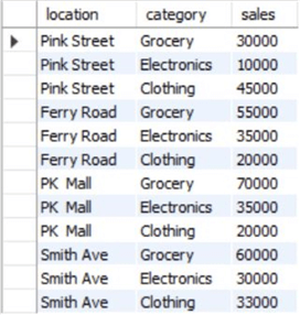
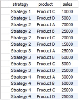
Now that we have our database, we will create the structure of our tables. One table will store information related to product sales across different locations of the retail store. The other table will store data related to the sales strategy.
--MSSQLTips.com
CREATE TABLE locational_sales
(
    location VARCHAR(255),
    category VARCHAR(255),
    sales INT
);
--MSSQLTips.com
CREATE TABLE sales_strategy
(
    strategy VARCHAR(255),
    product VARCHAR(255),
    sales INT
);
Now, we can populate our table with relevant values using the INSERT command, as shown below.
--MSSQLTips.com
INSERT INTO locational_sales VALUES
('Pink Street', 'Grocery', 30000),
('Pink Street', 'Electronics', 10000),
('Pink Street', 'Clothing', 45000),
('Ferry Road', 'Grocery', 55000),
('Ferry Road', 'Electronics', 35000),
('Ferry Road', 'Clothing', 20000),
('PK  Mall', 'Grocery', 70000),
('PK  Mall', 'Electronics', 35000),
('PK  Mall', 'Clothing', 20000),
('Smith Ave', 'Grocery', 60000),
('Smith Ave', 'Electronics', 30000),
('Smith Ave', 'Clothing', 33000);
--MSSQLTips.com
INSERT INTO sales_strategy VALUES
('Strategy 1', 'Product A', 50000),
('Strategy 1', 'Product B', 40000),
('Strategy 1', 'Product C', 10000),
('Strategy 1', 'Product D', 5000),
('Strategy 2', 'Product A', 70000),
('Strategy 2', 'Product B', 25000),
('Strategy 2', 'Product C', 20000),
('Strategy 2', 'Product D', 15000),
('Strategy 3', 'Product A', 25000),
('Strategy 3', 'Product B', 60000),
('Strategy 3', 'Product C', 5000),
('Strategy 3', 'Product D', 25000),
('Strategy 4', 'Product A', 30000),
('Strategy 4', 'Product B', 50000),
('Strategy 4', 'Product C', 25000),
('Strategy 4', 'Product D', 25000);
Now our tables are ready for viewing. We can use the SELECT command to display all of the rows of our two tables.
--MSSQLTips.com
SELECT * FROM stacked.dbo.locational_sales;
--MSSQLTips.com
SELECT * FROM stacked.dbo.sales_strategy;
Creating a Visualization in Power BI
Now that we have a dataset, we can finally make a visualization. To do so, we will export our dataset from SQL Server to Microsoft’s Power BI and then create the stacked charts. Follow the set of steps below to get started.
Step 1: Importing the Dataset
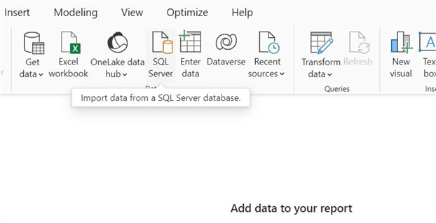
First, we must import our data model from SQL Server to Power BI. To do so, click on the SQL Server icon, as shown below, in the Data section of the home ribbon.
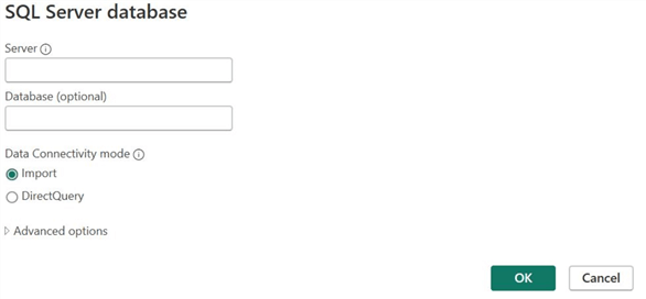
SQL Server database window will open. Enter the relevant server and database credentials, then click OK at the bottom.
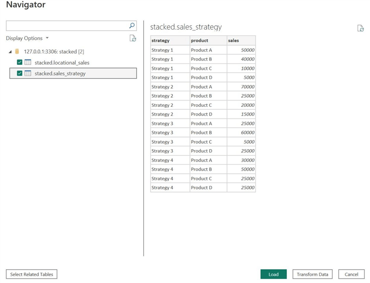
If Power BI can successfully connect with your database, the Navigator window will appear, as shown below. Under the Display Options, select all relevant tables from the database, then click Load to import these tables.
As we can see, Power BI also gives its users an option to preview these tables before loading them. We can manipulate the data using the Power Query Editor by clicking Transform if the dataset needs restructuring or additions or requires that anomalous, missing, or outlier values be dealt with. However, since our dataset is complete and clean, we don’t need to go through this step.
Step 2: Stacked Bar Chart in Power BI
We are now finally ready to create our stacked charts. First, we will create a stacked bar chart to analyze the sales trend across different product categories and different locations of our hypothetical firm.
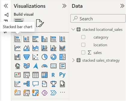
Click on the Stacked Bar Chart icon in the Visualizations panel, as shown below.
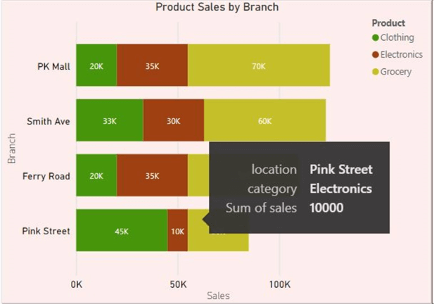
Now, we need to populate this visual. From the locational_sales table in the Data section, drag the location column to the Y-axis field since it is our primary categorical variable, the sales column to the X-axis field, and the category column to the Legend field. This process is outlined in the image below.

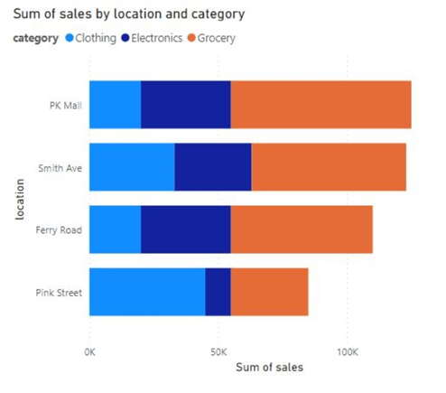
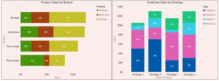
We can observe our stacked bar chart below, which outlines sales across different retail branches of the firm, alongside the products contributing to these sales.
Step 3: Stacked Column in Power BI
Now, we can make a stacked column chart outlining the predicted sales of different product categories across different sales strategies.
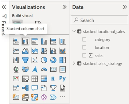
Similarly, like before, click the Stacked Column Chart icon in the Visualizations panel, as shown below.
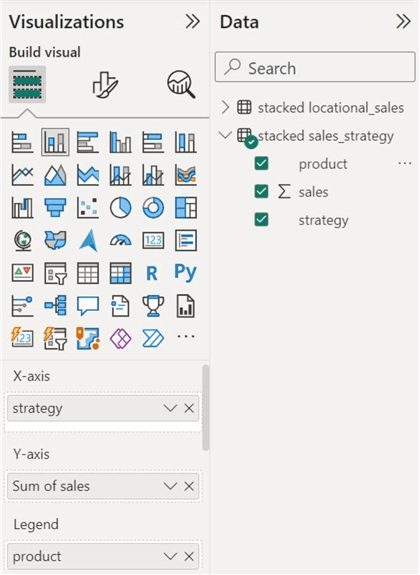
Like before, we will populate this visual considering the flip in its axes’ orientations. From the sales_strategy table in the Data panel, drag the strategy column to the X_axis field since it is the primary categorical variable in this case, the sales column to the Y_axis field, and the product column to the Legend field, as it is our secondary categorical variable.
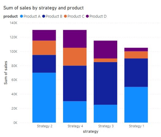
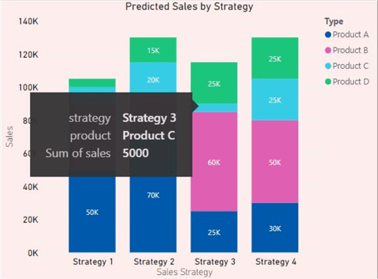
We can now see our stacked column chart below. It essentially outlines how different sales strategies are predicted to impact the sales of product categories, which ultimately affect the entire sales of this firm.
Customizations
Let’s face it. Our current stacked charts encode the information perfectly, yet they fall flat and are not very catchy. For starters, the default color scheme across the two charts is quite similar, which can cause confusion. Secondly, the x-axis in the stacked column chart is sorted according to the sales, which does not make sense in this case. To deal with issues like this, we can customize our visuals to make them more appealing, intuitive, and interpretable.
As shown below, Power BI offers customizations in two streams: visual formatting and general formatting.

Visual Formatting
Visual Formatting deals with visual-specific customization settings. The settings are shown below; we will review a few.

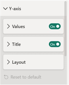
Y-axis. You can alter the font, appearance, and alignment of the data values and labels on the Y-axis. Users are also allowed to change the axis title themselves.
X-axis. Similarly, we can alter the font appearance, alignment, and size of the data values and labels on the X-axis alongside the axis title. We can also manually change the range of the chart to make it more suitable if required.
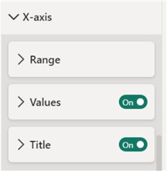
Legend. Enabling this provides a key for the chart, allowing readers to distinguish between the segments of the stacked chart. We can further change the position, text, and title of the enabled legend.

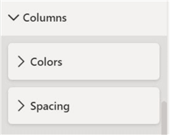
Bars/Columns. For the individual bars themselves, we can change the spacing between the bars and their colors. This helps implement a uniform color scheme.
Data Labels. To make the bar segments more comparable, we can also enable data labels so that the numerical value of each segment is visible.

General Formatting
This formatting stream deals with the general element of a chart that is common to every visual. The various editing options are shown below, and we will review a few of them.
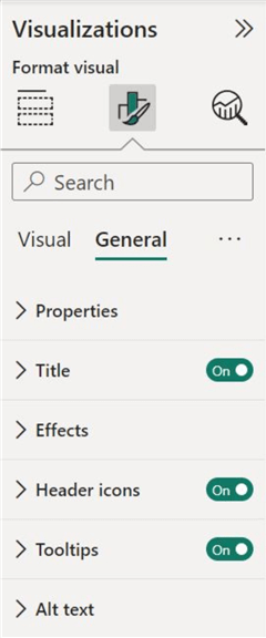
Title. Now, we can change the title of our charts to make it more descriptive. We can append a divider and further change the appearance of the title.

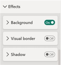
Effects. To make our visual more appealing, we can also append a background color to complement the chart.
We can now observe our final charts below. Notice how it significantly improved from the default charts we made before. The color scheme is more uniform for both charts, the x-axis is sorted properly for the column chart, the data labels are enabled, and many other factors make this visual complete.
Conduct Analysis
Now that we are done creating the chart, it is time to subject it to actual use and analyze it for important insights. Let’s take a look at the stacked bar chart first. As we can observe below, the ‘Pink Street’ branch contributes the lowest to the total aggregate sales, whereas the contribution of the ‘PK Mall’ is the highest. Furthermore, ‘Pink Street’ is the largest seller of clothing items. ‘PK Mall’ and ‘Smith Ave’ also offer a high sales contribution in the grocery items. Overall, grocery item sales are the largest, followed by clothing and electronics. The managers now have an indicator to try a different sales strategy for electronics and clothes for the ‘Pink Street’ branch.
Let's use our stacked bar chart and look at some of these strategies. As we can see below, strategies 2 and 4 are equal to roughly the same amount of total sales. However, the contribution of the individual products to the aggregate amount is quite different. Assuming that ‘Product B’ refers to clothing, strategy 4 may be more sound for the ‘Pink Street’ branch.
In this tip, we have thoroughly explored the basics and the importance of stacked charts. We also used SQL Server to create an imaginary dataset, which later helped us in Power BI to construct a stacked column and stacked bar chart. We also analyzed these charts to convey their usefulness.
Next Steps
- To explore this concept further, users can look at similar charts to the stacked column and bar chart. One example is the clustered column and bar chart and the 100% stacked column and bar chart.
- Furthermore, one should explore how these charts differ and the use cases where they shine the most.
- To explore other charts in Power BI

Harris Amjad currently works as a Software Engineer at Strategic Systems International. He is Microsoft Certified Data Analyst and Microsoft Certified Trainer. A rigorous, task-driven Data Enthusiast with substantial experience in Data Science, Data Analysis, and Data Engineering.
- MSSQLTips Awards: Trendsetter (25+ tips) – 2024 | Author Contender – 2023, 2024 | Rookie Contender – 2022
