Problem
Can I really make great data visualization reports with Power BI Desktop? What visualizations are available? How can I access my data? How difficult is it to make changes to my reports to make them more user friendly?
Solution
In a previous tip, Getting Started with Power BI Desktop, we described in detail the new Power BI Desktop (AKA Power BI Designer or PBID) that Microsoft has added to the Power BI tool set. That tip was followed by a second tip which reviewed some of the query methods available in Power BI Desktop. Finally, we provided a great tip on extracting data from a website. The great news is that getting PBID is easy as downloading it at: https://powerbi.microsoft.com/downloads.
The current edition of the software is available free of charge and Microsoft has indicated that the tool will continue to be free. Of course that could change. Furthermore to publish the PBID reports to the web, you must have an account setup on the Power BI site and currently sign up for the web publishing only available to commercial email addresses. Before I go too far I need to warn you that the tool is still in its early stages. Sure it works well from my testing, but features are being added and removed every week and every month. Be sure you temper any move to production with the fact the tool set may not scale as anticipated. Enough said. With all these changes and updates, Microsoft is currently releasing an update version of PBID at least once per month, if not more often. You can see the latest version information on the Microsoft Power BI Support page.
Working with the Power BI Desktop Report Design Panel
When you open PBID, the start screen, as shown below, allows you to start the query process via clicking on Get Data. Alternately, if you bypass the start screen, you can click on the Get Data button in the ribbon.

Once you have your data (see previously mentioned tip about querying data sources), you are ready to start designing your report grid or panel. The panel takes on a drop and pin structure which allows a report designer to quickly drop a visualization onto the dashboard / report design panel. These visualizations act as the model and structure for the dashboard based on the data retrieved in the query. As we will show in this tip, these visualizations are NOT your ‘father’s” Reporting Services report parts, tablixes / matrixes, or charts. These visualization are updated, interactive and their color palette and style are more modern. Furthermore, the module nature of the visualizations allows for customized visualizations (including ones designed by yourself or others). The selection of customized visualizations seems much like an app store effect.

Let us get started with creating our first report. To frame our example, we are using the AdventureWorksDW database as the basis for our queries; these queries have already been completed, and we are now ready to add a visualization. We actually have two methods of adding a visualization. We can either select a visualization from the list of available items, as shown below or we can just start selecting field which will be shown later in our tip.

After selecting the visualization, a blank version of the chart is added to the design grid.

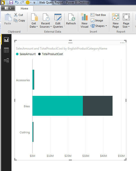
Alternately, the report designer can actually just start selecting the fields that are needed for the visualization. As illustrated next, under the Fields window, all the tables and fields from the query are shown. Simply, click the “> ” to the left of the table name to expand the field list. You simply check the box to the left of the field name. You may notice that some fields have a sigma sign, Ó, to the left of the name. That means that based on the query, that field is considered to be measure field and can be aggregated in various ways. In the below example, we selected SalesAmount, TotalProductCost, and EnglishProductCategoryName.


These selections immediately generate a clustered column chart without us even selecting the visualization type.

Pretty cool so far! If we do not like the selected visualization, we can just select the visualization on the design grid, and then click the desired visualization in the visualization gallery that we want to switch to.

Switching is that easy with the results shown below.
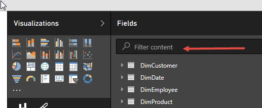
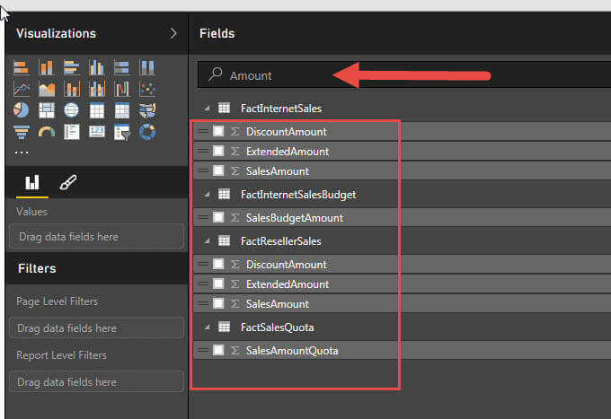
Now we have some of the basics out of the way, let us talk about some more of the features of the design space. First if your query returns many tables and fields, you can use the Filter content feature to search for only the specific fields.
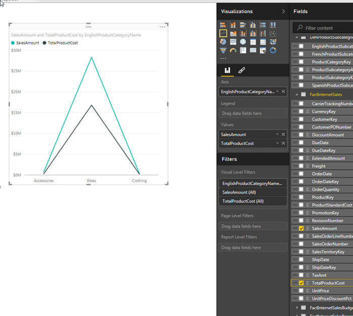
Furthermore, as shown next, we can add a second visualization, this time a line chart, using the same fields as before. Unfortunately, the line chart does not lend itself well to the just Sales Amount and Product Cost by Product Category. The illustration below displays two neat triangles, but they are not meaningful.
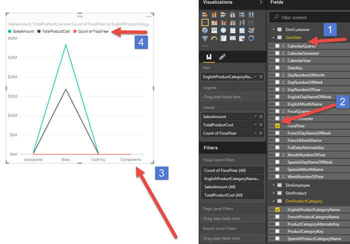
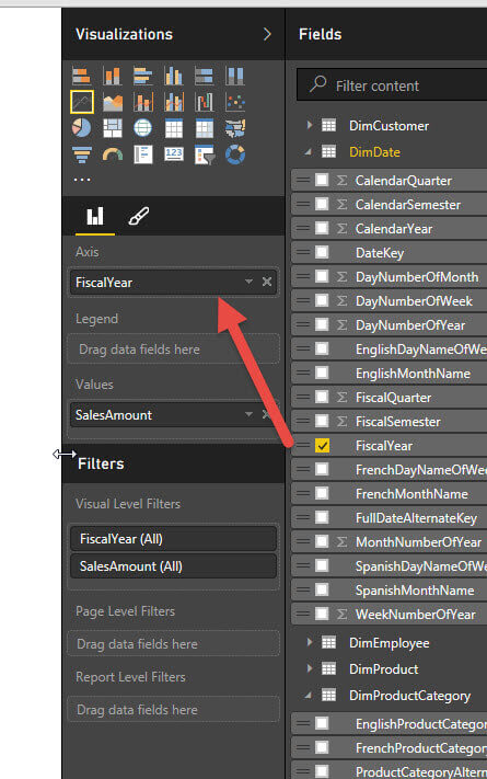
It would be best if we would add a date field, such as year, to display a trend over time. Here is where just “checking” the field may not work as intended. As shown in the next illustration, just clicking on Fiscal Year adds a new value of “count of Fiscal Year”. Definitely, this change is not what we wanted.
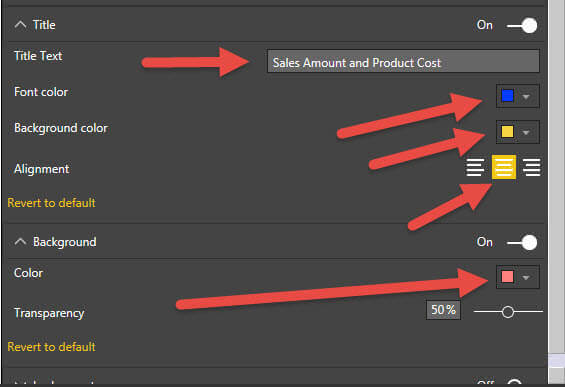
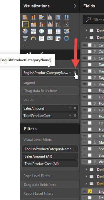
To adjust these items, we can actually use the visualization properties panel to make the appropriate adjustments. As displayed below, we first click on the X next to the EnglishProductCategoryName file to remove it from the Axis property. Then we drag the Fiscal Year field to Axis property. We also removed the TotalProductCost field from the values section.
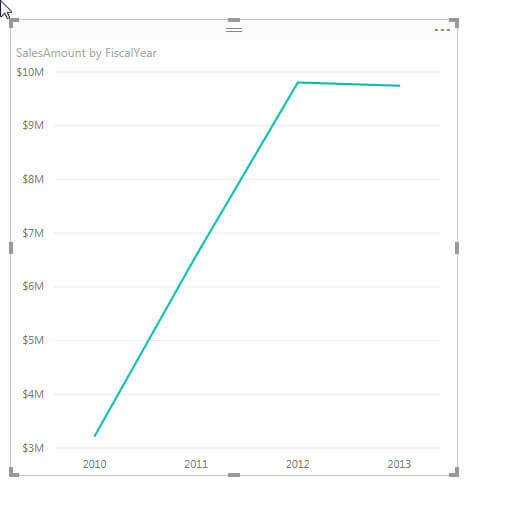
Now we have a simple line chart which shows the sales by year.
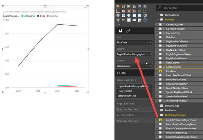
From there we can add back the product category to the legend property and now, as illustrated in the below screen print, we have a line graph showing each of the three major product categories by year.
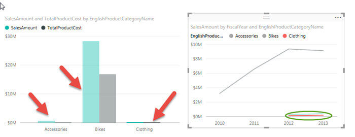
One of the neat things about the pinned visualizations is that by default all the visualizations are linked together. That means when you highlight / drill down on one visualization, the same drill down or highlighting effect is applied to all visualizations. Thus, as shown in the below illustration, when I click on the red line in the right hand graph that is for Clothing, the left hand chart actually also dims the Accessories and Bikes columns in the chart while highlighting the clothing columns.
This same functionality follows through to any chart added to the same page only. We can easily add a second page, as illustrated next, which is a completely separate report grid. However, the filtering and highlighting impact only those visualizations on the same page; the visualizations on the separate pages will not be changed based on the page filtering and highlighting on another page.

The concept we have been displaying above is called “highlighting”; as you may have noticed, the clicking effect “dims” the non-selected items while highlighting the selected items. In addition to highlighting, we can also filter our visualizations at three different levels:
- Visual level filters – these filters limit the data shown only within the selected visualization
- Page level filters – all the visualizations on a particular page have their results limited
- Report level filters – all visualizations on the report have their data restricted by the filter criteria
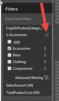
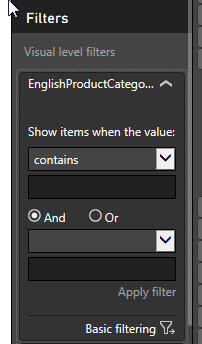
To apply a visual level filter, we simply select our visualization as shown below and then under the Visual level filter area, click just to the right of the field we want to filter. When hovering to the right of the field, a down arrow appears; click on the down arrow.
 

Two filter options are available, basic and advanced. The basic filtering allows you to quickly “check” the values you would like to filter by whereas the advanced area allows for setting up complex filtering including “and / or” functionality.

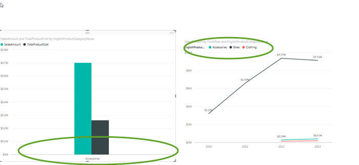
Notice in the below results that only the visualization on the right is filtered by accessories.
To remove the filter, we simply click the eraser button on the filter. Alternately, you can select the “All” checkbox and the filter will be eliminated.