Problem
What is the Power BI Key Influencer Visualization and how should I use it?
Solution
As Power BI continues to grow and features are added, new Microsoft developed visuals are being added. The Key Influencer Visual is actually not a custom visual developed outside of Microsoft, but is one of the normal visuals added to the default visual pick list. Of course there are plenty of custom visuals that you can choose from (see these tips for some great examples: Power BI Custom Infographics or Creating Custom Maps to Display Data with Power BI or Power BI Desktop Custom Visualization), but we are here to talk about the Key Influencer visual.
The Key Influencer Visual takes the next step toward detailed analytics within a visual by analyzing the selected data set, fields, and measures, and assigning specific “influence values” to input fields. This visual is progressing from a simple view of the data to integrating Microsoft AI features and analysis processing to produce a reporting set of values that are likely to influence a particular value. Furthermore, the behind the scenes work comes from Microsoft Artificial Intelligence infrastructure. Specifically, the visual uses machine learning to run regression analysis on the data to model the influencer and segmentation data. It is looking to identify, based on the selected category values, which values influence the designated metric being evaluated. The evaluation ranks the categories from most influential to least influential. Furthermore, the evaluation performs a second set of analysis in order to create distinct segments which group the various categories into segments of influence. These segments create a “picture” of the most common categories that are grouped together to produce a significant result in the metric being evaluated. I am sure going through the below example will assist with seeing the power of this new visual.
Before we get into an example, you need to be sure to download the latest version of Power BI desktop from: https://powerbi.microsoft.com/en-us/get-started/. The download and install process has changed, in that it now uses the Microsoft Store to complete the install. For those wanting the more traditional download and install method, you can still use this site: https://powerbi.microsoft.com/en-us/desktop/. Additionally, we will be using the AdventureWorks 2016 database as a basis for our data sources; this database can be downloaded from GitHub at: https://github.com/Microsoft/sql-server-samples/releases/tag/adventureworks.
What the Power BI Influencer Visual Can Do!
Depending on the version of Power BI Desktop that you are using, you may need to enable the Key Influencer feature in order to leverage its use. To enable this feature, navigate to File > Options and Settings > Options; then, click on the Preview features in the left menu, and finally as shown below, check the Key Influencer visual option.

Once enabled, the new Key Influencer visual is now available in the gallery.

Prior to diving into an example, we need to complete some setup work. For this tip, we will be using the AdventureWorks2016 database as our data source (take a look at these tips Querying SQL Server Data with Power BI Desktop or Connect to on-premises data sources with Power BI Personal Gateway as some examples for connecting to various data sources).
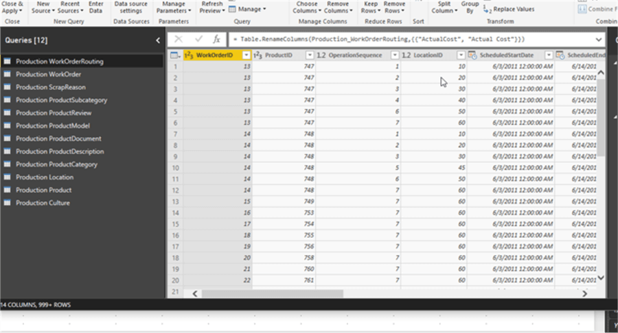
As shown in the below screen print, we add the Production schema tables from the AdventureWorks2016 database to our data model in the Power Query Editor. For this example, no particular transformations other than a few columns renames (to add spaces between words) were completed on the data. Once the tables are added, go ahead and select the Close and apply button in the upper left corner of the toolbar.
We are now ready to start designing our Key Influencer visual, and thus we must decide which value will be analyzed within the visual. As of this writing, only category type fields can be evaluated within the visual. In the below example, the Size field from the Product table is used; note that even though this field is numeric, it is categorical in nature and not continuous (currently the Key Influencer visual does not support analyzing continuous values).
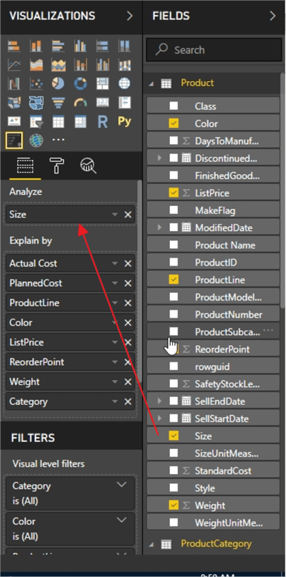
After setting the metric to be analyzed, the fields that could affect the analyze field are then added to the Explain by list. As shown below, we can add values from multiple, related, tables to the Explain by list of values. Thus, we are suspecting that the following items influence the Size of a product:
- Actual Cost
- Planned Cost
- Product Line
- Color
- List Price
- Reorder Point
- Weight
- Category
As the list of possible influencers is selected and added to the Explain by list, we do need to keep in mind that these items must be related to the Analyze field and that they also must be at the same level of aggregation. If they are not, then you will need to transform the data to get it to the same level.

Now, we are ready for the processing to begin! Before we review the processing and more so the results, it would be a good refresher for everyone to know that the analysis being performed is regression based. Additionally, if too few values exist for a particular Explain by value or the value list is too broad (even though they are known values, but there are many different values…. namely the cardinality of the data is very high), the analysis may not work for a particular set of Explain by values. Of course, the larger the dataset and the larger the number of Explain by values, the longer processing may take. Finally, normal report and page filters can also be implemented.
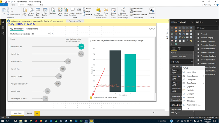
Let us first look at the Key Influencer tab, shown below, now that processing on our data is complete. You will notice in the upper left corner just below the title and tabs, is the selection drop down for deciding what value is being examined. For this example, we are looking at what influences the size of the product to be 62 (remember 62 is considered a categorical value). As we can see from the results, the key values influencing the size to be 62 are, in order of most influential to least influential:
- Product Line of R
- Color of Red
- Product Line of T
- Color of Blue
- Category of Bike
- Category of Components
- Color of Black
- List Price up to $906
You will also notice that not all the fields selected in the Explain by list are shown which indicates that either that particular field did not contain any influencers, or the influence was too low to be considered. Also, note that multiple values from the same field can be influencers as noted with the product line and color in this example.

Furthermore, drilling into the actual details in the above analysis, it shows that having a product line of R is 7.07 more likely to produce a size of 62. Selecting one of the influencers lines on the left side of the chart, will activate that value for detailed analysis chart on the right side as shown in the above screen print. The bar chart on the right side actually shows us a comparison of the designated Explained by value with other values for the same field. In the above example, we see that a Prod R is roughly 6% more likely than the average to produce a size of 62. You may also notice that T has a higher likelihood of indicating a size of 62, but because product line T has many fewer values, its influence is also less.
On the right side you will also notice that there is a bar that shows the key influential value (aqua in color) along with all the other available values for that particular field (black), and then finally an average line is displayed (in red). The average line is the average of all the values except for the main key influence metric that is selected from the left side.
One option that is available on the right-side key influence visual is a checkbox, below the bar / column charts, that allows you to only use those values that are influencers. It will basically ignore all the remaining values that have absolutely no influence on the selected category value as notated below.
As you continue to work with the key influencer tools, you will quickly notice that in addition to being able to select an individual item that you’re looking at, you can also add filters which allow you to even further subdivide the list that is being analyzed. For the below example, the filter is activated to only show categories of bikes; the analysis in the visual reprocesses and produces new results based on this feature.

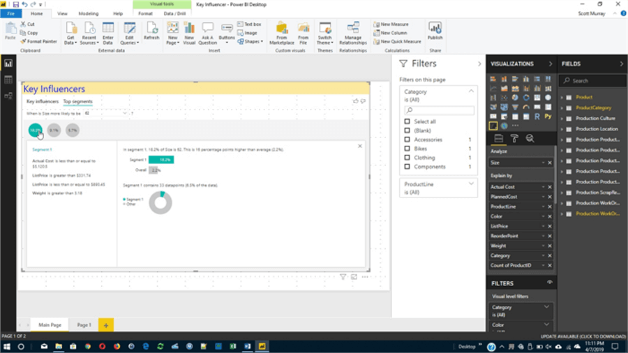
Next, we are going to move on to the second tab which is the Top segments tab. The top segments tab allows a visual consumer to actually look at values, when combined as a group, that have a key influence on the particular to be analyzed. Thus, for instance, as a visual consumer is looking through a particular set of fields and values, we can see what combinations have a strong impact on the analyzed value (size in our example). Therefore, in essence what is happening is a group of values are all banded together. As you are looking at these different segment groups, you will notice that certain influencers have a stronger value when combined; in the top segments visual, the size of the circle \ bubble shows you not only the influence but also the strength of that particular influence. As shown in the below example, the size of the circle shows the number of records that make up that particular set (you will need to know your data to know those values are valid and worthy of further review). Furthermore, the percentage listed inside the circle shows the percentage of value to be analyzed that makes up total population (as does the height of the bubble on the bubble chart).

The segmentation tab actually uses similar methodologies to the main key influencer tab, in that it is using a regression analysis to determine those values that make up this particular set are indeed key influencers. Clicking on an individual bubble opens a segment detail window, as illustrated in the subsequent screen print. This detail provides data for each of the category values that make up the segment, such as list price and weight in the below example. The detail visual also provides for the percentage of the total population of values this segment represents both within the particular metric value and as a whole (whole population).
Hopefully you can see these new visuals represent a very direct and exceptional step forward for data analytics within Power BI. As more visuals are developed, these “influential” visuals will continue to proliferate.
Next Steps
- All MSSQLTips.com Power BI Tips – SQL Server Power BI Tips
- Power BI Advanced Q & A – Power BI Advanced Q & A Techniques

I have a passion for crafting Business Intelligence Solutions for my user groups. My experience includes almost 15 years of SQL Server involvement with the last 12 years focused specifically on Business Intelligence, SharePoint, OLAP, SSRS, and Decision Support solutions. Currently, I am a Business Intelligence Architect in the healthcare industry, and I also teach database and analytics classes for Kennesaw State University, Southern New Hampshire University, and Reinhardt University. My education includes an MBA and an undergraduate in Accounting (yes I am a reformed accountant!), both from Kennesaw State University. I enjoy every day by trying to grow my faith and spend precious time with my family. I have been happily married to my wife of over 20 years, and we have two teenagers one who we home school with the help of a University Model School, Cornerstone Prep in Acworth, GA (cornerstoneprep.org). Our other child is a Construction Management major at KSU’s Southern Poly / Marietta campus. We are a soccer and Cross Country (XC) family who play, coach, and referee soccer or run for fun most every day. For several years, our family has volunteered (and played with the dogs and cats) at Etowah Valley Humane Society in Cartersville, GA.
- MSSQLTips Awards: Champion (100+tips) – 2016 | Author of the Year – 2015 | Author Contender – 2014, 2016-2021
