Overview
Gauges are generally used to represent Key Performance Indicators (KPIs) on a report or dashboard. Mobile Report Publisher offers different types of gauges, which can be logically categorized in three groups. Our intention is to understand the use of key configuration details of these gauges. A detailed explanation of every property of every gauge is beyond the scope of this tutorial. We will cover each gauge in brief and touch upon important details.
Explanation
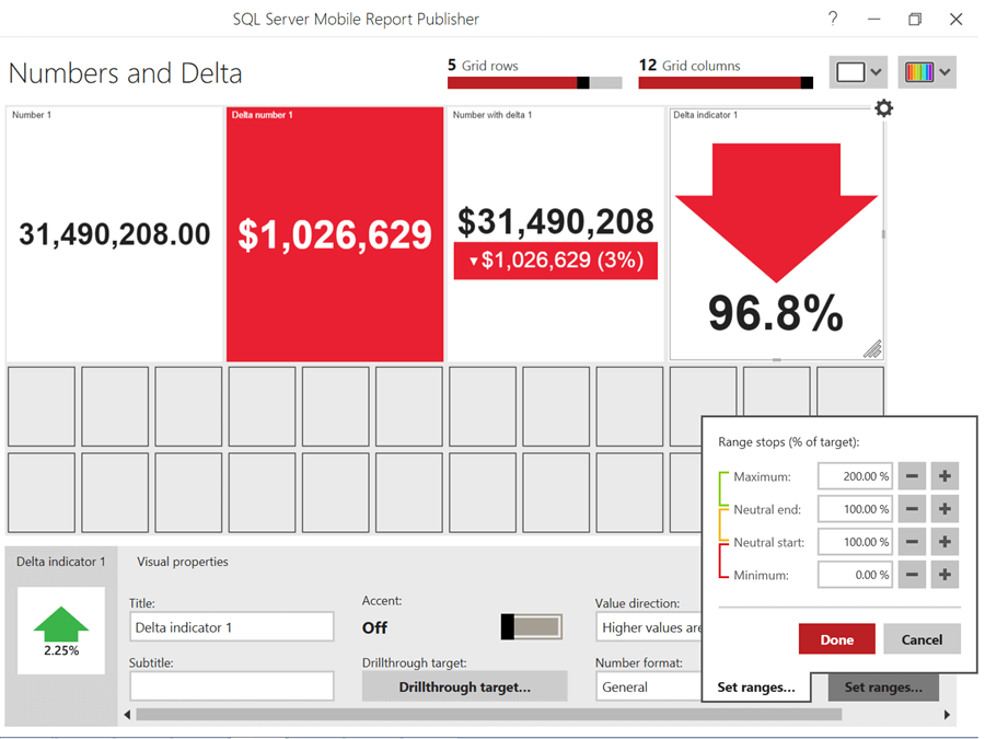
In SQL Server Reporting Services (SSRS) Mobile Report Publisher, the simplest gauges in terms of complexity are related to numbers and deltas. Monitoring statistics is the most basic and standard requirement of any dashboard. There are different ways to represent statistics. We can show actual numbers or percentages, highlight background or foreground, display actual values or the delta (difference) compared to the target metrics or goals. Every KPI has thresholds associated with it to display colors. As you can see below, gauges also provide options to define thresholds and associated colors.
Numbers and Delta Gauges
The four different gauges associated with numbers and delta are – Number, Delta Number, Delta indicator, and Number with delta.
Radial and Linear Gauges
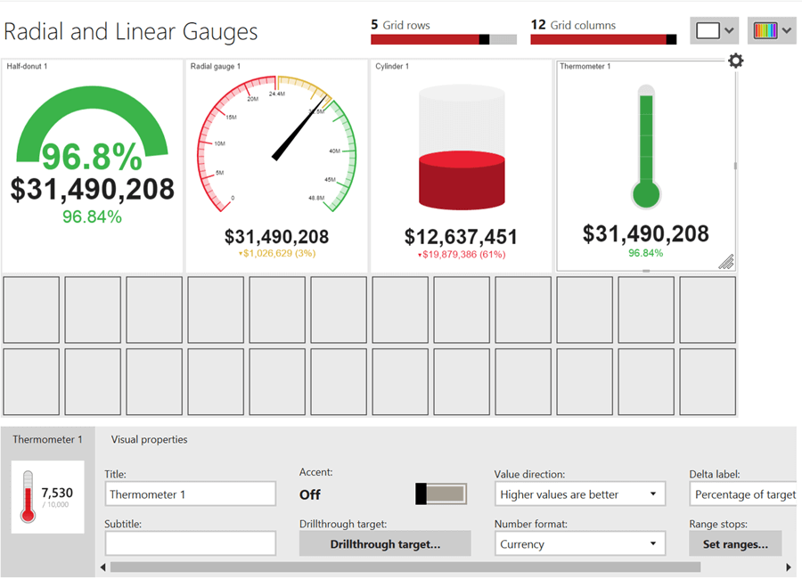
The next set of gauges are radial and linear (vertical) gauges. These gauges are – Half-donut gauge, Speedometer, Cylinder and Thermometer. The configuration settings are almost similar for all these gauges. The choice of any particular gauge depends on the type of data and the comfort of end-users with the visual.
Progress Bars, Linear and Bullet Graph Gauges
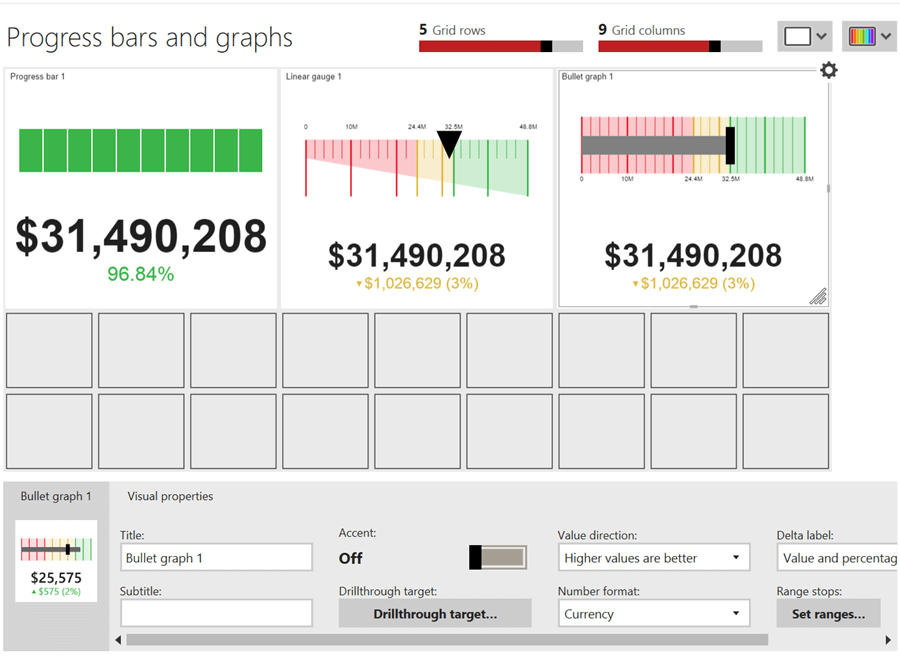
The final set of gauges are Progress bar, Linear gauge, and Bullet Graph. Bullet graph is often used in desktop based reports as well and is one of the most popular gauges to display KPIs. The grey bar shows the actual value, the black vertical bar represents goal, the color represents the thresholds and the vertical lines on the bar represent the scale.
Gauges take less space and provide analysis for a single metric from different angles like goal, target, status, etc. Considering reading more about gauges from here.
Additional Information
- Gauges and charts are generally represented side by side. Consider using a common dataset and create a small report that contains at least two charts and one gauge.

Siddharth has more than 14 years of experience in the IT Industry, with more than a decade of experience in Business Intelligence and Analytics, for clients banking, logistics, government, Media Entertainment, products, life sciences and other domains. He has been a lead architect for a portfolio of 40+ apps, containing apps in web, mobile, BI, Analytics, data warehousing, reporting, collaboration, CMS, NoSQL and other technologies. He has several certifications and is a published author for online and print-media publications, as well as the MSDN Library.
In his present role, he remains responsible for architecture design, technology stack selection, infrastructure design, 3rd party products evaluation and procurement, and performance engineering. These applications use technologies like Elasticsearch / Lucene, MongoDB, SharePoint 2013 and 2010, jQuery-based framework like Highcharts and GoJS, SQL Server and the Microsoft Business Intelligence stack (SSIS, SSAS, SSRS, MDX, PowerPivot, PowerView), jQueryMobile, Bootstrap, iOS xCode framework, and many others.
- MSSQLTips Awards: Champion (100+ tips) – 2018 | Author of the Year – 2017 | Author Contender – 2016, 2018-2019

Great article- thanks for the instructions.