Overview
SQL Server Mobile Report Publisher is a mobile report authoring tool that provides an interface and visualizations to develop mobile reports. It also provides options to consume data from Microsoft Excel spreadsheets or Shared Datasets deployed on a SSRS web portal. This means that the mobile report publisher indirectly supports all the data sources that SSRS supports. In this chapter we will introduce the interface and visualizations available in Mobile Report Publisher.
Explanation
The below diagram shows the authoring interface of Mobile Report Publisher. We will explore the different options.
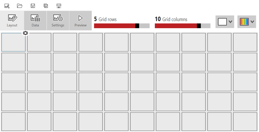
1) The toolbar on the top consists of five options:
- Create a new mobile report
- Open a mobile report
- Save
- Save as – mobile report
- SSRS server connections respectively.
2) The menu bar contains four tabs – Layout, Data, Settings and Preview.
- Layout – This tab provides an adjustable grid divided into rows and columns. This grid divides the targeted device screen virtually in percentages which allows for convenient size and position controls without getting into pixel by pixel calculation of each control.
- Data – This tab provides options to select data either from an Excel spreadsheet or from a shared dataset deployed on a SSRS web portal.
- Settings – This tab provides options to set Report level properties like Report Title, Currency, Client Data Caching, etc.
- Preview – This tab actually executes the report and shows the report output in a simulator. This feature is used to actually test the report.
3) The two options on the top right corner are for design layout and to apply themes. In Mobile Report Publisher, three types of layouts are available – Master layout, Tablet layout and Mobile layout. All controls need to be placed on the Master layout and configured. These controls will then become available for use on the Mobile and Tablet layouts.
Visualizations
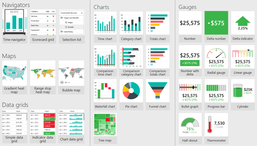
The below diagram shows the list of visualizations available in Mobile Report Publisher for developing mobile reports. These visualizations are categorized by Charts, Grids, Gauges, Maps and Navigators. Dragging and dropping each visualization onto the grid layout will show the visual on the chart using the sample data that ships with each visualization control.
Now that we have explored the authoring interface, we will focus on different categories of visualizations and the corresponding purpose in the next section.
Additional Information
- Consider exploring the mobile report publisher authoring interface and try out all the features discussed above.

Siddharth has more than 14 years of experience in the IT Industry, with more than a decade of experience in Business Intelligence and Analytics, for clients banking, logistics, government, Media Entertainment, products, life sciences and other domains. He has been a lead architect for a portfolio of 40+ apps, containing apps in web, mobile, BI, Analytics, data warehousing, reporting, collaboration, CMS, NoSQL and other technologies. He has several certifications and is a published author for online and print-media publications, as well as the MSDN Library.
In his present role, he remains responsible for architecture design, technology stack selection, infrastructure design, 3rd party products evaluation and procurement, and performance engineering. These applications use technologies like Elasticsearch / Lucene, MongoDB, SharePoint 2013 and 2010, jQuery-based framework like Highcharts and GoJS, SQL Server and the Microsoft Business Intelligence stack (SSIS, SSAS, SSRS, MDX, PowerPivot, PowerView), jQueryMobile, Bootstrap, iOS xCode framework, and many others.
- MSSQLTips Awards: Champion (100+ tips) – 2018 | Author of the Year – 2017 | Author Contender – 2016, 2018-2019