By: Scott Murray | Comments (1) | Related: > Power BI Charts
Problem
Power BI has a new feature which is the Power BI Small Multiples visual. In this article we cover how to enable this feature and also walk through an example of how to use this in a Power BI report.
Solution
Power BI has extensive contextual highlighting built into dashboards by default as noted in this Power BI tool tip. Furthermore, using filters and slicers allows for drill down and criteria limits; however sometimes a report consumer wants to see the same visual multiple times for some dimension value, such as country, city, product, or customer.
Similar functionality has been a main stay feature in SQL Server Reporting Services - SSRS for many years as outlined in this tip about putting a chart within a textbox of a matrix. Within Power BI, this functionality takes the name of Small Multiples as generally the charts will be smaller in size (they do not have to be small necessarily), so you can include many and sundry slices of the data. It is a lot like having a legend, but instead of different colors for each item in the legend, you have a different chart for each item. To be honest, I have been anxiously awaiting this feature for some time as it is often requested by my report consumers. I am so glad it is now in Preview, and based on the latest Power BI blog, it will be a work in progress for several updates.
Before we display the advantages and some of the caveats of small multiples, be sure to download the latest version of Power BI desktop. Additionally, we will be using the WideWorldImportersDW database as a basis for our data sources; this database can be downloaded from GitHub. If you need a refresher on bringing data into Power BI please see this tip about querying data.
Power BI Small Multiples Visual Example
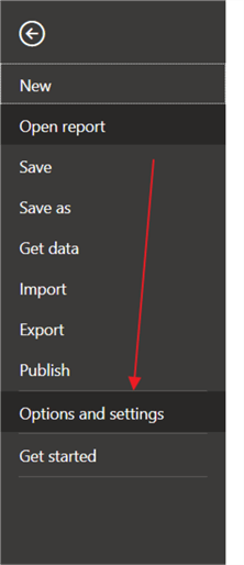
Our first step is to enable this preview feature in the Report Options by clicking on File in the tool bar and the Options and settings and then Options.
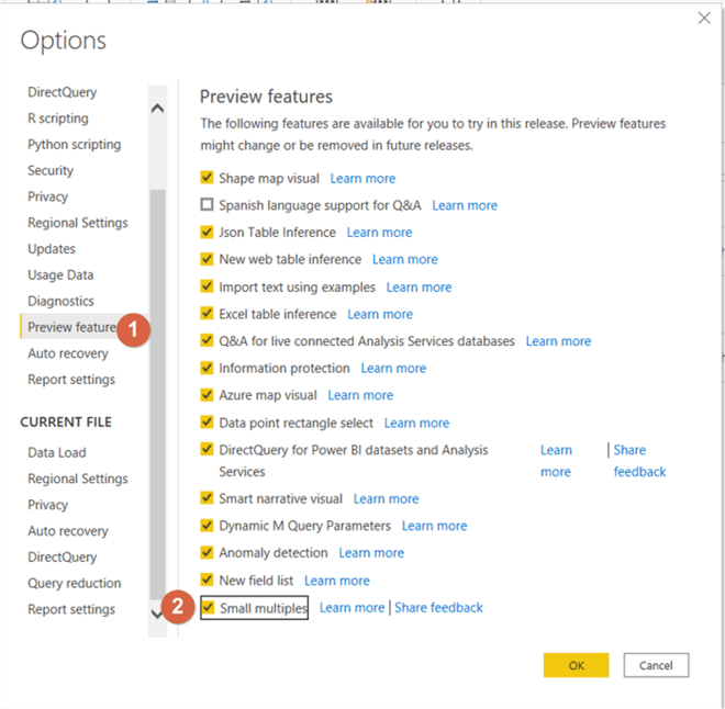
Next, check the box next to the Small Multiples (2) option to enable this feature for use in the report. Notice that the Share feedback option is available here, and Microsoft is actively seeking feedback on this feature.
Next, we can create a simple dashboard tab with a column chart, a matrix, and a line chart. As with any new feature and especially one that is still in preview mode, several limitations still constrain the full potential of the small multiples functionality. This feature currently only works for 4 visuals at the present time: line charts, bar charts, column charts, and area charts (note some folks combine bar and column charts). I would expect more visuals to come online as releases are completed over the next several iterations of updates.
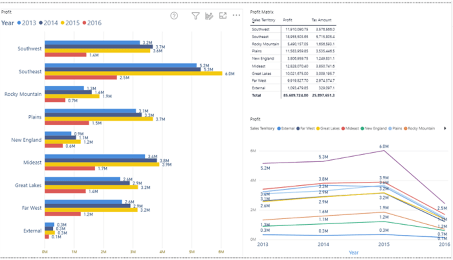
Creating a small multiple visual starts with adding the requested chart to the design grid first. Thus, using the bar chart shown on the left side of the above illustration, we will create new set of small multiples based on the sales territory field. This process is accomplished by dragging the Sales Territory field to the Small multiples well under visualizations, as shown next.
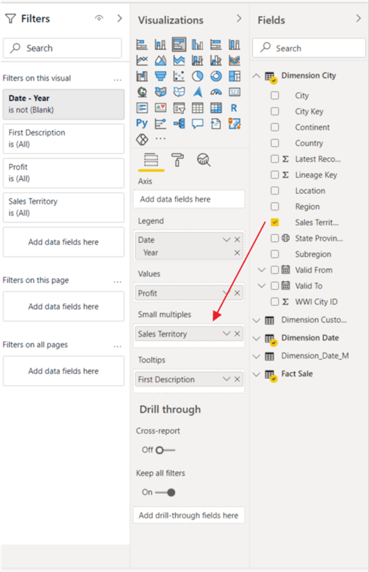
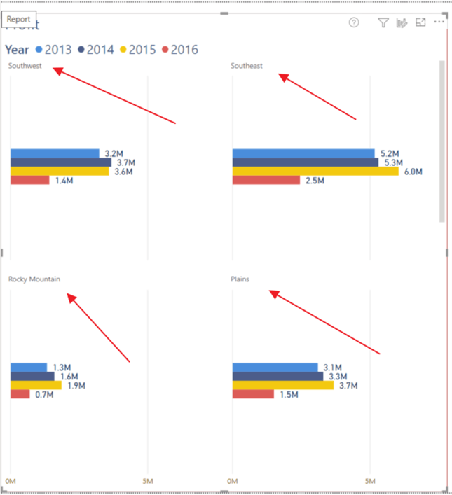
Now, as shown below, our column chart displays a separate chart for each Sales Territory within the main visual.
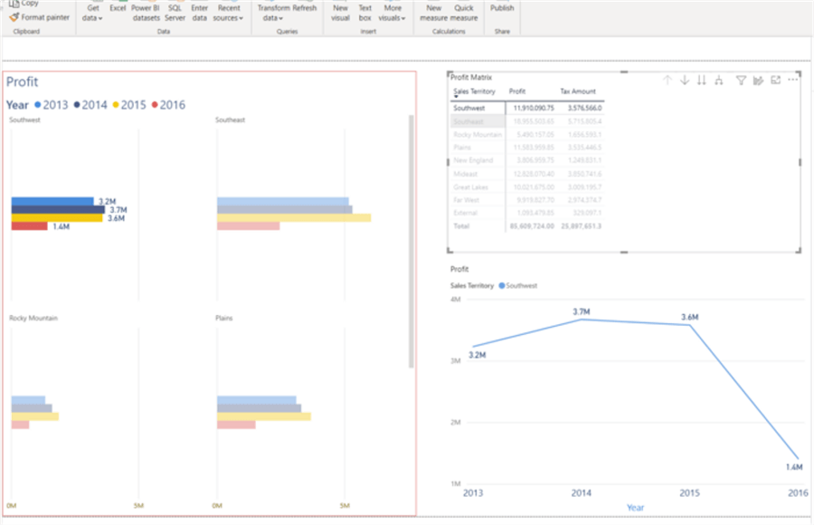
Cross filter continues to work as shown below. Southwest is selected in the matrix and the small multiple charts highlights the Southwest chart while dimming the other sales territory small multiples charts.
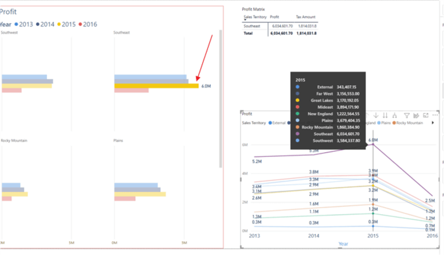
The same highlighting occurs when selecting both a territory and year from the line chart. Also, clicking on the legend or title in the small visuals will actually cross highlight the related values in the other visuals on the report page.
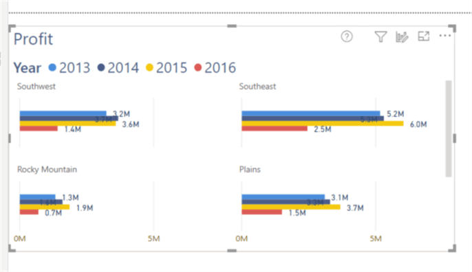
You will also notice the current functionality defaults number of visuals per row is 2; similarly, the default number or rows is 2 (2x2). Thus, if the size of the overall visuals is shrunk, as illustrated below, the 2x2 format is retained with a smaller size for each multiple. To see the additional small multiples visuals, you would need to scroll downward.
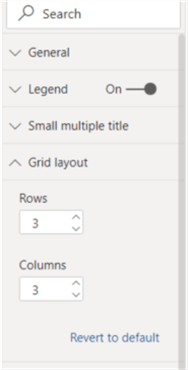
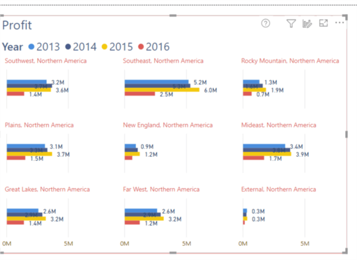
Fortunately, we can change that default 2x2 view to allow for a set number of columns. In the below screen prints, we adjust the grid to now show 3 visuals wide by 3 visuals tall. The current limit is 6x6.
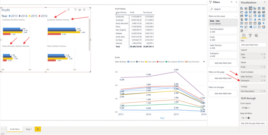
The small multiple category values can also extend beyond a single dimensional value. As illustrated subsequently, the small multiple category is a combination of Sales Territory and SubRegion.
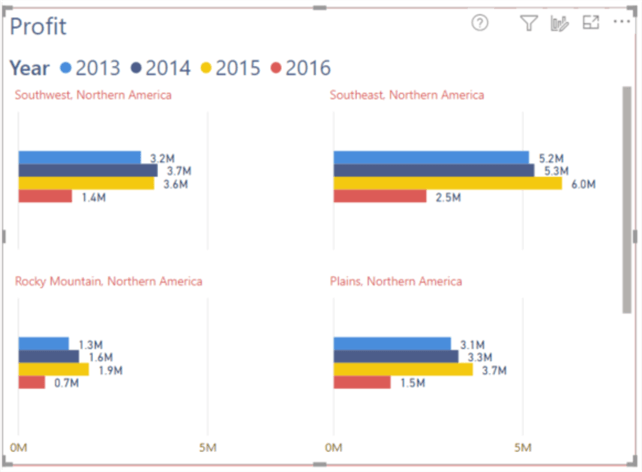
When small multiple values are added, additional formatting options are presented in the formatting pane including adjusting the title format. The title was changed to red in the below example.

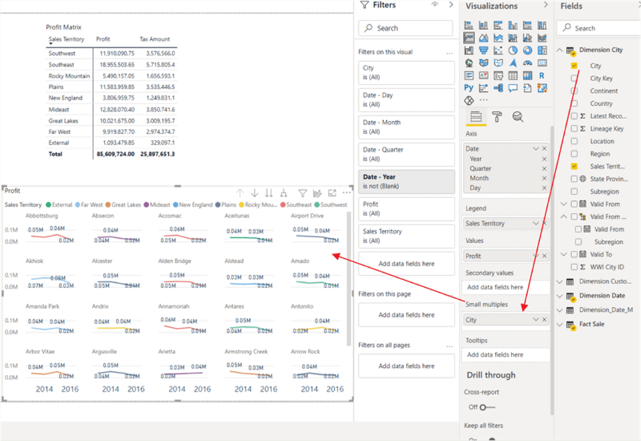
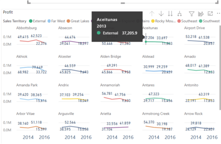
We can similarly use small multiples on a line chart. This functionality definitely reminds me of sparklines used in SSRS or even Excel and is illustrated below.
Tool tips allow you to quickly drill into the distinct values used on the line chart.
Caveats when using Power BI Small Multiples
Some of the other current caveats when using small multiples, for now, include:
- The ability to add them on the Power BI Service is not available
- Several formatting options are limited, disabled, or not available including:
- Analytics pane
- Background color
- Padding and grid lines between the small multiples
- Text wrapping on headers
- Zoom slider
- Concatenated labels and total labels
- Continuous X axis is not available
- Visuals beyond, bar, column, line and area charts are not available for use in small multiples, but combo charts and scatter charts are on the roadmap for the next set of releases
- Sorting by measure values is not currently available
- Rectangle select is not available
Even with these limitations, the new small multiples feature is a giant step in the correct direction to expand functionality in Power BI. It quickly provides the ability to show the same chart for multiple categorical values in one single and simple design. As this feature continues to expand, it will only enhance the abilities of report designers to quickly generate needed charts for report consumers.
Next Steps
- Check out the other Power BI Tips
Learn more about Power BI in this 3 hour training course.
About the author
 Scott Murray has a passion for crafting BI Solutions with SharePoint, SSAS, OLAP and SSRS.
This author pledges the content of this article is based on professional experience and not AI generated.
View all my tips


