By: Rick Dobson | Updated: 2022-08-05 | Comments | Related: > Python
Problem
I am a SQL professional assigned to support a team of data science engineers working on financial technology issues. I previously learned the basics of Python to implement data integration projects with remote data sources for my fellow data science team members. Now, I am receiving requests to create, configure, and display figures for multiple sets of charts in a single figure. My immediate needs are to portray security price time series data in line and candlestick charts. What is some sample Python code to illustrate core concepts for responding to these requests?
Solution
Python can work with several charting libraries. Two especially prominent charting libraries for Python are Matplotlib and Plotly. Both Matplotlib and Plotly offer subplots to display multiple charts for different datasets in a single figure. As of the time of writing this article, Plotly is the only one of these two libraries that shows time series data in candlestick charts. SQL professionals who seek an introduction to candlestick charts may do so here: Candlestick and Heikin Ashi Charts from Yahoo Finance and Stooq.com.
Another prior MSSQLTips.com tip included some coverage of candlestick charts with Plotly, but that tip was primarily focused on introducing Heikin Ashi smoothed data versus raw security price time series data. In addition to demonstrating a Plotly use case for candlestick charts, that tip demonstrated how to install Plotly for use with Python. This tip also relies on the Numpy and Pandas libraries for use with Python. You can learn how to install these two libraries for use with Python from this reference. All these libraries are available for free over the internet.
This tip gives you introductory-level coverage of how to create subplots for displaying line charts and candlestick charts in Python for data from SQL Server. You will learn how to generate subplot configurations in Plotly and populate them with traces for displaying different sets of data. A subplot is a placeholder for a chart in a set of charts within a single figure. A trace is a Plotly structure for displaying data in a chart format, such as a line or candlestick chart.
This tip presents three Python code samples:
- Demonstrates how to populate a figure with subplots for line charts displaying time series data.
- Reviews how to show candlestick charts for financial time series data with Plotly and Python.
- Illustrates how to populate a figure with subplots for candlestick charts containing different financial time series datasets.
All samples are presented with accompanying charts created by the code.
Creating and Displaying Line Chart Subplots with Plotly
A line chart is a simple type of chart. Therefore, presenting a collection of two or more charts where the individual charts are line charts is an easy way to create multiple subplots within a single figure. A scatter chart from the Plotly graph_objects library with a mode setting of "lines+markers" is portrayed as a line chart. The graph_object library is one of three approaches for charting data with Plotly (an overview of the three approaches is available on this web page.
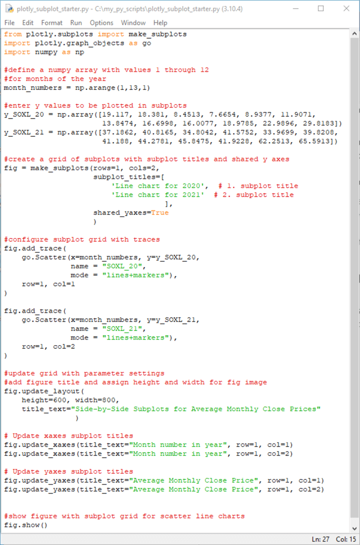
The following screenshot shows a Python script in IDLE, the integrated development environment for Python that automatically downloads when you install Python from Python.org.
- The script starts with three import statements for external Python libraries required by the script.
- After the import statements, three statements specify data to be plotted.
- The Numpy library's arange method is invoked to populate an array named month_numbers. This array has values 1 through 12 for the months from January through December.
- Then, the Numpy array method is invoked to populate two array objects with prices for the SOXL ticker symbol in 2020 (y_SOXL_20) and 2021 (y_SOXL_21). These values are derived from a SQL Server table and transcribed to the np.array statements. The process for extracting the values from SQL Server and transcribing them to the Python script is described here "Displaying Subplots for SQL Server Data with Python and Matplotlib".
- Next, the make_subplots function from the subplots library in Plotly configures
a pair of subplots. The subplots library automatically downloads when you install
Plotly. The make_subplots function resides within the subplots library. The
code assigns the subplot configuration to the figure object named fig.
- The rows and cols parameter values designate the number of rows and columns in the configuration of subplots. The subplot configuration in this example consists of a single row of subplots with two columns.
- The subplot_titles parameter values designate the titles for the first and second subplots in the subplot configuration.
- The shared_yaxes parameter has a value of True. This assignment means y-axis tick marker values appear only for the first chart in a row of subplots. Otherwise, y-axis tick marker values appear on all subplots in a row of subplots. More importantly, the charts in a row within a subplot configuration have the same y-axis value limits.
- The next code block invokes the add_trace method for the fig object. The
method is invoked twice. The first reference is for the subplot with row and
col parameter values of 1 and 1, respectively. The second reference is for the
subplot with row and col parameter values of 1 and 2, respectively.
- The Scatter function in the graph_objects (go) library shows the syntax for rendering a line chart. Recall the mode parameter value of "lines+markers" explicitly designates the return of a line chart from the Scatter function.
- The x and y parameter values within each Scatter function assign x and y coordinates for the line chart in each subplot.
- The name parameter value assigns a custom name for each subplot's trace in the fig object's legend. If no name parameter value is passed to the Scatter function, then the legend identifiers are trace 0, trace 1, etc., for successive subplots.
- The line colors in the example below are assigned automatically, which is convenient if you do not require custom colors for line chart features. If you need custom colors, you may find this reference helpful. I found Google Search a useful tool for discovering Plotly parameter settings.
- After the basic chart types and data sources are specified for the subplots,
the fig object can be updated in many ways. Several examples are provided in
the next block of code.
- The update_layout method for the fig object configures three fig object
properties.
- The height parameter value sets the height of the fig object in pixels.
- The width parameter value sets the width of the fig object in pixels.
- The title_text parameter value assigns a text string as a title to the fig object.
- The update_xaxes method for the fig object can control the title for the x-axis in each subplot within a fig object. The title_text parameter to the update_xaxes method assigns a string value for the x-axis title in each subplot. The row and col parameters designate to which subplot's x-axis to assign a string value.
- The update_yaxes method permits assigning string values for the y-axis titles for the subplots within a fig object. This method works similarly to the update_xaxes method.
- The update_layout method for the fig object configures three fig object
properties.
- The last line of code invokes the show method for a fig object to display the fig object created by the preceding code in the script.
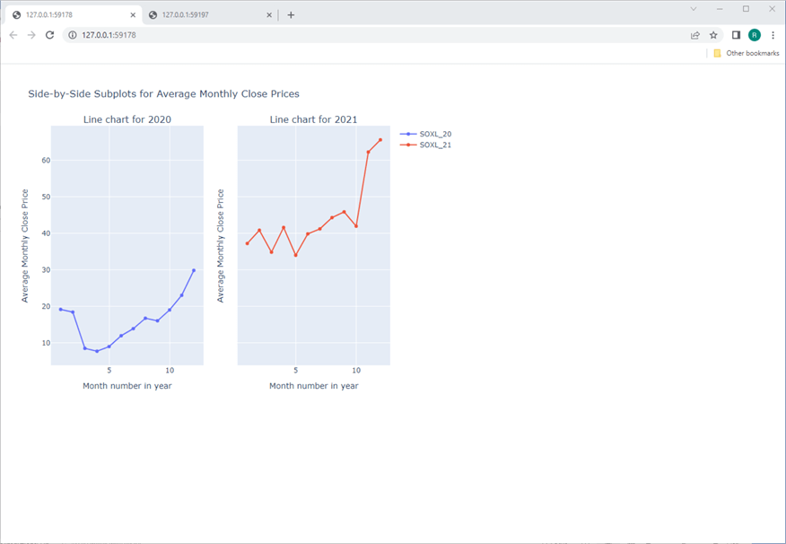
Here is the figure created by the preceding script. Plotly displays the figure in a browser window when you run the code from within the Python script window. While it's possible to program Plotly with Python, its underlying code is in JavaScript. This may be one reason why a fig object returned by the make_subplots function appears within a browser. Additionally, with the Google Chrome browser that I use, the display sometimes fails to open until I right-click a browser tab and choose Reload.
- Perhaps the most distinctive feature of the figure with two subplots is that the fig object appears sized for a relatively small portion of the browser window. Recall that height and width parameters are set in pixels. In many cases, it may be reasonable to override or omit the pixel settings for height and width.
- Notice that all the titles in the figure follow the code in the preceding
script.
- The title for each subplot (Line chart for 2020 and Line chart for 2021) derives from the subplot_titles parameters for the make_subplots function.
- The overall title (Side-by-Side Subplots for Average Monthly Close Prices) for the figure is from the fig.update _layout statement towards the bottom of the script.
- The x-axis titles (Month number in a year) are from the fig.update_xaxes statements after the fig.update_layout statement.
- Finally, the y-axis titles (Average Monthly Close Price) are from the fig.update_yaxes statements after the fig.update_xaxes statements.
- Also, the text for legends on the top right side of the figure follows directly from the name parameter assignments in the Scatter function for the two successive fig.add_trace statements towards the middle of the preceding script.
- The assignment of True to the shared_yaxes parameter in the make_subplots function means that the first and second subplots share common y-axis scale limits. Without the assignment of True to shared_yaxes, it could not be as apparent that average close prices are much higher in 2021 than in 2020.
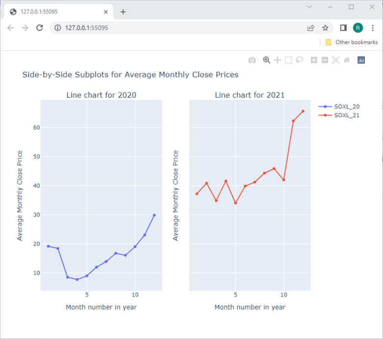
Here's another view of the preceding window with the right lower corner of the browser window dragged up and to the left. This makes the fig object appear more proportionally sized to the browser window size.
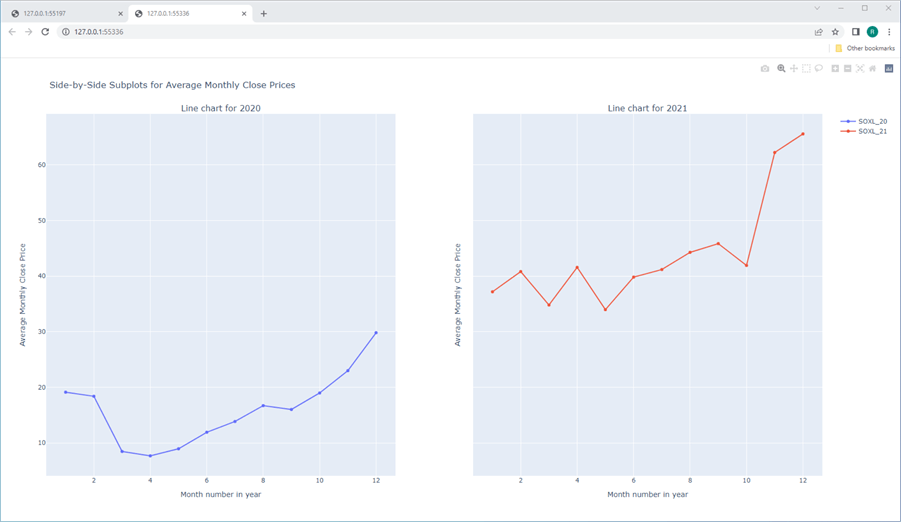
Here's yet another example of the fig object display. This display results from omitting any assignment of pixel values to the height and width parameters for the fig.update_layout statement. You can do this simply by failing to include the height and width parameters within the fig.update_layout statement. When you omit height and width parameters, Plotly adjusts the size and shape of a figure object in a browser window according to default rules.
The point of these three display versions is to illustrate how straightforward it is to manipulate your output from Plotly. Those more artistically inclined than me (an easy capability to have) will no doubt discover better ways of displaying line charts than the three examples presented in this section.
Creating and Displaying Candlestick Charts with Plotly
As mentioned earlier, this tip builds on code from a previous tip comparing observed open-high-low-close prices with Heikin Ashi open-high-low-close prices. This section starts by drilling down on the source data for the candlestick chart by extracting data from a SQL Server table of observed open-high-low-close prices for a security ticker.
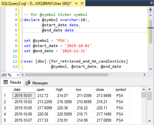
The following table with two rows shows a screenshot from SSMS in each row. The top table row shows the source code for a SQL script that runs a stored procedure named for_retrieved_and_HA_candlesticks; the code for the stored procedure is in the earlier tip in this section is based. The stored procedure returns two results sets – one for observed values and the other for the Heikin Ashi values. In the following script, the observed values are for the open-high-low-close prices for the PSA stock ticker, and that results set is the only one referenced in this section. This ticker symbol is for a public storage company. The script starts with a declare statement for three local variables (@symbol, @start_date, and @end_date). Next, three set statements assign values to the three local variables. The script ends with an exec statement to run the stored procedure.
The Results tab immediately below the script in the top table row shows the first five rows of the results set. The Results tab in the bottom table row shows the last five rows of the results set processed in this section.
The full results set can easily be copied to a CSV file by clicking the top left cell in the Results tab to select all rows, then by right-clicking the same cell and choosing Save Results As. Before clicking Save in the Save Grid Results dialog, verify the file type is CSV and enter your preferred name for the file. Within this tip, the CSV file conversion process writes the columns from the SQL Server results set as string values in the columns of the CSV file. Also, the conversion process reformats the date values from YYYY-MM-DD to MM/DD/YYYY. The CSV file is saved with the name PSA_with_observed_prices_for_plotly.csv. The file is saved in the csv_data_for_candlestick folder of the DataScienceSamples folder.

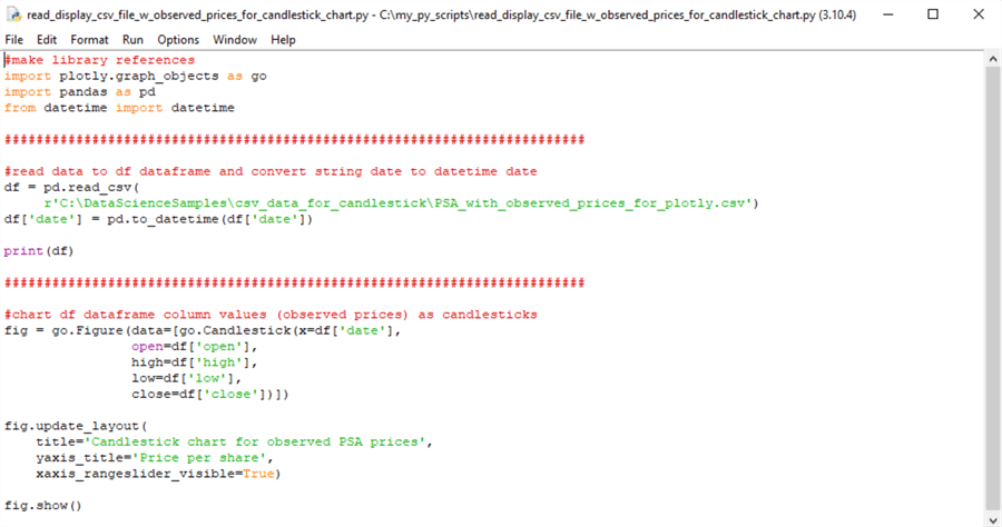
The next screenshot is a Python script for reading the PSA_with_observed_prices_for_plotly.csv file and transforming its values to create a candlestick chart with Plotly and Python. There are three sections to the script.
- The script starts with a set of import statements for external libraries referenced by the rest of the script.
- The second part reads the CSV file saved from SQL Server into a Pandas dataframe
named df with the read_csv function from the Pandas library.
- The read_csv function recognizes the open, high, low, and close column values as real numbers, with a Python data type named float64.
- However, the read_csv function does not recognize the date column format of MM/DD/YYYY as representing date values; instead, the function imports the date column values as string values.
- Therefore, the code invokes the Pandas to_datetime function to convert
the string values to datetime values.
- The Pandas to_datetime function performs the transformation from a string data type to a datetime data type, and the assignment statement saves the converted data back to the date column in the df dataframe.
- It also reformats the values in the date column from MM/DD/YYYY to YYYY-MM-DD.
- The second section concludes by printing the dataframe values.
- The third part of the script creates a candlestick chart from the data in
the df dataframe.
- The candlestick chart type is available from the Plotly graph_objects library.
- The code creates the candlestick chart in a figure object (named fig in the script).
- The candlestick chart has five input fields.
- The converted date column values are assigned to the x input field.
- The open, high, low, and close input fields are populated by the open, high, low, and close columns from the df dataframe.
- After assigning values to the input fields for the candlestick chart,
the code invokes the update_layout method for the fig object. Three parameter
assignments, respectively, set:
- the overall chart title,
- the y-axis title, and
- the visibility for the x-axis rangeslider.
- The overall script ends by invoking the show method for the fig object.
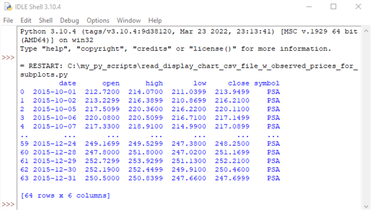
The next screenshot shows the output from the preceding script. The output appears in the IDLE shell window. By default, Python displays the first and last five rows from a print statement for a dataframe. Therefore, you can validate the data migration from SQL Server to Python by comparing these results from Python with the first and last five rows from the SQL Server results set that contains the source data for the PSA_with_observed_prices_for_plotly.csv file.
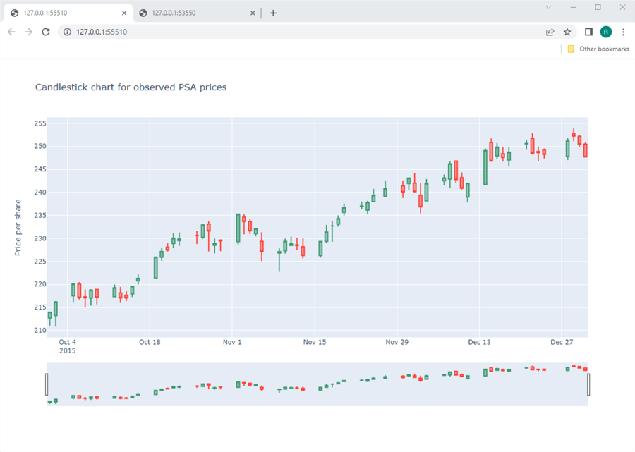
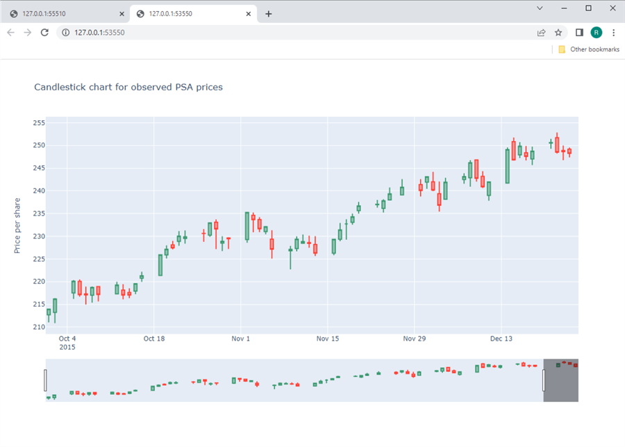
The next screenshot shows the candlestick chart as it initially appears in a browser window. The top chart window shows what is traditionally called a candlestick chart.
- The prices for each trading day appear as a single candle with upper and lower wicks (if required).
- If the candle color is green, the close price is higher than the open price.
- Conversely, if the close price is below the open price, the candle color is red.
- The upper wick for a candle shows when the high price is greater than either the open price or close price (whichever is greater).
- The lower wick for a candle shows when the low price is lesser than either the open price or close price (whichever is lesser).
- The x-axis rangeslider tool appears in the window below the one for the candlestick chart.
- The fig image shows the overall title and the y-axis title.
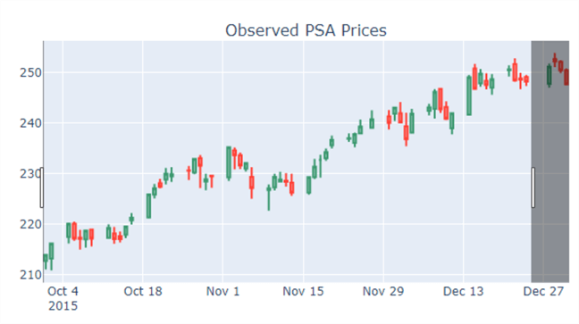
The next screenshot of the candlestick chart in the preceding image has the last several days in December blocked from showing by manipulating the x-axis rangeslider tool. The preceding candlestick chart starts on October 1, 2015, and runs through December 31, 2015. At the same time, the following candlestick chart begins on October 1, 2015, and runs through December 24, 2015. The shortened x-axis range results from the indented right edge of the x-axis rangeslider tool. As you can see, the x-axis rangeslider can alter the range of values shown in a Plotly chart.
Creating and Displaying Two-by-Two Candlestick Charts with Plotly
This section merges two key code design elements from the preceding two sections. The first element is how to create and display a configuration of subplots. The example in the first preceding section creates two subplots in a figure. This section creates and shows four subplots in a figure.
The second element is how to create and display a candlestick chart based on one CSV file with open-high-low-close prices for a single ticker symbol (PSA). This section demonstrates how to read and process four CSV files with open-high-low-close prices for four ticker symbols (PSA, NEE, UNP, and SPY). This section also shows how to suppress the visibility of the x-axis rangeslider tool while still maintaining a level of interactivity for Plotly charts as if the tool was visible.
As with the code for the immediately preceding section, there are three segments to the code in this section. The code in the first segment is the same in both sections. This section's second and third segments are longer and more involved than in the preceding section.
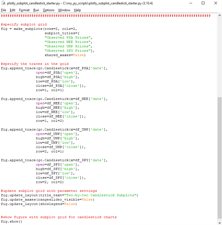
The following two screenshots show the first and second segments, which appear in the first screenshot. The third segment and closing line of code appear within the second screenshot.
- The header of the IDLE window at the top of both screenshots shows the file name for the script: plotly_subplot_candlestick_starter.py. You can tell from the file type (.py) that the file is for a Python script. The IDLE header also reveals the file path for the Python file.
- The first screenshot starts with four import statements for external libraries referenced in the second and third segments. The second segment reads four CSV files into Python dataframes and performs some minor processing to convert string data for use in creating a candlestick chart via Plotly.
- The third segment shows the code for assigning the four dataframes created in the second segment to four candlestick charts – one for each of four ticker symbols.
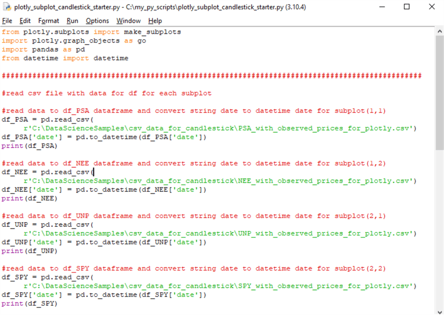
The code in the script for this section's second segment is a relatively simple extension of the second segment's code from the preceding section. As mentioned above, this code transfers the contents of a CSV file to a Pandas dataframe object. There are four separate transfers – one for each of four tickers (PSA, NEE, UNP, and SPY). Each CSV filename and corresponding dataframe name includes a ticker symbol. For example, the four dataframe names are df_PSA, df_NEE, df_UNP, and df_SPY. The matching filename to the df_SPY dataframe is SPY_with_observed_prices_for_plotly.csv.
The date column from a CSV file is converted from a string data type to a Python datetime data type via the to_datetime function from the Pandas library in an assignment statement. After the conversion, a print function copies the first and last five rows of the dataframe to the IDLE shell window. This facilitates a unit test validation of the transferred data from SQL Server to Python.
The third segment in the second screenshot picks up where the second segment leaves off.
- The third segment begins with a make_subplots function statement to create four subplots in a 2-by-2 configuration; the statement also assigns the configuration to a figure object named fig. The function statement additionally gives a title to each of the successive subplots. The last parameter assignment in the function indicates that the subplots do not have shared x-axis limits. This is because the range of values for the ticker prices displayed in each candlestick chart can vary from one candlestick chart to the next.
- The second, third, fourth, and fifth code blocks in the third segment illustrate
the syntax for assigning prices and dates to candlestick charts for the PSA,
NEE, UNP, and SPY tickers.
- Each code block assigns a trace based on a ticker symbol to a subplot.
- After the append_trace method within each code block, there is a go.Candlestick specification, which points to the candlestick chart type in the Plotly graph_objects library (go).
- Each candlestick chart specification receives values from five columns within the source dataframe for the candlestick chart. The five columns are for calendar dates, followed by open, high, low, and close price columns.
- After the go.Candlestick specification, the row and col parameter values
in the append_trace method designate a position for the candlestick chart
in the subplot configuration.
- row=1 and col=1 are for the top left position in the subplot configuration
- row=2 and col=2 are for the bottom right position in the subplot configuration
- other candlestick charts are assigned to subplots based on appropriate row and col parameter values
- The sixth code block is for customizing the appearance of charts with variations
of update statements for figure objects.
- The first update statement assigns a title to the overall set of four charts.
- The second update statement sets the visibility of the x-axis rangeslider tool to False. In other words, the x-axis rangeslider tool does not show.
- The last update statement sets the visibility of the legends for subplots to False. The legend does not need to show because each subplot is assigned its title in the make_subplots function statement.
- The final statement in the script is for the show method of the fig object. This statement displays the 2-by-2 matrix of candlestick charts.
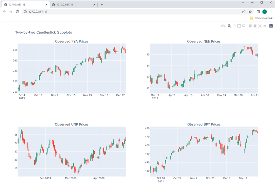
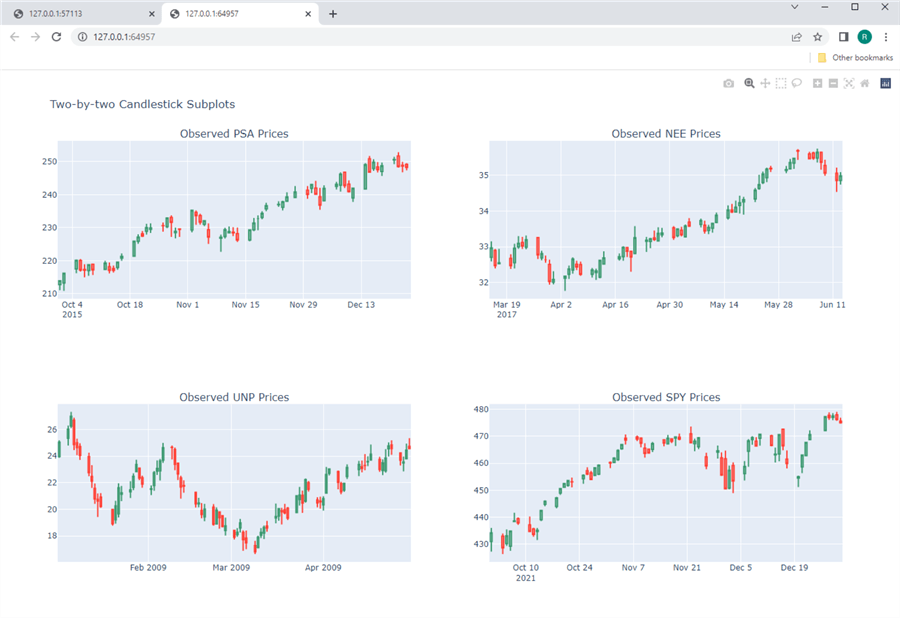
Here is a screenshot of the figure displayed in the preceding script. The figure has four candlestick charts – one for each of the four tickers. The title for each subplot specifies the ticker symbol whose prices are depicted in it. The visibility of the x-axis rangeslider tool is set to False. This removes the possibility of the x-axis rangeslider obscuring a portion of the candlestick chart below it.
The y-axis ticker range is set by default based on the candlestick values for a chart. Plotly also enables Python developers to programmatically set y-axis limits instead of relying on default assignments.
The x-axis ticker range is also set by default based on the date values passed to the x parameter of the candlestick graph_objects function and Plotly's built-in calendar. Again, there are a few ways to modify the x-axis values to show.
The next couple of screenshots shows one of these ways in the process. The left border of the PSA candlestick chart below is dragged towards the right frame of the chart so that all candles except the last four are excluded from the dragged area. When you drag an x-axis border edge, handlebars appear on the chart at the beginning and ending x-axis positions. The candles that are unshaded are those that are in the dragged area. The four candles that appear with a dark gray tint over them will be excluded from the redrawn candlestick chart. When you release the drag, the chart is redrawn to display just those candles in the dragged area.
Below is the re-drawn figure with four subplots. Notice that the chart for the PSA ticker in the top left subplot does not show the four shaded candles in the preceding figure. Furthermore, the last four candles for the re-drawn PSA candlestick chart include a green candle followed by three red candles. These are the same candles at the right edge of the dragged area in the preceding screenshot. The re-drawn candlestick chart below confirms the ability to interactively change charts with Plotly, even without an x-axis rangeslider.
Next Steps
This tip aimed to introduce multi-chart displays with Python and Plotly for a financial technology application. Because this tip targets SQL professionals, it began with a SQL script for extracting data from a SQL Server table that is appropriate for insertion in multi-chart displays. The results sets from the SQL Server scripts were copied to CSV files for reading by Python scripts. You can, of course, transfer the SQL Server scripts to Python with code.
A future tip may illustrate and discuss a programmatic solution to the transfer of results sets from SQL Server to Python:
- The tip starts with a simple example of line charts in a multi-chart configuration of subplots for a Plotly figure object. The first example includes the source data for the figure in the Python script.
- Next, you are introduced to Python and Plotly code for creating and displaying a candlestick chart for financial time series data. The source data for the example resides in a CSV file.
- The closing example demonstrates how to create and display a configuration of candlestick charts in a Plotly figure. Each candlestick chart resides in its own subplot. The source data for the example resides in four CSV files.
The tip's download file includes the Python scripts and CSV files referenced by the Python scripts. The obvious next step is to run the script files with the CSV files (when there is one, for example). You can, of course, create other CSV files for ticker symbols not examined in this tip. If you elect to do this, you will probably find it helpful to update the CSV file names and dataframe names in the Python script files.
About the author
 Rick Dobson is an author and an individual trader. He is also a SQL Server professional with decades of T-SQL experience that includes authoring books, running a national seminar practice, working for businesses on finance and healthcare development projects, and serving as a regular contributor to MSSQLTips.com. He has been growing his Python skills for more than the past half decade -- especially for data visualization and ETL tasks with JSON and CSV files. His most recent professional passions include financial time series data and analyses, AI models, and statistics. He believes the proper application of these skills can help traders and investors to make more profitable decisions.
This author pledges the content of this article is based on professional experience and not AI generated.
View all my tips
Article Last Updated: 2022-08-05


