By: Hristo Hristov | Updated: 2023-08-08 | Comments | Related: > Python
Problem
There are two major types of data - batch and real-time. Batch data gets ingested in certain increments and is not processed or visualized at the time the individual data points come in (e.g., average daily temperature for the past month). On the other hand, there is real-time streaming data. Here the data points appear at certain intervals; for example, the current temperature sampled every second. This type of data can also be processed or analyzed at the exact time the data point was generated. How do you visualize real-time streaming data with Python in your browser?
Solution
To visualize real-time streaming data, we can use the Python Bokeh library. It will allow us to ingest streaming data and visualize it live in the browser.
Environment Set Up
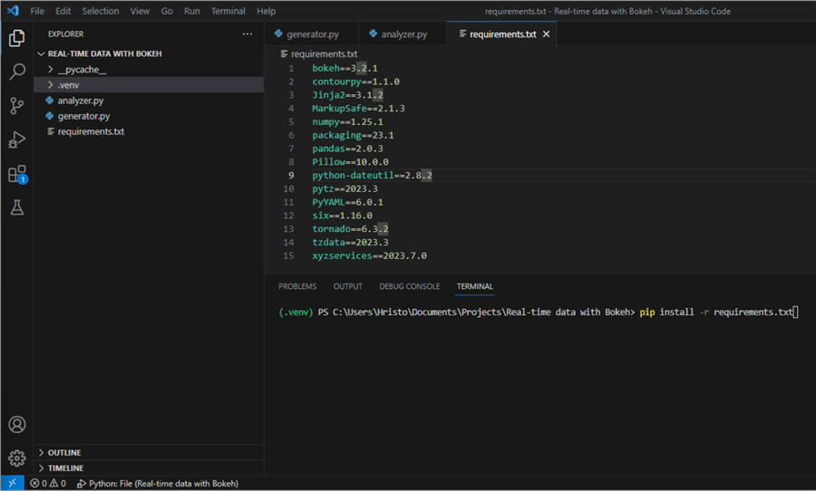
If you are starting your Python journey, follow steps one to five from this tip: Getting Started with Python under VS Code. Once you have an active .venv, you can use a requirements.txt file to quickly install all needed packages at once.
Step 1
Create a requirements.txt file in the root folder of your project.
Step 2
Add the following content and save the file:
bokeh==3.2.1
contourpy==1.1.0
Jinja2==3.1.2
MarkupSafe==2.1.3
numpy==1.25.1
packaging==23.1
pandas==2.0.3
Pillow==10.0.0
python-dateutil==2.8.2
pytz==2023.3
PyYAML==6.0.1
six==1.16.0
tornado==6.3.2
tzdata==2023.3
xyzservices==2023.7.0
Step 3
Run pip install -r requirements.txt in your terminal.

This action will install all required packages at once. With the installation done, we are all set to proceed.
Implement a Data Generator Class
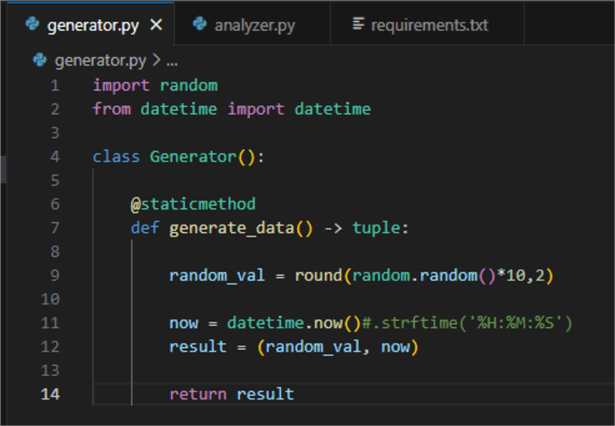
For this exercise, I created a simple class that generates synthetic data. However, you can use the idea and plug in your API, for example. Here is what the code looks like:
01: import random
02: from datetime import datetime
03:
04: class Generator():
05:
06:     @staticmethod
07:     def generate_data() -> tuple:
08:
09:         random_val = round(random.random()*10,2)
10:
11:         now = datetime.now()
12:         result = (random_val, now)
13:
14:         return result
The class contains a single static method generate_data(), returning a tuple. The tuple consists of a float value and a timestamp. Calling this method continuously will simulate having real-time streaming data. Save this to a file named generator.py:

Then you can proceed to the next section.
Visualization
Below is the code for visualizing the data:
01: from generator import Generator as G
02: from bokeh.models import ColumnDataSource, DatetimeTickFormatter, Span
03: from bokeh.plotting import figure, curdoc
04:
05: data_source = ColumnDataSource(data = {'Temp1': [],
06:                                        'Temp2': [],
07:                                        'DateTime': []})
08:
09: fig = figure(x_axis_type='datetime',
10:              y_axis_type='linear',
11:              width=1200,height=600,
12:              tooltips=[('Temp1', '@Temp1'), ('Temp2', '@Temp2')],
13:              title = 'Temperature readings')
14:
15: fig.line(x='DateTime',
16:          y='Temp1',
17:          line_color='green',
18:          line_width=3.0,
19:          source=data_source,
20:          legend_label='Temp1')
21: fig.line(x='DateTime',
22:          y='Temp2',
23:          line_color='red',
24:          line_width=3.0,
25:          source=data_source,
26:          legend_label='Temp2')
27:
28: hline = -Span(-location=7.5,
29:              dimension='width',
30:              line_color='black',
31:              line_width=1.0)
32: fig.add_layout(hline)
33:
34: fig.xaxis.axis_label, fig.yaxis.axis_label = 'Timestamp', 'Temperature'
35:
36: fig.xaxis.formatter = DatetimeTickFormatter(
37:         seconds=['%m/%d %H:%M:%S'],
38:         minutes=['%m/%d %H:%M:%S'],
39:         hours=['%m/%d %H:%M:%S'],
40:         days=['%m/%d %H:%M:%S'],
41:     )
42:
43: def stream():
44:     data1 = G.generate_data()
45:     data2 = G.generate_data()
46:
47:     new_row = {'Temp1': [data1[0]],
48:                'Temp2': [data2[0]],
49:                'DateTime': [data1[1]]}
50:
51:     data_source.stream(new_row)
52:     print([data1[0]], [data1[1]], [data2[0]])
53:
54: curdoc().add_periodic_callback(stream, 2000)
55: curdoc().add_root(fig)
Let's break it down line by line:
- 1 – 3: Import the Generator class from our generator module and other necessary modules.
- 5 – 7:
Declare a
data_sourcevariable of typeColumnDataSourcewith three columns, two for temperature values and one for a timestamp. - 9 – 13:
Create a new figure for plotting. Set specific attributes:
- axis types:
x is a
datetime, while y islinear. For both, the default isauto. Note: If the timestamp of your data source is string formatted (and not a datetime type), the plot may not visualize correctly. - Width and height in pixels.
- Tooltips for the data, representing a mapping between the name you want (string) and the column name (string with prefixed '@').
- A title for the plot.
- axis types:
x is a
- 15 – 26:
This is synthetic temperature data, so it makes sense to use a line plot. We
configure the lines according to our data source:
- 16: One for the first temperature reading using column Temp1.
- 22: Another for Temp2.
- 18 and 24: A float value for the line width.
- 19 and 25:
Pass the
data_sourceconfigured on line 5. - 20 and 26: Finally, a label for the legend. Omitting this argument will make the legend disappear from the plot.
- 28 – 32:
I wanted a static horizontal line marking an imaginary maximum threshold. So,
I use the
Spanclass to add fixed lines to the x or y axis. For the location, I passed a float (7.5), but theSpanobject can also make a vertical line at a point in time (e.g., on a static plot where x is a datetime). - 34: Label the axes.
- 36 – 41:
Setting the x axis format to an instance of the
DatetimeTickFormatterclass. This class takes an argument for every date part (e.g., second, minute, and so on). Here, the formatting for each date part is identical to provide a consistent label experience at different levels of zoom on the plot. You can format the date time part individually too. - 43 – 52:
The
streamfunction takes care of several important actions:- 44 and 45: Generate data from the static method from the Generator class.
- 47: Declare a dictionary that stores the currently generated values.
- 51:
We can efficiently append new data to a
ColumnDataSourceusing the stream function. You may wonder what happens to the size ofdata_sourcein memory if we stream for days or weeks. Interestingly, the size remains the same and is equal to the initial size in memory of the object holding one row. Bokeh only processes the new data for plotting instead of dealing with the entire dataset. - 52: For debugging purposes, I check the generated values. These will appear in the terminal once we run the script.
- 54: Using the
add_periodic_callbackfunction, we can configure periodic invocation of another function. In this case, it is thestreamfunction. It gets the data from theGeneratorclass every 2 seconds (2000 ms). In case you have real streaming data, you can omit using this function and append your data directly to thestreamfunction from line 51. - 55: Finally,
the
add_rootfunction adds the model (i.e., the configured plot) to the current document.
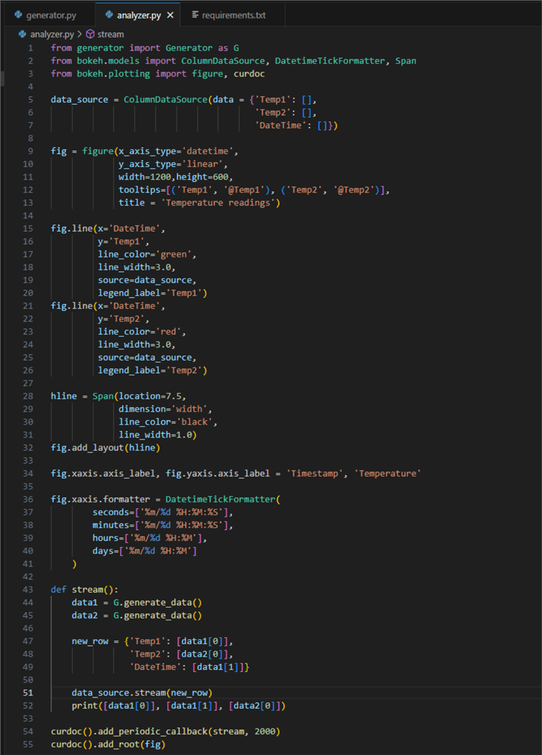
This is what the script file should look like:

To run it, type bokeh serve --show analyzer.py
in the terminal:

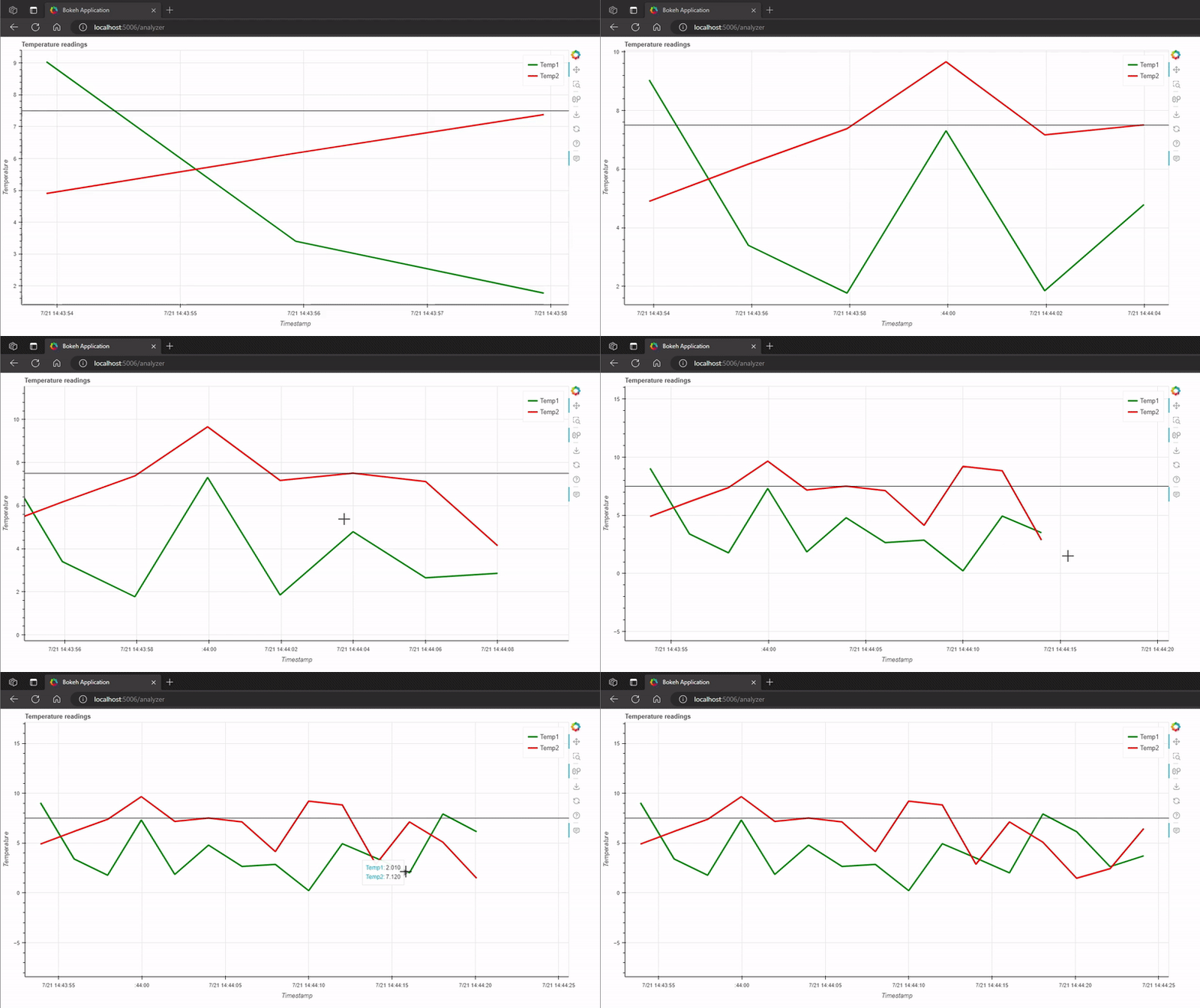
This should open your default browser with the plot we configured:

Conclusion
In this tutorial, we created a Python Bokeh real-time data streaming app. The app plots the data points as they appear at regular 2-second intervals and works in the browser. Users can interact with the plot by zooming in and out or sliding the canvas left or right. The plot can also be downloaded as a .png file.
Next Steps
- Getting Started with Python and Jupyter Notebooks under VS Code
- Interactive data visualization with matplotlib
- Bokeh ColumnDataSource
- Bokeh figure
- Bokeh line glyph
- Bokeh Span
- Bokeh DateTimeTickFormatter
- Bokeh document add root
About the author
 Hristo Hristov is a Data Scientist and Power Platform engineer with more than 12 years of experience. Between 2009 and 2016 he was a web engineering consultant working on projects for local and international clients. Since 2017, he has been working for Atlas Copco Airpower in Flanders, Belgium where he has tackled successfully multiple end-to-end digital transformation challenges. His focus is delivering advanced solutions in the analytics domain with predominantly Azure cloud technologies and Python. Hristo's real passion is predictive analytics and statistical analysis. He holds a masters degree in Data Science and multiple Microsoft certifications covering SQL Server, Power BI, Azure Data Factory and related technologies.
This author pledges the content of this article is based on professional experience and not AI generated.
View all my tips
Article Last Updated: 2023-08-08


