Problem
Recently, I wrote an article, Rank and Sort Data Based on Multiple Columns in Power BI Using DAX. However, it is very common for business users to request the ability to dynamically view the Top N and Bottom N values of a measure, like Total Sales, on the same visual. This requirement is simple to implement on either the Top or Bottom N options. But, the challenge is when we need to represent the two options on the same chart simultaneously.
Solution
This article will demonstrate step-by-step how to dynamically represent Top N and Bottom N in the same Power BI chart. However, I recommend that you read my other article before reading this one, as I will be referencing it since it explains how the ranking part is done using different approaches.
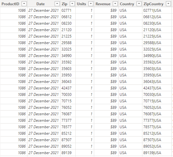
For this demo, I will leverage a data model with a Fact table called “Sales” (below). Of course, I will only show a snapshot of data rows within the table.
I would also use a Dimension table called “Product” (below), which has more rows of data.

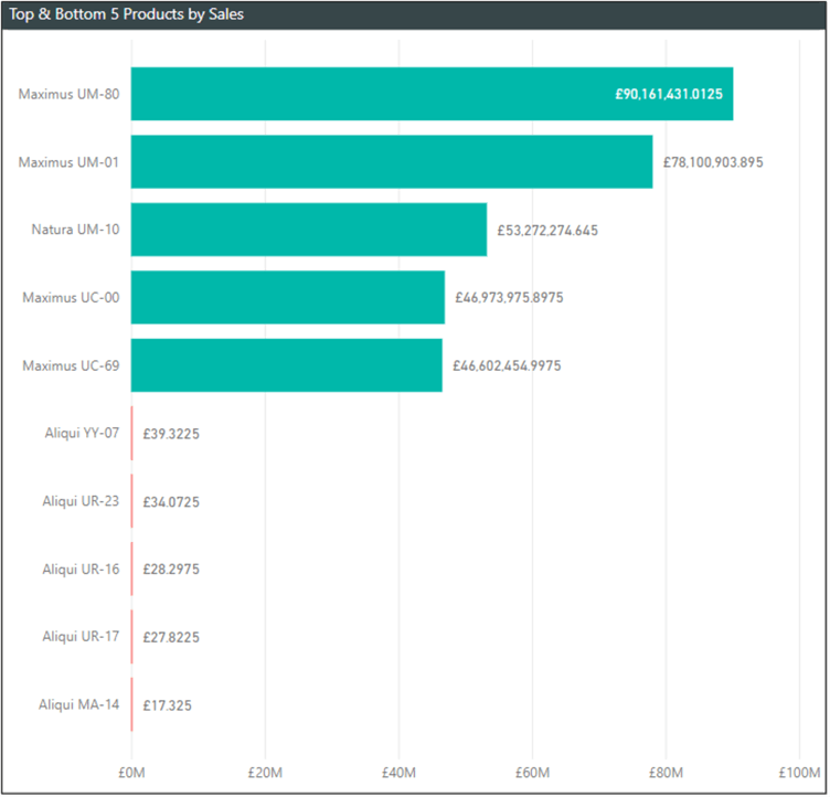
The requirement is as follows: On a bar chart, we need to show the top five and bottom five Products from the Products table based on the Total Sales value derived from the Sales table. The anticipated output should look like the image below.
Now that we understand the requirements, outlined below are the steps to follow. Remember to establish a relationship between your tables before you continue.
- Create a measure to summarize the Revenue on the Sales fact table.
- Create a measure to rank the measure created in step 1 and then apply a logic to render the top and bottom N in the visual.
- Apply the measure in step 2 to the Bar Chart visual.
- Apply a conditional formatting if required.
- Compare the output on the Top and Bottom N visual to when no DAX logic is applied.
Step 1: Create a Measure to Summarize the Revenue on the Sales Fact Table
This step is very straightforward. You need to create a measure on the Revenue column as follows. In this demo, I have referred to this measure as “Sales.”
Sales = SUM(Sales[Revenue])
Step 2: Create a Measure to Rank the Measure Created in Step 1 and Apply a Logic to Render the Top and Bottom N in the Visual
In this step, we will create a measure that first ranks the products and then applies a logic to only pull the Top N and Bottom N values and represent them on the Bar Chart, as seen in the final output above.
To create this measure, use or adapt the following DAX code:
Rank Value (Sales) =
VAR _rank_top =
    RANKX ( ( ALLSELECTED ( 'Product'[Product] ) ), Sales[Sales],, DESC, DENSE )
VAR _rank_bottom =
    RANKX ( ( ALLSELECTED ( 'Product'[Product] ) ), Sales[Sales],, ASC, DENSE )
VAR _result =
    IF (
        _rank_top <= 5,
        Sales[Sales],
        IF ( _rank_bottom <= 5, Sales[Sales], BLANK () )
    )
RETURN
    _result
Step 3: Apply the Measure in Step 2 to the Bar Chart Visual
To do this, select a bar chart among the visuals in Power BI. Note: In your case, this might be other visuals. But a bar chart is best to demonstrate in this tip.
In the image below, you can see that I have included the “Product” column from the Products table into the Y-axis well and the new measure created in Step 2 in the X-axis well.
This ensures that only the Top 5 and Bottom 5 products are rendered on the visual based on the total Sales value.

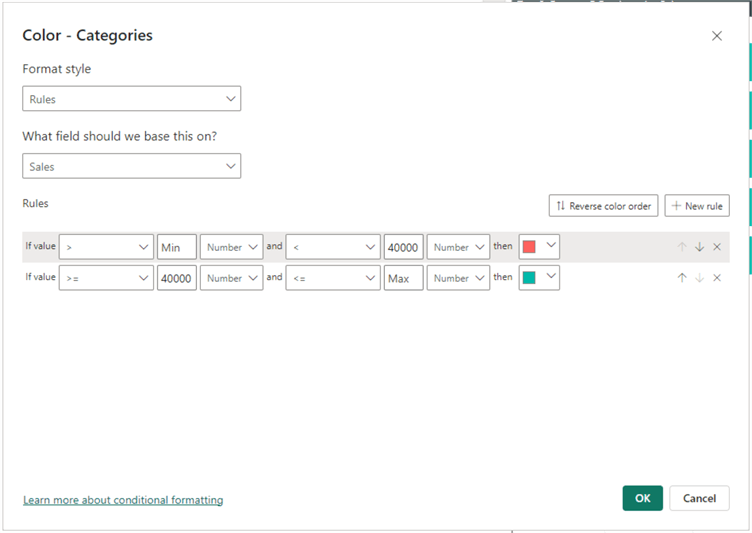
Step 4: Apply Conditional Formatting, If Required
This is an optional step. If you are interested in applying conditional formatting to help easily differentiate between the Top 5 and Bottom 5 products by sales, then follow this step. I have used bar color as the conditional formatting for this demonstration. I will use green bars and red bars for Top N and Bottom N, respectively.
The conditional formatting window can be seen in the image below. Note: I have not applied any logic for the conditional formatting to identify the Bottom N or Top N ranges. However, for simplicity, I have hardcoded the values in this tip just to show the concept. In your case, it might be obvious what to do. For example, you might have all your Bottom N values as negative values; thus, it would be easier to implement the conditional formatting.
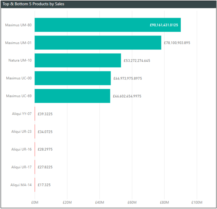
The output would look like the image below.
Step 5: Compare the Output on the Top and Bottom N Visual to When No DAX Logic is Applied
This step demonstrates how to figure out if the output of the previous steps (particularly Step 3) has yielded the desired outcomes based on business requirements.
To do this, create a new bar chart visual with only the “Sales” measure created in Step 1, as well as the Products column from the Products table, as seen in the image below.
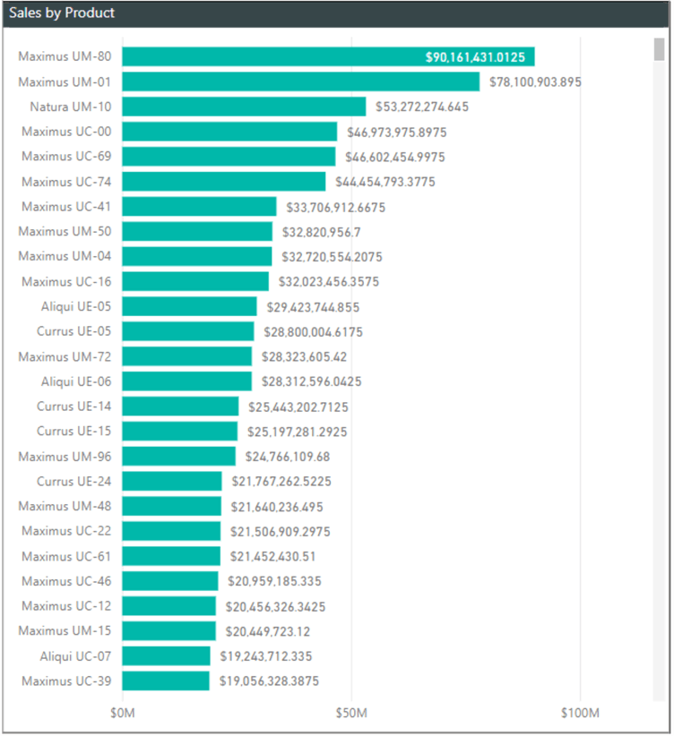
When you compare the above bar chart with the bar char for the Top and Bottom 5 created earlier, you can see that they match for the Top 5 bars, representing the Top 5.
Let’s do the same for the bottom values by taking a snapshot of the bottom part of the image above. This shows that the DAX code we wrote earlier in Step 2 has dynamically pulled the bottom 5 products based on sales. See the image below.

In summary, this article successfully demonstrated how to represent Top N and Bottom N on the same chart using DAX in Power BI. The N value is not fixed, allowing you to adjust it according to your business needs. This logic can also work if you use a rank of multiple fields from different or the same tables, but you would need to apply the logic used in my earlier article.
Next Steps
- See this Microsoft documentation on RANKX function.
- Read my tip: Rank and Sort Data Based on Multiple Columns in Power BI with DAX.
- Get more information on how to use the ALLSELECTED function in DAX.
- Read all of my articles here.

Kenneth A. Omorodion is a Microsoft Certified Solutions Associate (MCSA) with 12+ years of enterprise application experience in Power BI, DAX, Microsoft Fabric, Business Intelligence, data warehousing, SSRS, T-SQL, and Azure. Beyond his technical skills, Kenneth has expertise working with stakeholders’ and business leaders to help them better understand key insights. He has a great track record of successfully delivering full life cycle Business Intelligence and data solutions to organizations with measurable business impact.
- MSSQLTips Awards
- Achiever Award (75+ Tips) – 2025
- Author of the Year-2021
- Author Contender-2022/2023/2024
