Problem
I have created a bar chart in SQL Server Reporting Services (SSRS), but the chart looks crowded. I can’t seem to find a good alternative. Is there a possibility to make the chart more lightweight using the built-in tools?
Solution
In many cases, a bar chart or a column chart is the best way to present categorical data. However, sometimes the visualization can become a bit cluttered or aggressive when all the values are high, resulting in long bars throughout the chart. Let’s look at an example:

This bar chart displays a fictional satisfaction score for a set of subcategories. However, since all of the data is in the range between 80 and 100%, all of the bars extend to the outer right portion of the graph, cluttering the bar chart. This makes the visual quite heavy to look at, even though the bar chart is typically the most optimal visualization to display this kind of data.
A line chart might prove a viable alternative for some sets of data, but it typically implies a trend over time, which is something we’d like to avoid with this data set. When looking at the following line chart – using the same data – it becomes clear why the line chart is a bad idea. The peaks give the illusion of a certain “cyclical trend”, while there is none. Furthermore, the labels have now moved from the Y-axis to the X-axis, making them harder to read.

The solution to this problem is to use a slight variation of the bar chart: the lollipop chart. This visualization slims the bars down to a single line with a dot at the end to mark the value. In this tip, we’ll create the following lollipop chart:

As you can see, the visualization is now less visually aggressive. There’s only one minor drawback: the center of the circle identifies the value of the subcategory, but it can be difficult to judge the exact position of the center. This makes the lollipop chart a bit less accurate than the actual bar chart.
Creating a Lollipop Chart
Test Data
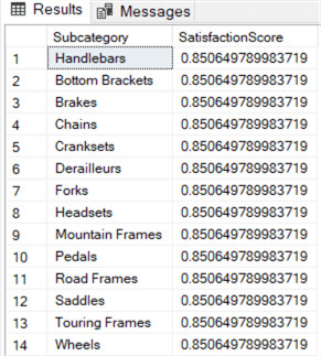
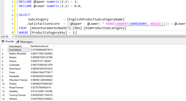
In this tip, we’ll use the AdventureWorks data warehouse to fetch the names of the subcategories. You can download this sample database from Github. With the following query, we’ll generate a random satisfaction score for each subcategory in the range of 80 and 100%.
DECLARE @Upper numeric(2,1) = 1;
DECLARE @Lower numeric(2,1) = 0.8;

SELECT
     Subcategory        = [EnglishProductSubcategoryName]
    ,SatisfactionScore  = ((@Upper - @Lower) * RAND(CONVERT(VARBINARY, NEWID()))) + @Lower
FROM  [AdventureWorksDW2017].[dbo].[DimProductSubcategory]
WHERE [ProductCategoryKey] = 2;
The RAND() function generates a random number between 0 and 1. Using the @Upper and @Lower variables, we can force the result into a specific range of values.
- If RAND() returns 0, @Lower is returned.
- If RAND() returns 1, (1 – 0.8) * 1 + 0.8 returns 1, the value for @Upper.
- All other values are situated between @Upper and @Lower.
As an argument to the RAND() function, CONVERT(VARBINARY,NEWID()) is passed as a seed. If we don’t do this, RAND() will return the same random number for each row:
The NEWID() function will guarantee a new seed for every, resulting in a unique random number for each row:
Keep in mind that since we’re using random numbers as sample data, your charts might look a bit different than the ones in this tip.
Creating a Bar Chart
The first step of creating a lollipop chart is creating the original bar chart. Using the query from the previous section, add a connection and a dataset in a blank report. Right-click on the canvas and choose the insert a chart. From the menu, choose the bar chart visualization:

Make the chart a bit bigger and configure the chart data as follows:

When we preview the chart, we can see most of the labels are missing:

We can force them to show up in the axis properties. Right-click on the vertical axis and choose Vertical Axis Properties.

In the Axis options pane, change the axis interval from Auto to 1. Click OK to close the menu. We’re making three additional formatting changes:
- Delete the legend at the top. There’s only one measure, so there’s no need to display a legend.
- Give the chart a proper title.
- Format the X-axis to show percentages.
The bar chart now looks like this:
Transforming the bar chart into a lollipop chart
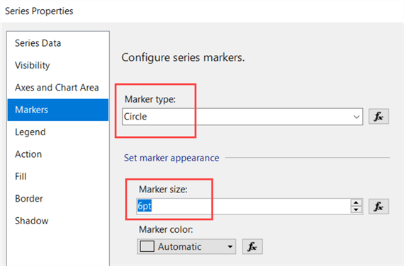
Now it’s time to create the lollipop chart. Right-click on a bar and choose Series Properties. Here we’re going to add the marker. Go to the Markers pane and set the Marker type from None to Circle. Change the size to at least 6pt.
Click OK to close the properties menu. The next step is to reduce the width of the bars. This setting cannot be found in the series properties menu. Select a bar and hit F4 to display the properties pane. In the CustomAttributes section (under General), you can find the MaxPixelPointWidth property. This property controls the width of the bars. Change it from 0 to 3.

The bar chart is now transformed into a lollipop chart:
Conclusion
Using a couple of minor tweaks, we have transformed a standard bar chart into a lollipop chart. The advantages of the lollipop chart is that they are less visually cluttered due to the smaller widths of the bars. However, it’s slightly less accurate since the center of the marker indicates the actual value (not the outer right point of the circle), which is now a bit harder to locate on the horizontal axis. You can mitigate this issue by displaying data labels.
Next Steps
- You can follow along with the instructions in this tip to create your own lollipop chart.
- More tips about creating charts in SSRS:
- Creating a box plot graph in SQL Server Reporting Services
- Create a Treemap Graph in SQL Server Reporting Services 2016
- How to create a heat map graph in SQL Server Reporting Services 2016
- How to create a Sunburst Graph in SQL Server Reporting Services 2016
- How to Create a Slope Chart in SSRS part 1 and part 2.
- How to Create a Dumbbell Plot in SSRS.
- For more Reporting Services tips: Reporting Services Tips.

Koen Verbeeck is a seasoned business intelligence consultant with over a decade of experience with the Microsoft Data Platform. He holds several certifications, including Azure Data Engineer. He’s a prolific writer, with over 375 articles on technologies such as Microsoft Fabric, SSIS, ADF, SSAS, SSRS, MDS, Power BI, Snowflake and Azure services. He has spoken at various events such as PASS, SQLBits, dataMinds Connect and many others. He frequently delivers educational webinars on MSSQLTips.com. For his efforts, Koen has been awarded the Microsoft MVP data platform award for many years.
- MSSQLTips Awards:
- Leadership Award (200+ Tips) – 2021
- Author of the Year – 2014/2020/2022
- Author Contender – 2024/2025